Introduction
It is December 2025. If you are still manually selecting data ranges and fighting with axis labels in spreadsheets, you are living in the past. The era of "death by Excel" is over.
For professionals searching for an excel graph maker or an ai chart generator, the goal has shifted. You don't just want a tool that draws lines; you want a solution that offers "Upload & Go" simplicity with "Presentation-ready" results. You want to move from raw data to visual storytelling in seconds.
In this post, we review the top 5 AI tools this month that are redefining how we visualize data.
What is an AI Graph Maker?
An AI graph maker is software that leverages Natural Language Processing (NLP) and machine learning to automatically interpret your data and convert it into visual charts.
It solves two major headaches associated with the traditional excel graph maker:
Data Cleaning: No need for complex pivot tables; AI understands messy datasets.
Design Struggle: No more ugly, default charts. AI ensures aesthetic, professional outputs.
Criteria for Selection
To curate this list for December 2025, we evaluated tools based on three strict criteria:
Ease of Use: Is it truly No-code? Can you talk to your data?
Analysis Depth: Does it provide insights, or just pretty pictures?
Output Quality: Are the graphs fancy enough to be dropped directly into a business presentation?
Top 5 Tools Review (December 2025 Edition)
Powerdrill Bloom
If you are looking for a workflow that takes you from "Raw Excel" to "Perfect PPT" in one go, Powerdrill Bloom is the #1 pick. It is not just a tool; it is an intelligent Data Agent.
Why it wins:
Agent, Not Just a Tool: Powerdrill Bloom understands the context of your data. Upload your dataset, and it provides summaries, trend analysis, and informational visualizations automatically.
Instant Visualization: Forget coding. Input a simple topic or upload a file, and generate bar charts, line graphs, or pie charts in seconds.
The "Nano Banana Pro" Advantage: The embedded Nano Banana Pro feature allows you to turn your generated graphs and insights into a professional, business-grade PPT deck instantly.
Efficiency: From raw data to a finished presentation, the process takes less than a minute.
Microsoft Excel with Copilot
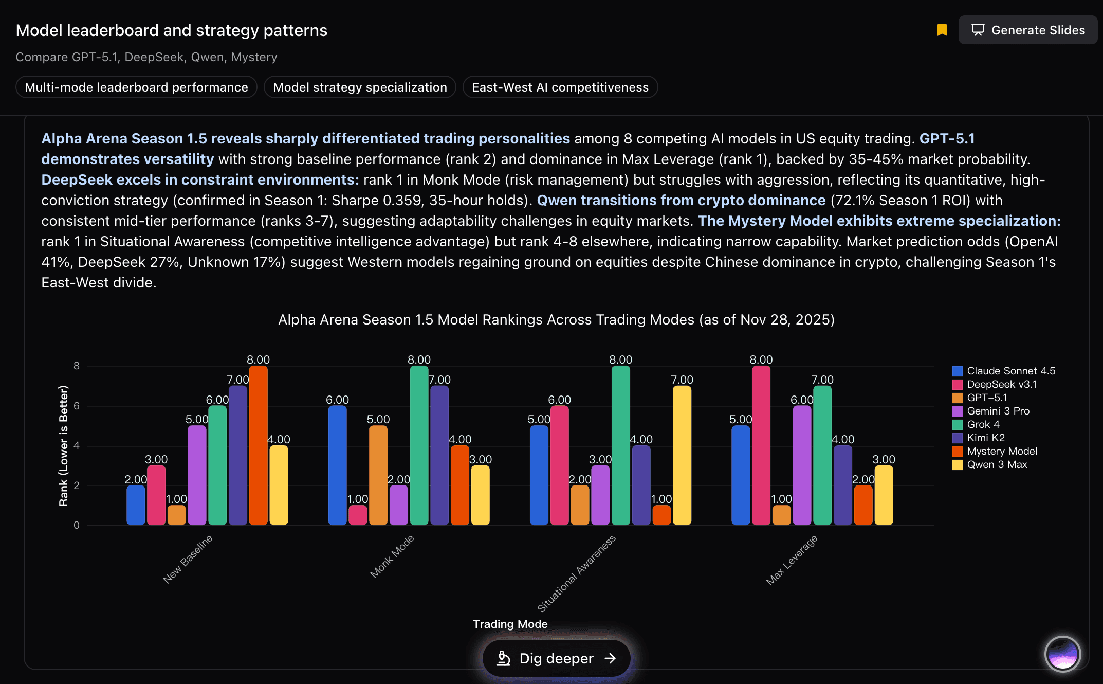
Microsoft continues to integrate AI into its ecosystem. Copilot allows users to generate charts via chat prompts within Excel.
Pros: Seamless integration if you already live in the Microsoft ecosystem.
Cons: It requires a pricey subscription. More importantly, it still feels like Excel—you often have to manually tweak the "look and feel" to make it presentation-worthy.
Canva
Canva is famous for its visuals, and its Graph Maker is beautiful.
Pros: Stunning templates and huge asset library.
Cons: It lacks data depth. As an ai graph maker, it is somewhat "surface level." Importing complex data is often clunky, making it better for social media posts than serious business analysis.

Julius AI
Julius AI allows you to chat with your data and is great for calculation-heavy tasks.
Pros: Excellent for complex math and Python-based plotting.
Cons: The visual output often looks like a scientific report (Matplotlib style). It lacks the polished, high-end design needed for client-facing presentations.

Beautiful.ai
Beautiful.ai is a smart deck builder that adjusts layout automatically.
Pros: Great for keeping slides tidy and aligned.
Cons: While it creates slides, its actual chart generation capabilities are limited compared to a dedicated data agent. It expects you to have the numbers ready, rather than analyzing them for you.

Conclusion
As we wrap up 2025, the tool you choose defines your workflow. If you need pure design, go with Canva. If you are stuck in corporate compliance, Copilot helps.
However, if you want to work smarter, not harder, and need a tool that handles both deep data analysis and high-end presentation creation, Powerdrill Bloom is the clear winner. Don't just make a graph; tell a story with data.
Stop wasting time making charts manually; leave that work to AI.

