Top 10 Marketing Data Analytics Tools for PowerPoint Presentations in 2026

Introduction
In 2026, the era of copy-pasting screenshots from dashboards into slides is officially over. Marketing teams are under immense pressure to not just report data, but to tell compelling stories that justify budget and prove ROI. However, transforming fragmented data from Google Ads, CRMs, and Social Media into a cohesive Monthly Business Review (MBR) remains a massive pain point.
After rigorously testing over 50 platforms, I have identified the definitive list of tools that bridge the gap between complex data and persuasive presentations. We are looking for "Intelligent Agents" that clean data, extract insights, and design slides automatically.
Before we dive deep into complex omnichannel analytics, if you are just starting out and want to learn the basics of generating standard slides from simple text prompts, I recommend reading my other guide: Create PPT Slides from Any Topic or File with AI.
For those ready to master advanced marketing intelligence, here are the top 10 tools that will revolutionize your reporting workflow.
Comparison Table: Top 10 Marketing Data Analytics Tools
Tool Name | Best For | AI Features | Pricing Model |
End-to-End Data Storytelling & Auto-PPT | Nano Banana Pro (Visuals), Text-to-Insight, Auto-Cleaning | Free Trial / Subscription | |
Data Connector (ETL) to Sheets/Looker | Basic anomaly detection | Tiered Subscription | |
Data Mapping & Transformation | Data classification | Tiered Subscription | |
Visual Reporting for Agencies | Automated summaries | Tiered Pricing | |
Client Reporting & SEO Tracking | AI Report Writer | Per Client/Month | |
Free Visualization within Google Ecosystem | Limited (Gemini integration) | Free / Pro | |
Deep, Complex BI Analytics | Einstein Discovery | Tiered Pricing | |
Enterprise Real-time Data | AI Service Layer | Custom Enterprise | |
Middleware for Big Data | Automated Pipelines | Custom Enterprise | |
Social Media Data to Google Sheets | Basic templates | Free Trial / Subscription |
1. Powerdrill Bloom
The definitive AI agent for 2026, designed to autonomously clean messy marketing data, extract growth insights, and generate professional business slides using the Nano Banana Pro visual engine.
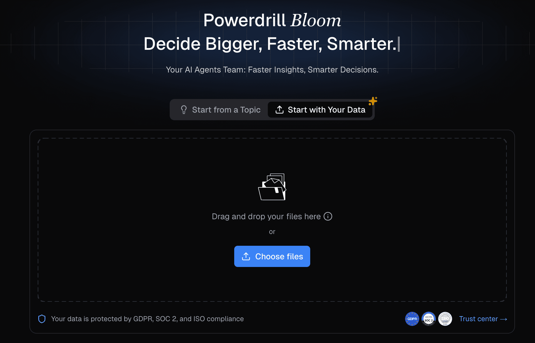
Key Features:
Multi-Source Data Cleaning: Automatically merges and cleanses CSV/Excel/PDF files from disparate channels (Ads, CRM, etc.) without SQL.
Nano Banana Pro Visuals: A high-end visual engine that generates "Consultant-Grade" infographics and slides instantly.
Natural Language Interaction: Simply ask, "Analyze the CPA trend by channel and create a slide deck," and the AI executes it.
Pros:
Seamlessly converts raw data into Presentation-Ready PPTs.
Unmatched visual quality ("Fancy & Professional") thanks to Nano Banana Pro.
Drastically reduces time spent on data prep and formatting.
Cons:
The advanced features may be overkill for very simple, single-channel reports.
Focuses more on narrative and slides than real-time dashboard monitoring.
Pricing:
Free Trial available; Competitive Monthly Subscription.
2. Supermetrics
The industry standard for moving marketing data into spreadsheets and data visualization tools, acting as a robust connector pipeline.
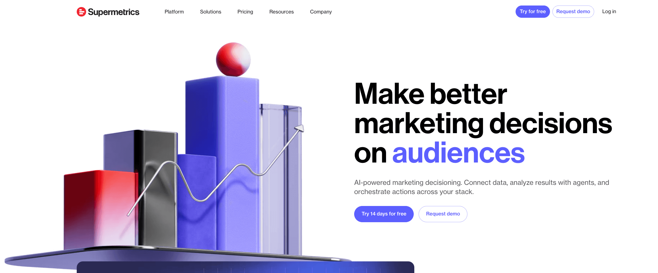
Key Features:
Broad Integrations: Connects to 100+ marketing platforms (FB Ads, Analytics, LinkedIn, etc.).
Automated Refresh: Schedules data transfers to Google Sheets or Excel automatically.
Data Blending: Basic blending capabilities within the connector settings.
Pros:
Extremely reliable and stable data connections.
Eliminates manual CSV exports from advertising platforms.
Great ecosystem support (Works well with Looker/Excel).
Cons:
It is a connector, not a presentation tool; you still need to build the slides/charts manually.
Pricing can get expensive as you add more data sources/users.
Pricing:
Tiered Monthly Subscription (Per Connector/User).
3. Funnel.io
A powerful "Marketing Data Hub" that specializes in collecting, mapping, and preparing data before sending it to a visualization tool.
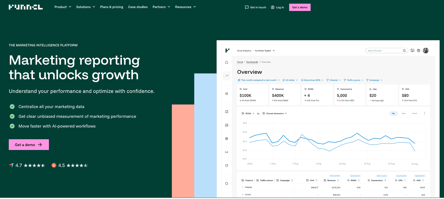
Key Features:
Data Transformation: Sophisticated rules to map disparate naming conventions across channels.
Data Storage: Stores historical data even if the source API limits it.
Export Flexibility: Sends cleaned data to Tableau, Looker, or Power BI.
Pros:
Excellent for fixing "messy" data taxonomies across global campaigns.
No coding required for complex data mapping.
Ensures a "Single Source of Truth" for data teams.
Cons:
Does not generate PowerPoint slides directly; requires an external BI tool.
Can be pricey for smaller agencies or teams.
Pricing:
Dynamic Pricing based on Spend/Usage.
4. Whatagraph
A visual reporting platform built specifically for marketing agencies to create easy-to-read performance reports for clients.
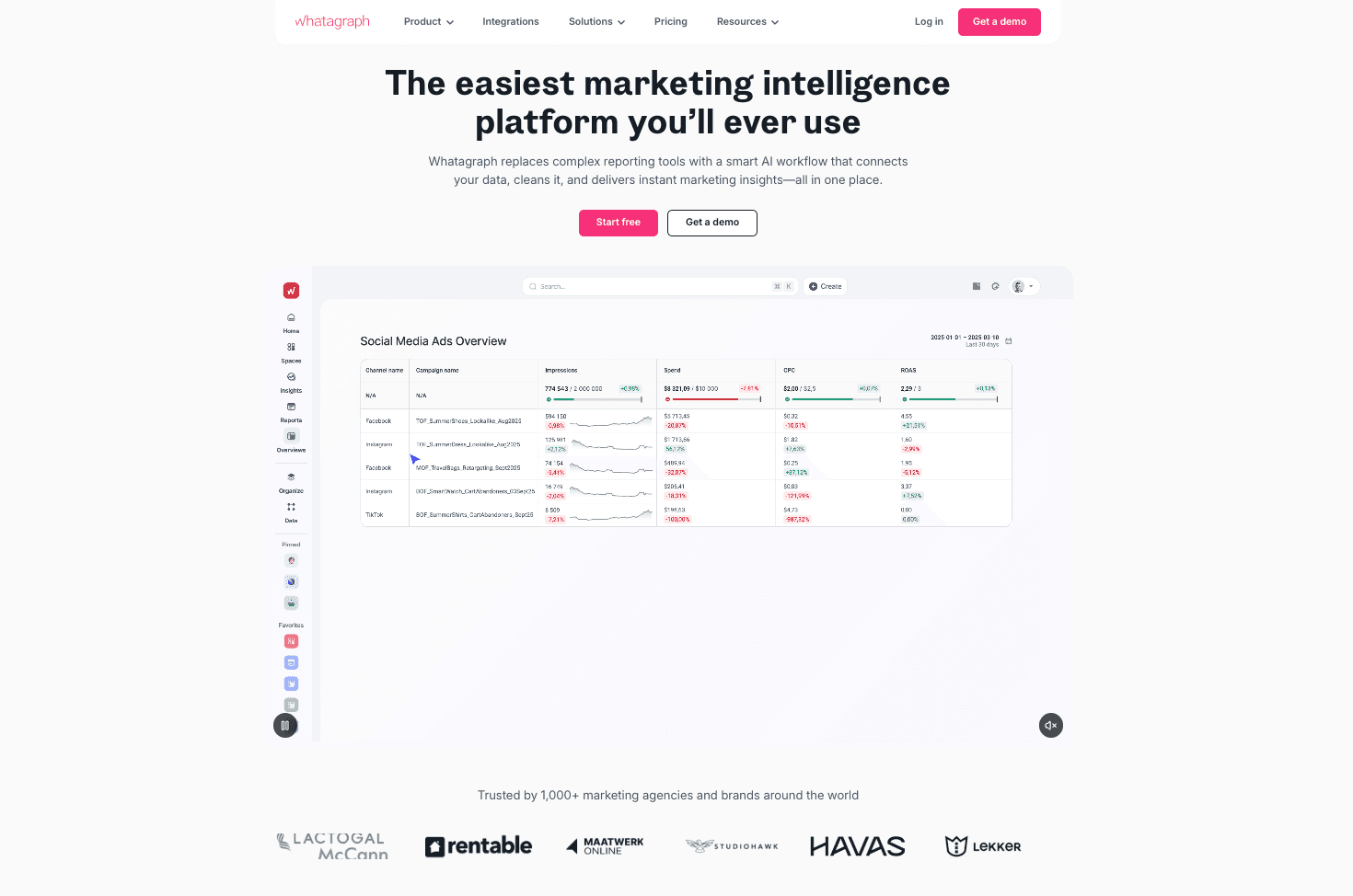
Key Features:
Pre-made Widgets: Drag-and-drop interface with visually appealing chart widgets.
White Labeling: Fully customizable branding for agency client reports.
Automated Delivery: Sends reports via email automatically on a schedule.
Pros:
Very fast setup; great for non-technical users.
Visually cleaner than standard Looker Studio reports.
Streamlines client communication.
Cons:
Limited deep analytics capabilities compared to BI tools.
Export to editable PowerPoint is often limited (mostly PDF/Web links).
Pricing:
Tiered Pricing (Start, Boost, Max).
5. AgencyAnalytics
An all-in-one reporting platform for agencies that combines SEO, PPC, and Social data into client-facing dashboards.
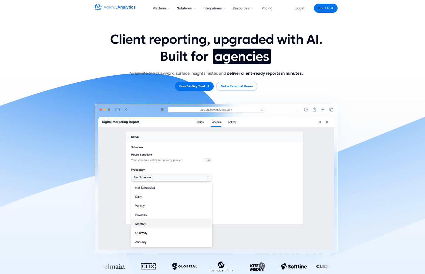
Key Features:
SEO Tools: Built-in rank tracker and site auditor alongside reporting.
Client User Roles: Grants clients login access to view their own live dashboards.
AI Report Summary: Generates text summaries of performance.
Pros:
Comprehensive solution for digital agencies (includes task management).
Very intuitive user interface.
Good value for agencies managing many small clients.
Cons:
Customization of visual design is somewhat rigid.
Focuses on dashboards, not narrative presentation slides.
Pricing:
Per Client / Per Month model.
6. Google Looker Studio
Google's free, web-based data visualization tool that turns data into informative dashboards and reports.
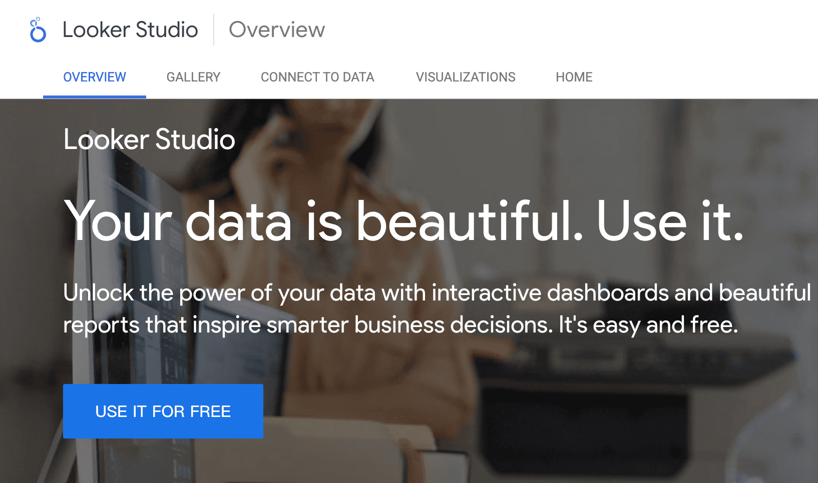
Key Features:
Google Integration: Native, seamless connection to Google Analytics 4, Ads, and Sheets.
Interactive Controls: Viewers can filter dates and dimensions dynamically.
Community Visualizations: Access to 3rd party chart types.
Pros:
Completely Free (for standard version).
Easy collaboration (works like Google Docs).
Standard for basic web analytics reporting.
Cons:
Can be slow/buggy with large datasets.
"Export to PPT" is not native; usually requires PDF export or plugins.
Pricing:
Free (Pro version available).
7. Tableau
A market-leading Business Intelligence (BI) platform for deep, complex data exploration and enterprise-grade analytics.
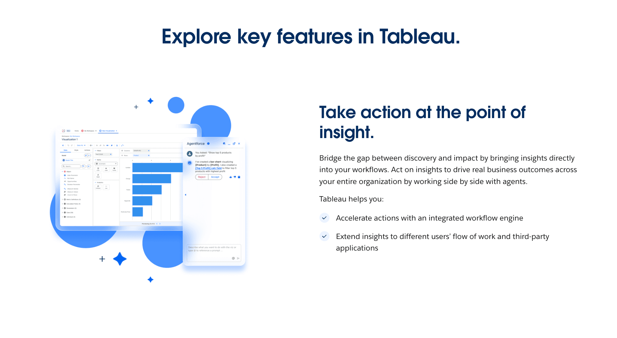
Key Features:
Advanced Analytics: Supports R/Python integration and complex statistical modeling.
VizQL Technology: Translates drag-and-drop actions into data queries.
Story Points: A feature allowing users to create slide-like presentations within the tool.
Pros:
Unparalleled depth of analysis and visualization customization.
Handles massive datasets efficiently.
Strong community and learning resources.
Cons:
Steep learning curve; requires data analysts, not just marketers.
Expensive licensing and resource-heavy.
Pricing:
Per User / Month.
8. Domo
A cloud-native platform that integrates data integration, BI, and business apps to foster a data-driven culture.
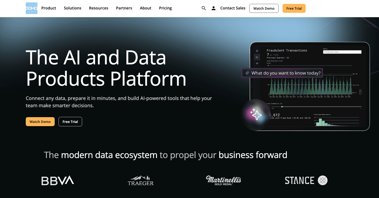
Key Features:
Magic ETL: Visual drag-and-drop data transformation.
Real-time Dashboards: Focuses on mobile-first, real-time data access.
App Store: Thousands of pre-built connectors and apps.
Pros:
Extremely fast implementation for enterprise data stacks.
Excellent mobile experience for executives.
Social collaboration features built-in.
Cons:
Enterprise pricing is often opaque and high.
Overwhelming for simple reporting needs.
Pricing:
Custom Enterprise Pricing.
9. Improvado
An enterprise-grade revenue data platform (middleware) that centralizes marketing and sales data for large organizations.
Key Features:
Data Normalization: Automatically harmonizes metrics across different platforms.
Data Warehouse Loading: Pushes data to BigQuery, Snowflake, etc.
Attribution Modeling: Supports complex attribution setups.
Pros:
Solves the "Data Engineering" problem for marketing teams.
High security and compliance standards.
Reduces reliance on IT for data access.
Cons:
No visualization layer itself; requires a separate BI tool (Tableau/PowerBI).
Targeted strictly at large enterprises.
Pricing:
Custom Enterprise Pricing.
10. Porter Metrics
A user-friendly tool designed to connect social media and marketing data directly to Google Sheets and Looker Studio.
Key Features:
Google Ecosystem Focus: deeply integrated with G-Suite.
Social Media Connectors: Strong support for Facebook, Instagram, and TikTok data.
Templates: Offers a library of pre-built report templates.
Pros:
Very affordable and easy to start.
Great for freelancers and small businesses.
Good customer support.
Cons:
Limited to Google Sheets/Looker Studio destinations.
Lacks advanced data transformation features.
Pricing:
Free Trial / Monthly Subscription.
How to Choose the Right Tool?
Choosing the right tool depends entirely on your specific bottleneck:
The Connector Scenario: If your primary issue is just getting data from Facebook Ads into a spreadsheet so you can crunch it yourself, Supermetrics is the reliable veteran.
The Agency Scenario: If you are a digital agency needing to send 50+ clients a standardized monthly PDF report with your logo, AgencyAnalytics or Whatagraph are efficient choices.
The "Insight-to-Presentation" Scenario: HOWEVER, if you are a marketing team that needs to raw data (Excel/CSV) into a compelling story, extract growth insights, and generate a Nano Banana Pro-level PowerPoint presentation automatically, Powerdrill Bloom is the unrivaled choice for 2026. It replaces the Data Analyst + Designer + Admin workflow.
How Powerdrill Bloom Accelerates Marketing Reporting
Powerdrill Bloom isn't just a tool; it's your AI Marketing Analyst. Here is the workflow that is changing the industry:
Data Ingestion: You upload messy Excel files or CSV exports from your ad platforms.
AI Cleaning: The agent automatically detects headers, merges formats, and cleans anomalies.
Text-to-Insight: You ask natural language questions: "Why did ROAS drop in Q3?" or "Compare User Acquisition Cost between Instagram and TikTok."
Nano Banana Pro Visualization: The engine selects the perfect chart type and generates stunning, business-appropriate visuals—not just generic screenshots.
Presentation Generation: With one click, it compiles these insights into a structured Slide Deck (PPT/PDF) with narrative titles and bullet points, ready for the boardroom.
Conclusion
In 2026, the competitive advantage belongs to marketers who can make decisions fast. While traditional tools like Tableau or Supermetrics handle the data piping, only Powerdrill Bloom completes the "Last Mile" of analytics: transforming complex numbers into persuasive, designer-quality PowerPoint presentations instantly. Stop building slides; start telling stories.
Frequently asked questions
What are Marketing Data Analytics Tools for PowerPoint Presentations?
These are software solutions that connect to marketing data sources (like Google Analytics, Ads), analyze key performance indicators (KPIs), and automate the creation of visual slides for presentations, bridging the gap between raw data and business storytelling.
Which tool is recommended for Marketing Data Analytics for PowerPoint in 2026?
Powerdrill Bloom is highly recommended due to its ability to handle raw files and its Nano Banana Pro engine, which generates aesthetically pleasing, professional slides and deep insights without requiring coding skills.
How do these tools help marketing or data teams increase efficiency?
They automate the manual labor of "Automated Reporting"—eliminating data copying/pasting, reducing errors, and using AI for "Visual Storytelling." This allows teams to focus on strategy and "Data-Driven Decisions" rather than slide formatting.