How to Turn Product Usage Data Into a Feature Adoption Report (2026)
A usage export is a long list of events: user ID, event name, timestamp, maybe a property or two. A feature adoption report is one percentage. The distance between them is three decisions, not a formula.
Which users belong in the denominator. What counts as having used the feature. And over what window you are measuring.
Change any one of those and the number moves by tens of percentage points. The report still looks correct, which is the problem.
This guide covers what to settle first, the three manual routes, and where each one breaks down.
What you need before you start
You need event-level rows, not a pre-aggregated summary. One row per event, with a user identifier and a timestamp.
You need the event name that actually represents the feature. This is rarely as clean as it sounds, because most features fire several events. A feature adoption number is only ever as good as that mapping.
You also need to know who could have used it. If the feature shipped behind a flag to a subset of accounts, everyone else does not belong in the denominator.
A quick sanity check saves an hour later. Count distinct users in the export and compare that to your known active-user count. If they differ a lot, the export is filtered in a way you have not noticed.
The three decisions that change the number
The denominator. All signed-up users, monthly active users, or only users eligible for the feature. These produce three different percentages from the same events. Every feature adoption figure is a fraction, so name both halves before you compute anything.
Eligible is usually the honest choice for a newly shipped feature. All signed-up users is the number that looks worst and is easiest to defend as conservative.
What "used" means. Fired the event once, fired it twice, or fired it in two separate sessions. A single click during a tour is not adoption, and most teams learn that the hard way.
Pick a threshold and write it on the report. Two uses on two different days is a common and defensible rule.
The window. Adoption is not a point in time. It is the share of eligible users who did the thing within a period, so the period is part of the definition.
Here is a documented subtlety worth knowing before you copy a tool's methodology. Amplitude's retention documentation explains how its calculation works. It "computes retention data by comparing the date of that starting event to the date of the return event you specified."
The date range applies to the first event only. Amplitude states plainly that "users don't have to trigger the return event during that period to appear in the analysis."
That is sensible behaviour and it surprises people. A spreadsheet that filters both events to the same window will not match the tool, and neither is wrong.
How to do it manually
Option 1: Count distinct users, then divide
Start with deduplication, because raw event counts are not adopters. Pull the unique user list with UNIQUE.
Then count how many of those users fired the feature event, using COUNTIFS with the event name and the date bounds. Divide by your eligible-user count.
Keep the two counts in visible cells rather than nesting them in one formula. Someone will ask what the denominator was, and you want to point at it.
The ceiling is that this gives you one number with no shape. You know 18% adopted and nothing about who.
Option 2: Build a user-level flag table
One row per eligible user, one column per question. Did they fire the event, how many times, and on how many distinct days.
Now you can slice. Adoption by plan, by signup cohort, by account size, by whether they completed onboarding.
This is where feature adoption becomes actionable rather than reportable. A blended 18% hides that new users are at 40% and users from last year are at 4%.
That gap is the finding. Our guide to cohort analysis covers why the blended figure moves whenever signup volume moves, even with behaviour unchanged.
The limit is volume and joins. A million-row export plus an account table is past the point where formulas stay pleasant.
Option 3: Keep a definitions tab beside the numbers
Write down the event name, the threshold, the window, the denominator, and who was eligible.
This is what makes the report comparable next month. It is also the tab that gets skipped when someone needs the number in ten minutes.
The limitation is that documenting a definition does not apply it. Somebody still rebuilds the same five filters every cycle.
The shared ceiling. All three assume the event names are clean. When the same action fires under three names after a refactor, the real work is reconciling those before any counting starts.
Where the manual route slows down
The first report takes a morning. The fourth takes longer, because by then the definition has quietly drifted.
Event names change when the product changes. A rename in the codebase becomes a cliff in your chart, and it looks exactly like users abandoning the feature. That is how a feature adoption chart ends up reporting a code change rather than a customer decision.
Rollout changes break the denominator. The feature reaches 100% of accounts and adoption appears to drop, because the eligible population tripled.
Then there is the counting error that survives longest. Summing event counts instead of distinct users inflates adoption whenever a handful of power users hammer the feature.
There is one more cost that only shows up under deadline. When someone asks "is that good?", a single percentage cannot answer, and building the comparison is a second project.
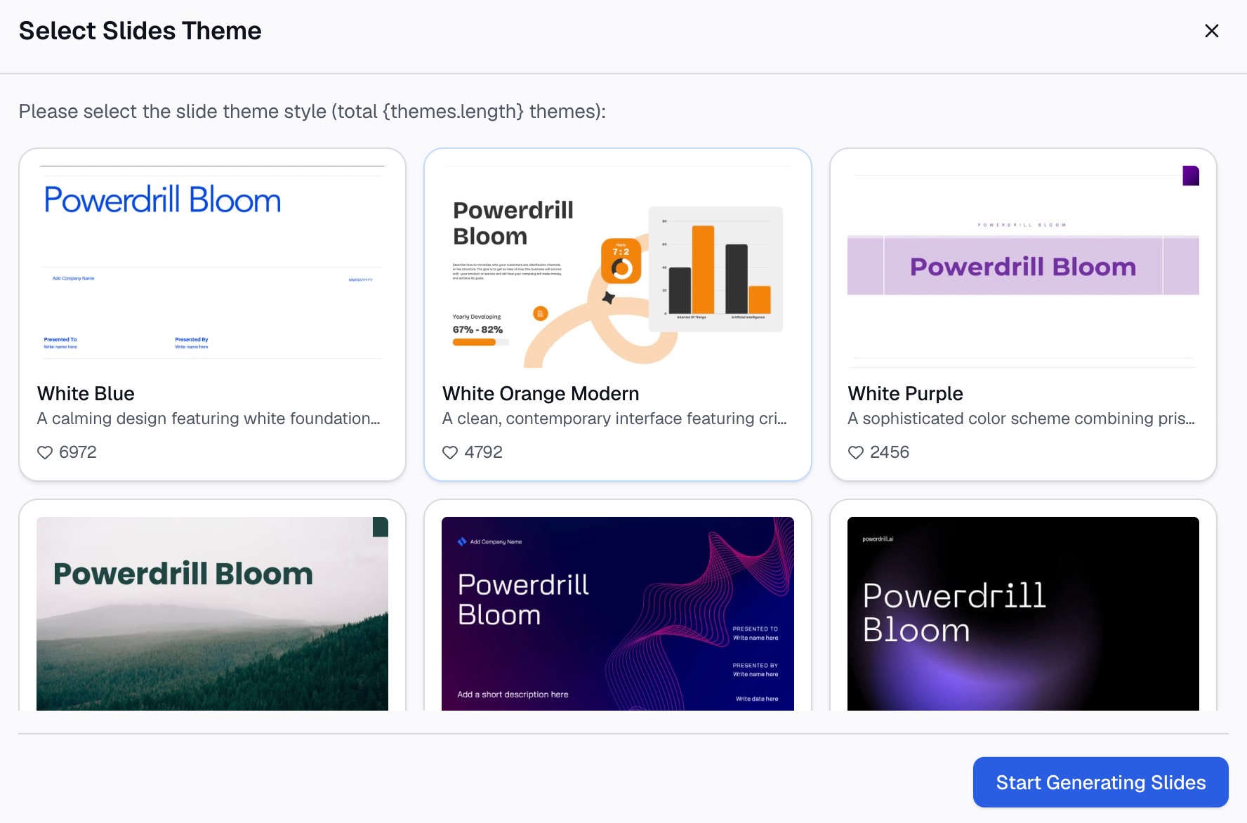
How to build the report with Powerdrill Bloom
Step 1: Upload your usage export
Upload the event export, or the event and account files together. Powerdrill Bloom profiles the columns on arrival, so inconsistent event names and missing user IDs surface before any percentage is calculated.

Step 2: Describe the definition in natural language
State the rules rather than building them. Name the event, the threshold, the window, and which users are eligible.
Then ask the questions that catch the traps. Ask whether any event names look like near-duplicates. Ask how many distinct users fired the event versus how many events fired, and how the feature adoption rate differs by signup month.
Step 3: Export the chart, report, or deck
Take out the adoption trend, a table by segment, or a slide that carries the number and the definition together.
Why this beats rebuilding it every cycle
| Manual route | Powerdrill Bloom | |
|---|---|---|
| Deduplicating users from events | Helper columns per file | Ask for distinct users |
| Splitting by cohort or plan | Join and rebuild the table | Ask for the breakdown |
| Renamed events after a release | Spot it in the chart later | Surfaces on upload |
| Changing the eligible population | Rework the denominator | State the new rule |
The third row is where accuracy is won or lost. A renamed event and a genuine drop look identical in a line chart, and only one of them needs a product response.
Common mistakes
Counting events instead of users. Ten thousand events from two hundred people is not adoption. Deduplicate first, always.
Using all signed-up users as the denominator on a flagged feature. If only a third of accounts can see it, the other two thirds are not non-adopters. They are not eligible.
Treating one click as adoption. A single event during onboarding is exposure. Require repeat use on separate days if you want the number to mean something.
Comparing a blended rate across months. New and existing users adopt at different rates, so the mix moves the number on its own. Split by cohort before drawing a conclusion.
Ignoring an event rename. A refactor produces a cliff that looks like churn. Check the event dictionary before you investigate user behaviour.
Copying a tool's window without reading how it works. Documented retention windows often filter the first event only, so a spreadsheet that filters both will disagree.
Reporting the percentage with no definition attached. The number is meaningless without the denominator and the threshold. Put both on the chart, the same way a good KPI dashboard labels its metrics.
Conclusion
Decide the eligible population, set a usage threshold, fix the window, and deduplicate users before dividing. Those four turn a feature adoption percentage into something a product team can act on.
What makes it expensive is that the definition has to survive product changes. Renamed events and widened rollouts both move the number without anyone touching the report.
If that is where your reporting cycle goes, try Powerdrill Bloom on your usage export. See also our guide to building a cohort retention chart, the roundup of AI tools for product analytics, and the CSV AI assistant page.
Frequently asked questions
What is feature adoption?
It is the share of eligible users who used a feature within a defined window, measured as distinct users rather than events. The definition only holds if the denominator and the usage threshold are stated.
How do I calculate it from an event export?
Count distinct users who fired the feature event inside your window, then divide by the eligible-user count. Deduplicate first, because one user can produce hundreds of events.
Should the denominator be all users or active users?
Use the eligible population, which is the users who could actually reach the feature. All signed-up users produces a conservative figure and understates adoption behind a rollout flag.
How long should the measurement window be?
Long enough for a normal usage cycle, so weekly for daily-use products and monthly for periodic ones. Keep it fixed across reports, since changing it changes the number.
Why does my number differ from the analytics tool?
Usually the window or the deduplication rule. Documented retention calculations often apply the date filter to the first event only, which a spreadsheet built on both events will not reproduce.