How to Create a Cohort Retention Chart From Your User Data

Introduction
You are pouring money into marketing, acquiring thousands of new signups, yet your active user base refuses to grow. It feels like pouring water into a leaky bucket. One of the most frustrating bottlenecks for product managers, marketers, and founders is knowing exactly when and why users abandon a product.
Looking at high-level metrics like "Monthly Active Users" (MAU) isn't enough; it hides the underlying churn. To truly fix your leaky bucket, you need to understand the lifecycle of specific user groups over time. This is where creating a cohort retention chart from your user data becomes the ultimate game-changer for your business growth strategy.
What Is a Cohort Retention Chart?
A cohort retention chart is a visual representation of user engagement over a specific period, broken down by groups of users who share a common characteristic. Most commonly, this characteristic is their sign-up date (e.g., users who joined in January vs. February, or Week 1 vs. Week 2).
Visually, it usually looks like a triangular heatmap or a descending staircase. The rows represent the specific cohorts (the group of users), and the columns represent the time elapsed since their initial interaction (Day 0, Day 1, Day 7, Day 30, etc.). The cells within the chart contain percentages indicating how many users from that specific cohort returned to use the app or software on that particular day.
By visualizing data this way, you stop looking at your users as a monolithic blob. Instead, you can see if the users you acquired this month are sticking around longer than the users you acquired last month, providing immediate feedback on whether your product updates or onboarding changes are actually working.
When Should You Use Cohort Analysis?
Cohort analysis is not just a vanity metric; it is a diagnostic tool. You should use a cohort retention chart when you need to answer specific, behavioral questions about your user data:
Evaluating Product Updates: Did the new feature you launched in Q2 actually improve user stickiness, or did it confuse people and increase churn? Comparing pre-launch and post-launch cohorts will give you the answer.
Testing Marketing Channels: Are users acquired through organic search more loyal than users acquired through paid Facebook ads? You can segment your cohorts by acquisition channel to calculate true Customer Lifetime Value (LTV).
Fixing Onboarding Drop-offs: Do users drop off massively on Day 1 or Day 7? Identifying the exact day the retention plummets allows you to trigger targeted email campaigns or in-app tutorials right before the expected drop-off point.
Pricing Changes: When you change your subscription tiers, do new cohorts retain at the same rate, or does the new pricing model drive them away after the first month?
Create a Cohort Retention Chart with AI (Powerdrill Bloom)
Historically, building a cohort retention chart required complex SQL queries (using JOIN and DATEDIFF functions) or messy Excel pivot tables. Today, Powerdrill Bloom eliminates this technical barrier entirely. As an action-driven, general-purpose AI agent built for both solo professionals and teams, Powerdrill Bloom transforms raw user data into stunning cohort charts with zero coding required. Here is how to do it in minutes.
Step 1: Import Your User Data
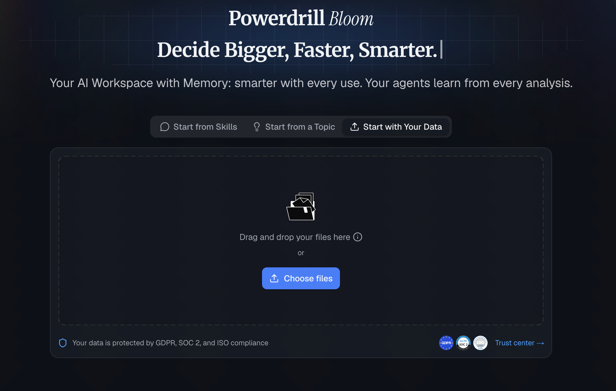
Start by uploading your raw data into Powerdrill Bloom. You can easily upload CSVs, Excel files, or connect directly to your database. Because Powerdrill Bloom features persistent Workspaces, it securely remembers your files across sessions, meaning you don't have to re-upload your user logs every time you log in. Your data remains organized and accessible for both you and your team.
Step 2: Describe What You Want to Analyze
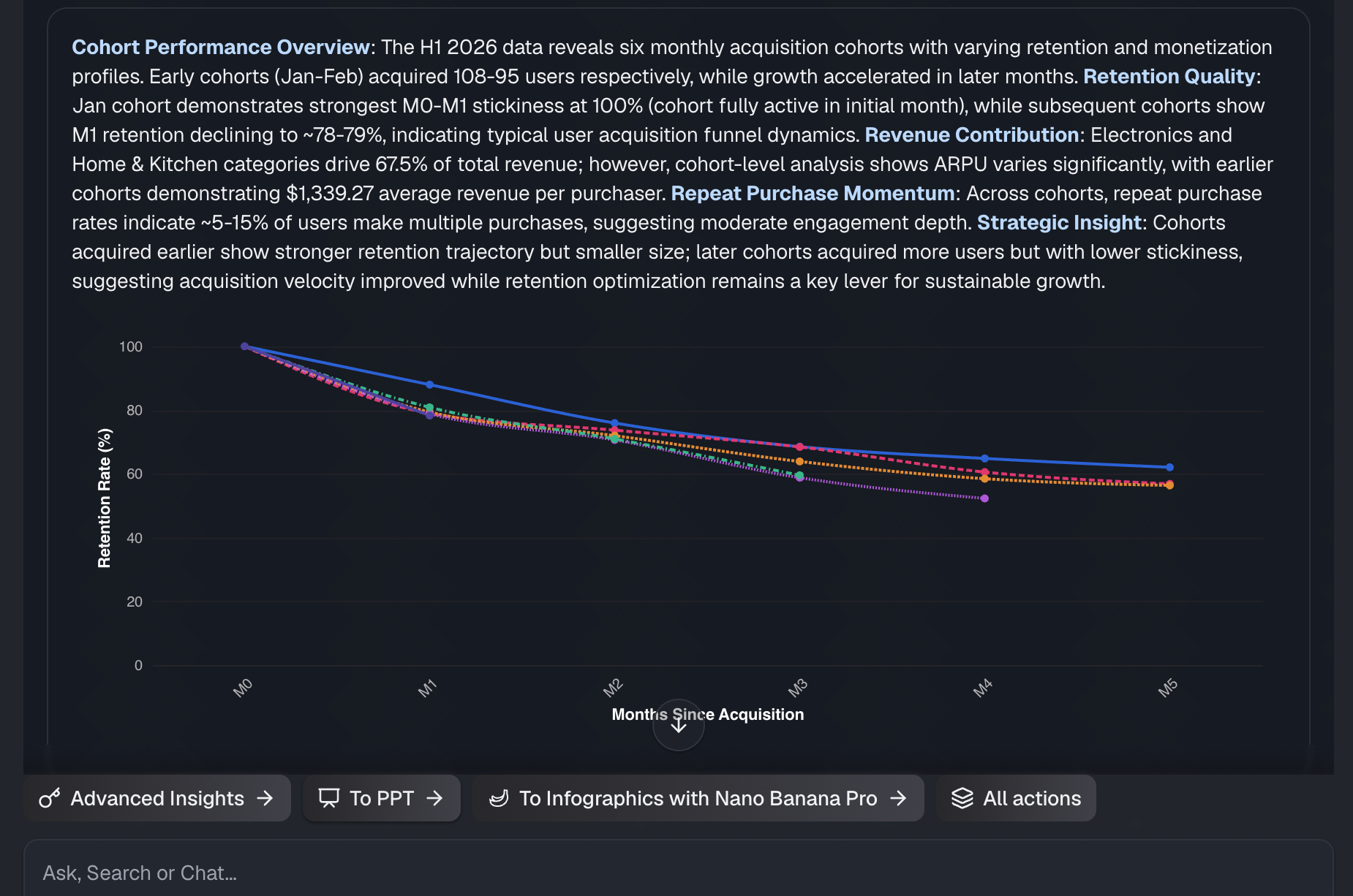
Instead of writing SQL, just tell the AI what you want in plain English. Use the chat interface to type a prompt like: "Create a cohort retention line chart showing monthly retention rates for each acquisition cohort. Compare retention trends across cohorts and summarize the key insights." Powerdrill Bloom’s advanced analysis skills will immediately process the logic, identifying the unique cohorts and calculating the return intervals.

Step 3: Let AI Build Your Charts
In seconds, Powerdrill Bloom acts on your request. It goes beyond a simple text answer and actually gets the work done, generating a beautifully formatted cohort retention heatmap. The AI automatically applies color scaling—darker shades for high retention, lighter shades for low retention, so you can spot churn trends instantly.
Step 4: Export Everything in One Click
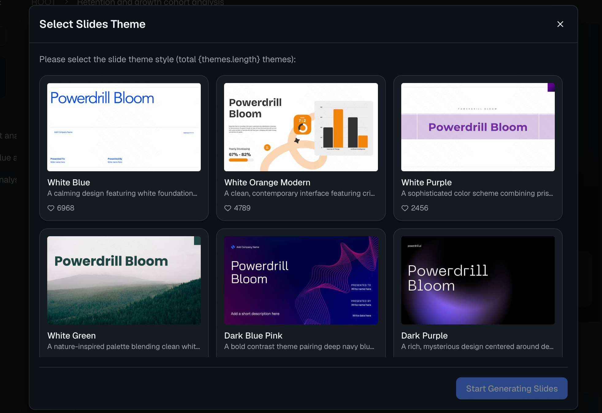
Data is only useful if it can be communicated. Powerdrill Bloom’s flagship strength is turning these insights into shareable assets. With a single click, you can export your newly generated cohort retention chart into a full presentation deck or a cohesive report. Whether you are presenting to stakeholders, clients, or your internal growth team, your data story is ready to go.
Common Mistakes When Building Cohort Charts
Even with the best tools, human error can skew your analysis. Avoid these common pitfalls:
Not Cleaning Your Data: Including test accounts, internal company emails, or bot traffic in your dataset will artificially inflate or deflate your retention numbers.
Choosing the Wrong Time Interval: If you run a daily habit app (like a fitness tracker), you need daily cohorts (Day 1, Day 2). If you run a B2B SaaS billing software, monthly cohorts (Month 1, Month 2) make more sense. Using the wrong interval creates noisy, unreadable charts.
Defining "Active" Incorrectly: Simply opening an app might not be a valuable interaction. Ensure your data defines "retained" based on a core action, like completing a workout, sending a message, or making a purchase.
Best Practices for Better Retention Analysis
To get the most out of your cohort data, push your analysis a step further.
Segment by Behavior: Don't just cohort by sign-up date. Cohort users by actions. Compare the retention of users who completed their profile on Day 1 versus those who didn't.
Look for the "Smile Curve": In rare, excellent products, retention dips and then goes back up over time as churned users are resurrected. Keep an eye out for this indicator of strong product-market fit.
Pair Quantitative with Qualitative: A cohort chart tells you when users leave, but not why. If you see a massive drop on Day 3, cross-reference this data by sending out targeted user feedback surveys on Day 3 to understand the friction.
Conclusion
Understanding user retention is the lifeblood of any sustainable business. While cohort retention charts used to be locked behind advanced SQL skills and tedious spreadsheet formulas, modern AI has democratized data storytelling. Stop wasting hours wrestling with raw data.
By leveraging Powerdrill Bloom, you can instantly turn complex user logs into beautiful, actionable cohort charts and presentation decks. Ready to find out exactly why your users are leaving and how to keep them? Try Powerdrill Bloom today and take control of your product’s growth.
FAQs
What is the fastest way to make a cohort retention chart?
Using Powerdrill Bloom is the fastest method. Just upload your data and type what you need in plain English.
Do I need to know SQL to build cohort charts?
Not anymore. Powerdrill Bloom acts as your data analyst, writing the code in the background automatically.
Can my entire team view the retention analysis?
Yes, Powerdrill Bloom features persistent Workspaces that allow teams to collaborate, analyze, and share data files seamlessly across sessions.
How do I present my cohort data to stakeholders?
Powerdrill Bloom offers a one-click export feature that instantly turns your generated charts into ready-to-share presentation decks.
Is Powerdrill Bloom only for cohort charts?
No, it’s a general-purpose AI agent that handles all types of data research, automation, chart generation, and workflow execution.