How to Build a KPI Dashboard From a Spreadsheet (And Which Metrics to Cut)

To build a KPI dashboard from a spreadsheet, decide which metrics earn a tile before you build anything. Give every tile an owner and a comparison, then cut anything nobody would act on. Then lay the survivors out so the most decision-relevant number sits top left. The build takes an afternoon. The cutting is what makes it useful.
This guide covers the selection test, how many tiles a dashboard can carry, the layout, and the spreadsheet prep that prevents most of the rework.
The problem with most dashboards
Most dashboards fail for the same reason. They answer the question "what can we measure" instead of "what will we do about it."
The result is familiar. Twenty tiles, all technically accurate, none of them prompting anyone to change anything. People check it for a week, then stop. Six months later someone asks whether the numbers are even still wired up correctly, and nobody knows.
The fix is not a better charting tool. It is a shorter list.
A KPI dashboard is not a display of your data. It is a standing answer to a small set of recurring questions. If you cannot name those questions, the layout will not save you.
The cut test: which metrics earn a tile
Run every candidate metric through these four rules. Most will fail at least one, and that is the point. Do this on paper, before anyone opens a charting tool. Deciding while building is how twenty-tile dashboards happen.
Every tile needs an owner
Name the person who would act if the number moved. Not the team, the person. A metric that nobody owns is a metric nobody will investigate when it dips, which makes it decoration. Write the owner's name next to the metric while you are still deciding. If nobody's name fits, that is the answer.
Every tile needs a comparison
A bare number is unreadable. Revenue of $840K means nothing until you know whether last month was $600K or $1.2M. Every tile carries the prior period, and prefer that over a target, because a target tells you about the plan rather than the direction.
Ratios need their denominators visible
Conversion rate, win rate, and retention all hide their sample size. A 60% win rate on five deals and on five hundred deals look identical on a tile and mean completely different things. Put the count next to the rate.
If nothing changes, it does not belong
The final filter. Imagine the number is 30% worse next month. Does anyone do anything? If the honest answer is no, move it off the dashboard. It can live in a monthly report where curiosity is allowed.
How many tiles a dashboard should have
Between five and nine for a working dashboard, and closer to five for an executive one.
That range is not a style preference. It comes from how long people actually look, which is rarely more than a few seconds.
The constraint is not screen space. It is that people scan a dashboard in a few seconds, and attention divides. Nine tiles get roughly a second each. Twenty tiles get skipped entirely, and the reader falls back to whichever two they already trusted.
There is one exception worth allowing. A single dense table below the tiles is fine, because people read tables differently than they scan tiles.
If you genuinely need more, split by audience rather than cramming. One dashboard per team, each with its own five to nine, beats one dashboard with thirty that serves nobody.
Laying out the grid
| Zone | What goes there | Why |
|---|---|---|
| Top left | The single most decision-relevant number | Reading starts here, always |
| Top row | Three to four headline metrics with comparisons | The scan-in-five-seconds layer |
| Middle | Trend charts behind the headline numbers | Where someone goes after the headline surprises them |
| Bottom | Breakdowns by segment, region, or owner | The diagnostic layer, only read when something is wrong |
| Anywhere | A last-updated timestamp | The first thing people distrust is freshness |
Mobile changes the calculus. If people check this on a phone, the top-left rule becomes a top-of-column rule, and the tile count drops again.
Keep the top row to a single row. The moment headline metrics wrap onto a second line, the hierarchy you designed stops being visible.
Use consistent direction coding too. If green means good on one tile, it has to mean good on every tile. That includes the ones where a falling number is the good outcome.
Preparing the spreadsheet first
Three problems in the source cause most dashboard rebuilds.
Dates stored as text. Any time grouping breaks silently. Convert the column before you build, and check that the earliest and latest dates look plausible.
Inconsistent category labels. "EMEA", "emea", and "Europe" become three segments in every breakdown. Map them to one set and keep the mapping file.
Summary rows mixed into detail rows. A total row sitting inside the data doubles every figure it touches. Strip them out before the first aggregation, not after someone spots a number that is twice too large.
Keep the cleaning steps written down, not just performed. Next quarter, someone else will run the refresh.
Do this once, save the cleaned version, and next month's refresh becomes a file swap rather than a rebuild.
How to build the KPI dashboard with Powerdrill Bloom
Once the metric list is settled, the assembly is the mechanical part.
Step 1: Upload your spreadsheet
Drop in the Excel, CSV, or TSV file behind the metrics. Multiple files load together, so a current file and a prior-period file can be compared in one pass without a manual lookup. Column detection and cleanup run on upload, which handles the date and label problems above.

Step 2: Describe the dashboard in natural language
List the tiles you decided on. For example: "show revenue, new accounts, win rate with deal count, and median cycle time, each against last month, plus a breakdown by region." The agent builds the tiles and picks the chart types. Ask it to drop a tile or add a segment and it rebuilds rather than making you restructure the sheet.
Step 3: Export the chart, report, or deck
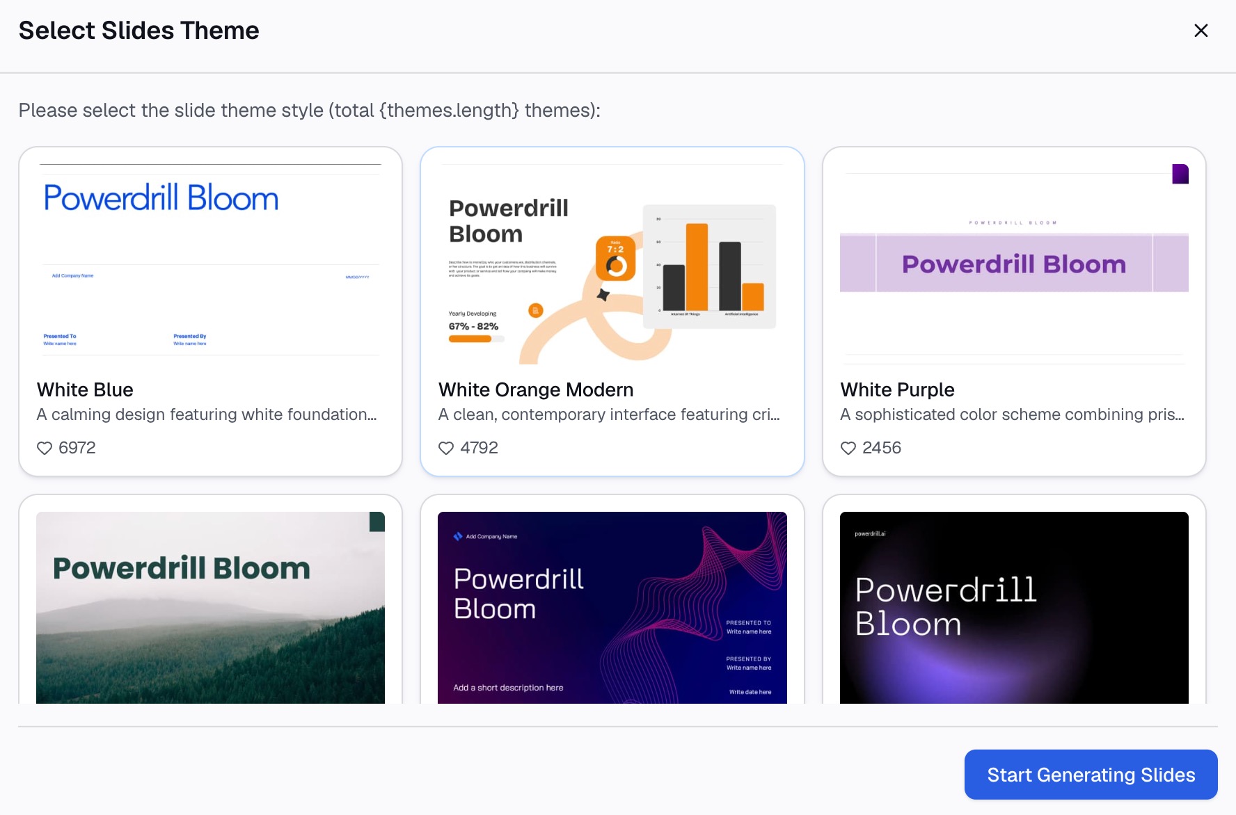
Take the dashboard out as charts, as a written summary, or as slides for the review meeting. Professional, Business, and Fancy styles export to PowerPoint or Notion. The data visualization tool page covers the chart types available from the same upload.
Common mistakes
Building before deciding. Choosing tiles while you build guarantees you keep whatever was easy to compute.
Mixing time grains. One tile showing month-to-date next to another showing trailing twelve months makes the comparison meaningless. State the period on every tile.
Targets with no history. A tile at 62% against a 70% target tells you nothing without last month's 48%. Direction first, target second.
No owner on the dashboard itself. Someone has to be responsible for the whole thing still being correct in six months. Without that, accuracy decays quietly.
Letting the tool pick the chart. A default chart type answers the tool's convenience, not the reader's question. Choose the form deliberately.
Treating it as finished. Review the tile list quarterly. Metrics that mattered during one push often stop mattering afterward, and nobody removes them.
The short version
A KPI dashboard is a selection problem first and a layout problem second. Give every tile an owner and a comparison, show denominators next to ratios, and cut anything nobody would act on. Five to nine tiles, most important one top left, and a visible last-updated stamp.
If the source spreadsheet needs cleaning before any of that works, doing both in one pass is faster. Try Powerdrill Bloom free — upload the file, name the tiles you want, and export the result to a deck. See also how to build an interactive sales dashboard from a CSV and what is a data dashboard.
Frequently asked questions
How many KPIs should a dashboard have?
Five to nine for a working team dashboard, and closer to five for an executive view. People scan in seconds, so attention divides across tiles. If you need more coverage, split by audience instead of adding rows.
What makes a good KPI?
It has a named owner, a comparison period, a visible denominator if it is a ratio, and a decision attached. If nothing would change when the number moves, it is a metric worth tracking but not worth a tile.
Can I build a KPI dashboard from Excel?
Yes. Clean the dates, unify the category labels, and remove any summary rows first, then aggregate and chart. The recurring cost is the monthly rebuild, which is the part worth automating once the tile list stops changing.
What is the difference between a dashboard and a report?
A dashboard answers a fixed set of questions continuously, and is read in seconds. A report answers one question at one point in time, with the reasoning included. Most teams need both, and confusing them produces a dashboard nobody reads.
How often should a KPI dashboard update?
Match the refresh to the decision cycle, not to what is technically possible. A metric reviewed monthly does not benefit from hourly updates, and frequent refreshes on slow-moving numbers mostly generate noise.