How to Create an Executive Summary Slide: A Full Guide
Most decks open with an agenda. Most decks should open with the answer.
One slide, read in about twenty seconds, that tells a busy reader what you found and what you want them to do. Everything after it is evidence.
This guide covers what belongs on an executive summary slide and what to cut. It also covers how to write the headline, and how to build one from a data file without transcribing numbers by hand.
What the slide has to do
There is a rule for this that predates PowerPoint, and it comes from people who write for audiences with no patience at all.
The U.S. federal plain language guidance puts it in four words inside a longer instruction: "Organize the information. Prepare readers for what to expect. Summarize lengthy documents up-front."
Up-front is the whole job. The summary is not a recap you reach at the end. It is the thing the reader sees before deciding how much attention the rest deserves.
The same guidance names the constraint that decides every other choice: "The first rule of plain language is: write for your audience." An executive summary slide written for the analyst who built the model is a different slide from one written for the person approving the budget.
There is a practical consequence that people resist. If a reader stops after this one slide, they should still have the decision, the reason, and the ask. Building it so that stopping is safe is what separates a summary from an introduction.
The four blocks that belong on it
Most working versions of this slide carry the same four pieces, in this order.
The finding. One sentence, stated as a conclusion rather than a topic. "Churn rose to 4.1% in Q3, concentrated in accounts under twelve months old" — not "Q3 churn analysis."
The evidence. Two to four numbers that support the finding, with their comparison points. A number without a baseline is decoration.
The implication. What follows if the finding is true. This is the sentence executives actually argue about, and leaving it out moves the argument to a slide nobody reaches.
The ask. What you want, from whom, by when. Even when the answer is "no decision needed today," say so explicitly.
| Block | Length | Common failure |
|---|---|---|
| Finding | One sentence | Written as a topic, not a conclusion |
| Evidence | Two to four figures | Numbers with no comparison |
| Implication | One or two sentences | Omitted entirely |
| Ask | One sentence | Vague ownership or no date |
An executive summary slide that carries all four is usually crowded, which is why the next section matters as much as this one.
What to leave off
The plain language guidance is blunt about mechanics that inflate text without adding meaning. "Active voice makes it clear who should do what. It eliminates ambiguity about responsibilities." And: "Passive voice obscures who handles what and is one of the biggest problems with government writing."
On tense, the advice is equally direct: "The simplest and strongest form of a verb is present tense."
Those two rules alone will cut a crowded slide by a fifth. The example given is worth keeping in mind while editing — not "It must be done," but "You must do it."
Beyond the language, four things routinely appear on this slide and should not:
- Methodology. How you calculated it belongs in an appendix. Readers who care will ask.
- Caveats about data quality. Unless a caveat changes the decision, it goes in a footnote on the detail slide.
- The agenda. A summary and a table of contents are different objects with different jobs.
- More than one chart. A single small chart can support the finding. Two charts mean you have not decided what the finding is.
The guidance does endorse two compression devices explicitly. "Use tables where appropriate" — noting these work "for more than just showing numerical data" — and "Use lists. They can help you convey detailed information quickly without overloading your readers."
Writing the headline
The title line does more work than the body, and it is the part most often wasted.
A title that names the subject ("Q3 Retention Review") tells the reader where they are. A title that states the conclusion ("Retention held everywhere except new accounts") tells them what to think about. Only the second one survives being read alone in a forwarded PDF.
Three tests for a headline on this slide:
- Could it be false? If nobody could disagree with it, it is a label rather than a claim.
- Does it survive without the chart? Forwarded decks lose context first.
- Is it under twelve words? Longer headlines get skimmed to the first clause anyway.
The related habit of writing conclusions into every slide title is covered in the walkthrough on takeaway slide titles. The summary slide is where it matters most, because it is the one slide guaranteed to be read.
Building one from your data
When the numbers live in a spreadsheet or an export, the sequence below gets from file to finished slide without retyping anything.
Step 1: Upload the source data and state the audience
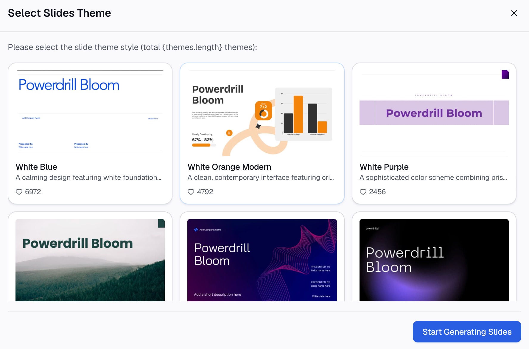
Start in Powerdrill Bloom with the workbook, CSV, or export behind the deck. Describe the slide you want in natural language, and name who will read it.
The audience line changes the output more than any other instruction. "Summarize for the finance committee" and "summarize for the product team" produce different findings from identical data, because the two groups care about different columns.
Say what the decision is, if there is one. A summary written toward a pending decision is sharper than one written toward "here is what happened."

Step 2: Fix the finding before touching the layout
Read the proposed finding first and argue with it. Is it a conclusion or a topic? Does the evidence actually support it, or does it support a weaker version?
This is the step people skip, and skipping it produces a well-formatted slide that says nothing. Ask for the two or three competing readings of the same data and pick deliberately.
Check the comparison points at the same time. Against last quarter, against plan, and against the same period last year are three different stories. The one you choose is an argument you are making.
Step 3: Generate the slide and the backup
Request the executive summary slide itself, plus the two or three detail slides that answer the obvious follow-up questions.
Ask for the numbers to be traceable — which rows produced each figure — so that a challenge in the room does not require a rebuild afterward.
Export the deck, then read only the summary slide and ask whether the decision is obvious from it alone. Working decks pass that test; drafts rarely do on the first pass.
Putting a summary in front of your own numbers this week? Try Powerdrill Bloom.
How this differs from an executive summary document
The two share a name and almost nothing else, and conflating them is the most common structural mistake in this area.
A document version is read linearly, in private, at whatever length the reader chooses. It can afford a paragraph of context, a nuance, and a properly hedged conclusion. The walkthroughs on writing an executive summary from a spreadsheet and generating one from raw business data cover that form.
The slide version is read in a room, in seconds, usually while somebody is talking over it. It cannot afford nuance, and hedging reads as uncertainty rather than rigour.
Three concrete consequences follow:
- Length. A document summary runs several paragraphs. A slide runs roughly sixty to ninety words total.
- Hedging. A document can say "results are directionally positive, subject to the caveats in section 4." A slide says the finding, and the presenter voices the caveat.
- Ordering. A document can build. A slide leads with the conclusion because there is no second chance.
If you have already written the document version, do not paste it in and shrink the font. Extract the four blocks and rebuild.
Formatting and layout
The layout that works is boring, which is the point.
Put the headline across the top at full width, large enough to read from the back of a room. Underneath, use a two-column split. The finding and implication go on the left as prose. The supporting figures go on the right, as a small table or a single chart.
Keep the ask visually separate — a strip across the bottom, or a boxed line. It is the part people look for when they return to the slide later. Hunting for it is friction you can remove for free.
Type sizes settle most arguments here. If the body needs to go below about 18 points to fit, the problem is the word count, not the font. Cut rather than shrink.
One more layout habit worth adopting: leave the bottom-right corner empty. That is where eyes land last, and an empty corner reads as confidence rather than as wasted space.
Presenting it
The summary slide is the one you should be able to deliver without looking at it.
Say the finding, then stop talking for a beat. Most presenters rush past their own conclusion into the evidence, which trains the room to treat the conclusion as preamble.
When a question arrives early — and on this slide it will — answer it in one sentence and offer the detail slide rather than improvising. Knowing which slide answers which question is most of what preparation buys you.
If the room disagrees with the finding, the summary slide has still worked. Getting the disagreement in minute two instead of minute twenty is the entire reason the slide exists. The walkthrough on answering data questions in a presentation covers the follow-up.
What a finished one looks like
An abstract description helps less than a filled-in example, so here is one.
Headline. "Support costs rose 22% on flat ticket volume."
Evidence. Cost per ticket $14.80 against $12.10 last quarter. Volume 41,200 against 41,600. Average handle time 9.4 minutes against 7.9.
Implication. The increase is handle time, not demand. At current trend, next quarter adds roughly $110,000.
Ask. Approve the routing change by 30 September. Owner named, one line.
That is about seventy words, and a reader gets the whole argument from it. Every number carries its comparison, and the implication states a consequence rather than restating the finding.
Notice what is absent. There is no methodology, no data caveat, and no chart. A well-built executive summary slide can carry one small chart, but this version does not need one, because three paired numbers already make the point.
The detail behind each line lives on the slides that follow. If nobody asks, you have saved the room ten minutes.
Common mistakes
Writing a topic instead of a conclusion. "Customer Retention Overview" tells the reader nothing they did not know from the meeting invitation.
Numbers without comparisons. "Revenue was $4.2M" is a fact. "Revenue was $4.2M against a $4.8M plan" is a finding.
No ask. If nobody knows what you want, the meeting ends with "thanks, send the deck around."
Too many words. Ninety is a working ceiling. Past that, the slide is being read rather than presented, and you have written a document with a border.
Building it first. A summary written before the analysis is finished is a guess with good formatting. Write it last, even though it appears first.
Duplicating the next slide. If the summary and the slide after it carry the same chart, one of them is redundant.
Hedging the headline. "Retention may have declined slightly" invites the room to relitigate the data instead of discussing the implication.
Frequently asked questions
What should an executive summary slide include?
Four things. The finding stated as a conclusion, and two to four supporting figures with their comparison points. Then the implication if the finding holds, and a specific ask with an owner and a date. If a reader stops there, they should still have everything needed to respond.
How long should it be?
Roughly sixty to ninety words in total, which usually means one headline, three or four short lines, and a small table or single chart. If the body type has to drop below about 18 points, cut content rather than shrinking the font.
What is the difference between an executive summary slide and an executive summary document?
The document is read privately and linearly and can carry nuance, caveats, and several paragraphs. The slide is read in seconds in a room, leads with the conclusion, and leaves the caveats to the presenter's voice. Rebuild rather than shrink when converting between them.
How do you format an executive summary slide?
Use a full-width headline stating the conclusion, then a two-column body with prose on the left and figures on the right. Set the ask apart visually at the bottom. Federal plain language guidance recommends tables and lists as compression devices, noting that lists convey detailed information quickly without overloading readers.
How do you write the headline?
State the conclusion rather than the subject, keep it under about twelve words, and check that someone could in principle disagree with it. A headline nobody could dispute is a label, and a label wastes the most-read line on the slide.
Source: Digital.gov, "Principles of plain language" and "Writing for understanding," Plain Language Guide Series, U.S. General Services Administration.