How to Add Alt Text in PowerPoint with AI: 6 Quick Steps
A deck that gets forwarded is a deck that gets read by people you never met. Some of them use a screen reader. Alt text is what those readers get instead of the picture.
PowerPoint has had an alt text pane for years, and it now drafts descriptions for you. The work that remains is deciding which images need a description at all, and what a chart's description should actually say.
This guide covers both: the six steps inside PowerPoint, and the part that stays a judgment call.
What alt text is and what it is for
Alt text is a short written description attached to an image, chart, shape, or other object. Screen readers announce it in place of the visual.
Microsoft's guidance on length is specific. Its support page on alternative text says to "type 1-2 sentences in the text box to describe the object and its context." The page names the reader too: someone who cannot see it.
That is the whole brief. Not a label, not a filename — a description of the object and its context, written for somebody who will never see it.
The rule most people get wrong on charts
Here is where decks differ from web pages, and where a rule from the W3C Web Accessibility Initiative changes how you should think about it.
The WAI decision tree sorts images into categories. For informative images, the instruction is to "Use a brief description of the image in a way that conveys that meaning." For decorative images, "Use an empty alt attribute." For images of text, "Use the alt attribute to include the text of the image."
For complex images such as graphs and diagrams, the instruction is different in kind: "Include the information contained in the image elsewhere on the page."
Read that again, because it is counterintuitive. The rule for a chart is not write a longer description. It is put the information somewhere a reader can actually get at it.
On a slide, that means the finding belongs in a headline, a caption, or the speaker notes — not compressed into a description nobody can scan. A chart's alt text can then be short, because it is no longer carrying the whole payload.
| Image type | What the guidance says to do |
|---|---|
| Informative photo or icon | Brief description conveying its meaning |
| Purely decorative | Mark it decorative, no description |
| Image of text | Include the text itself |
| Chart or diagram | Put the information elsewhere on the slide |
How to add alt text in PowerPoint: 6 steps
1. Open the Alt Text pane
Microsoft documents two routes. You can "Control-click or right-click the object, and then select View Alt Text...", and "The Alt Text pane opens."
The other route goes through the ribbon: "Select an object. On the object's Format tab in the ribbon, choose Alt Text."
2. Decide whether the image is decorative
Do this before writing anything. Microsoft's page is explicit that not every visual needs a description. It describes the test as whether visuals "are purely decorative and add visual interest but aren't informative." Those can be marked as such, with nothing written.
The mechanics are simple. "Select the Mark as decorative checkbox. The text entry field becomes grayed out."
A background texture, a divider line, a repeated brand shape — all decorative. Marking them properly is not laziness. It stops a screen reader from reading out noise between the parts that matter.
3. Turn on automatic alt text, then treat it as a draft
PowerPoint can generate descriptions for you. The setting lives under File > Options > Accessibility. There you can "Toggle Automatic Alt Text on and off," and separately "Enable the option to generate alt text using AI."
There is a review step built into the workflow. Microsoft's page describes it plainly: "If the alt text is satisfactory, select the Approve alt text checkbox."
That checkbox is the honest part of the feature. The software writes a first pass; a person confirms it. Generated descriptions are good at naming what is in a photo and weaker at knowing why the photo is on your slide.
4. Write one or two sentences with context
Now apply the length guidance. One or two sentences, describing the object and its context.
The difference between a weak and a strong description is usually context, not detail.
| Weak | Stronger |
|---|---|
| "Bar chart" | "Bar chart of quarterly revenue; Q3 is the only quarter below plan." |
| "Photo of a warehouse" | "Our Dallas warehouse after the layout change described on this slide." |
| "Screenshot" | "The settings screen, with the export option highlighted." |
Notice that the stronger versions all answer why is this here. That is the question a screen reader user actually has.
5. Handle charts by moving the finding off the image
For any chart, go back to the WAI rule. The information goes elsewhere on the slide.
In practice this means three small edits. Put the takeaway in the slide headline, so it reads as a sentence rather than a topic. Put the supporting numbers in the speaker notes. Then write short alt text naming the chart type and what it plots.
This has a side effect worth having. A slide whose headline states the finding is a better slide for everyone in the room, not only for screen reader users.
6. Run the Accessibility Checker before you send
PowerPoint ships a checker that flags missing descriptions across the whole file. Microsoft recommends it at the organizational level too. Its accessibility guide for administrators advises teams to "Increase the use of the Accessibility Checker by having it run automatically for your users."
Run it last, after your edits. It catches the object you forgot on slide 14, which is almost always a chart pasted in during a rush.
One habit makes this step nearly free. Run the checker once when the deck is half built, and again before you send. The first pass catches a pattern you are about to repeat across twenty more slides.
Building the deck so alt text is not a cleanup task
Everything above is remediation: the deck exists, and now it needs descriptions. The work shrinks considerably if the descriptions arrive with the slides.
That is where generating a deck from the underlying data helps. The tool that made the chart knows what the chart plots, which is exactly the context a good description needs.
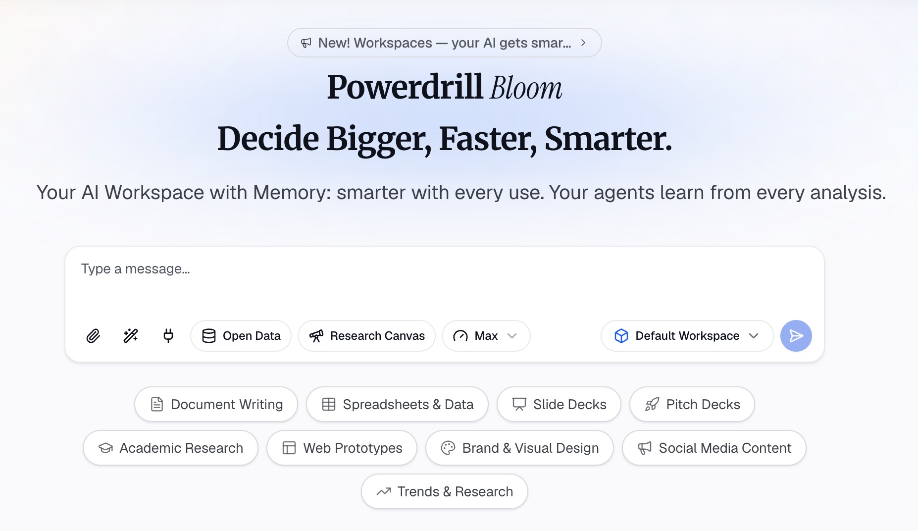
Step 1: Upload the source file and ask for the deck
Start in Powerdrill Bloom with the workbook, CSV, or PDF the analysis lives in. Ask for the presentation you need, naming the audience and the number of slides.
Because the request happens in natural language, the accessibility requirement goes in the same sentence. Ask for every chart slide to carry a headline that states the finding.
Step 2: Review the headlines before the visuals
Read the generated headlines on their own first. Each one should state a finding rather than a topic. When they do, the deck already meets most of the WAI rule for complex images.
Fix any headline that reads as a label. This is faster to do here than after the file is exported.
Step 3: Export, then add descriptions in PowerPoint
Download the deck and open it in PowerPoint. Work through the six steps above, which now go quickly — the charts already have their findings in text, so their descriptions can be short.
Decorative elements still need marking, and the Accessibility Checker still runs last.
If your starting point is a spreadsheet, auto-generating PPT slides from Excel files covers the generation step in more detail. For a faster version, there is making a presentation from Excel data in minutes. Survey decks have their own conventions, covered in creating a survey results presentation.
Want your next deck to arrive with its findings already in text? Try Powerdrill Bloom.
Where these descriptions travel after the deck
A slide rarely stays a slide. Understanding where the description goes next explains why the effort is worth it.
Export to PDF and the descriptions carry into the tagged document, which is how most decks reach people outside the company. Send the file to a colleague who rebuilds two slides into a different deck, and the descriptions travel with the objects.
Publish the deck to an intranet or a learning system, and the same text becomes what assistive technology announces there. Several public sector and education buyers ask for this explicitly during procurement.
None of that works if the field is empty. A blank description is not neutral — it leaves a gap where a listener expected information, and they cannot tell whether the image mattered.
There is also a plain search benefit inside your own organization. Descriptions are text, and text is findable. A deck whose charts are described is a deck somebody can locate six months later.
A convention that scales across a team
Individual diligence does not survive a busy quarter. A short written convention does.
Three rules cover most of it. Decorative elements get marked, not described. Every chart slide gets a headline that states the finding. Photos get one sentence saying why they are on the slide.
Put those three rules in the template rather than in a wiki nobody opens. A title placeholder that reads "State the finding here" does more for accessibility than a policy document.
| Convention | Who it helps immediately |
|---|---|
| Findings in headlines | Everyone in the room, plus screen reader users |
| Decorative elements marked | Listeners, by removing announced noise |
| One sentence per photo | Anyone whose images failed to load |
| Checker run before sending | The person who would otherwise get a complaint |
The second column is the argument to use internally. Each of these helps a general audience, which is why they survive contact with a deadline.
One more practical note on review. When somebody else builds the deck, ask them to read three slides aloud without looking at the screen. Whatever they cannot explain is what the description needs to say.
What to do with an existing deck backlog
Most teams discover this topic when a request arrives for a deck that already exists, sometimes dozens of them.
Do not start at slide one of file one. Sort by reach instead. The deck sent to customers matters more than the internal readout nobody opens again.
Within each file, fix charts first. They carry the most information and are the most common gap. Photos and icons are quicker and can wait.
For decks that will be rebuilt anyway, rebuilding from the source data is often faster than patching. The regenerated version can arrive with findings already in the headlines, which removes most of the remediation work.
If a deck is genuinely dead — a one-off from two quarters ago — archive it rather than fixing it. Accessibility effort spent on documents nobody reads is effort not spent on the one going out Thursday.
Common mistakes worth avoiding
Describing the file instead of the content. "Chart1.png" tells a listener nothing. It is the most common failure in decks that were assembled quickly.
Writing a paragraph for a chart. Long descriptions are hard to listen to and easy to lose track of. The WAI guidance points the other way — move the information onto the slide.
Marking informative images as decorative to clear the checker. This makes the warning disappear and removes the content along with it.
Skipping the review step on generated descriptions. The Approve alt text checkbox exists because a first pass benefits from a second look.
Leaving the check until the meeting starts. The checker takes under a minute, and slide 14 is always the problem.
Copying a description from one chart to a similar chart. Two revenue charts covering different periods need different sentences, and the duplicate is worse than nothing because it states something untrue.
Treating the pane as a compliance box rather than a writing task. The field accepts anything, including text that passes every automated check and helps nobody who is listening.
How long this actually takes
The honest number surprises people, so it is worth stating.
A twenty-slide deck with six charts takes about ten minutes if you know the rules. Most of that is the six charts, and most of the chart work is rewriting headlines — which improves the deck anyway.
Marking decorative elements is fast once the pattern is clear, because the same logo and divider repeat on every slide. The checker run takes under a minute.
The expensive version is different. Fixing a deck you did not build, six months after the fact, means reconstructing what each chart was supposed to show. That can take an hour for the same twenty slides.
The gap between ten minutes and an hour is entirely about when you do it. Nothing about the task got harder; the context just evaporated.
A quick reference
| Situation | What to do |
|---|---|
| Logo in the corner of every slide | Mark as decorative |
| Photo illustrating a specific point | One or two sentences with context |
| Chart or graph | Finding in the headline, numbers in notes, short description |
| Screenshot of a UI | Describe what is shown and what is highlighted |
| Table image | Prefer a real table; otherwise summarize the takeaway |
| Anything you are unsure about | Ask what a listener loses if it were removed |
Frequently asked questions
What is the purpose of alt text in PowerPoint?
It gives screen reader users an equivalent of the visual. Microsoft describes the goal as describing the object and its context "to someone who cannot see it." It also helps anyone whose images fail to load.
How long should alt text be?
Microsoft's guidance is one to two sentences. For charts and diagrams, the W3C Web Accessibility Initiative recommends putting the information elsewhere on the page instead of writing a longer description.
How do I add alt text in PowerPoint?
Right-click the object and choose View Alt Text, or select the object and choose Alt Text on the Format tab. The Alt Text pane opens, and you type the description there or mark the object as decorative.
Can PowerPoint generate alt text automatically?
Yes. Automatic alt text can be toggled under File > Options > Accessibility, including an option to generate descriptions using AI. Microsoft's workflow includes an Approve alt text checkbox, so generated text is reviewed rather than accepted silently.
Do decorative images need alt text?
No. Microsoft's guidance is to mark purely decorative visuals as decorative, which leaves the description field grayed out. Doing this correctly keeps screen readers from announcing elements that carry no information.
Sources: Microsoft Support, "Add alternative text to a shape, picture, chart, SmartArt graphic, or other object"; Microsoft Learn, "Accessibility guide for Microsoft 365 Apps"; W3C Web Accessibility Initiative, "An alt Decision Tree."