How to Create a Survey Results Presentation: A Full Guide
A survey results presentation turns raw responses into a short deck that answers one question per slide. Clean and code the responses, choose one chart per question, then write each finding as the slide title. Move sample sizes and exact question wording into an appendix. Built by hand this takes an afternoon. Built with an AI agent it takes minutes.
What a survey results presentation has to do
A survey report and a survey deck are not the same document. The report carries the full method. The deck carries the decision.
That difference is not a style preference. The American Association for Public Opinion Research writes its disclosure standards around exactly this split. The guidance is explicit about this. It says that "Summaries and shorter forms of reports can then refer to the full report as a source for the details of the method." When that reference is made, the standards treat the shorter report as including the method details.
So a deck is allowed to be short. It is not allowed to be silent. Every number you put on a slide still needs a traceable base, and the audience still needs to know where the method lives.
A good survey results presentation does four things:
- States one finding per slide, in the title, as a sentence
- Shows one chart that supports that finding, and nothing else
- Carries the base size for every number on the slide itself
- Points to an appendix that holds question wording, sample sizes and weighting
Most decks fail on the first and the third. They put a chart title like "Q7: Satisfaction" on the slide and leave the reader to work out what happened.
A workable slide order for a survey results presentation looks like this:
- Headline. The one sentence you want remembered, with the total base underneath.
- Method in a line. Who was asked, how many, when, and by what mode.
- Findings. One per slide, in descending order of how much they change the decision.
- Segments. Only the cuts that differ from the total. Cuts that match the total are noise.
- Open-ended themes. Counts first, quotes second.
- Recommendation. What you are asking the audience to decide.
- Appendix. Wording, bases, weighting, and anything a sceptical reader will ask for.
Steps two and seven are the ones people drop under time pressure. They are also the two that determine whether anyone can check your work later.
What you need before you start
Gather these four things before you open any slide tool.
The raw export. A CSV or Excel file with one row per respondent and one column per question. Exports from most survey platforms already look like this.
The questionnaire. The exact wording of every question you plan to report, in the order it was asked. You will need it for the appendix.
The base sizes. How many people saw each question, and how many answered it. Skip logic means these numbers differ by question.
The decision the deck feeds. Write it in one sentence before you build anything. "Should we keep the current onboarding flow?" produces a very different deck from "What do customers think of us?"
Still deciding which tool to run the analysis in? The roundup of AI software for survey data analysis compares options that read a raw export directly.
How to build a survey results presentation by hand
The manual route works. It is worth knowing, because it shows you what the automated route is actually doing.
Code the open-ended answers
Closed questions are already countable. Open-ended answers are not. You read a sample of them, invent a set of categories, then assign every answer to a category.
This is the step that eats the afternoon. It is also the step that changes the numbers most. Pew Research Center ran the same election question in both formats. It found that "fully 43% of those asked the open-ended version provided a response not listed in the closed-ended version of the question." Categories drawn from the answers themselves tend to fit better than categories invented after the fact.
Keep a category sheet as you go. Record the rule you used for each bucket. You will need it when somebody asks why a comment landed where it did.
Choose one chart per question
Pick the simplest chart that carries the finding. Single-choice questions take a bar chart sorted by size. Scale questions take a stacked bar. Trends across waves take a line.
Resist the grouped bar chart with six series. It is the most common way a survey deck becomes unreadable.
Write the slide titles and assemble the deck
Now write each title as the finding, not the topic. "Satisfaction" is a topic. "Satisfaction fell nine points among trial users" is a finding.
Then order the slides so the story runs from the headline to the detail. Put the method at the back, not the front.
Where the manual route slows down
A survey results presentation is mostly assembly work, and assembly work is where time goes. Three places slow it down, reliably.
Coding open-ends at volume. Two hundred comments is a morning. Two thousand is a week, and consistency drifts as you go.
Re-cutting by segment. The moment somebody asks "what about enterprise customers?", every chart has to be rebuilt against a filtered base.
Keeping base sizes attached. Numbers get copied into slides and the base gets left behind. This is how a deck ends up quoting a percentage that rests on eleven people.
None of these are hard. They are just slow, and they are slow every single time the survey runs again.
How to create a survey results presentation with an AI agent
An AI data agent reads the export, does the counting and the coding, and assembles the slides. You describe what you want in natural language rather than building each chart by hand.
Powerdrill Bloom works this way. Here is the whole flow.
Step 1: Upload the raw survey export
Drag the CSV or Excel export into a new workspace. Add the questionnaire as a second file if you have it as a document. The agent reads column headers as questions and rows as respondents.
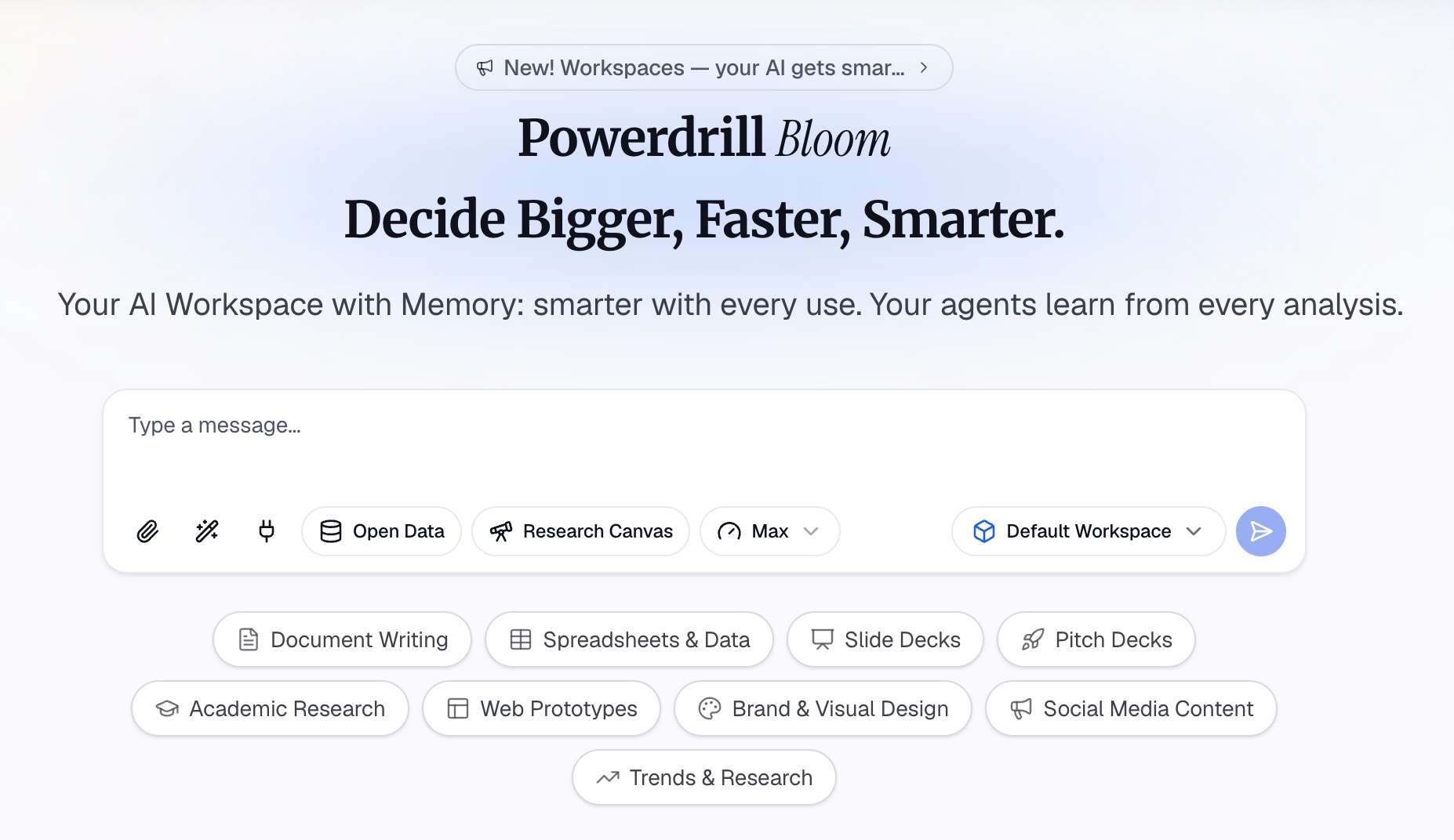
You do not need to pre-clean the file. Blank cells, skip-logic gaps and free-text columns are all expected in a survey export.
Step 2: Ask for the analysis in natural language
Describe the cut you want the way you would ask a colleague. For example: "Group the open-ended answers in column K into themes, then show satisfaction by plan tier with base sizes."
Read what comes back before you go further. Check that the theme labels match what respondents actually wrote, and that the base sizes look right against your questionnaire. This is the point where an early error is cheap to fix.
If you only need the charts rather than a full deck, the walkthrough on turning messy survey data into clear charts covers that shorter path.
Step 3: Generate the deck and edit the titles
Ask for the slides once the analysis reads correctly. Say how many slides you want and what the closing recommendation should be.
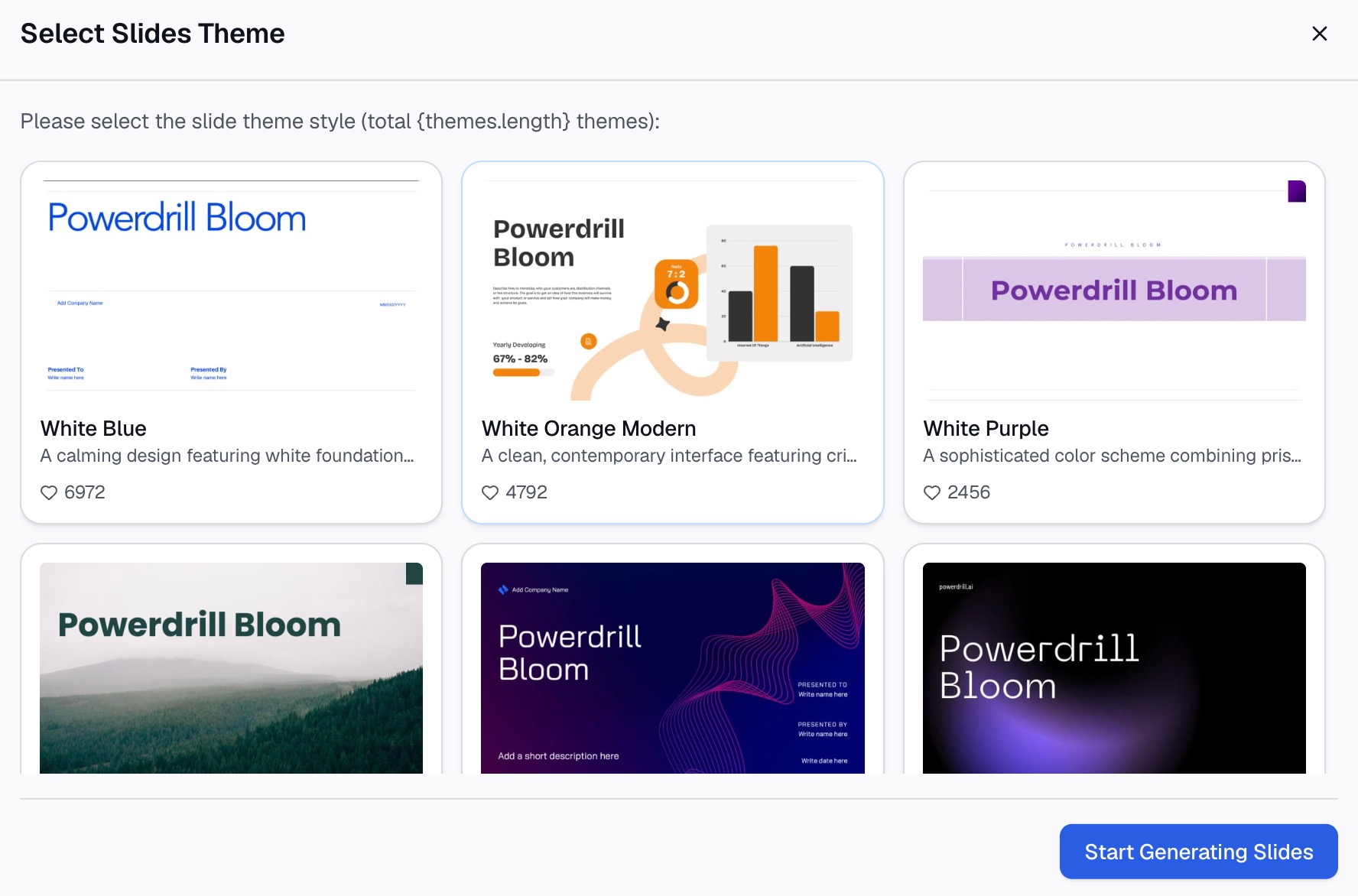
Then edit every slide title yourself. The agent can tell you what the data says. Deciding which finding deserves the headline is your call, and it depends on the decision you wrote down in the first place.
The pricing page lists four individual tiers. Free is $0.00 per month and includes basic slides, docs, sheets and images. Pro is $199.00 per year, Plus is $399.00 per year and Premium is $1,990.00 per year. Each adds larger credit allowances and richer output generation.
What belongs on a slide and what belongs in the appendix
This is the split that keeps a deck both short and defensible. The disclosure standards give you a ready-made checklist of what has to be available somewhere.
| Item | Front of deck | Appendix |
|---|---|---|
| The finding, written as the slide title | Yes | — |
| One chart supporting that finding | Yes | — |
| Base size for every number shown | Yes | — |
| Exact question wording and order | — | Yes |
| Sample sizes for each mode of collection | — | Yes |
| How the data were weighted | — | Yes |
| Unweighted bases behind subgroup figures | — | Yes |
| Who sponsored and who conducted the research | — | Yes |
The standards ask researchers to report "sample sizes for each mode of data collection." They also ask them to "Describe how the weights were calculated, including the variables used and the sources of the weighting parameters." None of that belongs on slide four. All of it belongs in the pack.
One rule makes the split work in practice: if a number appears on a slide, its base appears on the same slide.
How to show open-ended answers without cherry-picking
Quotes are the most persuasive thing in a survey deck and the easiest thing to misuse. Three habits keep them honest.
Show the distribution before the quote. Give the theme counts first, then one quote as illustration. A quote without a count is an anecdote wearing a suit.
Quote across the range, not just the extremes. Include a representative middle comment, not only the delighted and the furious ones.
Keep the wording visible. Pew notes that "Even small wording differences can substantially affect the answers people provide." If your question was leading, the deck should say so rather than let the chart imply otherwise.
The same caution applies to comparisons across waves. Pew's guidance is that "identical question wording should be used when the intention is to compare results to those from earlier surveys." If the wording changed, label the trend as broken rather than drawing a line through it.
Make the deck readable before you send it
A survey deck is dense by nature, so readability is doing real work here. Microsoft's accessibility guidance for PowerPoint gives concrete thresholds you can check in a few minutes.
Use "a larger font size (18pt or larger), sans serif fonts, and sufficient white space." To find problems quickly, "review your slides for areas that look crowded or illegible."
Give every slide a unique title. The guidance notes that a person using a screen reader "relies on the slide titles to know which slide is which." Writing findings as titles satisfies both the readability goal and the storytelling goal at once.
Then check reading order. Objects placed in a logical order let assistive technology follow the slide the way a sighted reader does.
Presenting live is a different job from sending a deck. The guide on answering data questions in a presentation covers what tends to come from the room.
Common mistakes to avoid
Reporting percentages on tiny bases. A subgroup of fourteen people produces a number that moves seven points if one person changes their mind. Show the count, or merge the group.
Leading with method. Nobody has ever been convinced by slide two of a sampling frame. Method goes at the back and gets referenced from the front.
One slide, four charts. If a slide needs four charts, it is four slides or it is an appendix table.
Letting the chart write the title. A chart shows a shape. A title states what the shape means. Only one of those is a finding.
Recoding open-ends differently each wave. Keep the category sheet from last time. A trend built on shifting categories is not a trend.
Rounding away the uncertainty. Reporting 47.3% implies a precision that a sample of 400 does not carry. Round to whole numbers and let the appendix hold the detail.
Showing every question you asked. A survey results presentation is a selection, not a transcript. Questions that did not inform the decision belong in the appendix table, not on slides.
Conclusion
A survey results presentation is a short argument backed by a long appendix. Get the split right and the rest follows. One finding per slide, one chart under it, the base attached, and the method available to anyone who asks.
The slow parts are the coding and the re-cutting, and both of them scale badly by hand. You may prefer to spend the afternoon on titles rather than tallies. If so, try Powerdrill Bloom on your own survey export and see how far the first draft gets you.
Frequently asked questions
What is a survey results presentation?
It is a short deck that reports what a survey found and what should happen next. It states one finding per slide, shows the chart behind it, carries base sizes, and keeps question wording and weighting details in an appendix.
How many slides should a survey results presentation have?
Ten to fifteen slides in the main body works for most audiences. Build the survey results presentation as one headline slide, one slide per finding, and one recommendation slide. The appendix behind it can run as long as the method requires.
How do I present open-ended survey responses?
Code the answers into themes, report the counts for each theme, then add one or two quotes as illustration. Show a comment from the middle of the range, not only the most positive and most negative ones. Keep the coding rules with the deck so the next wave can reuse them.
Should I include the margin of error in a survey deck?
Include it whenever the survey used a probability sample and you are reporting differences between groups. Disclosure standards ask for estimates of sampling error alongside sample sizes, so the figure belongs in the appendix at minimum.
Can AI build a survey results presentation from a raw export?
Yes. An AI data agent can read the export, code the open-ended answers, produce the charts and assemble a first-draft survey results presentation. Review the theme labels and base sizes before you use the output, and write the slide titles yourself.
Sources: AAPOR Disclosure Standards · Pew Research Center, Writing Survey Questions · Microsoft, Make your PowerPoint presentations accessible