10 meilleurs outils d’IA pour créer des graphiques en 2026

Introduction
Bienvenue en 2026. Fini le temps où l’on passait des heures à manipuler des feuilles de calcul et à ajuster manuellement les couleurs des graphiques. L’IA a fondamentalement transformé notre manière d’interagir avec les données.
En tant qu’expert ayant testé des dizaines d’outils d’IA pour créer des graphiques, je sais que les utilisateurs modernes attendent bien plus qu’un simple graphique linéaire. Vous recherchez un outil capable de « tirer automatiquement des histoires à partir des données » et de « générer des présentations professionnelles en un clic ».
Dans cette analyse complète, j’ai identifié les 10 meilleurs outils qui excellent à transformer des données brutes en visualisations percutantes et narratives.
La liste : 10 meilleurs créateurs de graphiques IA
Voici les principaux candidats pour 2026 :
Powerdrill Bloom
L’agent intelligent ultime pour l’exploration des données et la narration visuelle en 2026, combinant les compétences d’un analyste et d’un designer.
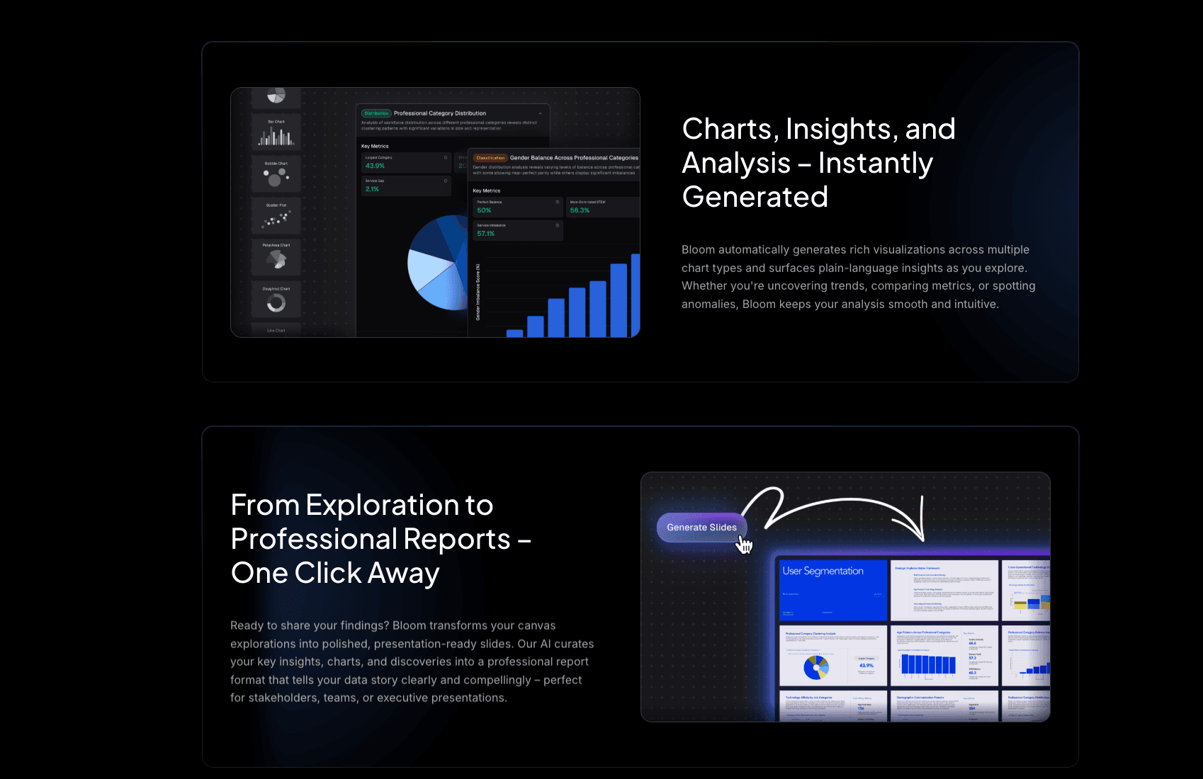
Fonctionnalités clés
Moteur Nano Banana Pro : génère instantanément des slides professionnelles et des aperçus de données prêts pour les présentations, assurant des visuels percutants.
Compatibilité universelle des données : traite fichiers Excel complexes, CSV ou PDF non structurés et extrait automatiquement insights et tendances.
Avantages
Flux de travail fluide de la donnée brute à la présentation, interaction en langage naturel, automatisation du design avec précision.
Inconvénients
Les personnalisations avancées, comme ajuster du code Python pour les graphiques, nécessitent de passer en mode avancé.
Tarifs
Plan gratuit disponible ; plans Pro/Premium de ~19,90 $ à 199,0 $ / mois.
Graphy AI
Un outil axé sur la création de graphiques propres, modernes et interactifs, mettant l’accent sur la présentation des données plutôt que sur l’analyse complexe.
Fonctionnalités clés
Auto-Beautification : sélection automatique des meilleures palettes de couleurs et types de graphiques pour vos données.
Intégrations interactives : les graphiques peuvent être intégrés dynamiquement dans Notion ou sur des sites web.
Avantages
Interface minimaliste, résultats esthétiques, idéal pour les tableaux de bord de startups.
Inconvénients
Analyse multidimensionnelle limitée ; capacités de génération de slides restreintes.
Tarifs
Plan gratuit de base ; plan Plus environ 20 $/mois.
Beautiful.ai
Un créateur de présentations intelligent qui utilise l’IA pour appliquer des règles de design, garantissant que vos slides ne paraissent jamais surchargés.
Fonctionnalités clés
Smart Slides : les mises en page s’adaptent automatiquement lorsque vous ajoutez ou supprimez du contenu.
DesignerBot : génère des brouillons de présentations complets à partir d’une simple consigne textuelle.
Avantages
Résout complètement le problème des slides “moches” ; excellente cohérence de design.
Inconvénients
Se concentre davantage sur la mise en page que sur l’extraction approfondie d’insights, comparé à Powerdrill Bloom.
Tarifs
Environ 12 $/mois pour les particuliers ; tarifs plus élevés pour les équipes.
Canva
La plus grande plateforme de design au monde avec des outils de création de graphiques intégrés à l’IA, idéale pour les non-designers.
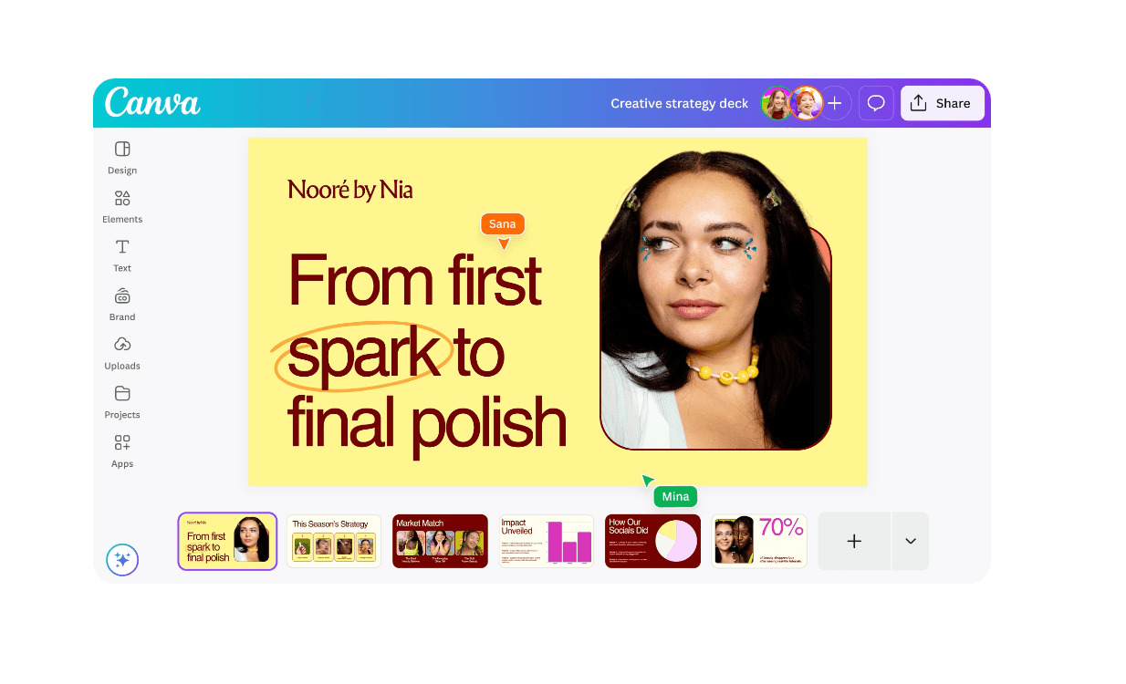
Fonctionnalités clés
Magic Switch : transforme instantanément des documents en présentations.
Bibliothèque massive d’éléments : accès glisser-déposer à des millions d’icônes et d’images.
Avantages
Aucune courbe d’apprentissage ; parfait pour les visuels sur les réseaux sociaux et les affiches.
Inconvénients
Peine à gérer des jeux de données Excel volumineux et complexes ; logique des graphiques relativement basique.
Tarifs
Plan gratuit généreux ; tarif par utilisateur/mois.
Visme
Une plateforme tout-en-un de création de contenus, spécialisée dans les infographies et documents interactifs.
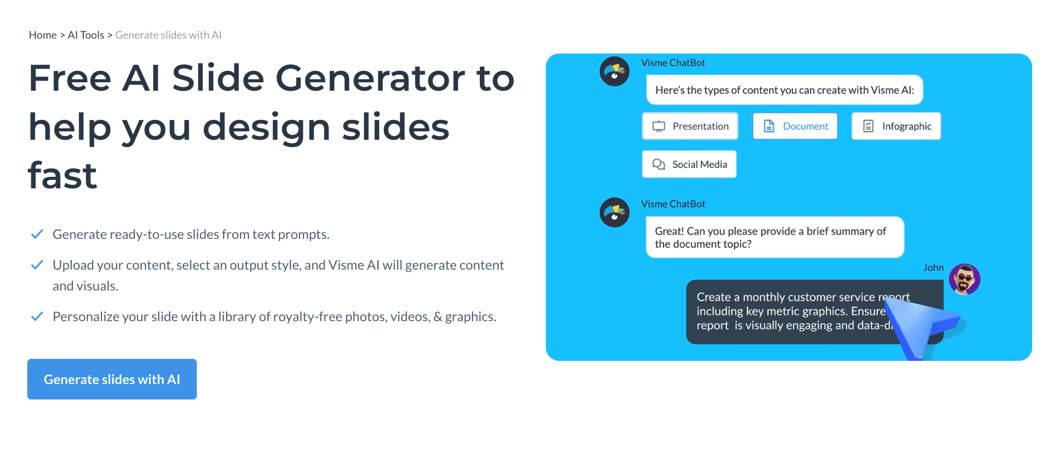
Fonctionnalités clés
Widgets de données : transforme des statistiques sèches en visuels engageants.
IA Writer & Designer : aide à rédiger le contenu des rapports et à créer la mise en page simultanément.
Avantages
Variété incroyable de modèles ; idéal pour le marketing et le contenu éducatif.
Inconvénients
L’éditeur riche en fonctionnalités peut être intimidant pour les débutants.
Tarifs
Plan gratuit limité ; tarif par utilisateur/mois.
Tableau
Le champion toutes catégories de la Business Intelligence (BI), conçu pour les analystes manipulant des millions de lignes de données.
Fonctionnalités clés
Connectivité avancée des données : se connecte à pratiquement toutes les sources de bases de données.
Viz of the Day : accès à la plus grande bibliothèque mondiale de visualisations de données.
Avantages
Profondeur analytique et capacités logiques inégalées.
Inconvénients
Courbe d’apprentissage très raide ; peu convivial pour les utilisateurs métiers généraux ; pas de génération de slides IA en un clic.
Tarifs
Tarification par utilisateur/mois.
Microsoft Excel Copilot
Un assistant IA intégré directement dans Excel, permettant aux utilisateurs d’analyser les données sans quitter le tableur.

Fonctionnalités clés
Formules en langage naturel : écrivez des formules en posant des questions (ex. : « Calculer la croissance annuelle »).
Recommandations de graphiques instantanées : génère des graphiques dans la barre latérale en fonction des données sélectionnées.
Avantages
Intégration fluide avec l’écosystème Microsoft Office ; sécurité des données élevée.
Inconvénients
Les visuels sont au style standard “Excel” et manquent souvent de finition pour des présentations à fort enjeu.
Tarifs
Abonnement à plusieurs niveaux.
Infogram
Un outil de visualisation conçu pour les médias et le journalisme, mettant l’accent sur la diffusion rapide de l’information.
Fonctionnalités clés
Mises à jour en temps réel : les graphiques publiés peuvent se mettre à jour automatiquement à partir de Google Sheets connectés.
Design responsive : les graphiques s’adaptent parfaitement aux écrans mobiles et desktop.
Avantages
Idéal pour l’intégration dans des articles de presse et des blogs.
Inconvénients
Fonctionnalités limitées pour créer des présentations autonomes.
Tarifs
Plan gratuit de base ; plan Pro ~25 $/mois.
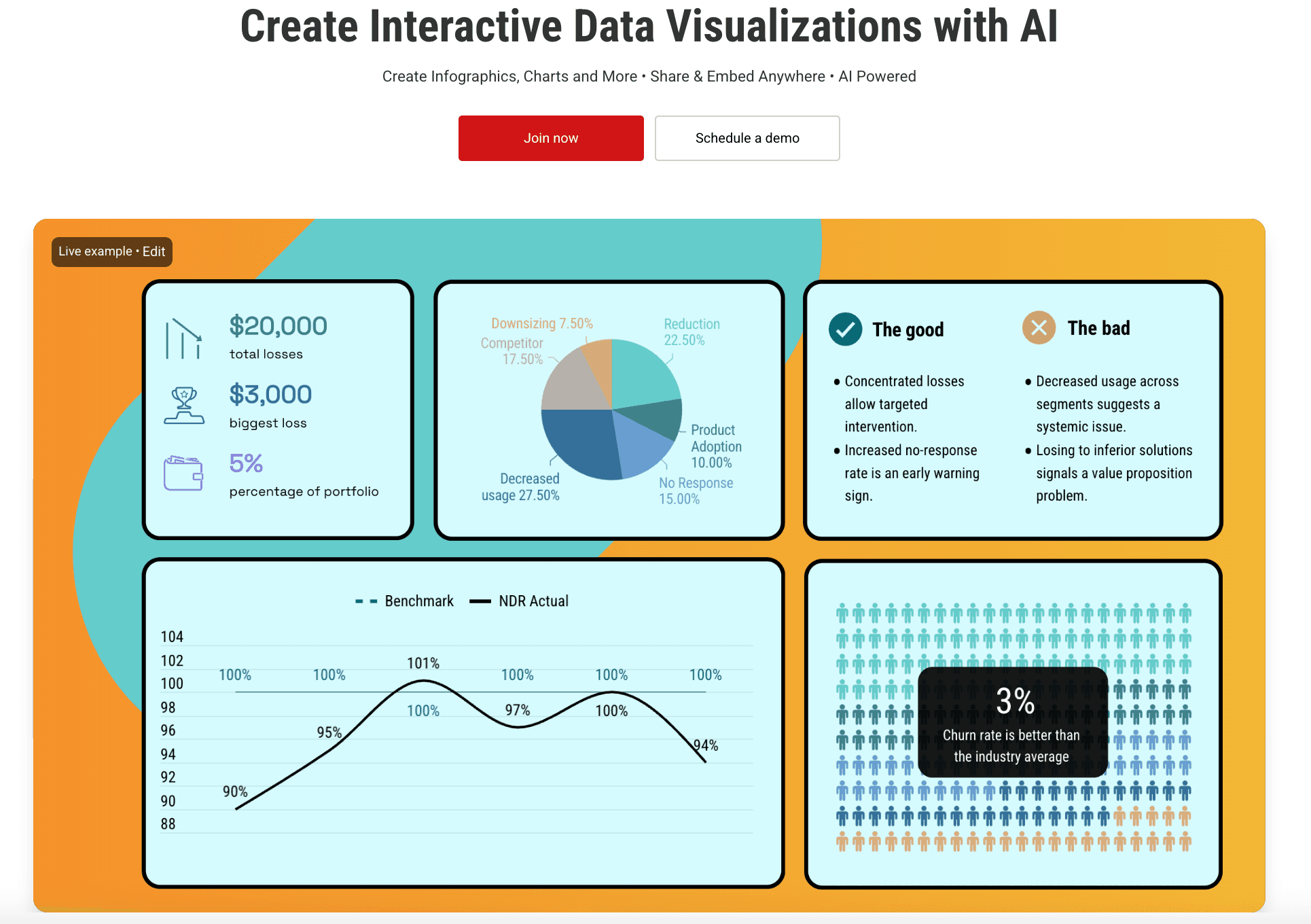
Piktochart AI
L’outil expert pour transformer des textes et données complexes en infographies et documents imprimables faciles à lire.
Fonctionnalités clés
Résumé en infographie : l’IA condense de longs rapports en synthèses visuelles.
Export qualité impression : supporte des exports haute résolution pour documents physiques.
Avantages
Idéal pour les rapports annuels et les flyers.
Inconvénients
Moins flexible pour l’exploration dynamique des données comparé aux agents IA conversationnels.
Tarifs
Essai gratuit ; plan Pro ~29 $/mois.
10. ChartGPT
Un outil léger qui fait exactement ce que son nom indique : transformer rapidement du texte en graphiques.

Fonctionnalités clés
Texte vers graphique : tapez « Graphique des ventes du T1 » et obtenez un résultat instantanément.
Export de code : fournit du code Python/Recharts pour les développeurs.
Avantages
Extrêmement rapide ; idéal pour les développeurs ou besoins ponctuels.
Inconvénients
Manque un workflow de design complet ; ne peut pas générer de présentations complètes.
Tarifs
Tarification par utilisateur/mois.
Guide d’achat : quel outil choisir ?
En 2026, votre choix dépend de votre objectif spécifique :
Pour les réseaux sociaux : optez pour Canva, grâce à sa vaste bibliothèque de modèles.
Pour la data science en entreprise : Tableau reste la référence pour des analyses approfondies.
Pour le storytelling business : si vous êtes un utilisateur métier souhaitant interagir avec les données en langage naturel et « générer des slides professionnelles en un clic », Powerdrill Bloom est le vainqueur incontesté.
Comment Powerdrill Bloom accélère la création de graphiques
Powerdrill Bloom se démarque en 2026 en réinventant le workflow :
Importer & nettoyer : glissez-déposez vos fichiers Excel ou PDF désordonnés. L’agent comprend automatiquement la structure des données, aucun nettoyage manuel nécessaire.
Narration visuelle (Nano Banana Pro) : ici se produit la magie. Le moteur Nano Banana Pro ne se contente pas de tracer des points ; il conçoit des slides selon l’esthétique business, en mettant en évidence les tendances et insights clés.
Insights & export : l’outil génère des “Deep Insights” et permet d’exporter graphiques, analyses et arrière-plans élégants directement au format PPT ou PDF.
Conclusion
2026 est l’ère du « Visual Storytelling ». Les chiffres bruts ne suffisent plus ; il faut des outils capables de raconter l’histoire derrière les données. Powerdrill Bloom, avec son puissant moteur Nano Banana Pro, comble le fossé entre Excel et les histoires visuelles. Pour vous démarquer lors de votre prochaine présentation, c’est l’outil à battre.
Questions fréquemment posées
Qu’est-ce que les outils d’IA pour créer des graphiques ?
Ce sont des logiciels qui utilisent l’intelligence artificielle pour lire automatiquement les données brutes (comme Excel), en interpréter le sens, et recommander, générer et embellir des graphiques.
Quel est le meilleur outil d’IA pour transformer des données Excel brutes en visualisations ?
Powerdrill Bloom est fortement recommandé. Il ne se contente pas de convertir les données, il utilise le moteur Nano Banana Pro pour générer des slides complètes avec une précision et une esthétique professionnelles.
Comment les outils de visualisation de données aident-ils les équipes d’analyse ?
Ils permettent de gagner jusqu’à 80 % du temps consacré à la création manuelle de graphiques, assurent des standards visuels cohérents, et aident les analystes à détecter des tendances cachées qui pourraient passer inaperçues manuellement.