How to Write a Weekly Status Report From Your Data (2026 Guide)
A weekly status report should carry three or four numbers, a one-line read on each, and an explicit note on what changed since last week. The hard part is not writing it. It is deciding which three numbers earn the space, and separating a real movement from ordinary week-to-week noise.
Most weekly reports fail in one of two directions. They list every metric anyone has ever asked for, so nobody reads them. Or they list a headline number with no baseline, so nobody can tell whether it is good.
This guide covers what to gather before you write and a reusable structure. It ends with where assembling it by hand starts eating the morning it was meant to save.
What you need before you start
You need the current period's numbers, the previous period's for comparison, and enough history to know what normal variation looks like. That third item is the one people skip, and it is what separates a report from a list.
Two decisions come before the writing.
Your comparison baseline. Week-on-week is the obvious choice and the noisiest. For anything with a weekly cycle, comparing against the same weekday range or a four-week rolling average is far more informative. Pick one and keep it.
Your audience's decision. A report read by a team lead who can reallocate work needs different content from one read by an executive. The executive is deciding whether to keep funding the thing. Write for the decision the reader can actually make.
A good result looks like this. Three or four metrics with current value, comparison value and direction. One sentence per metric saying what it means. A short blockers section with an owner attached to each.
How to do it manually
Option 1: Pull and normalize the numbers
Export from each source, line them up by period, and check that the periods actually match. A CRM export defaulting to calendar month and an analytics export set to the last 30 days will not agree. The discrepancy becomes invisible once the numbers are in a slide.
Put current and prior values side by side with an absolute change and a percentage change. Both are needed: percentages exaggerate small bases, absolute numbers hide fast growth from a small base.
Option 2: Separate signal from noise
Before writing that something rose, check whether the rise is larger than the normal week-to-week variation. The cheap version of this is the range of the last eight weeks. If this week's value sits inside it, the honest description is "within the usual range," not "up 12%."
This single habit removes most of the false alarms that make weekly reports lose credibility. A report that calls out a movement every week is not tracking anything.
Option 3: Write the read, not the number
Each metric gets one sentence that a reader can act on. "Signups 412, up from 388, within the normal range" is a fact. "Signups steady for the fourth week; the paid channel is flat while organic grew, so the mix is shifting" is a read.
For blockers, name the thing, the owner and what would unblock it. A blocker without an owner is a complaint.
Keep the read separate from the number in the layout too. Readers scanning for the figure should find it without wading through interpretation. Readers who want the interpretation should not have to infer it from a table. One line each, in that order.
Option 4: Keep the structure identical week to week
Use the same order, the same metrics and the same phrasing every week. A reader who knows where the churn number lives can find it in three seconds. A reader facing a redesigned layout has to read the whole thing.
Consistency also makes omissions visible. If a metric that appears every week is suddenly missing, that absence carries information. It usually means the export failed rather than that the metric stopped mattering.
Where the manual route slows down
It is the same forty minutes every week, and the work is not the writing. It is exporting three files, aligning periods, rebuilding the comparison, and checking last week's report to see what you said.
Because it is expensive, it degrades. Week five the eight-week range check gets skipped. Week eight one of the sources is quietly dropped. By week twelve the report is a template with numbers pasted in, which is the format everyone stops reading.
Adding history makes it worse, not better. The comparison that gives the report its value is the one that needs the most upkeep, so it is the first thing to go.
How to write a weekly status report with Powerdrill Bloom
Step 1: Upload your spreadsheet
Upload the exports together. Powerdrill Bloom profiles each file, so mismatched date ranges and differing column names are visible before you compare anything. The period alignment problem surfaces at upload rather than in the meeting.

Step 2: Describe the report in natural language
Ask for the structure directly. Give me these four metrics for last week with the prior week and the eight-week range, and flag any that fall outside it. Then ask the follow-up that makes it a read rather than a list. What changed in the mix, and which movements are larger than normal variation.
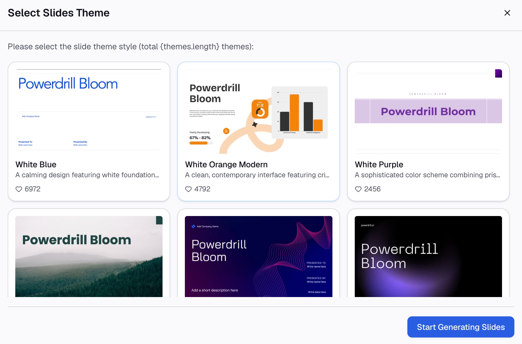
Step 3: Export the chart, report, or deck
Take out the summary table, a trend chart for anything that moved, or a written draft you can edit rather than compose.
Why this beats rebuilding the report every Monday
| Manual route | Powerdrill Bloom | |
|---|---|---|
| Aligning periods across sources | Manual check every week | Flagged at upload |
| Eight-week range comparison | Rebuild the history each time | Ask for it |
| Deciding what moved meaningfully | Judgment plus arithmetic | Ask which values fall outside range |
| Next week | Repeat the whole process | Upload the new exports |
The row that changes the report's quality is the third. When testing whether a movement is real costs a sentence, you check every metric every week. When it costs twenty minutes, you check the one you already suspect — which is how confirmation bias gets into a status report.
Common mistakes
Reporting every metric you have. Three or four numbers get read. Twelve get skimmed and then ignored. Put the rest in an appendix if someone genuinely needs them.
A number with no baseline. "Revenue was $84k" is unreadable without last week, last month, or the plan. Always pair the value with its comparison.
Calling noise a trend. Without a sense of normal variation, every week has a story, and the report stops being believed. Silence about a steady metric is a valid weekly update.
Burying the bad news. Readers find it anyway, and finding it late costs more trust than the problem itself. Lead with it and pair it with an owner.
Writing it for nobody in particular. A report addressed to everyone gets read by no one. Write for the specific decision your reader makes.
Letting the format drift. Changing the order or the wording each week forces the reader to re-learn the document. Keep it boring and identical, and let the numbers be the only thing that changes.
Conclusion
A weekly status report is a filtering problem wearing a writing problem's clothes. Pick three or four metrics, pair each with a baseline and a range, write one actionable sentence per metric, and attach owners to the blockers.
What makes it degrade is the weekly rebuild. If Monday morning is going on exports and period alignment rather than on the read, try Powerdrill Bloom on this week's files. Related reading: our AI report generator page and automating data reporting from Excel for the scheduling side. See also writing an executive summary from a spreadsheet and building a KPI dashboard.
Frequently asked questions
What should a weekly status report include?
Three or four metrics with their comparison values and one sentence of interpretation each. Add a short blockers section with owners, plus an explicit note on what changed since last week. Anything else belongs in an appendix.
How long should a weekly status report be?
Short enough to read in two minutes — roughly one screen. Length is what stops these reports being read, and a longer report is usually a sign that the filtering step was skipped.
How do I know if a change is meaningful?
Compare it against the normal variation of the last eight weeks or so. If the current value sits inside that range, describe it as steady. Calling every fluctuation a trend is what makes a weekly report lose credibility.
Should I use week-on-week or a rolling average?
A rolling average is more informative for anything with a weekly cycle, because week-on-week comparison is dominated by noise. Whichever you pick, state it in the report and keep it consistent.
How do I report bad news in a status report?
Early and with an owner. State the problem, its size, who is on it and what would unblock it. Burying it costs more credibility than the problem does, because readers find it eventually.