How to Write a Data-Driven Whitepaper (Without a Research Team)
A data-driven whitepaper needs four things a normal report does not. One defensible claim, a stated method, charts that stand alone, and numbers a stranger can question. You do not need a research department for any of them. You need a dataset you already own and the discipline to describe how you used it.
The writing is the smaller half. What makes a whitepaper credible is that its evidence survives someone reading it sceptically.
This guide covers what to settle first, the three-part manual route, and where that route slows down when the document is updated annually.
What you need before you start
You need a dataset you have the right to publish from. Product usage, survey responses, transaction records and public data all qualify, provided you can describe them honestly.
You also need one claim. A whitepaper arguing three things convinces nobody, because a reader cannot tell which one you are defending.
Two decisions come before any writing.
Who the reader is. A whitepaper for practitioners can assume vocabulary. One for buyers cannot, and it fails by being too technical rather than too thin.
What the reader should do next. A whitepaper with no implied action is a report with a cover page.
One habit saves the most work later. Write the method paragraph first, before the analysis. It forces you to define your population and date range while you can still change them.
How to do it manually
Option 1: Settle the claim, then test it against the data
Write your intended conclusion as a single sentence. Then check whether the dataset can actually support it.
This order feels backwards and prevents the most expensive failure. Analyse first and write later, and you will find something interesting and reshape the whitepaper around it. That is how a document ends up arguing four things.
Then look for the counter-case deliberately. Segment the data by whatever would most plausibly break your claim, and see whether it holds.
The limit here is honesty rather than skill. Nobody checks your work at this stage, so it is the step most often skipped.
Option 2: Build the evidence so each chart makes one point
Give every exhibit a single job. A chart carrying two arguments will be read as neither.
Label completely, because a whitepaper circulates without you. Axis units, sample size, date range and source belong on the figure itself, not in the surrounding paragraph. Our AI graph maker page covers the production side.
Then write the method note. State the population, the period, what you excluded and why. Two paragraphs is usually enough, and their absence is what makes a whitepaper look promotional.
This produces evidence that travels. It also takes longer than the prose, which surprises people the first time.
Decide your rounding rule once and apply it everywhere. A percentage shown to one decimal in a chart and to none in the text reads as two different numbers.
Keep the underlying table for every exhibit. If a reader asks how a figure was derived, the answer should take a minute rather than a rebuild.
Option 3: Draft the document around the evidence, not the outline
Write the section that carries the main chart first, then build outward. Sections that never earn a chart are usually the ones to cut.
Keep the executive summary until last. It has to state the claim, the evidence and the implication in a form someone will read alone. Our guide to writing an executive summary from a spreadsheet covers that piece specifically.
Finish with an appendix carrying the full tables. Anything a reader might want to check belongs there rather than in the argument.
The shared ceiling. All three assume the analysis is stable. In practice a reviewer asks one new question late, and that question sends you back through the whole evidence chain by hand.
Where the manual route slows down
The first edition is genuinely satisfying. The second one, a year later, is where the practice dies.
The reason is structural. Refreshing a whitepaper means rerunning every figure with a new date range, then checking every sentence that quoted a number. The sentences are the problem, because they look unchanged.
The failure is predictable. Charts get regenerated because they visibly must be. Prose keeps last year's figures, and a reader eventually notices that page four contradicts page nine.
There is a second drag. Late questions from a reviewer or a lawyer arrive as new analyses, and each one costs an afternoon in the original workbook.
Those late questions are also the most predictable part of the process. Sample size, exclusions and date range come up almost every time, so prepare those three answers before anyone asks.
How to write a data-driven whitepaper with Powerdrill Bloom
Step 1: Upload the dataset behind the argument
Upload the usage export, survey file or transaction records you intend to publish from. Powerdrill Bloom profiles the columns on arrival, so blanks, duplicates and type mismatches surface before any number reaches the document.
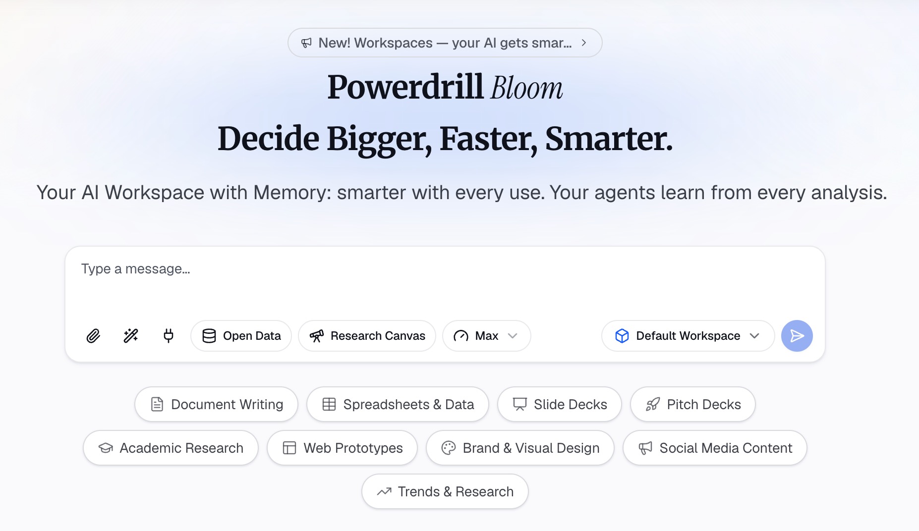
Step 2: Ask for the claim and the counter-case in natural language
State the claim you want to test, then ask for the evidence and the exceptions in the same pass. Ask which segments contradict the pattern, and which comparisons rest on samples too small to publish.
Then ask for the method facts you have to disclose. Ask how many records were excluded, on what rule, and what the date range actually covers.
Step 3: Export the chart, report, or deck
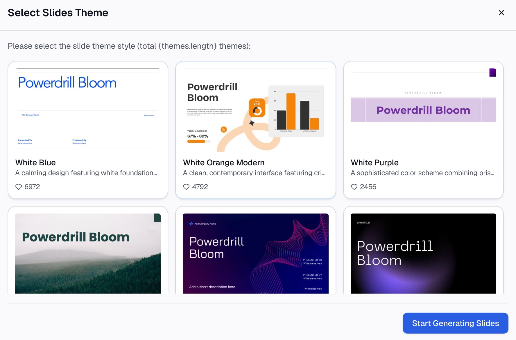
Take out labelled figures, a table for the appendix, or a written draft you edit into the whitepaper itself.
Why this beats starting from a blank document
| Manual route | Powerdrill Bloom | |
|---|---|---|
| Testing the claim before writing | Rebuild the analysis per angle | Ask for each angle in turn |
| Finding the counter-case | Segment manually and hope | Ask which segments break the pattern |
| Method facts to disclose | Count exclusions by hand | Ask what was excluded and why |
| Next year's edition | Rerun every figure and reread every line | Upload the new export |
The last row decides whether a whitepaper becomes a series. An annual document that costs a week gets published once.
The counter-case row is the one most people skip. Finding the segment that breaks your claim before a reader does is what separates a credible whitepaper from a defensive one.
Common mistakes
Arguing more than one thing. Two claims halve the persuasive weight of each. Pick the one your data supports best and put the rest in the appendix.
Hiding the method. A whitepaper without a stated population and period reads as marketing, however good the analysis is.
Publishing a percentage without its denominator. Sixty percent of twelve responses is not a finding. State sample sizes on the figure.
Charts that need the paragraph to make sense. Whitepapers get excerpted, screenshotted and quoted. Every exhibit has to stand alone.
Letting prose keep last edition's numbers. Refresh the words in the same pass as the charts, then check each figure against its source.
Treating the whitepaper as a longer blog post. The reader expectation is evidence rather than opinion. Our note on data storytelling covers the difference in structure.
Skipping the appendix. Without it, a sceptical reader has nowhere to go except away. Full tables cost nothing to include.
Conclusion
Settle one claim, test it against the data including the case that would break it, build exhibits that stand alone, and disclose your method. That is the whole difference between a whitepaper and a brochure.
The part that decides whether it becomes a habit is the refresh. Rerunning every figure and rereading every sentence by hand is what keeps most whitepapers to a single edition.
If that is where your documents stop, try Powerdrill Bloom on the dataset behind your argument. See also our guide to writing an analysis report with AI and the AI report generator page.
Frequently asked questions
What makes a whitepaper different from a report?
A whitepaper is written for readers outside your organisation, so it has to be self-contained and checkable. That means one stated claim, a described method, and exhibits that make sense without the surrounding text.
How long should a data-driven whitepaper be?
Long enough to carry the evidence and no longer. Most land between six and twelve pages, with full tables moved to an appendix rather than the argument.
What data can I use if I have no research team?
Data you already own usually works: product usage, survey responses, transaction records or support tickets. The requirement is that you can describe the population and period honestly.
Where does the method section belong?
Near the front if the audience is technical, in an appendix if it is not, but always present. Write it first either way, because it forces you to define the population before you analyse it.
How often should a whitepaper be refreshed?
Annually is the common cadence for anything quoting current figures. Budget for rerunning every chart and rechecking every number written in prose, which is the step that usually gets missed.