What Is Data Storytelling? Definition, Examples, and Framework (2026)
Data storytelling is the practice of combining data, visuals and narrative so an audience reaches a specific conclusion and can act on it. It is not decorating charts with adjectives. The narrative does the work a chart cannot do on its own: stating what the pattern means and what should happen next.
The distinction matters because most presentations described as data storytelling are inventories. Twelve charts, one per metric, and a closing slide that says "questions?" That is a report. A story has a claim.
This guide covers the three components, a framework you can reuse, how it differs from dashboards and reports, and the three ways it reliably fails.
What is data storytelling?
A chart shows a pattern. A story explains why the pattern exists and what follows from it.
Consider a line that drops in March. The chart is accurate and silent. A reader can see the drop and cannot tell whether it was a pricing change, a seasonal effect, or an outage. Data storytelling supplies that. The drop follows the pricing change, it is concentrated in one segment, and that segment is one a targeted offer can reach.
The definition has a practical edge. If your audience can look at your work and still ask "so what should we do?", you produced a report. That question being unanswered is the diagnostic.
The three components
Data. The evidence, at the granularity that supports the claim and no finer. A story about regional performance does not need transaction-level detail on screen; it needs the regional figures and a defensible method behind them.
Visuals. The chart type is an argument about what matters. A line chart argues that time is the relevant dimension. A bar chart argues that categories are comparable. Choosing the wrong one obscures the point even when the numbers are right.
Narrative. The sequence and the claim. This is what most teams under-invest in, because it is the part no tool generates for you and the part that requires knowing your audience.
Remove any one and the thing collapses. Data plus visuals with no narrative is a dashboard. Narrative plus visuals with no data is a pitch. Data plus narrative with no visuals is a memo — sometimes the right answer, and worth considering more often than it is.
What data storytelling is used for
Getting a decision made. The commonest real use, and the one worth optimising for. A recommendation with evidence behind it, structured so the decision becomes the obvious next step.
Explaining a change after the fact. Why the quarter came in where it did, in a form a non-analyst can follow without a glossary.
Making an unfamiliar dataset legible. New market, new cohort, new product line. The audience has no priors, so sequence matters more than usual.
Building the case for an investment. Where the evidence has to survive a skeptical reading, which raises the bar on method transparency.
What unites these four is that a decision follows. If nothing changes based on what you present, the format you need is a report, and that is a legitimate thing to need.
A framework you can reuse
Start with the claim, not the data
Write the sentence you want the audience to repeat afterwards. One sentence, specific, falsifiable. "Churn rose in the SMB segment because onboarding time doubled after the January release" is a claim. "Insights into customer retention" is a title.
If you cannot write the sentence, you are not ready to build slides. That is uncomfortable and it is usually true.
Choose the smallest evidence set that supports it
For each chart, ask what would change if you removed it. If the answer is nothing, remove it. Three charts that build an argument beat nine that survey a dataset.
This is where most cutting happens, and it is resisted because every chart took work. The work is sunk; the audience's attention is not.
Sequence for the audience's starting point
An audience that already believes the problem exists needs the solution first. An audience that does not believe it needs the evidence first. Getting this backwards is why a technically strong deck can land badly — the content was right and the order assumed the wrong reader.
Close with the action
Name what should happen, who does it, and what you need. A story that ends at "and that's the data" has handed the hardest step back to the audience.
Show the method where it is contestable
If the claim depends on how you grouped or filtered, say so on the slide rather than in an appendix. "Excluding trials under 30 days" belongs next to the number it changes.
This feels like it weakens the argument. It does the opposite. An audience that spots an unstated assumption stops trusting the whole deck; one that sees the assumption declared reads the rest more generously.
Data storytelling vs. dashboards vs. reports
| Data storytelling | Dashboard | Report | |
|---|---|---|---|
| Purpose | Drive one decision | Monitor ongoing state | Record what happened |
| Point of view | Explicit claim | Deliberately neutral | Mostly neutral |
| Lifespan | One moment | Continuous | Archival |
| Success looks like | A decision is made | Anomalies get noticed | The record is accurate |
These are complements, not competitors. A dashboard surfaces that something moved; a story explains why and what to do. Trying to make one artefact serve both purposes produces a dashboard nobody reads and a story nobody trusts.
Three ways data storytelling fails
Telling every number. The instinct to show all the analysis, because it was work. The audience experiences it as being handed a filing cabinet and asked to find the point themselves.
Hiding the conclusion at the end. Building suspense works in fiction. In a business audience, half the room has stopped listening before the reveal, and the other half has formed a different conclusion. Lead with the claim.
Presenting to the wrong altitude. Showing an executive the segment-level detail, or showing an analyst only the headline, are the same mistake in opposite directions. Match the grain of the evidence to what the reader can act on.
Substituting polish for argument. A beautiful deck with no falsifiable claim is the most common failure and the hardest to name, because it looks like good work. The test: delete every chart and read the text alone. If nothing is being argued, the charts were carrying decoration rather than evidence.
How to build one from your data with Powerdrill Bloom
Step 1: Upload your data
Upload the export. Powerdrill Bloom profiles the columns, so you can see what the dataset actually contains before deciding what claim it can support. That is the right order, given that the claim has to survive the data.

Step 2: Describe the story in natural language
Ask analytical questions rather than chart requests. Which segment drove the change, whether the pattern holds when controlling for size, and what would have to be true for an alternative explanation. The answers are what your narrative is made of.
Step 3: Export the chart, report, or deck
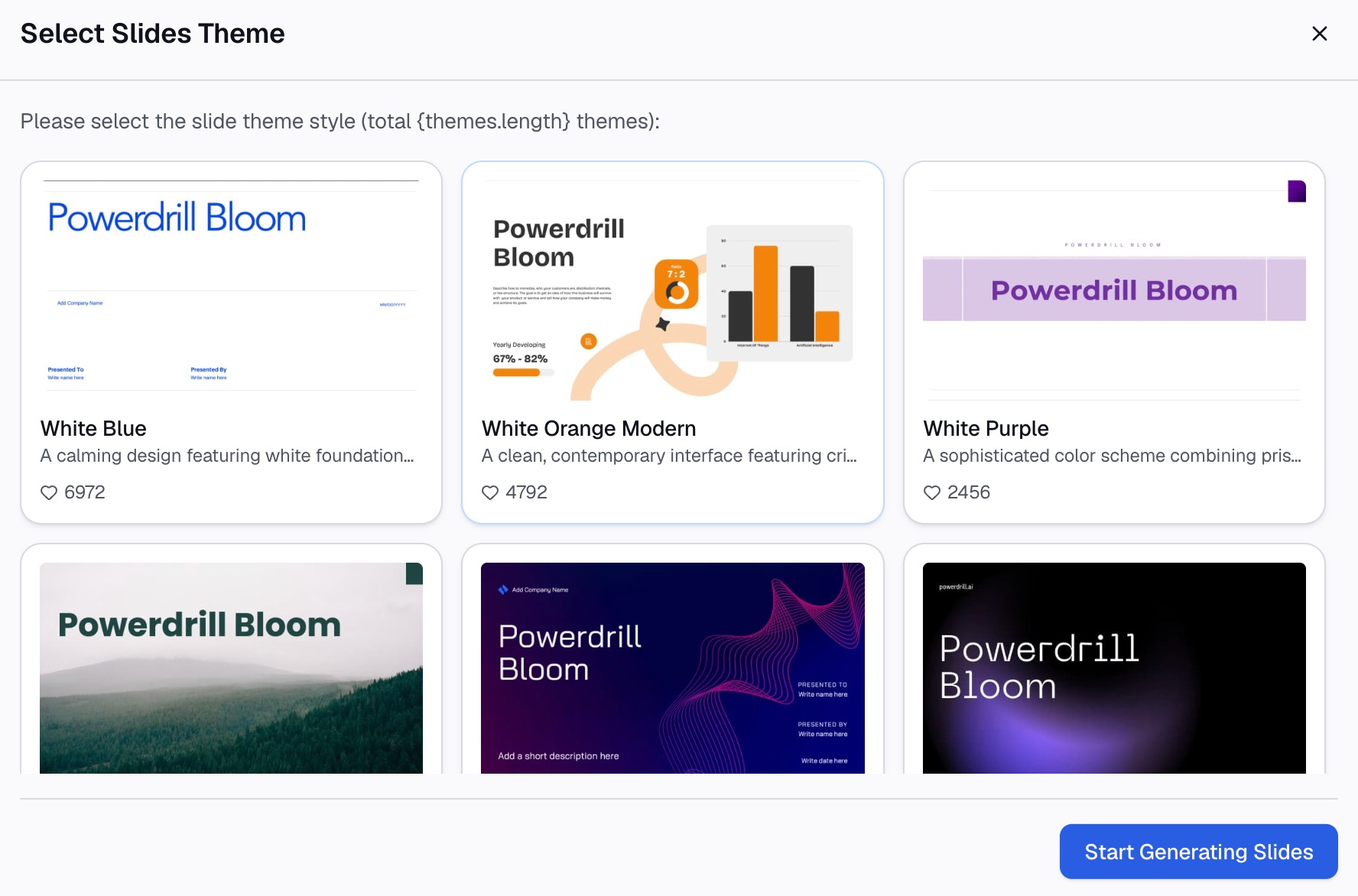
Take out the charts that survived the cut, a written narrative, or slides for the meeting.
Conclusion
Data storytelling is the discipline of committing to a claim and building the smallest evidence set that supports it. Data, visuals and narrative together — and narrative is the component that separates it from every dashboard and report your audience already ignores.
The bottleneck is usually earlier than people expect. You cannot write the claim until you know what the data supports. Try Powerdrill Bloom on the export and find the claim first. See also our data visualization tool page and the practical guide to telling data stories. There is also a survey of AI tools for data storytelling and a walkthrough for turning a CSV into a chart.
Frequently asked questions
What is data storytelling in simple terms?
Combining data, visuals and narrative so an audience understands what a pattern means and what to do about it. The narrative is what distinguishes it from a chart, which shows a pattern without interpreting it.
What are the three elements of data storytelling?
Data, visuals and narrative. Data without narrative is a dashboard, and narrative without data is a pitch. Data with narrative but no visuals is a memo, which is occasionally the right format.
How is data storytelling different from data visualization?
Visualization is one component. A visualization shows the pattern; storytelling sequences several of them behind an explicit claim and closes with an action. You can visualize well and still tell no story.
How many charts should a data story have?
As few as the argument needs, usually three to five. The test for each chart is whether removing it would change the conclusion. If not, it is decoration competing for attention.
Do I need special tools for data storytelling?
No. The hard parts are choosing the claim and cutting the evidence, and neither is a tool problem. Tools help with the step before — working out what the data supports — and with producing the charts once you know.