How to Make an Annotated Chart with AI: 7 Easy Ways in 2026
An annotated chart is a chart that carries its own explanation. Without one, the reader has to guess which line matters and why. This guide covers seven annotation techniques that Excel and Tableau already support, and how to generate the wording for them from your own data.
Why an unannotated chart gets misread
A chart shows a shape. It does not say which part of the shape is the point.
Microsoft's documentation on data labels makes the case with a small example. In a pie chart, it notes, "without the data labels it would be difficult to tell that coffee was 38% of total sales."
That is a two-word fix on a five-slice pie. The same problem scales badly. A twelve-month line with two series and a mid-year policy change is unreadable without help, and every reader invents a different explanation for the dip.
The cost shows up later, in the meeting. Someone asks what happened in April, and you spend four minutes narrating something the chart could have said on its own.
What annotation means in the tools you already have
Two vocabularies exist, and mixing them up is why people think this is harder than it is.
Excel calls the feature data labels. Microsoft describes them as making "a chart easier to understand because they show details about a data series or its individual data points."
Placement is flexible. You can add them "to one series, all the series (the whole chart), or one data point."
Tableau calls the feature annotations. According to Tableau's documentation, you can add one to call out a specific mark or a specific point. A third type covers "an area, such as a cluster of scatter marks."
Both do the same job from opposite directions. Excel attaches numbers to points; Tableau attaches sentences to regions. A well-marked chart usually needs one of each.
7 easy ways to annotate a chart
These seven cover almost every real case. Pick one or two per chart, not all seven.
1. A mark annotation on the single data point that matters
Tableau's mark annotation is tied to a selected mark, so it moves with the data rather than sitting at fixed coordinates. Use it when one bar or one dot is the entire story.
This option only appears once a data point is selected, which is a useful constraint. It forces you to decide which point you are arguing about.
2. A point annotation on a moment in time
A point annotation marks "a specific point in the view, such as a reference line or a value on an axis." That makes it the right tool for the week a price changed or the day a campaign launched.
Keep the text to one clause. "Pricing change" beats a sentence explaining the pricing change.
3. An area annotation over a period or a cluster
The area type covers a region, and Tableau's own example is "a cluster of outliers or a targeted region." Shade the recession, the outage window, or the segment you want treated as one group.
This is the technique most often missing from business charts. Readers assume a continuous line means continuous conditions, and an area marker is how you tell them otherwise.
4. Data labels on the two or three points that carry the argument
In Excel, choose the series, select Add Chart Element, then Data Labels. Microsoft notes you can label a single data point after selecting the series first.
Resist labelling everything. Microsoft says as much in its own guidance. If the labels make the chart "look too cluttered," you remove them by selecting them and pressing Delete.
5. A data callout when the number needs a box around it
Excel has a dedicated shape for this. Microsoft's instruction is direct: "If you want to show your data label inside a text bubble shape, select Data Callout."
Callouts read better on a slide than bare labels, because the box separates the number from the plot area behind it. They read worse in dense charts, where the boxes collide.
6. Label text pulled from a spreadsheet column
This is the most underused feature on the list. Excel can take label text from cells: under Label Options and Label Contains, select the Values From Cells checkbox, then choose the range.
The consequence is worth pausing on. If the wording lives in a column, you can draft and revise all of it in the spreadsheet. The chart then updates from that column.
7. Text that updates when the underlying data does
Both tools support this. Microsoft states that by default data labels "are linked to values on the worksheet, and they update automatically when changes are made to these values."
Tableau goes further with dynamic variables. Its documentation says you can use the Insert menu so that the note "can display data values that update as the underlying data changes."
Use it on any chart that gets refreshed. A hard-typed figure inside a marker is the most common source of a chart that contradicts itself.
How to make an annotated chart with AI
The tools handle placement well. What they do not do is decide what to say, and that is the part people stall on.
Step 1: Upload the data behind the chart
Sign in to Powerdrill Bloom and upload the export the chart was built from. Excel, CSV, PDF, and docs are listed on the free plan.
Upload the whole file rather than the summary range. The interesting notes usually come from a column that never made it onto the chart.

Step 2: Ask what a reader would misread
Describe the chart in natural language and ask which points would be misunderstood without explanation. Ask for the answer as a short list, one line per point, with the figure attached.
Then ask for the wording twice: once as a five-word marker and once as a full sentence. The short version goes on the chart and the long version goes in the caption below it.
Step 3: Put the wording where the chart can read it
Paste the approved short lines into a column beside the data, then point Excel's Values From Cells at that range. The chart now carries the text, and the text lives with the numbers.
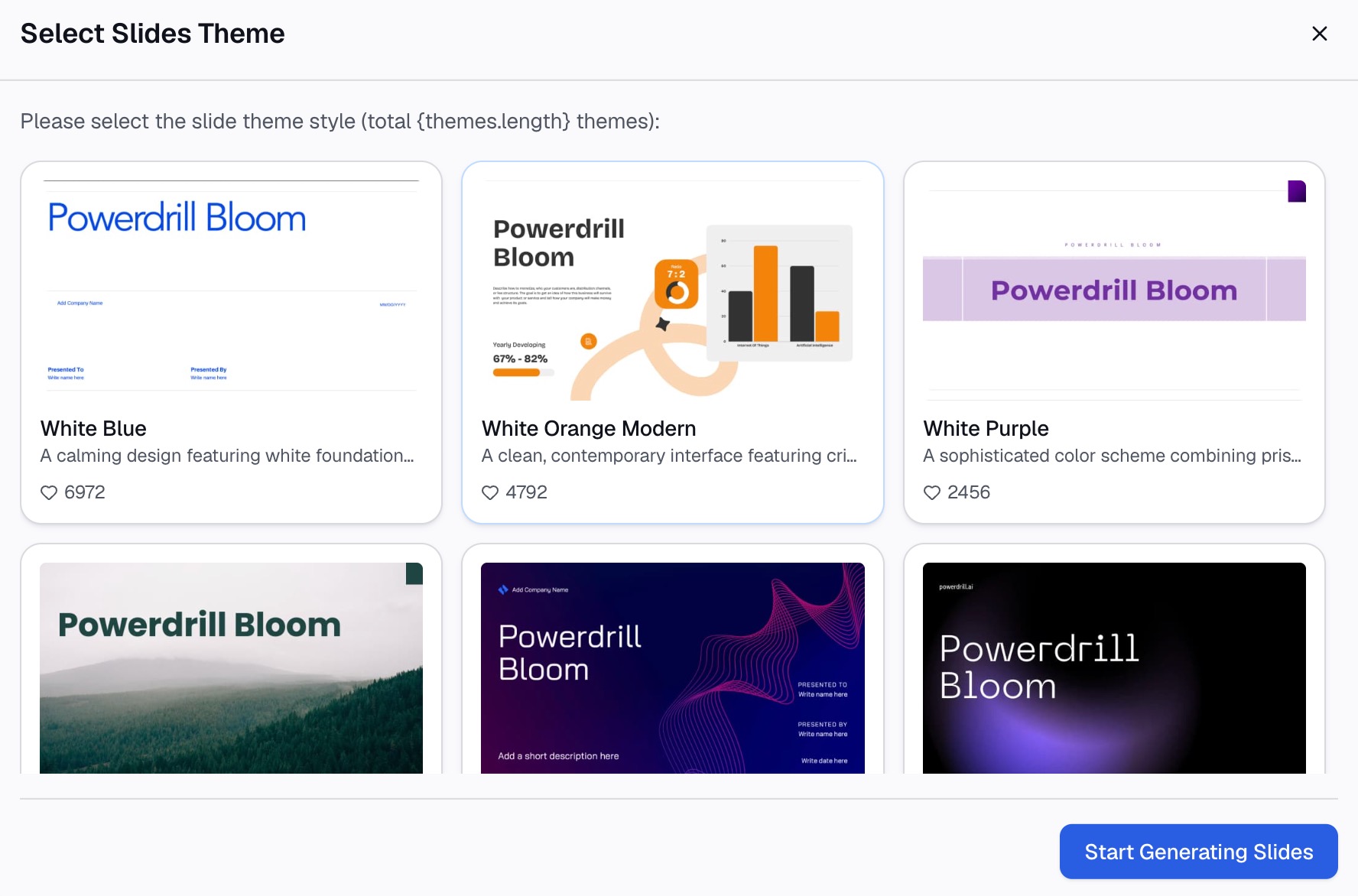
Charts and visuals can also be generated directly, which the make graphs from Excel page covers. To draft the wording from your own file, try Powerdrill Bloom.
Where the annotation text should come from
Wording written from memory is where charts start to lie. A marker saying "up sharply" beside a 3% move is worse than no marker at all.
So keep three rules. Every figure in a marker comes from a cell, not from recollection. Every claim of cause is labelled as a possible cause. And anything you cannot source gets cut rather than softened.
How many annotations is too many
| Chart type | Markers worth adding | What to avoid |
|---|---|---|
| Single-series line | 1–2 on turning points | Labelling every month |
| Multi-series line | 1 per series, at most | Competing text over crossing lines |
| Bar or column | Labels on the top and bottom bars | A number on all twenty bars |
| Pie or donut | Percentages on every slice | A separate note per slice |
| Scatter | 1 area over the cluster | Naming individual dots |
| Dashboard tile | 0, plus a clear title | Any long text at tile size |
The dashboard row surprises people. At tile size there is no room for explanation, so the title has to do the work. A heading like "Churn up 2 points since June" outperforms "Churn rate."
Common mistakes worth avoiding
A title that names the metric instead of the finding. "Monthly revenue" tells the reader what they are looking at. "Revenue flat since the March price change" tells them why they are looking at it.
Typing figures into the note by hand. The chart refreshes, the marker does not, and nobody notices until someone checks.
Explaining the axis. If the reader needs a note to understand the axis, fix the axis.
Restyling instead of explaining. Colour and font choices are a separate job, covered in matching charts to your brand colors and in making data slides easy to read. Neither of them substitutes for a sentence.
Say what the chart implies
Every chart you build already contains a conclusion. The only question is whether you write it down or make each reader guess at it.
Seven techniques is more than most charts need. One good marker on the point that matters, plus a title that states the finding, handles the large majority of business charts.
The AI graph maker page covers generating the chart itself if it does not exist yet. The data visualization tool page covers the wider set.
Frequently asked questions
What is an annotated chart?
It is a chart with explanatory text attached to specific parts of it. That might be a label on a data point, a note on a date, or a shaded region over a period. The text tells the reader which part of the shape matters.
How do I annotate a chart in Excel?
Excel uses data labels. Choose the series or chart, select Add Chart Element, then Data Labels, and use the arrow to set the position. Selecting Data Callout puts the label inside a text bubble shape.
Can chart notes update automatically?
Yes. Microsoft states that data labels are linked to worksheet values by default and update when those values change. Tableau supports dynamic variables so the text can display data values that update with the underlying data.
How many notes should a chart have?
One or two on most business charts. More than that competes with the data itself, and Microsoft's own guidance is to delete labels if they make the chart look cluttered.
Can I write chart labels in a spreadsheet column?
Yes. In Excel, under Label Options and Label Contains, select the Values From Cells checkbox and pick the range. The cell values then display as the labels, so the wording can be drafted and revised in the sheet.