How to Make Charts That Match Your Brand Colors (2026 Guide)
To make charts that match your brand colors, collect the hex codes from your brand guidelines, build a custom theme in Excel or Google Sheets so those colors become the default series order, then check every pair for contrast and colorblind safety before you ship. The theme is what makes it repeatable — applying colors chart by chart is what makes it a job you redo every month.
Default chart palettes are the fastest way to make a good analysis look like a draft. The numbers can be right and the slide still reads as unfinished, because the blue is not your blue.
This guide covers the manual route in Excel and Sheets, why it drifts, and the faster path.
What you need before you start
Three things, and only the first one is obvious.
The hex codes, not the color names. "Our blue" is not a specification. You need #1B4F9C-style values for primary, secondary, and accent colors, plus at least two neutrals for gridlines and axis labels. Brand guidelines usually carry them; if yours does not, pull them from the logo file rather than eyeballing from a screenshot.
Enough distinct colors for your worst chart. A brand palette often has three colors. A stacked bar with seven segments needs seven distinguishable fills. Decide in advance how you will extend — usually tints and shades of the primary, not new hues borrowed from nowhere.
A contrast rule. Brand colors are chosen for logos and headers, not for small chart elements on white. WCAG asks for a contrast ratio of at least 4.5:1 for normal text and 3:1 for large text and graphical objects. A pale brand yellow that looks fine in a logo can be unreadable as a data label, and that is a legibility problem before it is a design preference.
The manual route in Excel and Google Sheets
Build a custom theme, not a custom chart
In Excel, set your palette once at the document level: Page Layout → Colors → Customize Colors, enter your hex values into the Accent 1 through Accent 6 slots in the order you want series to appear, name the theme, and save it. New charts then pick up brand colors by default. Microsoft documents the process in change a theme and make it the default.
The order matters more than people expect. Accent 1 is what every single-series chart will use, so it should be your primary brand color, not the first one in your guidelines document.
Google Sheets has no document-level theme colors for charts in the same way. There you set colors per series in the chart editor, then reuse the chart by copying it and swapping the data range.
Set the neutrals too
Gridlines, axis lines, and tick labels default to grey values that rarely match a brand's neutral. Setting these is what separates "chart with our colors in it" from "chart that looks like ours". A light neutral for gridlines and a dark one for text is enough.
Save a template and reuse it
In Excel, right-click a finished chart and choose Save as Template, then apply that template to new charts instead of restyling from scratch. This is the step that turns a one-off into a system. Microsoft's create a chart from start to finish covers the surrounding chart mechanics.
Check it before you ship it
Two checks, both quick. Convert the chart to greyscale — if two series become indistinguishable, they were relying on hue alone. Then view it at the size it will actually be seen: a distinction that is obvious at full screen can vanish in a slide thumbnail or a printed handout.
Where manual theming falls apart
Four failure modes, and they are all about repetition rather than difficulty.
Themes do not travel. A custom theme lives in the workbook or on the machine where you saved it. Send the file to a colleague and your palette may or may not survive. Paste the chart into a deck built on a different template and it often re-themes itself to the destination.
Series order changes the colors. Add a new region to your data and the color assignments shift down one. Last month's chart and this month's chart now show the same segment in different colors, which quietly breaks month-over-month comparison.
Charts built by different people diverge. Two analysts, two interpretations of "use our brand colors", and a deck where slide 4 and slide 9 disagree about what the primary blue is.
Brand palettes are not data palettes. Three brand colors cannot encode eight categories, and stretching them produces adjacent tints nobody can tell apart. Someone eventually improvises, and the improvisation becomes the new standard by accident.
Worth noting that tooling is moving on this. Microsoft's July 2026 Excel update added a @brand-kit skill that applies an organization's branding to a workbook and a @theme-design skill that picks coordinated colors and styles charts, described in what's new in Excel. That is a strong signal about how common this problem is — and it applies to workbooks, which is a different surface from the deck you eventually present.
How to make brand-matched charts with Powerdrill Bloom
The approach that scales is to state the palette once as part of the request, so every chart in the set is generated consistently rather than restyled individually.
Step 1: Upload your data
Drop your Excel, CSV, TSV, or PDF files into a workspace. Powerdrill Bloom auto-cleans as it reads, so mixed date formats and numbers stored as text get resolved rather than producing an axis that needs fixing before you can even think about color.

Working in the same workspace each month keeps context — including the styling instruction you settled on last time.
Step 2: Ask for the charts and give the palette in the same instruction
State the colors with the request rather than fixing them afterwards:
"Chart monthly revenue by region as a line chart, and category share as a stacked bar. Use #1B4F9C for the primary series, #F2A900 for the secondary, and #6B7280 for gridlines and axis labels. Keep the same color for each region across every chart, and make sure adjacent segments stay distinguishable in greyscale."
Two parts of that instruction do the real work. Naming the exact hex codes removes the guesswork, and asking for the same color per region across every chart is what produces a coherent set instead of five individually correct charts.
Step 3: Export the charts or turn them into a deck
Take the individual charts, or convert the whole canvas into a presentation-ready deck in one click — Professional, Business, or Fancy — and export to PowerPoint or Notion for any final adjustment.
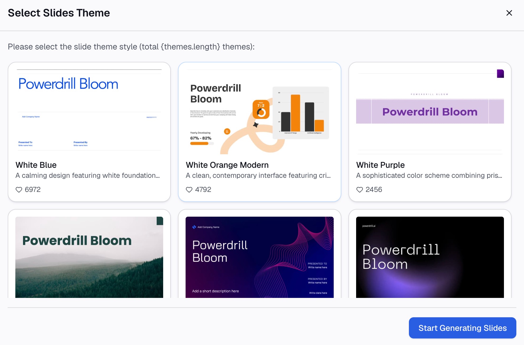
Because the palette was part of the request, the charts arrive consistent with each other, which removes the per-chart reconciliation that usually happens at the end.
Why consistency beats exact matching
| Chart-by-chart styling | Palette stated once | |
|---|---|---|
| Five charts in one deck | Five rounds of restyling | One instruction |
| Same category, same color everywhere | Manual discipline | Part of the request |
| New series appears | Colors shift down one | Assignment restated |
| Travels to another machine | Theme may not follow | Instruction is reusable text |
| Greyscale and contrast check | Manual, usually skipped | Ask for it explicitly |
The point worth internalising: an audience does not notice that your blue is exactly #1B4F9C. They do notice when the same product line is blue on slide 3 and orange on slide 7. Internal consistency is worth more than exact fidelity to the brand book.
Best practices
Assign colors to meaning, then keep them fixed
Decide that Enterprise is always the primary blue and SMB is always the accent, then never change it. Color becomes a legend the audience learns once, and month-over-month comparison gets easier.
Reserve one accent for the point you are making
If everything is branded, nothing stands out. Keep the palette muted for context series and use a single high-contrast accent for the bar or line the slide is actually about.
Do not encode with hue alone
Around one in twelve men has some form of color vision deficiency, and red-green pairings are the most common failure. Add a second channel — direct labels, different line styles, ordering, or position — so the chart still reads without color.
Use semantic colors carefully
Red for a decline and green for growth is a strong convention worth keeping even when neither is a brand color. Overriding it with brand colors to stay on-palette makes charts harder to read, and being on-brand is not worth being misread.
Set the neutrals, not just the series
Gridlines, axis labels, and backgrounds carry more of the "does this look like ours" feeling than most people expect, and they are the elements most often left at default.
Common mistakes to avoid
- Using brand colors for a continuous scale. Sequential data needs a gradient with even perceptual steps. Two brand colors stretched into a ramp produces a scale where equal value differences look unequal.
- Too many brand tints. Five shades of the same blue are five colors nobody can tell apart in a legend. Beyond about five categories, group the tail into "Other".
- Testing only on a white background. A palette tuned for white can disappear on a dark slide master. Check where it will actually be shown.
- Letting the tool pick the order. Whatever your palette, the first series should be the one the slide is about, not whichever column happened to sort first.
- Styling before checking the data types. A perfectly branded chart plotting text-formatted dates is still wrong. Fix the data first — our guide on turning messy survey data into clear charts covers that groundwork.
Conclusion
Brand-matched charts are a systems problem, not a design problem. Collect the hex codes, set them once as a theme or as part of your request, fix the color-to-category mapping so it never moves, and check contrast and greyscale before anything ships.
If you would rather state the palette once and get a consistent set back, Powerdrill Bloom generates the charts and the deck from the same instruction, with 1,000 daily refreshed credits on the free plan. The AI graph maker and data visualization tool pages show the chart types available.
Frequently asked questions
How do I add my brand colors to Excel charts?
Open Page Layout → Colors → Customize Colors, enter your brand hex values into the Accent 1 through Accent 6 slots in the order you want series to appear, then save the theme. New charts in that workbook use those colors by default. Put your primary brand color in Accent 1, since single-series charts always use it.
Can Google Sheets save brand colors as a default for charts?
Not as a document-level chart theme in the way Excel does. In Sheets you set colors per series in the chart editor, then reuse a styled chart by copying it and pointing the copy at new data. Keeping the hex codes somewhere in the file makes that reuse less error-prone.
How many colors should a chart palette have?
Enough for your most complex chart, which is usually five to seven distinguishable values. Beyond about seven, most audiences stop matching legend entries to segments, so grouping smaller categories into "Other" reads better than adding more colors.
What contrast ratio do chart colors need?
WCAG asks for at least 4.5:1 for normal text and 3:1 for large text and graphical objects. Data labels, axis text, and small chart elements should be checked against those thresholds, because brand colors chosen for logos frequently fail them at small sizes.
How do I keep the same category the same color across every chart?
Assign color to meaning rather than to series order, and write that mapping down. If you are generating charts from an instruction rather than building them one at a time, state the mapping in the instruction so it applies to the whole set at once.