How to Make Data Slides Easy to Read: 7 Easy Fixes in 2026
A data slide fails in the room, not on your screen. To make data slides easy to read, write the conclusion in the title and raise every font to at least 18 points. Then label values directly instead of using a legend, keep one idea per slide, and use colour to mark only your point.
Those five moves plus two more cover almost every unreadable chart. This guide covers why data slides fail, seven fixes you can apply in one pass, and how to produce a deck that already follows them.
What you need before you start
Three things, and none of them is a design tool.
You need the file the chart came from, because half the fixes are content decisions rather than formatting ones. You need to know the one sentence each slide is supposed to prove.
And you need to know how the deck will be seen. A projected slide, a shared PDF, and a screen-shared window have different floors for legibility, and the projector is the harshest of the three.
Why data slides fail in the room
The chart was legible when you built it. You were eighteen inches from a large monitor, and you already knew what it said.
The audience meets it under different conditions. It is projected, it is smaller, they have four seconds, and nobody has told them what to look for.
Microsoft's guidance on accessible presentations names the physical constraints directly. It recommends "font size (18pt or larger), sans serif fonts, and sufficient white space."
The same page gives a review instruction that works for everyone. To find problems, "review your slides for areas that look crowded or illegible."
There is a reason that test is harsher than it sounds. Microsoft notes that people who have dyslexia "describe seeing text merge or distort," so crowding is not only an aesthetic complaint.
None of this is about making slides pretty. It is about whether a number survives the trip from your screen to someone else's understanding.
The 7 fixes
Apply them in order. The first two do most of the work.
Fix 1: Put the conclusion in the title
Replace the chart name with the finding. "Revenue by region" becomes "West drove 60% of Q3 growth."
This is the highest-leverage change on the list because it removes the guessing step. A reader who knows the point can then check the chart against it rather than hunting for a story.
Microsoft's accessibility guidance supports the habit for a second reason. It notes that a person using a screen reader "relies on the slide titles to know which slide is which." The same page recommends a unique, descriptive title on every slide.
So a descriptive title serves the room and the assistive technology at once.
Fix 2: Raise every font to 18 points or more
Take Microsoft's 18-point floor as a hard minimum rather than a suggestion, and apply it to axis labels and footnotes too.
Axis text is where this breaks. Chart elements often inherit a smaller default than body text, so a slide can pass a glance and still have unreadable axes.
If the deck will not fit at 18 points, the slide is holding too much. That is a content problem wearing a formatting costume.
Fix 3: Label the values, drop the legend
A legend makes the reader look away from the data, match a colour, and look back. Direct labels remove that round trip.
Both Excel and PowerPoint support this natively. Microsoft's documentation on data labels covers adding them to a chart and positioning them per series.
The rule of thumb is simple. Two or three series can be labelled at the end of each line, and a legend earns its place only above roughly five series.
If you have more than five series, Fix 4 applies instead.
Fix 4: One idea per slide
Split anything carrying two conclusions. A slide that shows both a trend and a breakdown is two slides sharing a frame.
Dual axes are the most common version of this. Two metrics on different scales invite a comparison the geometry cannot support. Our guide to charting two metrics with different scales covers the honest ways to handle it.
Splitting costs you a slide and buys you a point that lands. That trade is almost always worth making.
Fix 5: Use colour to mark one thing
Grey everything except the bar, line, or cell you are talking about. Colour becomes a pointer rather than decoration.
This also fixes a common accessibility failure. When colour carries meaning on its own, anyone who cannot distinguish those hues loses the message. Pair the highlight with a label or a direct annotation.
The side effect is speed. A reader finds the point without your narration, which matters when the deck circulates without you.
Fix 6: Align numbers and fix the decimals
Right-align numeric columns and use the same number of decimal places down the whole column. Ragged decimals make a table feel unreliable even when it is correct.
Pick the precision from the decision, not from the source data. Nobody chooses a supplier on the second decimal of a percentage, so two significant figures usually beat six.
State units once in the header rather than in every cell. "Revenue ($000s)" beats a column of dollar signs and commas.
Fix 7: Run the Accessibility Checker before you send
PowerPoint ships a checker that catches what your eye has stopped seeing. Microsoft notes that it "runs automatically in the background when you're creating a presentation," and flags issues in the status bar.
You can also launch it deliberately. The path is Review, then Check Accessibility, which opens a pane listing issues and suggested fixes.
Treat missing alt text and unreadable contrast as blocking rather than cosmetic. Both are common in charts pasted in as images.
Then do the human pass described in our guide to reviewing a data deck before you send it.
A before-and-after check
Run this table over any slide you are unsure about.
| Element | Fails when | Passes when |
|---|---|---|
| Title | Names the chart | States the finding |
| Smallest text | Below 18 points | 18 points or larger |
| Series identification | Legend off to one side | Labelled at the data |
| Ideas per slide | Two conclusions | One conclusion |
| Colour | Every series coloured | One highlight, rest grey |
| Numbers | Mixed decimals, left-aligned | Consistent decimals, right-aligned |
| Accessibility | Never checked | Checker run, alt text present |
Seven rows, seven fixes. A slide that clears all seven is readable at the back of the room.
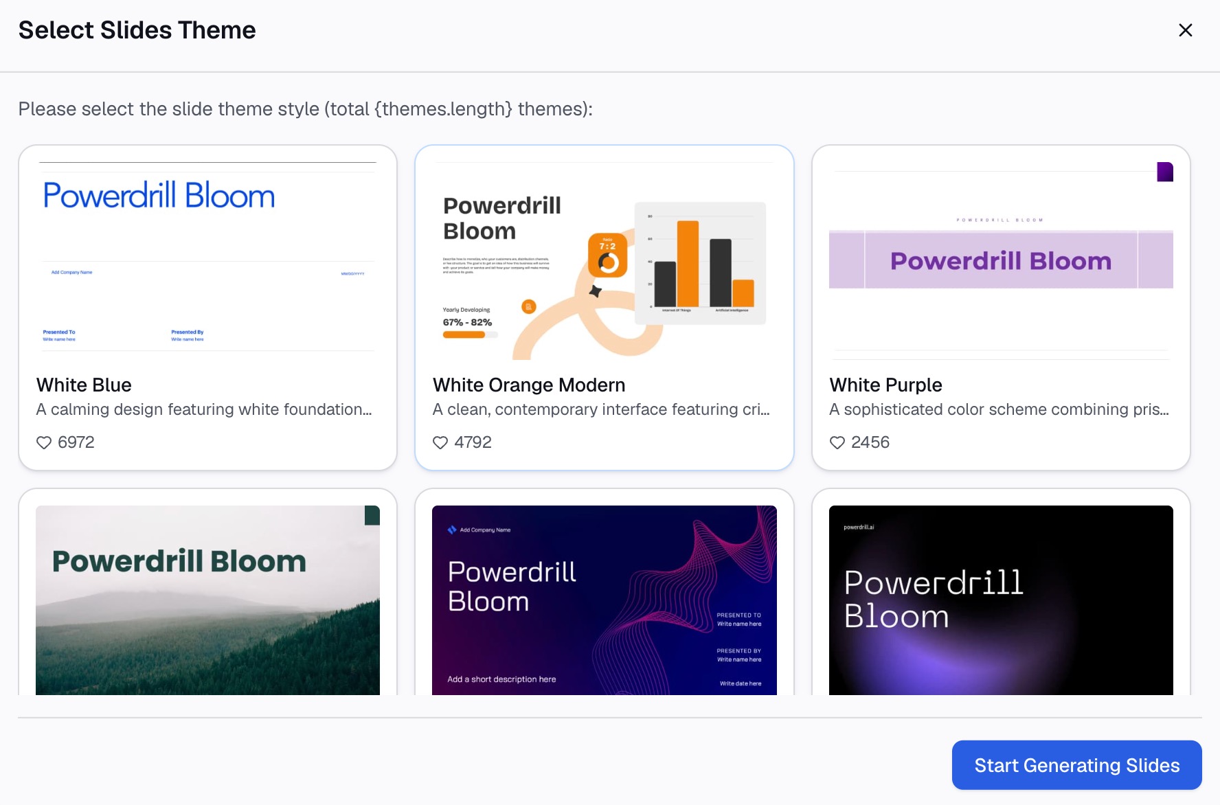
How to build it with Powerdrill Bloom
Step 1: Upload the file behind the slide
Upload the export that the chart is based on. Powerdrill Bloom profiles the columns on arrival, so mixed types, blanks, and duplicate keys surface before any chart is drawn.

Step 2: Describe the slide in natural language
State the conclusion you want the slide to make, then the constraints. Name the one metric, the period, the highlight, and the series to grey out.
Then ask for the readability pass explicitly. Ask for direct value labels instead of a legend, ask for consistent decimal places, and ask for a title written as a finding.
Step 3: Export the chart, report, or deck
Take out the chart, or slides built from the same run. Our pages on Excel to PPT and Word to slides cover the conversion side when the source is a file rather than a question.
Common mistakes
Naming the chart in the title. A title that says "Monthly revenue" makes every reader do the interpretation you already did.
Leaving axis labels at their default size. The body text passes the 18-point floor and the chart text does not.
Keeping a legend for two series. It costs the reader a lookup for no gain.
Colouring everything. When every series is bright, nothing is emphasised and the eye has nowhere to land.
Six decimal places from the source file. Precision that no decision uses reads as noise and invites questions about the wrong thing.
Pasting the chart as a picture with no alt text. The Accessibility Checker flags it, and screen readers get nothing.
Fixing the design and not the content. If the slide needs a seventh series to make its point, the point needs splitting, not restyling.
Conclusion
Write the finding in the title, hold every font at 18 points or more, and label values directly. Then keep one idea per slide, highlight with a single colour, tidy the numbers, and run the checker.
The order matters more than the count. Fixing the title and the font size gets you most of the readability, and the rest removes friction.
What this pass does not do is make a weak point strong. A slide nobody can misread is also a slide whose argument is fully exposed, which is the right outcome.
If rebuilding the same charts every cycle eats an afternoon, try Powerdrill Bloom on your own export. See also the AI graph maker page and our explainer on data storytelling.
Frequently asked questions
What font size should data slides use?
Microsoft's accessibility guidance recommends 18 points or larger, with sans serif fonts and sufficient white space. Apply the floor to axis labels and footnotes, not only to body text.
Should I use a legend or data labels?
Label the data directly when you have two or three series, because a legend forces a colour lookup. A legend becomes reasonable above roughly five series, though that many series is usually a sign the slide should split.
How do I write a slide title for a chart?
Write the conclusion rather than the chart name. "West drove 60% of Q3 growth" tells the reader what to verify; "Revenue by region" makes them work it out.
Is dual-axis charting always wrong?
Not always, but it invites a comparison the scales cannot support. Splitting into two charts, indexing both metrics to a common base, or plotting the ratio directly are usually clearer.
What does the PowerPoint Accessibility Checker catch?
It flags accessibility issues and suggests fixes, and it runs automatically in the background while you build. Launch it manually through Review, then Check Accessibility.