How to Make a Poster Presentation with AI: A Full Guide
A poster presentation is a single large page that summarizes a research project. It is displayed at a conference or event while the author stands beside it to answer questions. A good poster presentation has a short title, clear sections, a few strong charts, and text people can read from several feet away.
This guide covers what goes on a poster, the sizes and font sizes that university guides recommend, and how to build one in PowerPoint. It also shows how AI can turn a paper and its data into section drafts and charts. The last sections cover how to give the poster presentation on the day.
What a poster presentation is
A poster presentation is a way to share research on one printed sheet instead of in a talk. Conferences group posters into a session, and visitors walk past, read, and stop to ask questions.
That format changes how you write a poster presentation. A talk has your full attention for ten minutes. A poster has a passing reader for a few seconds, then perhaps a conversation.
The University of Warwick's poster guidance puts the goal simply. "Important information should be readable from about 10 feet away." The same guide asks for a title that "is short and captures viewer's interest."
The University of Illinois Chicago's School of Public Health adds a longer view. Its student guide notes that "Your poster can be circulated well beyond the conference date." So the poster has to work both as a conversation starter and as a document someone reads later.
What goes on a research poster
Most research posters follow the same order as a short paper, and a poster presentation built that way is easy to scan. The UIC guide lists five sections that most posters include:
| Section | What it covers, per the UIC guide | Typical length |
|---|---|---|
| Background | Context, problem definition, and rationale | 2 to 4 sentences |
| Aims | Goals, objectives, or the solution being evaluated | 1 to 3 bullets |
| Methods | Design and procedures for data collection | 3 to 5 bullets or a diagram |
| Results | The findings | 1 to 3 charts with short captions |
| Conclusion | Implications and impact of the findings | 2 to 4 sentences |
The "typical length" column is a planning suggestion, not a rule from the guide. Adjust it to your field and your event.
Around those sections, add a title, your name, and your institution. Warwick's guidance says a good poster "Includes acknowledgments, your name and institutional affiliation." Many posters also carry a short reference list and a contact email or QR code.
Keep the total short. Warwick suggests a "Word count of about 300 to 800 words." That is far less than a paper, so most of the work is choosing what to leave out.
The UIC guide frames the content as five questions: why, what the research contributes, how it was done, what it found, and what it recommends. If each section answers one of those, the poster tells a complete story.
Poster size, layout, and font sizes
Check your event's rules before you design a poster presentation. Size limits vary, and the University of New Hampshire's research conference guide is a good example. It recommends 32 by 40 inches or 36 by 48 inches, and says posters should not exceed 36 by 48 inches.
Font sizes for a poster presentation depend on poster size and viewing distance. Two university guides give these ranges:
| Text element | Warwick guidance | UIC guidance (3×5 ft poster) |
|---|---|---|
| Title | Ideal 158 pt, at least 72 pt | 60 to 96 pt |
| Section headings | Ideal 56 pt, at least 46 to 56 pt | 34 to 40 pt |
| Body text | Ideal 36 pt, at least 24 to 36 pt | 20 to 24 pt |
| References | Not listed | 10 to 12 pt |
The two guides differ because they assume different sizes and distances. UIC says printed posters "should be legible at 3-4 feet and the title should be legible at least 6 feet away." Warwick's figures aim for readers about 10 feet away.
A few layout rules appear in both guides or are easy to apply:
- Use columns. The UIC guide says to "Use columns to present your information," with equal spacing between sections.
- Leave margins. UIC recommends 1-inch margins to prevent cropping when printing.
- Use a light background. Warwick recommends white "or some other light colour" and warns against busy patterns.
- Choose a clean font. Warwick recommends sans serif fonts and line spacing between 1.2 and 2.0.
The UNH guide adds that "most of your audience reads from left to right, top to bottom." Put the title across the top, then run the sections down the columns in that order.
How to make a poster presentation with AI
The hardest part of a poster presentation is cutting a full paper down to a few hundred words without losing the finding. AI is useful for that cut and for turning results tables into charts. The steps below use Powerdrill Bloom, but the same approach works with any assistant that can read your files.
Step 1: Upload the paper, the data, and the poster rules
Upload the paper or report your poster is based on, as a PDF or a document. Add the spreadsheet behind your results, such as the Excel or CSV file with your measurements.
Then paste the event's poster rules into the chat: the size, the orientation, and any required sections. Add one line on the audience, for example "mixed researchers from several fields." That tells the AI how much background to keep.
Finally, state the single finding you want visitors to remember. If you are not sure yet, ask the AI to list the three strongest results from the data, then pick one. That finding becomes the poster's headline.
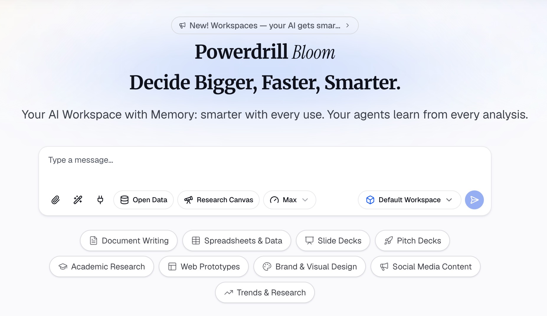
Step 2: Draft each section to a word budget and build the charts
Give each section a word budget that adds up to your target, such as 600 words in total. Ask the AI to draft Background, Aims, Methods, Results, and Conclusion within those limits.
Ask in natural language and be specific. For example: "Draft the Methods section in five bullets of no more than 12 words each." Short, parallel bullets read better at a distance than paragraphs.
Next, ask for the charts. Name the comparison you want to show, such as "treatment versus control over 12 weeks." Ask for one chart per key result, with a one-sentence caption that states the takeaway. The AI graph maker page shows the chart types it produces.
Check every number against your data before moving on. A printed poster has no room for a correction note.
Step 3: Set up the poster in PowerPoint and place the content
Create a new PowerPoint file with a single slide. On the Design tab, select Slide Size, then Custom Slide Size, and type the width and height of your printed poster.
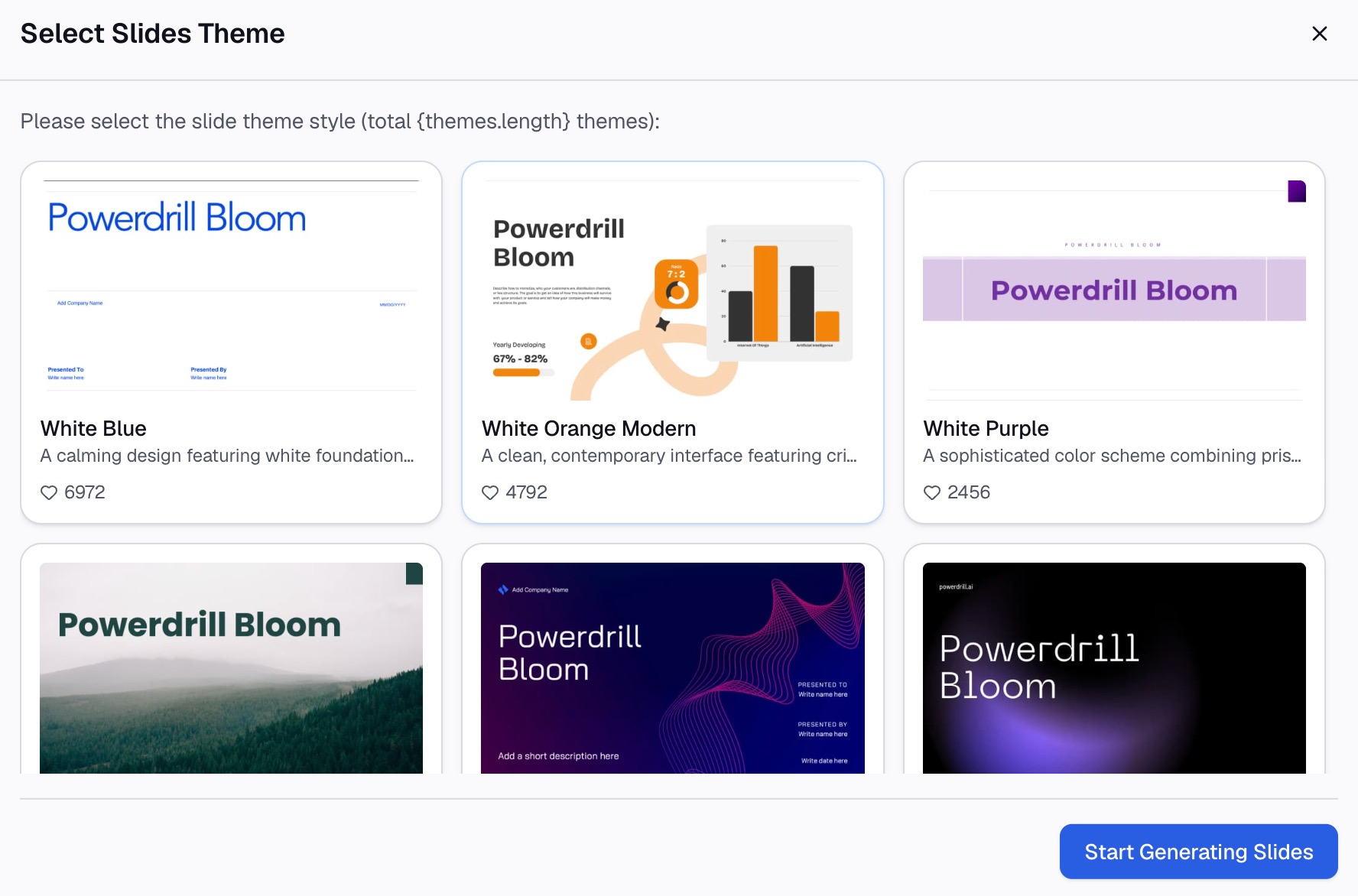
Paste each drafted section into its own text box, laid out in columns. Export the charts from Powerdrill Bloom as images and insert them into the Results area. Then set the font sizes for title, headings, and body text using your event's rules or the table above.
Finish with a read-through at the print size. Zoom to 100% and check that nothing is crowded, that the charts are sharp, and that the headline finding is the first thing you see.
How to make a poster presentation in PowerPoint
Many poster guides, including the UIC guide, assume you build the poster presentation in PowerPoint. A few settings decide whether the print looks right.
Set the size first. The UIC guide says "the slide size must be set to your desired print size" before you design. Microsoft's support page lists the custom slide size limits: a minimum of 1 inch and a maximum of 56 inches for width or height.
Work at half size for large posters. Because of that 56-inch limit, the UIC guide suggests building large posters at half size. Its example is an 18 by 30 inch slide for a 3 by 5 foot poster, printed at 200%.
Pick the right scaling option. If you change the size after adding content, PowerPoint asks how to scale it. Microsoft explains that Maximize enlarges content but "could result in your content not fitting on the slide," while Ensure Fit shrinks it.
Use guides to align boxes. The UIC guide suggests turning on the ruler and the Grid and Guides option. Aligned text boxes make the poster look finished.
Save a PDF for printing. UIC notes that saving as a PDF reduces file size. The same guide says to confirm the file size limit and file type for your event.
Charts and images that print well
Charts often carry a poster's main message, so give them room.
The UIC guide asks for "simple and effective data displays that are easy to see and understand." In practice, that means one idea per chart, large axis labels, and a caption that says what the chart shows.
Warwick's guide asks two useful questions about each chart: whether it is used appropriately, and whether it has a clear textual explanation of the data. If a chart needs a paragraph of explanation, it is probably the wrong chart.
Image resolution matters more in a printed poster presentation than on a screen. Warwick suggests a minimum of 300 dots per inch for images saved in design programs. The UIC guide adds a quick test: view images at full size. In its words, "The pictures may look fine on your screen at 33%" but blur in print.
If your poster summarizes a paper, our guide to charts for a research paper covers choosing the right chart type in more depth.
Poster presentation example
Here is an illustrative outline for a 36 by 48 inch poster presentation on a study of remote work and team productivity. The numbers are examples, not results from a real study.
- Title (top, full width): "Hybrid Teams Closed More Tickets With Two Office Days per Week"
- Background (left column, 60 words): Why hybrid schedules matter and what earlier studies left open.
- Aims (left column, 30 words): Compare ticket output across three schedule types.
- Methods (left column, 80 words): 12 teams, 24 weeks, ticket data from the help desk, schedule logged weekly.
- Results (center, two charts, 120 words): A bar chart of tickets per person by schedule, and a line chart of weekly output.
- Conclusion (right column, 60 words): Two office days showed the highest output, with limits on what the data can prove.
- Next steps and contact (right column, 40 words): Planned follow-up, email, and a QR code to the full paper.
That outline totals about 390 words, inside Warwick's 300 to 800 range. The title states the finding, so a passing reader gets the point without stopping.
How to present your poster on the day
The poster is half of a poster presentation. The other half is the conversation you have beside it.
Warwick's guidance quotes tips for the session itself. It suggests you "Stand to the side of your poster and welcome everyone," and point to the relevant part of the poster as you talk. If you must step away, it recommends leaving your email address so people can contact you.
Prepare a short spoken summary. Warwick calls it an elevator pitch: "no longer than two minutes and no more than three sentences." It should say what you studied, what you found, and why it matters.
Before the session, Warwick's checklist says to make sure you can explain the significance of every figure on the poster. Rehearse a one-line explanation for each chart. The UIC guide also suggests handouts, such as copies of your poster, and our guide to a presentation handout covers how to make one.
Common mistakes to avoid
- Too much text. Pasting the abstract and methods from the paper fills the poster and hides the finding. Stay near the word budget.
- A title that describes instead of tells. "A Study of Hybrid Work" says less than a title that states the result.
- Designing before sizing. Changing the slide size after placing content can shift or shrink everything.
- Small or blurry charts. Check every chart at full size before printing.
- No contact details. People read posters when you are not there, so leave an email or QR code.
- Unchecked numbers. AI drafts save time, but every figure on the poster should match your data.
When your paper and data are ready, you can try Powerdrill Bloom to draft the sections and charts for your next poster.
Frequently asked questions
What should be included in a poster presentation?
Most research posters include a title, background, aims, methods, results, and a conclusion, plus your name and affiliation. The UIC guide lists those five content sections. Add acknowledgments, key references, and a contact email or QR code.
What size is a poster presentation?
It depends on the event, so check the rules first. Common sizes include 36 by 48 inches, and the University of New Hampshire guide recommends 32 by 40 or 36 by 48 inches. Warwick's guide uses A1.
How many words should a poster presentation have?
Warwick's guidance suggests about 300 to 800 words in total. Aim for the lower end and let charts carry the results. Warwick's guide notes that bullets, numbering, and headlines make a poster easy to read.
Can I make a poster presentation in PowerPoint?
Yes. Create one slide, then set a custom slide size on the Design tab before adding content. PowerPoint's maximum is 56 inches per side, so build larger posters at half size and print at 200%.
How can AI help with a poster presentation?
AI can cut a paper into short section drafts within a word budget and turn results tables into charts with captions. You still choose the headline finding, check every number, and lay out the final poster.
Sources: University of Warwick, Poster Guidance · University of Illinois Chicago School of Public Health, Poster Guide for Students · University of New Hampshire Library, Poster Tips and Tools · Microsoft Support, Change the size of your PowerPoint slides.