How to Make Charts for a Research Paper (Formatting, Resolution, and Common Rejections)
Charts for a research paper have to clear two separate bars. The figure must be readable at the size it will actually print, and the file must meet the journal's technical specification. Most returned figures fail the second bar for reasons that take minutes to fix and weeks to discover.
This guide covers the specifications and the design rules that survive print. It also covers the axis choices reviewers push back on, plus a checklist to run before you submit.
Why journal figures get returned
Production checks happen after acceptance, which is the worst possible time to learn that your figures are wrong. A return at that stage delays publication by days or weeks.
The reasons cluster into three groups. Technical failures are resolution, file format, color mode, and fonts. Legibility failures are text that disappears when the figure is scaled to one column. Integrity failures involve adjustments that alter what the data shows.
None of the three are about your analysis. They are all about the artifact you hand over.
The order of work matters for a research paper. Figures are usually the last thing built and the first thing checked in production.
The specifications you have to hit
Requirements differ by journal, so treat any single list as an example and check your target's own page. PLOS ONE publishes a precise one, and the numbers give a useful sense of the range.
| Requirement | PLOS ONE specification |
|---|---|
| File format | TIFF or EPS only, TIFF preferred |
| Resolution | 300 to 600 dpi |
| Minimum width | 789 pixels, 2.63 inches, 6.68 cm at 300 dpi |
| Maximum width | 2250 pixels, 7.5 inches, 19.05 cm at 300 dpi |
| Maximum height | 2625 pixels, 8.75 inches, 22.23 cm at 300 dpi |
| File size | Under 10 MB per figure |
| Fonts | Arial, Times, or Symbol only, 8 to 12 point |
| Color mode | RGB at 8 bit per channel, or grayscale |
Collect your target journal's numbers before you build the first chart. Retrofitting a research paper figure to a specification costs more than starting from it.
Two details catch people out. EPS files must have fonts embedded or converted to outlines, because missing fonts are a common corruption. And the figure file itself must not contain author names, the article title, or the figure number and caption, since those live in the manuscript.
PLOS ONE's figure guidelines list the full set, including the integrity rules on composites and background adjustment.
Design rules that survive print
Size the figure at its final width
Build the chart at the width it will be printed, not at whatever size your screen gives you. A chart designed at 12 inches and shrunk to 3.5 loses every label. Set the canvas to single-column or double-column width first, then choose font sizes inside that frame.
Make it readable in grayscale
Many readers print in black and white, and some journals still charge for color. Encode every distinction twice: by color and by something else. Line style, marker shape, or fill pattern all work. Then convert a copy to grayscale and check that the series are still distinguishable.
Avoid red and green as your only contrast. Roughly one in twelve men has some degree of red-green color vision deficiency, so that pairing fails for a real share of your readers.
Label the axes fully, including units
Every axis gets a name and a unit. "Time" is not an axis label; "Time since injection (min)" is. Abbreviations that appear in the figure must be expanded in the caption, even if you defined them in the text.
Say what the error bars are
Error bars are the single most common source of reviewer questions. Standard deviation, standard error, and a 95% confidence interval look identical and mean different things. State which one, and state n, in the caption. A figure with unlabeled error bars invites a revision request on its own.
Axis choices reviewers challenge
Truncated y-axes. Starting a bar chart above zero exaggerates differences visually. For bars, start at zero. For line charts of a trend, a truncated axis can be legitimate, but mark the break clearly.
Log scales without a flag. A log axis is often the right call for data spanning orders of magnitude. It also changes how a reader perceives the shape, so label it explicitly rather than leaving it to be inferred from tick spacing.
Dual y-axes. Two series on two different scales lets you imply a relationship by choosing the scaling. Reviewers know this. Use two panels instead unless the shared axis is genuinely meaningful.
Each of these is a choice a reader can second-guess. Say why you made it, in the caption, and the question usually stops there.
Bars for distributions. A bar of means hides the spread. If you have the underlying points, show them. Box plots, violin plots, or plotted individual observations all carry more information at the same size.
What belongs in the figure and what belongs in the caption
Keep the figure to the data, the axes, the legend, and panel letters. Everything explanatory goes in the caption.
A complete caption states what is plotted, the sample size, and what the error bars represent. It also names the statistical test if significance is marked, and expands any abbreviation appearing in the panel. The standard is that a reader should understand the figure without returning to the body text.
Panels also have a size floor. If a four-panel figure means each panel prints at 1.5 inches wide, split it into two figures.
Panel letters are their own small convention. Use consistent capitalization, place them in the same corner on every panel, and reference them the same way in the text.
How to build the charts with Powerdrill Bloom
The analysis and the first version of the chart can come out of the same pass. That shortens the loop between a result and a figure.
Step 1: Upload your data
Drop in the Excel, CSV, or TSV file holding your measurements. Multiple files load together, so replicates stored separately can be combined without a manual merge. Column detection and cleanup run on upload.
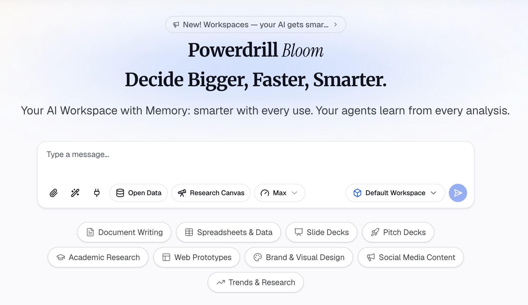
Step 2: Describe the figure in natural language
Say what the figure has to show. For example: "plot mean response by treatment group with standard error bars, and use distinct marker shapes so it reads in grayscale." The agent builds the chart and applies the encoding. Ask for a different grouping or an added panel and it rebuilds instead of making you restructure the sheet.
Step 3: Export the chart, report, or deck
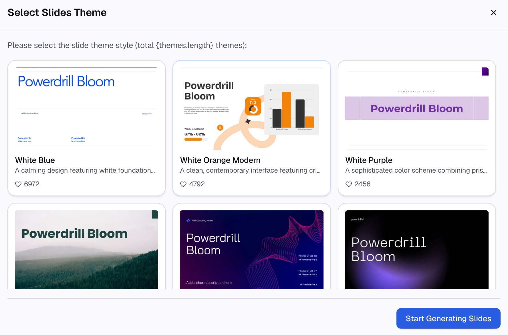
Take the chart out as an image, fold it into a written summary, or convert the canvas into slides. That covers a lab meeting or a conference talk. The AI graph maker page lists the other chart types available from the same upload.
One honest limitation: this gets the figure right in structure, labeling, and grayscale-safe encoding. Converting the final file to TIFF or EPS at your journal's dpi is a separate step in an image editor. Do that conversion last.
A pre-submission checklist
Run this before the figures leave your machine. It takes about ten minutes per figure, and a returned research paper costs considerably more than that.
Format and resolution match the journal's stated numbers. Not approximately. Exactly.
Shrink the figure to its printed width and read it on screen. If any label needs zooming, the font is too small.
Convert a copy to grayscale. Every series still distinguishable, or fix the encoding.
Every axis has a unit. Every abbreviation is expanded in the caption.
Error bars are named, with n stated. Standard deviation, standard error, or confidence interval.
No author names, titles, or figure numbers inside the image file.
Panels are labeled consistently and referenced the same way in the text.
The short version
A chart for a research paper is a technical deliverable, not just a visualization. Build it at final print width, encode differences twice so grayscale still works, unit-label every axis, and name your error bars. Then match the journal's format, dpi, font, and color-mode requirements exactly.
If the analysis behind the figure is still in a spreadsheet, doing both in one pass is faster. Try Powerdrill Bloom free — upload your data, describe the figure, and export the chart. See also how to turn messy survey data into clear charts and AI-driven quantitative data analysis for research.
Frequently asked questions
What resolution do journal figures need?
Most journals ask for 300 dpi at minimum. PLOS ONE specifies 300 to 600 dpi and notes that anything below 300 prints blurred or pixelated. Going far above 600 can trigger resizing, so aim inside the stated band rather than as high as possible.
What file format should I use for research paper figures?
TIFF and EPS are the most widely accepted, and PLOS ONE accepts only those two, preferring TIFF. Check your target journal, because some accept PDF or high-resolution PNG. If you submit EPS, embed the fonts or convert them to outlines.
How do I make a chart readable in black and white?
Encode every distinction with two channels, such as color plus line style or color plus marker shape. Then convert a copy to grayscale and confirm the series are still separable. Avoid relying on red versus green, which also fails for color-blind readers.
Should error bars show standard deviation or standard error?
Either can be correct, and what matters is saying which. Standard deviation describes the spread of your observations, while standard error describes the precision of the mean. State the choice and the sample size in the caption every time.
Can I put the figure title inside the image?
No. Journals want the number, title, and caption in the manuscript rather than baked into the file. PLOS ONE states this explicitly, and figures that include author names or captions inside the image are commonly returned.