How to Create a Gantt Chart with AI: Step by Step
A Gantt chart shows each task as a horizontal bar running from its start date to its finish date. Excel has no built-in chart type for this, so the usual route is a stacked bar chart with the first series hidden. This guide covers both the manual build and a three-step version from a task list.
Why Gantt charts are awkward to build
Microsoft states the constraint plainly. Its documentation says that "though Excel doesn't have a predefined Gantt chart type, you can simulate one by customizing a stacked bar chart." The chart is set up "to show the start and finish dates of tasks."
That word — simulate — explains every frustration people have with this chart. You are not selecting a Gantt chart. You are building a stacked bar chart and then making half of it invisible so the remaining half looks like a timeline.
The trick works. It is also fiddly in a specific way. The steps are easy to follow and easy to forget. Six months later you build the second one, and you look the recipe up again.
What you need before you start
- A task list with three columns: task name, start date, and duration in days. Microsoft's walkthrough uses a range of A1:C6 as its example.
- Dates stored as real dates, not text. This is the single most common reason a Gantt build goes wrong.
- A decision about whether duration or finish date is your source of truth. Storing both invites them to disagree.
- Optionally an owner column, if you want to group or colour by person later.
How to do it manually in Excel
Option 1: Follow the stacked bar recipe
This is Microsoft's documented approach, and it is worth knowing even if you later automate it.
Select the data — in Microsoft's example, A1:C6. Insert a stacked bar chart. Then hide the first series. Microsoft's wording is to "click the first data series (the Start part of the bar in blue)." From there, "on the Format tab, select Shape Fill > No Fill." Delete the legend and chart title if you do not need them.
One more step matters. By default the tasks run bottom to top, which reads backwards. Microsoft's instruction is to "hold the CONTROL key and select the vertical axis (Tasks)." Then choose Format Axis, and "under Axis position, choose Categories in reverse order."
From there you can refine. Microsoft notes you can add "gridlines, labels, changing the bar color, and more" through Add Chart Element on the Chart Design tab.
Option 2: Start from a template
Microsoft also points to free Gantt chart templates as an alternative to building the chart yourself.
Templates get you a good-looking result quickly. The trade-off is that your data has to fit the template's expected columns, which usually means retyping a task list you already have somewhere else.
Option 3: Save your own version as a template
Once you have built one you like, Microsoft's page describes saving it as a template so the formatting can be reused.
This is the right move if you build the same chart monthly. It does not help the first time, and it does not survive a change in the shape of your task data.
Where the manual route slows down
The build is maybe ten minutes. The maintenance is where the time goes.
Project dates move. When they do, the chart updates only if the underlying cells were the source. After a few rounds of manual tidying, they often are not. Someone has dragged a bar, or hard-typed a duration, and the chart and the plan have quietly diverged.
Then there is the reporting layer. A Gantt chart alone rarely satisfies the person who asked for it. They want to know which tasks slipped, which are on the critical path, and what the chart looked like last month. Those are questions about the data, not about the chart, and Excel's chart object has no memory of previous versions.
The third cost is presentation. A Gantt chart built for a spreadsheet is dense by design. Getting it into a deck usually means a screenshot, which cannot be updated without repeating the whole exercise.
How to create a Gantt chart with Powerdrill Bloom
Step 1: Upload the task list
Drop the project export or task spreadsheet into Powerdrill Bloom. The Free plan covers Excel, CSV, PDF, and document uploads, so a plain task list works without a paid plan.

It does not need to be tidy. A list with task names, start dates, and either durations or end dates is enough. Columns you do not need can stay in the file.
Step 2: Describe the timeline you want
Ask in natural language rather than specifying chart mechanics. Something like: build a Gantt chart from these tasks, ordered by start date, with each bar labelled by owner.
This is the part the manual route makes hard. Reordering, grouping, or colouring by a field means rebuilding the series in Excel; here it is a change to the request.
Step 3: Generate the chart and the status summary together
Ask for both outputs at once — the chart plus a short written summary of what slipped and what is at risk. Powerdrill Bloom's Free plan lists generating insights, charts, and summaries, and the Pro plan adds deeper analysis, visualization, and reporting with Office document output.
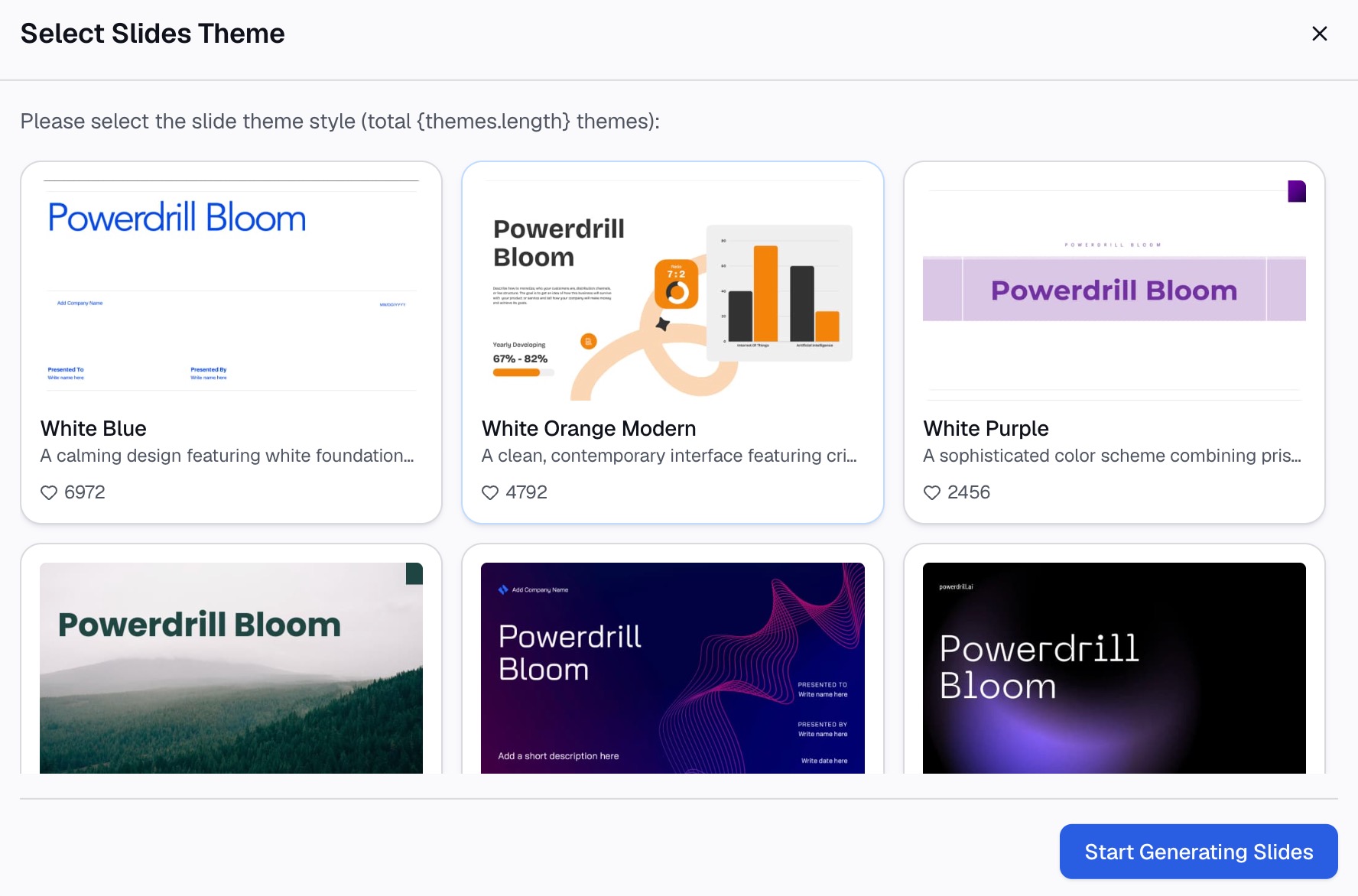
Because both come from the same file, the commentary and the timeline cannot disagree with each other. When dates change, you regenerate rather than re-format.
What this saves
| Task | In Excel | From the uploaded task list |
|---|---|---|
| First build | 10–15 minutes following the stacked bar recipe | One request |
| Reordering or grouping by owner | Rebuild the series | Change the request |
| Refreshing after dates move | Manual, and only if the cells are still the source | Regenerate |
| Getting it into a deck | Screenshot, repeat when it changes | Slide output from the same pass |
| Written status alongside the chart | A separate document | Produced together |
Best practices
Keep dates as dates. If a column is text, every downstream step misbehaves. Fix it in the source file, not in the chart.
Pick duration or end date, not both. Two sources of truth for the same bar means one of them will be stale.
Do not put sixty tasks on one chart. Group them by phase or workstream and produce one chart per group. A Gantt chart is a communication device, and past roughly twenty bars it stops communicating.
Mark today. A vertical line at the current date turns a plan into a status report. Without it, the reader has to work out where they are.
Pair the chart with a written status. The bars show the shape; the text explains the two that moved. A weekly status report covers the narrative side, and a project handover report is where the timeline eventually needs to land.
Conclusion
Excel can produce a perfectly good Gantt chart, and Microsoft documents exactly how. The cost is not the first build — it is the fourth revision, when the plan has moved and the chart has not.
If your task list already exists as a file, try Powerdrill Bloom and generate the timeline and the status commentary from the same pass. For other chart types from the same data, the AI graph maker and make graphs from Excel routes cover the rest.
Frequently asked questions
Does Excel have a Gantt chart type?
No. Microsoft's documentation states that Excel "doesn't have a predefined Gantt chart type." It describes simulating one by customizing a stacked bar chart to show task start and finish dates.
How do you make a Gantt chart in Excel step by step?
Select your task, start, and duration columns, insert a stacked bar chart, then set the first data series to Shape Fill > No Fill. Delete the legend and title, then set the vertical axis to Categories in reverse order so tasks read top to bottom.
Why do my Gantt bars appear in the wrong order?
Excel plots categories bottom to top by default. Microsoft's fix is to select the vertical axis, open Format Axis, and under Axis position choose Categories in reverse order.
What data do I need for a Gantt chart?
At minimum a task name, a start date, and a duration or finish date. Dates must be stored as real dates rather than text, and you should pick either duration or finish date as the single source of truth.
Can I generate a Gantt chart without building it manually?
Yes. Upload the task list, describe the timeline in natural language, and generate the chart and a written status summary from the same file. Regenerating after dates change avoids re-formatting the chart by hand.