Data Facts of MBA Admission, Class 2025

Nowadays, more and more people are choosing to study for an MBA. Today, Powerdrill AI will explore the MBA Admission dataset, Class 2025.
Source: Kaggle
The dataset offers a detailed overview of applicant profiles, showcasing the diversity in their academic backgrounds, professional experiences, and demographic characteristics. This rich variety of information provides a solid foundation for analyzing trends and patterns, enabling more informed and data-driven decisions in the MBA admissions process. By leveraging these insights, institutions can better understand the applicant pool and tailor their strategies to identify top candidates.
Relevant Inquiries:
Q1.What is the distribution of gender among the applicants?
Q2.What is the distribution of GMAT scores among admitted and waitlisted applicants?
Q3.How does the average GMAT score vary across different majors?
Q4.How does the admission rate vary across different races?
Q5.What is the distribution of work industries among the applicants?
Q6.Analyze the correlation between work industry and admission outcomes (Admit, Waitlist).
Q7.Analyze the correlation between GPA and admission status to see if academic performance has a significant impact on admissions.
Q8.Analyze the relationship between work experience and admission outcomes. Does having more work experience correlate with a higher likelihood of admission?
Q1.What is the distribution of gender among the applicants?
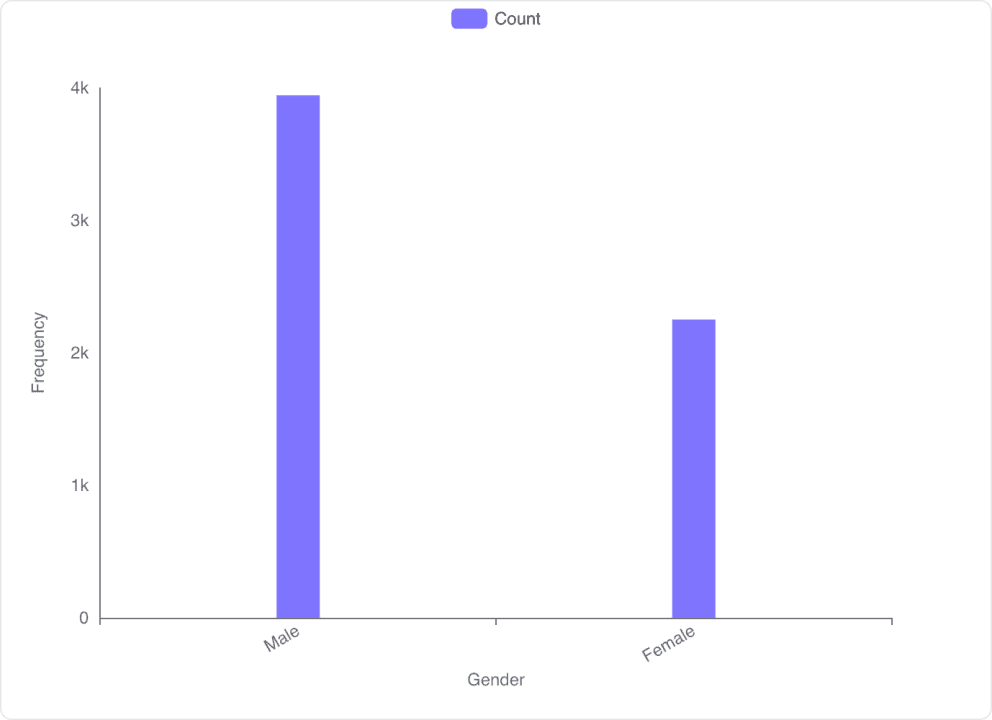
Gender Distribution Data
Gender Categories: The dataset includes two gender categories: 'Male' and 'Female'.
Count Statistics: The mean count is 3097.00 with a standard deviation of 1196.42. The minimum count is 2251, and the maximum count is 3943.
Detailed Counts: There are 3943 male applicants and 2251 female applicants.
Visualization of Gender Distribution
Bar Chart Representation: The bar chart visualizes the frequency of each gender among the applicants.
Male Applicants: Represented by a bar reaching approximately 4000 on the frequency axis.
Female Applicants: Represented by a bar reaching approximately 2250 on the frequency axis.
Conclusion and Insights
Higher Male Representation: There are significantly more male applicants (3943) compared to female applicants (2251).
Visual Confirmation: The bar chart clearly shows the disparity in the number of applicants by gender, with males being the predominant group.
Q2.What is the distribution of GMAT scores among admitted and waitlisted applicants?
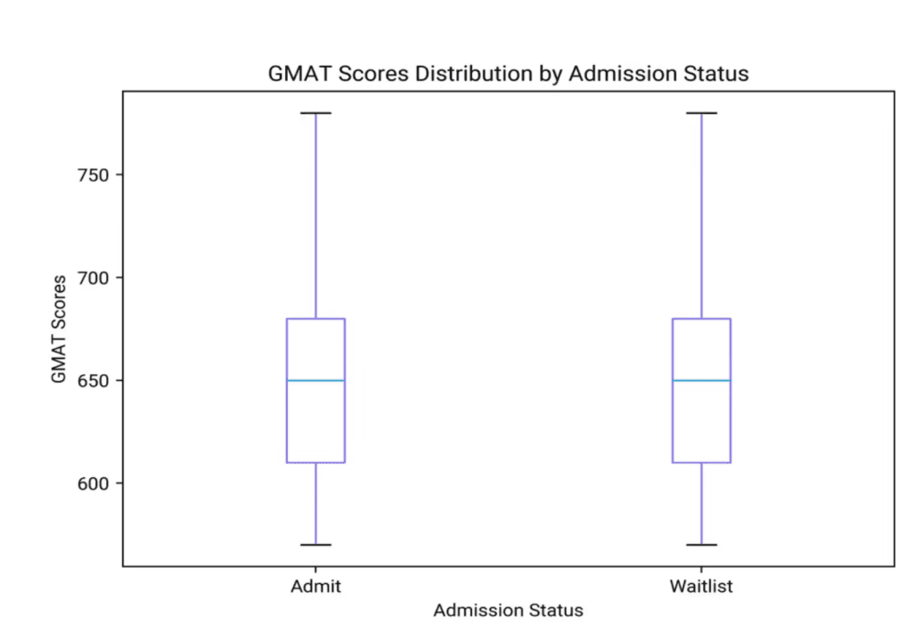
GMAT Scores Data Overview
Mean GMAT Score: The average GMAT score across all applicants is 651.09.
Standard Deviation: The GMAT scores have a standard deviation of 49.29, indicating moderate variability.
Range: The GMAT scores range from a minimum of 570.00 to a maximum of 780.00.
GMAT Scores Distribution Visualization
Admitted Applicants: The box plot shows that the median GMAT score for admitted applicants is around 650. The interquartile range (IQR) is approximately from 620 to 680, with the whiskers extending from about 600 to 750.
Waitlisted Applicants: The median GMAT score for waitlisted applicants is also around 650. The IQR is similar to that of admitted applicants, ranging from approximately 620 to 680, with whiskers extending from about 600 to 750.
Conclusion and Insights
Similar Median Scores: Both admitted and waitlisted applicants have a similar median GMAT score of around 650.
Comparable Variability: The interquartile ranges and overall spread of GMAT scores are quite similar for both groups, indicating that GMAT scores alone may not be a distinguishing factor between admitted and waitlisted applicants.
Potential Additional Factors: Given the similarity in GMAT score distributions, other factors such as work experience, essays, and interviews might play a significant role in the admission decision process.
Q3.How does the average GMAT score vary across different majors?
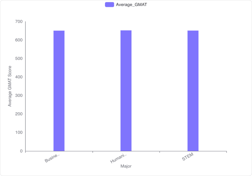
Average GMAT Scores by Major
Business: The average GMAT score for Business majors is 650.36.
Humanities: The average GMAT score for Humanities majors is 651.83.
STEM: The average GMAT score for STEM majors is 650.83.
Visualization of Average GMAT Scores
Bar Chart Representation: The bar chart visually represents the average GMAT scores across the three majors: Business, Humanities, and STEM. The scores are relatively close to each other, with Humanities having the highest average GMAT score.
Conclusion and Insights
Humanities Majors: Humanities majors have the highest average GMAT score at 651.83.
Business and STEM Majors: Business and STEM majors have similar average GMAT scores, with Business at 650.36 and STEM at 650.83.
Overall Variation: The variation in average GMAT scores across the majors is minimal, indicating that students from different majors perform similarly on the GMAT.
Q4.How does the admission rate vary across different races?
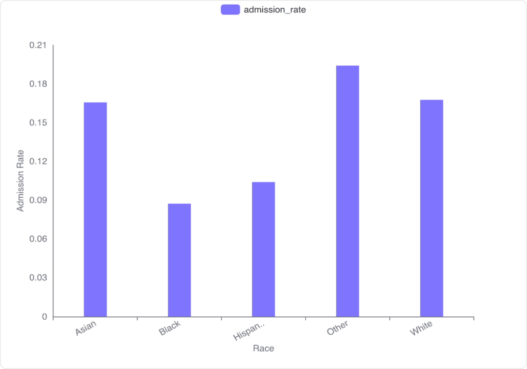
Admission Rate Data
Asian: The admission rate is approximately 16.56%.
Black: The admission rate is approximately 8.73%.
Hispanic: The admission rate is approximately 10.40%.
Other: The admission rate is approximately 19.41%.
White: The admission rate is approximately 16.76%.
Conclusion and Insights
Significant Variation: There is a significant variation in admission rates across different races, with the "Other" category having the highest rate and the "Black" category having the lowest.
Close Rates: The admission rates for "Asian" and "White" categories are relatively close, both around 16.5% to 16.8%.
Potential Factors: The variation in admission rates may be influenced by multiple factors, including but not limited to socio-economic background, access to resources, and institutional biases. Further investigation would be needed to understand the underlying causes.
Q5.What is the distribution of work industries among the applicants?
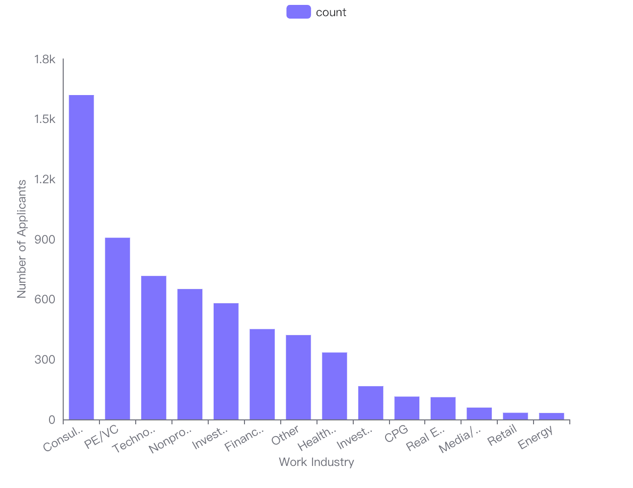
Analysis of Work Industry Data
Consulting: The most represented industry with 1619 applicants.
PE/VC (Private Equity/Venture Capital): The second most common industry with 907 applicants.
Technology: Has 716 applicants.
Nonprofit/Government: Includes 651 applicants.
Investment Banking: Comprises 580 applicants.
Financial Services: Accounts for 451 applicants.
Other: Represents 421 applicants.
Health Care: Has 334 applicants.
Investment Management: Includes 166 applicants.
CPG (Consumer Packaged Goods): Comprises 114 applicants.
Real Estate: Accounts for 111 applicants.
Media/Entertainment: Represents 59 applicants.
Retail: Has 33 applicants.
Energy: The least represented industry with 32 applicants.
Visualization of Work Industry Distribution
The bar chart visually represents the distribution of applicants across various work industries.
Consulting stands out as the most dominant industry.
PE/VC and Technology follow as the next most common industries.
Nonprofit/Government and Investment Banking also have significant representation.
Health Care and Financial Services show moderate representation.
Other industries like Investment Management, CPG, Real Estate, Media/Entertainment, Retail, and Energy have fewer applicants.
Conclusion and Insights
Consulting is the leading industry among applicants, indicating a high interest or demand in this field.
PE/VC and Technology are also popular choices, reflecting trends in finance and tech sectors.
Nonprofit/Government and Investment Banking have substantial representation, suggesting diverse interests among applicants.
Health Care and Financial Services show moderate interest, while other industries have relatively lower representation.
This distribution can help in understanding the career preferences and trends among the applicant pool.
Q6.Analyze the correlation between work industry and admission outcomes (Admit, Waitlist).
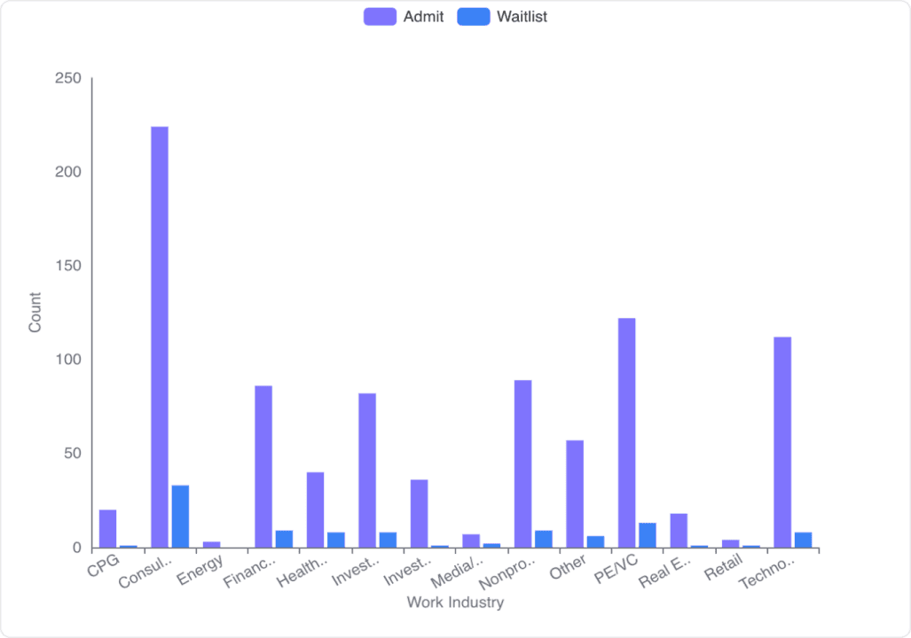
Data Overview
Work Industries: The dataset includes 14 different work industries such as CPG, Consulting, Energy, Financial Services, Health Care, etc.
Admit Statistics: The mean number of admits is 64.29, with a standard deviation of 61.23. The minimum number of admits is 3, and the maximum is 224.
Waitlist Statistics: The mean number of waitlists is 7.14, with a standard deviation of 8.51. The minimum number of waitlists is 0, and the maximum is 33.
Admission and Waitlist Counts by Industry
Consulting: Highest number of admits (224) and waitlists (33).
Financial Services: Significant number of admits (86) and moderate waitlists (9).
PE/VC: High number of admits (122) and waitlists (13).
Technology: High number of admits (112) and moderate waitlists (8).
Health Care: Moderate number of admits (40) and waitlists (8).
Energy: Lowest number of admits (3) and no waitlists.
Visualization Insights
Consulting: Dominates in both admits and waitlists, indicating a strong correlation with admission outcomes.
Financial Services, PE/VC, and Technology: Show high admits with moderate waitlists, suggesting these industries also have a strong correlation with admission outcomes.
Energy: Shows minimal admits and no waitlists, indicating a weak correlation with admission outcomes.
Other Industries: Such as CPG, Health Care, Investment Banking, and Nonprofit/Gov, show varying levels of admits and waitlists, indicating moderate correlations.
Conclusion and Insights
Strong Correlation: Consulting, Financial Services, PE/VC, and Technology industries show a strong correlation with higher admission outcomes.
Weak Correlation: Energy industry shows a weak correlation with admission outcomes.
Moderate Correlation: Other industries like CPG, Health Care, and Investment Banking show moderate correlations with admission outcomes.
This analysis highlights the significant impact of work industry on admission outcomes, with certain industries like Consulting and Technology having a notably higher influence.
Q7.Analyze the correlation between GPA and admission status to see if academic performance has a significant impact on admissions.
Correlation Coefficient
Correlation Coefficient: The correlation coefficient between GPA and admission status is 0.097. This indicates a very weak positive correlation, suggesting that higher GPAs are slightly associated with higher chances of admission, but the relationship is not strong.
Hypothesis Testing
P-value: The p-value for the correlation is 0.0021. This is significantly lower than the common alpha level of 0.05, indicating that the correlation between GPA and admission status is statistically significant.
Conclusion and Insights
Weak Positive Correlation: There is a weak positive correlation between GPA and admission status, suggesting that while GPA does have some impact on admissions, it is not a strong predictor.
Statistical Significance: Despite the weak correlation, the relationship is statistically significant, meaning that GPA does play a role in the admissions process, albeit a small one.
Q8.Analyze the relationship between work experience and admission outcomes. Does having more work experience correlate with a higher likelihood of admission?
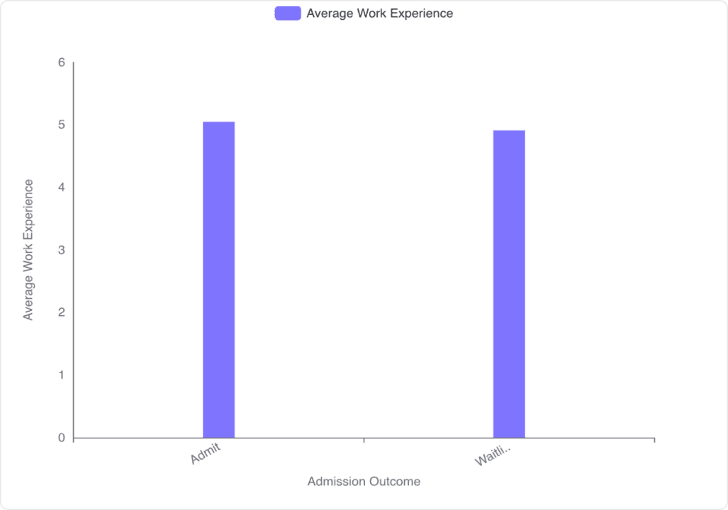
Analysis of Work Experience and Admission Outcomes
Admitted Applicants: The average work experience for admitted applicants is approximately 5.05 years.
Waitlisted Applicants: The average work experience for waitlisted applicants is approximately 4.91 years.
Visualization of Work Experience and Admission Outcomes
Bar Chart Comparison: The bar chart visually represents the average work experience for admitted and waitlisted applicants. It shows that admitted applicants have slightly more work experience compared to waitlisted applicants.
Conclusion and Insights
Correlation: There is a slight correlation between having more work experience and a higher likelihood of admission. Admitted applicants tend to have more work experience on average compared to waitlisted applicants.
Implication: While work experience appears to be a factor in admission decisions, the difference in average work experience between admitted and waitlisted applicants is relatively small. This suggests that other factors may also play a significant role in the admission process.
Try Now
Try Powerdrill AI now, explore more exciting data stories in an effective way!