Data Visualization for Business Analysts: A Comprehensive Guide

Introduction
In today’s data-driven business environment, effective data visualization is a crucial skill for business analysts. By presenting data visually—through graphs, charts, and interactive dashboards—business analysts not only simplify intricate data but also make patterns, trends, and anomalies more accessible, allowing stakeholders to make faster, informed decisions. Without proper visual representation, even the most profound findings can be lost in translation. Data visualization allows analysts to tell compelling stories, reveal hidden trends, and drive actionable business decisions.
Understanding the Basics of Data Visualization
What is Data Visualization?
Data visualization involves the design and creation of graphic representations that make large, complex sets of quantitative and qualitative data easier to communicate and understand. Using static, dynamic, or interactive visual elements, these visualizations present data from specific fields of expertise in a way that is accessible to a wider audience. The goal is to enable users to visually explore and quickly grasp key insights, such as patterns, relationships, trends, outliers, and other structures within the data that might be difficult to detect otherwise.
Types of Data Visualization
There are several types of data visualizations, each serving different purposes:
Bar Charts: Ideal for comparing categories of data.
Line Graphs: Useful for showing trends over time.
Pie Charts: Great for illustrating proportions.
Heatmaps: Perfect for highlighting the intensity of data values in a dataset.
Scatter Plots: Excellent for visualizing relationships between variables.
Each of these visual tools has its strengths and is suitable for different kinds of data stories.
Best Practices for Creating Effective Visualizations
1. Know Your Audience
The first step in creating an impactful visualization is understanding who will be viewing it. A dashboard for a team of data scientists will look different from one designed for the executive team. Tailor your visualizations based on the audience’s level of data literacy, their interests, and their needs.
2. Choose the Right Visualization for the Data
Not all data fits well into every type of visualization. A clear understanding of the dataset’s nature will help in selecting the appropriate visual tool. For example, categorical data is best represented in bar charts, while continuous data might be more informative in a line graph or histogram.
3. Design Principles
Good visual design enhances comprehension. Here are some design principles to keep in mind:
Simplicity: Avoid clutter. Too much information in a single visualization can confuse rather than inform.
Consistency: Use consistent color schemes and fonts across multiple visualizations.
Highlight Key Information: Make the most critical insights stand out using size, color, or labels.
Data Visualization Tools for Business Analysts
Overview of Popular Tools
There are numerous data visualization tools available, each with its own strengths. Some popular tools include:
Powerdrill: A rising star in the data visualization space, especially for business analysts, thanks to its ease of use and powerful functionality.
Tableau: A powerful platform known for its flexibility and advanced features.
Power BI: Microsoft’s robust tool for visualizing data from various sources.
Google Data Studio: A free and accessible tool for basic visualizations.
How Powerdrill can be used to analyze and present data?
Powerdrill stands out due to its seamless integration with data processing workflows and a wide range of visualization options. The platform offers a user-friendly interface that makes it easy to create impactful visualizations for various business purposes. Here are a few examples of how Powerdrill can be used to analyze and present data from a retail database.
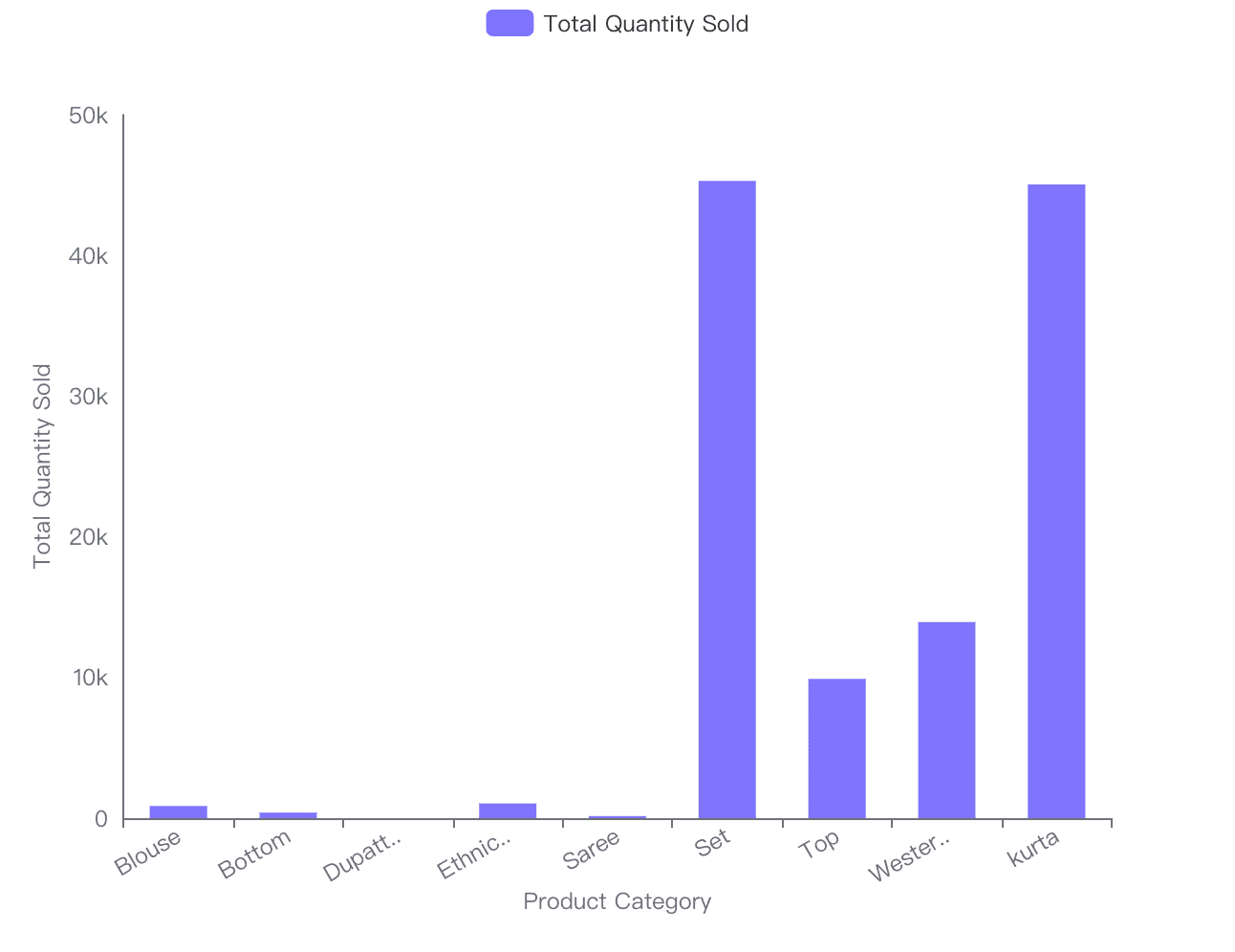
Example 1: Sales by Product Category
This bar chart highlights the total sales across different product categories. By using Powerdrill’s filtering and sorting options, This insight can help the business identify and focus on top-selling products.
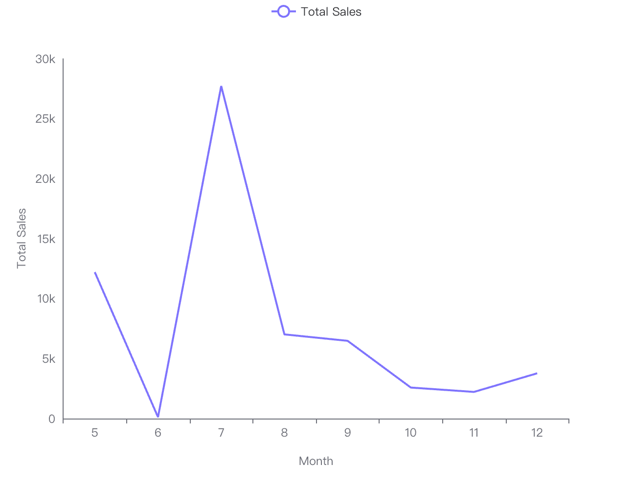
Example 2: Monthly Sales Trends
In this line graph, you can see a monthly trend of sales over the past year. Business analysts can forecast future sales and adjust inventory according to the seasonal patterns and growth trends.
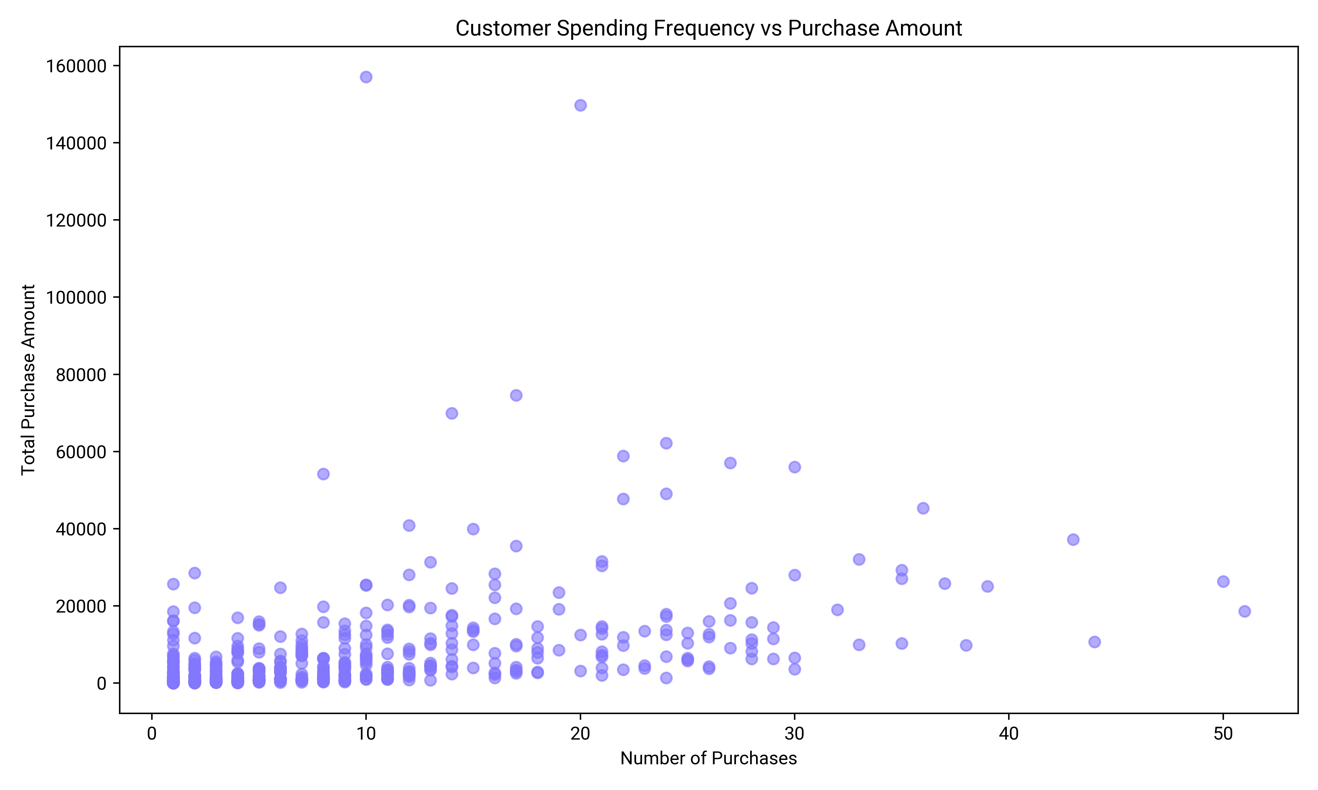
Example 3: Relationship Between Customer Spending Frequency and Purchase Amount
This scatterplot reveals the relationship between how frequently customers make purchases and the amount they spend per transaction. The plot helps identify high-value customers who make frequent, large purchases, offering valuable insight for loyalty programs or targeted marketing efforts.
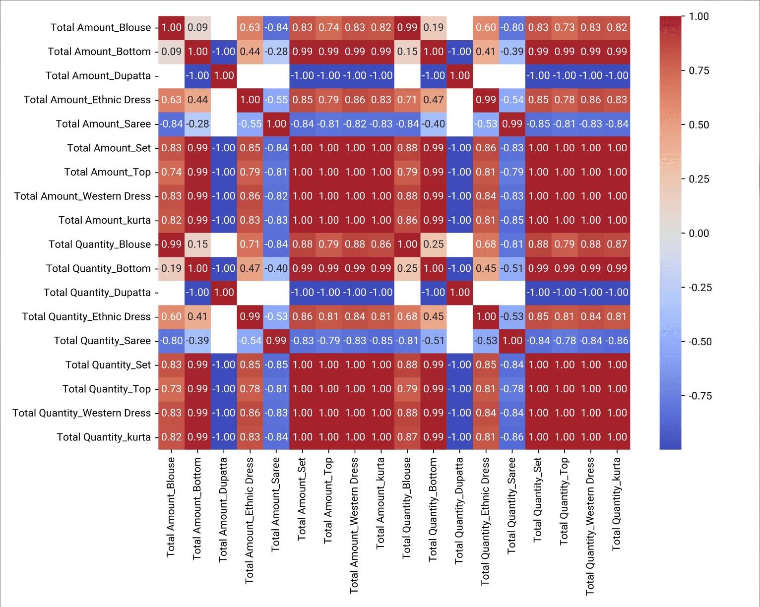
Example 4: Product Combination Sales Comparison
This heatmap showcases the sales performance of various product combinations. By comparing different categories side by side, business analysts can easily spot complementary products or bundles that boost sales, helping with inventory planning and promotional strategies.
Conclusion
Effective data visualization can make or break business decisions. By presenting data in a clear and visually engaging way, analysts can ensure that decision-makers are not only informed but also able to act quickly on insights. A well-crafted visualization reduces uncertainty, highlights key performance indicators, and can even spark innovation within a company.
Now is the time to take your data visualization skills to the next level. Whether you’re new to data visualization or looking to refine your abilities, explore the tools and best practices mentioned here. Dive into Powerdrill tutorials and experiment with different types of visualizations to communicate data effectively and drive better business outcomes. The power of visual storytelling is at your fingertips—use it to transform how your organization makes decisions.