How to Build an Interactive Sales Dashboard From a CSV in Minutes (2026 Guide)

Introduction
Every successful sales team thrives on actionable data, but raw numbers trapped in endless spreadsheets rarely tell a compelling story. Whether you are tracking quarterly revenue, analyzing regional performance, or forecasting upcoming market trends, transforming a standard Comma-separated values (CSV) file into a dynamic visual experience is absolutely essential for business growth.
Unfortunately, many professionals get bogged down by complex software, turning what should be a quick insight extraction into a multi-day engineering project. Modern Data visualization has evolved significantly over the last few years, and today, you no longer need an advanced degree in data science or analytics to uncover the hidden value in your sales records.
In this comprehensive guide, we will explore exactly how you can build a stunning, fully interactive sales dashboard from a simple CSV file in mere minutes, without writing a single line of code.
What Is an Interactive Sales Dashboard?
An interactive sales dashboard is a visual interface that displays key performance indicators (KPIs) and sales metrics in a dynamic, user-controlled format. Unlike static reports or printed PDFs, interactive dashboards allow users to engage directly with the data to uncover deeper insights.
Real-Time Data Filtering: Users can click on specific dates, geographical regions, or product categories to isolate data segments instantly, making the dashboard highly adaptable to various questions.
Drill-Down Capabilities: You can click on a broad, high-level metric (like total annual revenue) to reveal the granular details beneath it (such as monthly sales broken down by individual sales representatives).
Dynamic Visualizations: Charts, graphs, and tables automatically adjust based on the parameters set by the viewer, offering a customized and highly relevant viewing experience.
Centralized Source of Truth: It aggregates scattered and disorganized CSV data into one unified, easy-to-read command center, ensuring the entire sales team is aligned on the same metrics.
Challenges of Building Sales Dashboards Manually
Historically, turning a CSV into a visual dashboard has been an uphill battle for non-technical teams, often leading to frustration and delayed decision-making.
Steep Learning Curves: Traditional Business Intelligence (BI) tools require extensive training, specialized certifications, and sometimes a foundational knowledge of SQL or Python just to get started.
Tedious Data Cleaning: Manually formatting messy CSV files—fixing inconsistent date formats, removing duplicates, and handling missing values—can consume hours of valuable time before the visualization process even begins.
Static and Lifeless Outputs: Standard spreadsheet software often generates flat, unengaging charts that cannot be manipulated, explored, or customized by the end-user during a live presentation.
Version Control Nightmares: Emailing updated spreadsheet files back and forth leads to misaligned data, overwritten files, and constant confusion over which dashboard version is the most current and accurate.
How to Build an Interactive Sales Dashboard From a CSV Using Powerdrill Bloom
To bypass the headaches of manual data processing, AI-native platforms have completely changed the data analysis game. Powerdrill Bloom is a cutting-edge, no-code data platform that acts as your personal AI data analyst. It allows absolutely anyone to transform flat, uninspiring CSV files into rich, interactive dashboards through simple text conversations. Here is how you can do it in four incredibly easy steps:
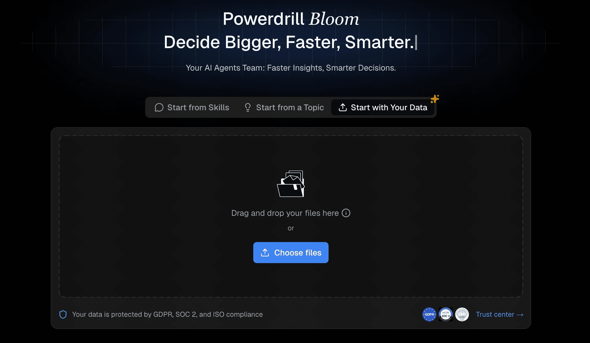
Step 1: Upload Your CSV File to Powerdrill Bloom
The journey from raw data to actionable insight begins with your file. You can seamlessly drag and drop your CSV file directly into the platform. Once uploaded, Powerdrill Bloom’s intelligent backend engine instantly reads, parses, and automatically cleans your dataset.
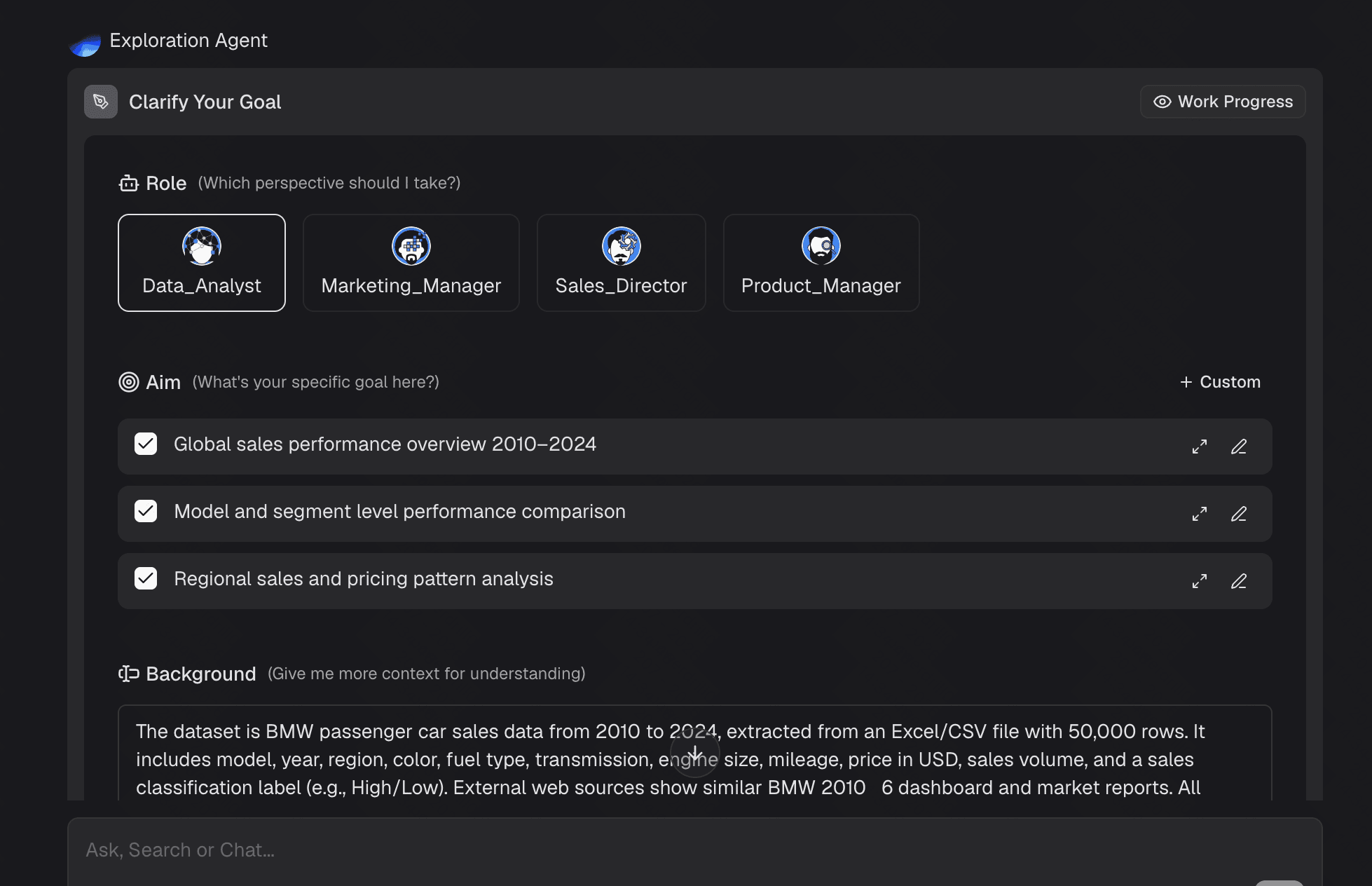
Step 2: Ask Questions in Natural Language
Instead of navigating confusing drop-down menus, writing pivot table formulas, or learning query languages, Powerdrill Bloom lets you talk directly to your data. Using the conversational chat interface, you simply ask questions exactly as you would ask a human data analyst. The advanced AI comprehends the specific intent behind your query, scans your uploaded CSV, and extracts the precise answers instantly.
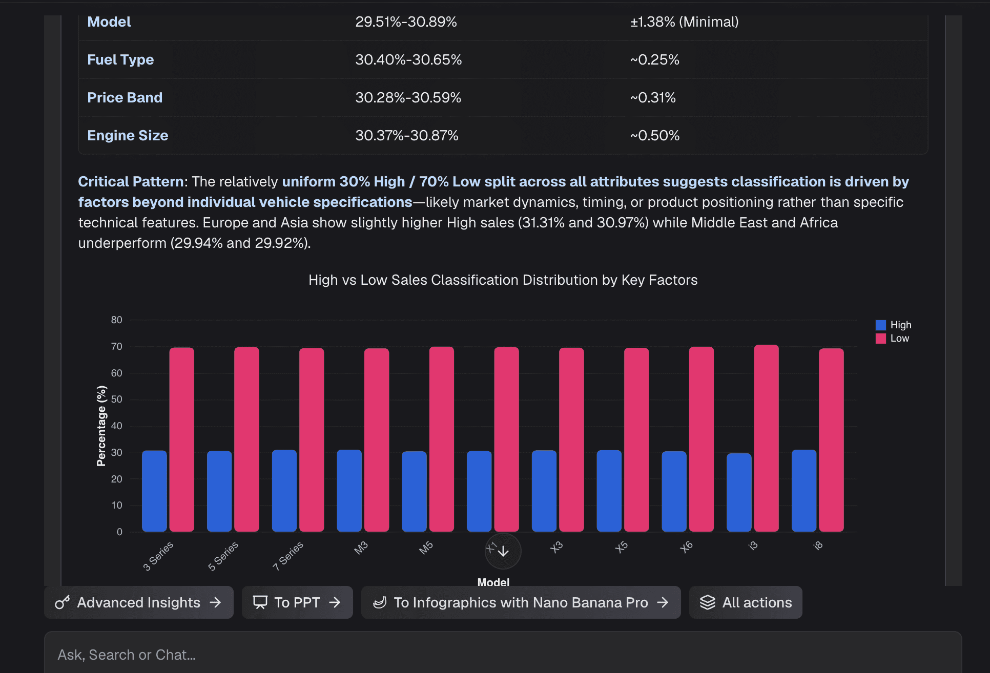
Step 3: Generate Interactive Charts Automatically
Once you ask your question, Powerdrill Bloom does much more than just give you a text-based response; it instantly generates a fully interactive chart. The AI automatically evaluates the context of your question and selects the most visually effective chart type for your specific data—whether that is a bar chart for categorical comparisons, a line graph for time-series trends, or a scatter plot for correlation analysis
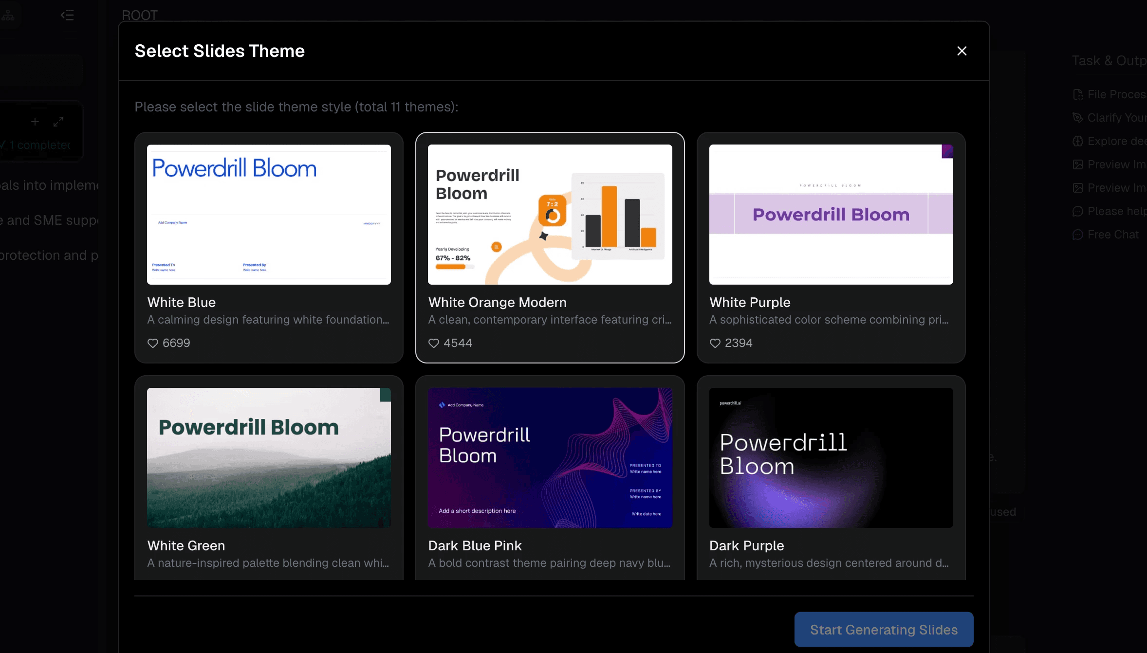
Step 4: Export and Share AI-Powered Insights
A beautifully designed dashboard is only valuable if it can be easily shared with key stakeholders. Powerdrill Bloom makes professional collaboration utterly seamless. Once your dashboard is assembled, you can generate a secure, shareable web link in just one click.
Best Practices for Sales Dashboard Design
Even with an AI powerhouse like Powerdrill Bloom effortlessly building the charts for you, structuring your overall dashboard effectively is key to driving action and understanding.
Focus on Key Metrics First: Place your most critical KPIs (like Total Revenue, Conversion Rate, or Win Rate) at the top left of the dashboard, as this is the natural starting point for the viewer's eye.
Keep It Uncluttered: Resist the urge to include every single metric available in your CSV. A dashboard should offer a high-level overview; too many charts will overwhelm the viewer and dilute the main message.
Use Consistent Color Coding: Assign specific, distinct colors to regions, product lines, or sales teams, and keep them consistent across all charts to significantly reduce cognitive load.
Provide Context and Benchmarks: Always include target lines, goals, or historical comparisons (e.g., Year-over-Year growth percentages) so viewers instantly know if the current numbers represent a success or a concern.
Conclusion
Building an interactive sales dashboard from a CSV file does not have to be a painful, time-consuming process reserved strictly for data engineers and IT departments. By understanding the essentials of visual design and leveraging modern AI technology, you can easily turn static numbers into a compelling, interactive narrative in a matter of minutes.
If you are ready to stop wrestling with clunky pivot tables, eliminate data bottlenecks, and start making smarter, faster decisions, it is time to upgrade your entire workflow. Head over to Powerdrill Bloom today to effortlessly transform your raw CSVs into stunning, interactive data apps that will impress your team and drive your sales strategy forward.
FAQs
How long does it take to create a dashboard?
With Powerdrill Bloom, it takes just minutes. Upload your CSV, type a simple prompt, and the AI generates it instantly.
Do I need to know how to code?
Not at all. Powerdrill Bloom uses natural language processing, meaning you just chat with the AI to build visualizations.
Is my CSV data secure?
Yes. Powerdrill Bloom employs strict enterprise-grade security protocols to ensure your uploaded CSV data remains completely private and protected.
Can I share my dashboard with non-users?
Absolutely! Powerdrill Bloom allows you to generate secure web links to share interactive dashboards with anyone, instantly and easily.
Does the AI clean my messy data?
Yes. Powerdrill Bloom automatically formats dates, identifies missing values, and intelligently cleans messy CSV files upon upload.