10 Best AI Tools to Convert Excel to Graphs in 2026 (Tested & Compared)
Introduction
With the development of technology, turning messy Excel spreadsheets into stunning visual insights no longer requires advanced coding or hours of manual formatting. Today’s AI-powered tools can instantly analyze your data and convert it into dynamic graphs in seconds. But with so many software options available, which one truly fits your needs?
In this comprehensive guide, we have tested and compared the 10 best AI tools to convert Excel to graphs.Whether you need deep analytical power or a beautiful presentation, here is everything you need to know.
Quick Comparison Table
Tool | Best For | AI Capabilities | Pricing Model |
All-in-one AI graphing & insights | High | ||
Quick and simple basic charts | Low | Free | |
Fast web-based file conversion | Low | ||
Complex, unique visual layouts | None/Low | Free | |
Marketing infographics creation | Medium | ||
Interactive, embeddable charts | Medium | ||
Visual storytelling with data | Medium | Custom Pricing | |
Newsroom and editorial reporting | Low | ||
Deep data science & coding tasks | High | ||
Automated presentation slide decks | High |
1. Powerdrill Bloom
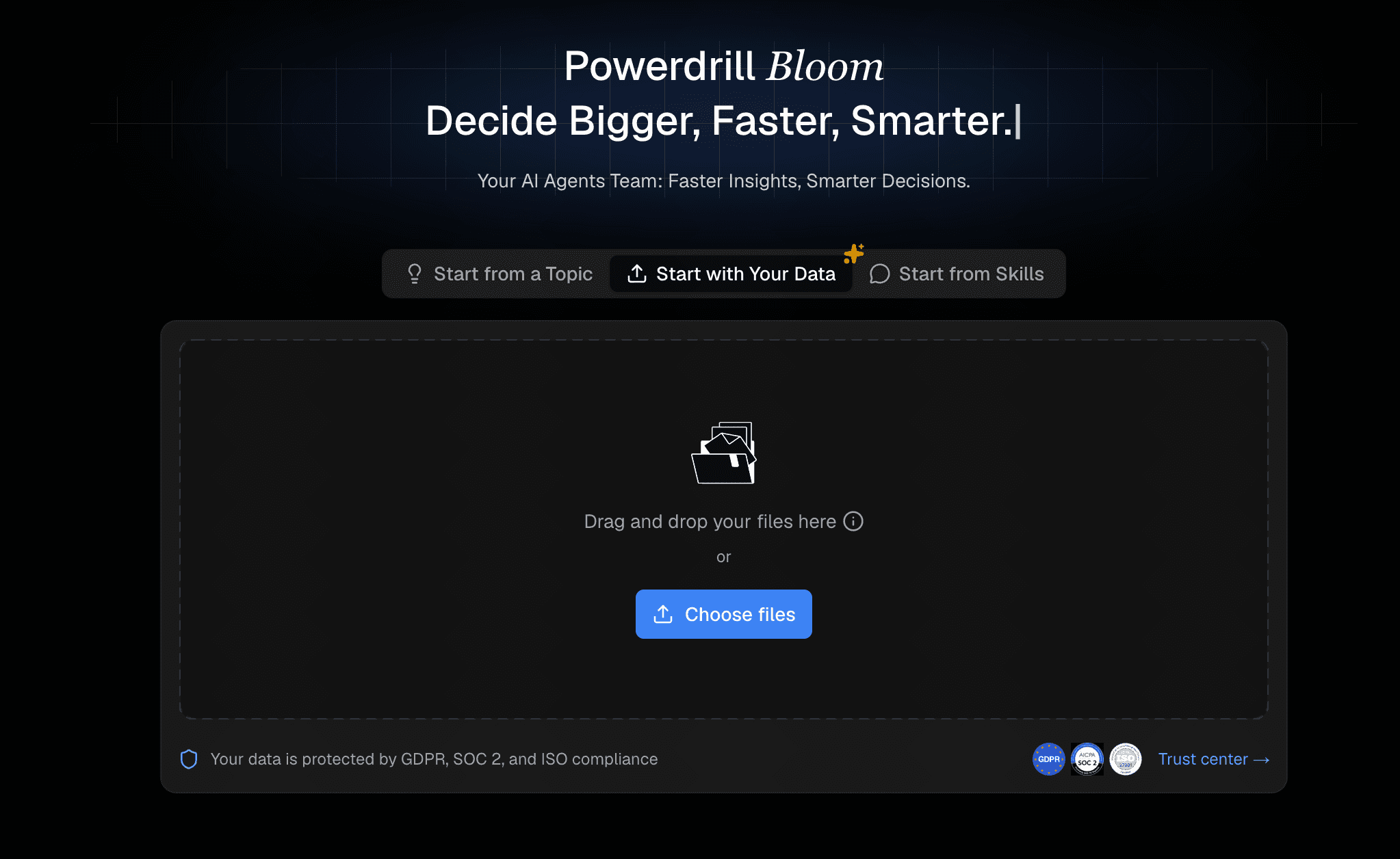
Powerdrill Bloom is a cutting-edge AI assistant designed to effortlessly transform Excel data into interactive, professional-grade charts and actionable insights using simple text prompts.
Key Features
Instant AI anomaly detection and automatic data summarization.
Natural language processing allows you to create graphs via simple chat.
Intelligently recommends the best charts and instantly generates professional, business-fancy Slides and Infographics ready for executive meetings.
Pros
Incredibly user-friendly with zero learning curve.
Highly accurate AI-driven chart recommendations.
Cons
Requires a stable internet connection for AI processing.
Advanced predictive models require a premium tier.
Pricing
Offers a generous free tier, with premium pro plans starting at $13.27/month.
2. ToolsMaverick
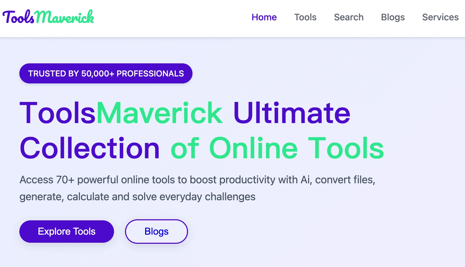
A straightforward online utility that quickly maps your Excel columns into standard, basic chart formats.
Key Features
Simple drag-and-drop interface for fast uploads.
Supports fundamental chart types like bar, line, and pie.
Pros
Extremely fast processing speeds.
No account registration required for basic tasks.
Cons
Lacks advanced AI analytical capabilities.
Very limited aesthetic customization.
Pricing
Free.
3. Aspose
Known widely for file management APIs, Aspose offers a specialized web app for directly converting Excel files into image-based graphs.
Key Features
Broad spreadsheet format support (XLSX, CSV, XLS).
Direct cloud-to-cloud conversion capabilities.
Pros
Highly secure and reliable infrastructure.
Excellent API options for software developers.
Cons
Generates static images, not interactive charts.
Clunky interface for non-technical users.
Pricing
Free web tool; commercial API usage requires a paid license.
4. RAWGraphs
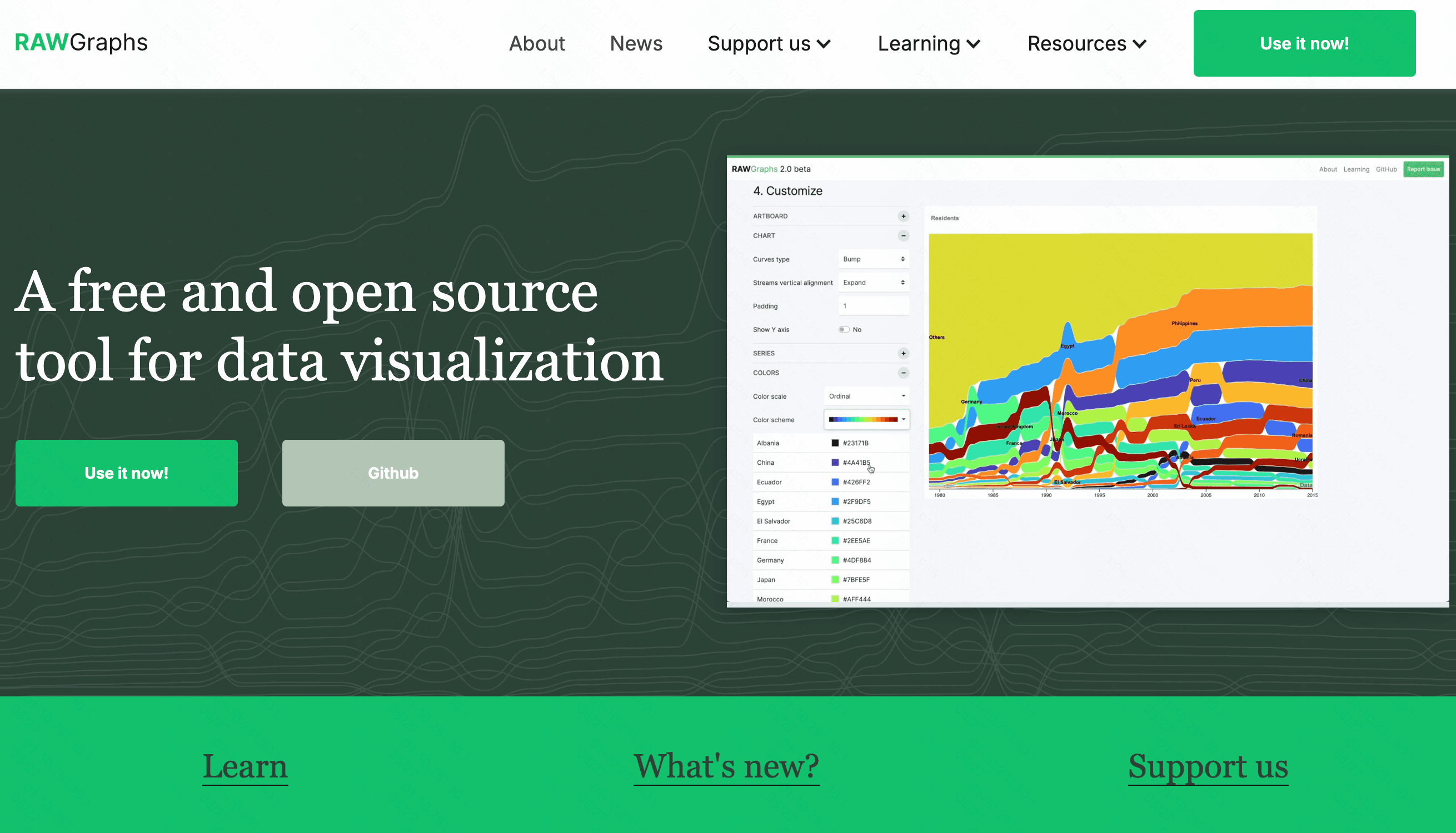
An open-source tool built to bridge the gap between spreadsheet applications and professional vector graphics editors.
Key Features
Highly customized, non-standard visual models.
Direct export to SVG for Adobe Illustrator.
Pros
Excellent for highly unique chart designs.
Completely free and privacy-friendly.
Cons
No automated AI assistance.
Steep learning curve for beginners.
Pricing
100% Free (Open Source).
5. Infogram
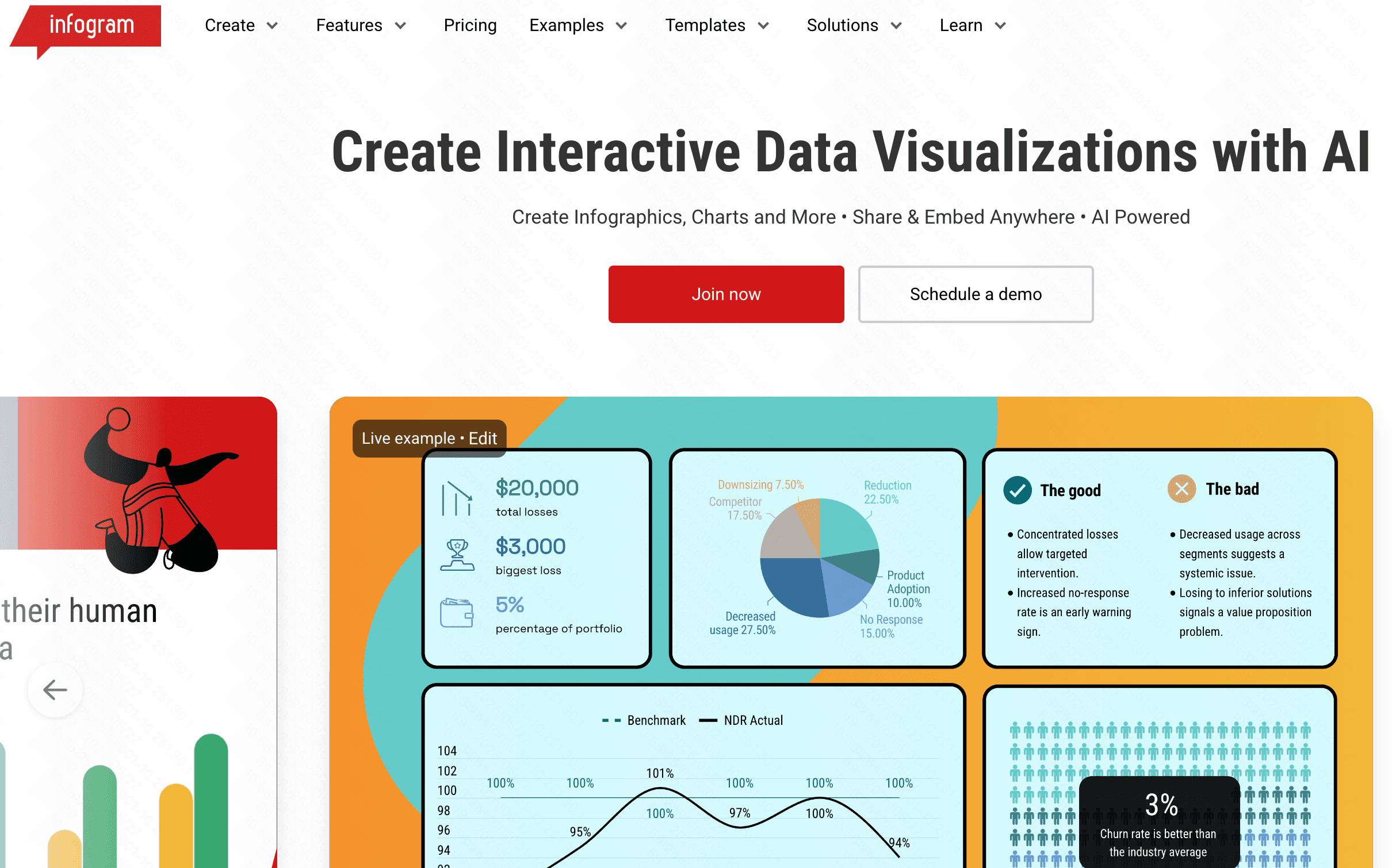
A popular web-based data visualization platform tailored specifically for digital marketers, educators, and media professionals.
Key Features
Hundreds of pre-built infographic templates.
Object animations and interactive map integrations.
Pros
Produces visually stunning, colorful outputs.
Great features for seamless team collaboration.
Cons
Can become laggy with massive Excel datasets.
Premium tiers are relatively expensive.
Pricing
Basic free plan; premium plans start at $19/month.
6. Graphy
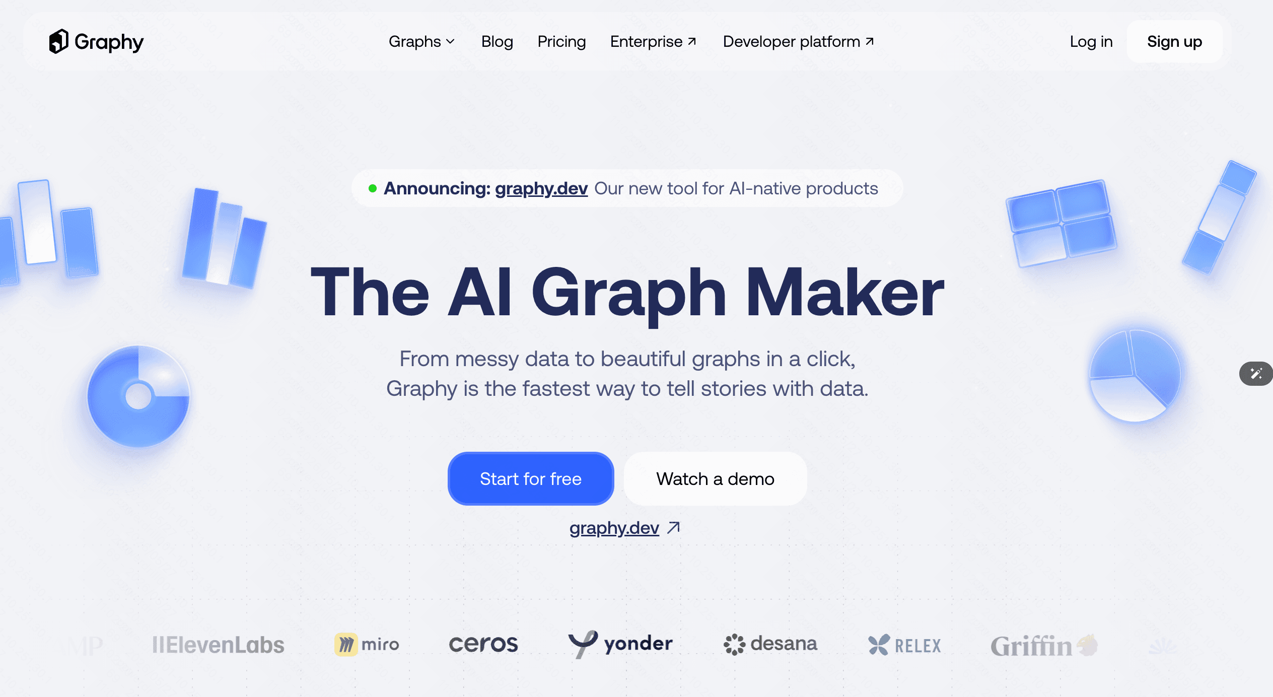
A sleek, interactive charting tool designed to make sharing data on the web and social media visually engaging.
Key Features
Modern, aesthetic default color palettes.
Easy Notion integration and web embedding options.
Pros
Very fast, responsive chart generation.
Beautiful default styling requires minimal tweaking.
Cons
Lacks deep statistical data analytics.
Not suitable for massive, highly complex datasets.
Pricing
Free tier available; Pro subscriptions start at $16/month.
7. Flourish
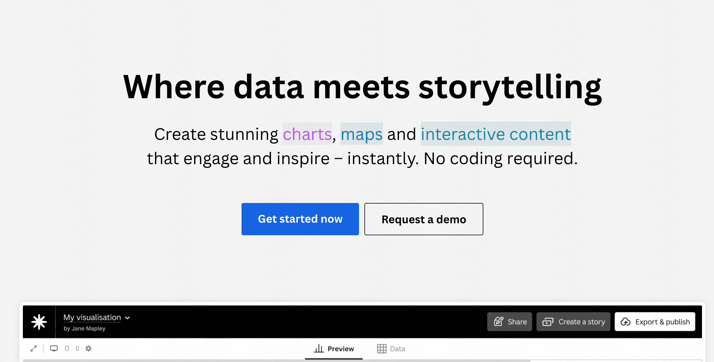
Acquired by Canva, Flourish focuses heavily on data storytelling through highly animated and interactive visuals.
Key Features
Famous for advanced racing bar charts.
Seamless integration with presentation software.
Pros
Best-in-class animations for audience engagement.
Excellent for dynamic presentations.
Cons
The vast array of settings can feel overwhelming.
The free version forces your data to remain public.
Pricing
Free for public use; custom enterprise pricing for private data.
8. Datawrapper
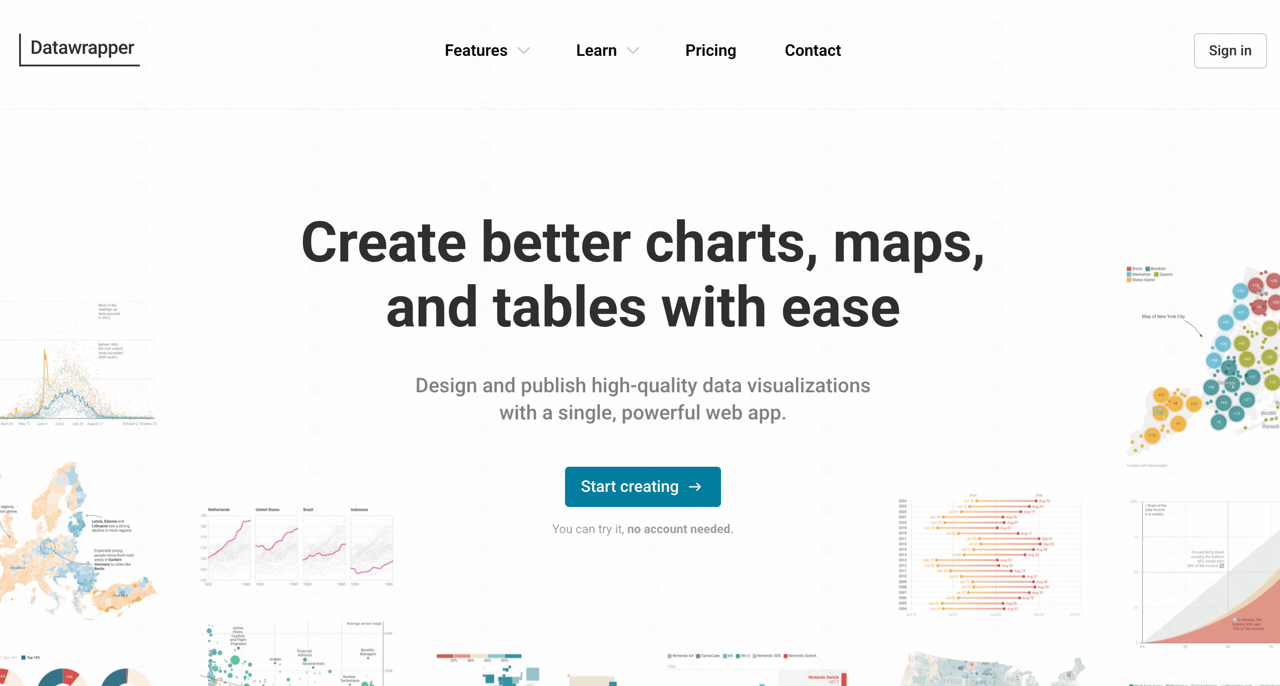
A favorite tool among global journalists, allowing users to create responsive, embeddable charts without writing any code.
Key Features
Live updating charts linked directly to spreadsheets.
Built-in tools to check for color blindness accessibility.
Pros
Perfect mobile-responsive designs.
Maintains high editorial and publication quality.
Cons
Limited AI text-to-chart conversational generation.
Custom brand design themes require expensive plans.
Pricing
Free basic plan; custom professional plans start at $599/month.
9. Julius AI
An advanced AI data analyst tool that writes and runs Python code in the background to interpret your Excel files.

Key Features
Advanced mathematical and statistical modeling.
AI-driven conversational interface for deep analytics.
Pros
Easily handles complex math and massive file sizes.
Highly transparent, showing the code it writes.
Cons
Can be overkill for simple, everyday graphing needs.
Requires some understanding of data structures.
Pricing
Free limited tier; premium plans start at $16/month.
10. Beautiful AI
An AI-powered presentation maker that automatically formats slide decks, including data charts imported directly from Excel.
Key Features
Smart slide templates that adapt as you add data.
Automatic brand alignment and color formatting.
Pros
Perfect for creating instant, professional pitch decks.
Eliminates formatting and alignment struggles entirely.
Cons
Primarily a slide tool, not a dedicated data analytics platform.
No free tier is available.
Pricing
Plans start at $12/month.
How to Choose the Best Tools for Your Work Flow
Selecting the perfect tool heavily depends on your specific daily needs. If you are a journalist focused on mobile readability, Datawrapper is an excellent choice. If you require complex mathematical modeling, Julius AI stands out. For crafting quick, aesthetic slides, Beautiful AI is superb.
However, if you want the ultimate balance of intuitive AI interaction, beautiful graphics, and powerful data analysis, Powerdrill Bloom is the unmatched leader. It bridges the gap between complex data science and everyday business needs. By allowing anyone to simply chat with their data, Powerdrill Bloom generates presentation-ready graphs instantly, making it the most efficient choice for modern workflows.
Conclusion
Converting Excel data to graphs has evolved from a tedious chore to a seamless, AI-assisted experience. While there are many capable tools in 2026, finding one that maximizes your specific productivity is key. Ready to transform your messy spreadsheets into actionable, stunning visual insights? Head over to Powerdrill Bloom today and experience the future of effortless data visualization!
FAQs
Can AI automatically choose the best graph for my data?
Yes, advanced tools like Powerdrill Bloom analyze your Excel data context and automatically recommend the most effective chart type.
Are these AI graphing tools safe for confidential data?
Most top tools use strong encryption. Always review the specific privacy policy before uploading sensitive corporate Excel spreadsheets online.
Do I need to know coding to use these tools?
Not at all! Platforms like Powerdrill Bloom use natural language processing, meaning you simply type what you want to see.
Can I export these AI-generated graphs to PowerPoint?
Yes, most platforms allow you to easily export your generated graphs as high-quality PNGs, PDFs, or directly into slides.
Is there a limit to the Excel file size I can upload?
File limits depend on your specific pricing plan. Premium plans generally support larger datasets containing millions of spreadsheet rows.