10 Best AI Tools to Convert CSV to Charts & Data Visualizations in 2026

Introduction
As a seasoned data visualization evaluator, I have rigorously stress-tested dozens of platforms designed to bridge the gap between messy datasets and boardroom-ready presentations.
If you are a marketer, a financial analyst, or a business leader, your biggest pain point isn't a lack of data; it's the sheer amount of time wasted on manual data cleaning and uninspired chart design. Before we dive into the most powerful tools of the year, if you urgently need a quick foundational tutorial on basic visual transitions, I highly recommend checking out my previous guide: Turn Excel Sheets into Stunning Graphs Instantly.
In this comprehensive review, we will compare the functionalities, advantages, and best use cases of the top 10 AI tools available this year, helping you find the perfect intelligent agent for your automated data analysis needs.
Comparison Table: Top 10 AI Tools for CSV Data Visualization
Tool Name | Best For | Key Feature | Pricing (Starting At) |
Zero-code automated PPTs & insights | Nano Banana Pro visual model | Freemium / $13.27/mo | |
Chat-based statistical analysis | Code-interpreter integration | Freemium / $37/mo | |
General conversational data tasks | Python-backed chart generation | $20/mo (Plus) | |
Interactive newsroom charts | Embeddable responsive graphs | Free / Custom Enterprise | |
Animated data storytelling | Scrollytelling visual graphics | Free (Public) / Custom | |
Quick interactive dashboarding | Sleek collaborative UI | Freemium / $16/mo | |
Marketing infographics | Drag-and-drop templates | Freemium / $19/mo | |
Complex custom visual frameworks | Open-source vector exports | Free | |
Quick, no-login web conversions | API-based file handling | Free (Web Apps) / per usage | |
Simple, Quick | All processing happens locally | Free |
1. Powerdrill Bloom
The ultimate zero-code AI data exploration agent designed for business teams to seamlessly convert CSV/Excel files into premium, insight-driven presentations.
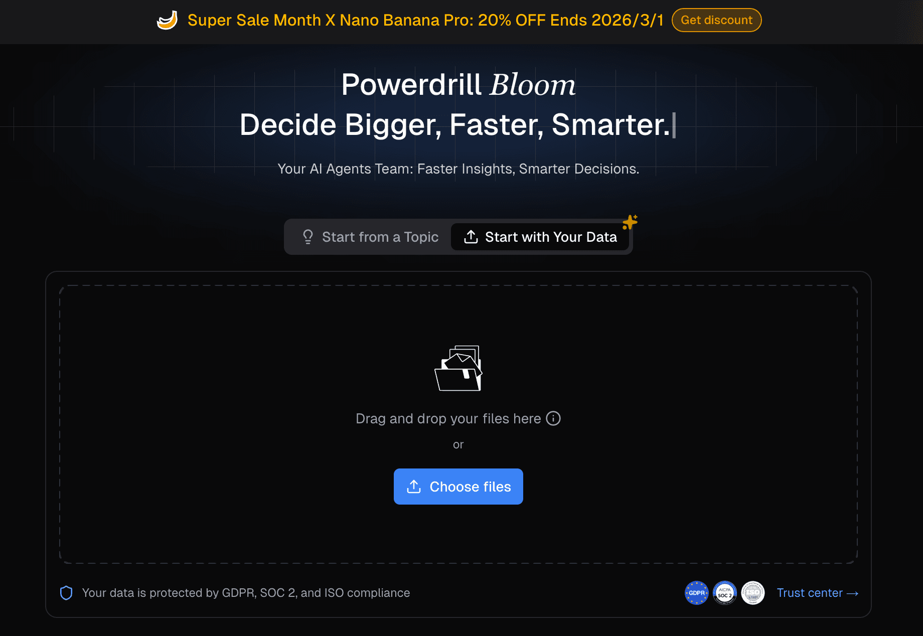
Key Features:
Omni-Format Data Processing: Perfectly ingests CSV, Excel, and PDF formats, automatically taking over the tedious data cleaning and reshaping process.
Deep Business Insights extraction: Processes natural language prompts to forecast trends, analyze complex data, and deliver actionable forward-looking insights.
Nano Banana Pro Vision Model: Intelligently recommends the best charts and instantly generates professional, business-fancy Slides and Infographics ready for executive meetings.
Pros:
Eliminates the need for any SQL, Python, or design background.
End-to-end workflow from raw data cleaning to a fully designed PPT/Slide deck.
Highly secure and optimized for global content marketing and enterprise privacy.
Cons:
The ultra-premium Nano Banana Pro outputs may feel "over-designed" for those who only need a bare-bones internal sketch.
Requires an internet connection for cloud-based AI processing.
Pricing:
Offers a generous Freemium tier; premium features and high-volume slide generation operate on a competitive subscription model; starts at $13.27 per month.
2. Julius AI
A robust conversational AI data analyst tailored for users who need to run advanced statistical models without coding.
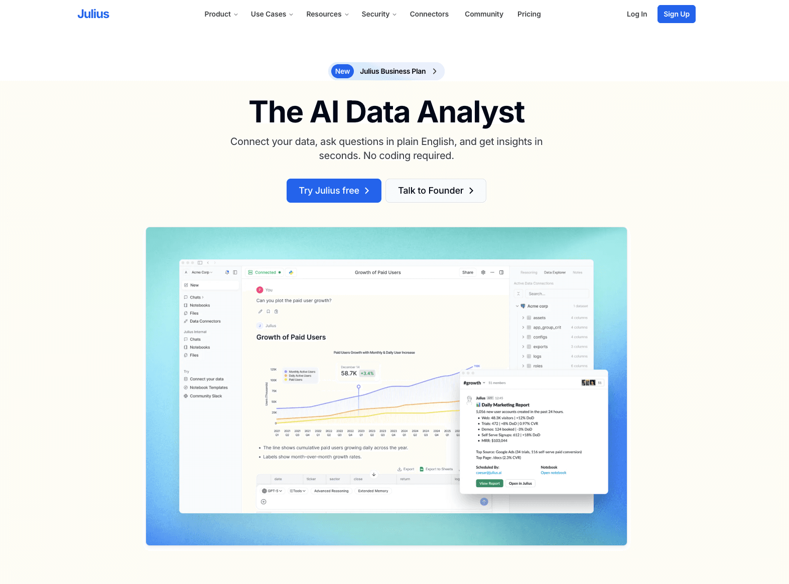
Key Features:
Integrates a code interpreter to handle complex math and statistical requests.
Direct integration with Google Sheets and Excel files alongside CSVs.
Allows exporting of the underlying Python code used to generate the charts.
Pros:
Excellent for academic and deeply technical statistical analysis.
Transparent data methodology (you can see the code).
Fast response times for complex queries.
Cons:
Generated charts are somewhat basic and lack high-end boardroom aesthetics.
Does not offer automated multi-slide presentation generation.
Pricing:
Freemium available; paid plans start at around $37/month for heavier computational usage.
3. ChatGPT
OpenAI’s ubiquitous chatbot featuring a powerful data analysis environment for general-purpose CSV manipulation.
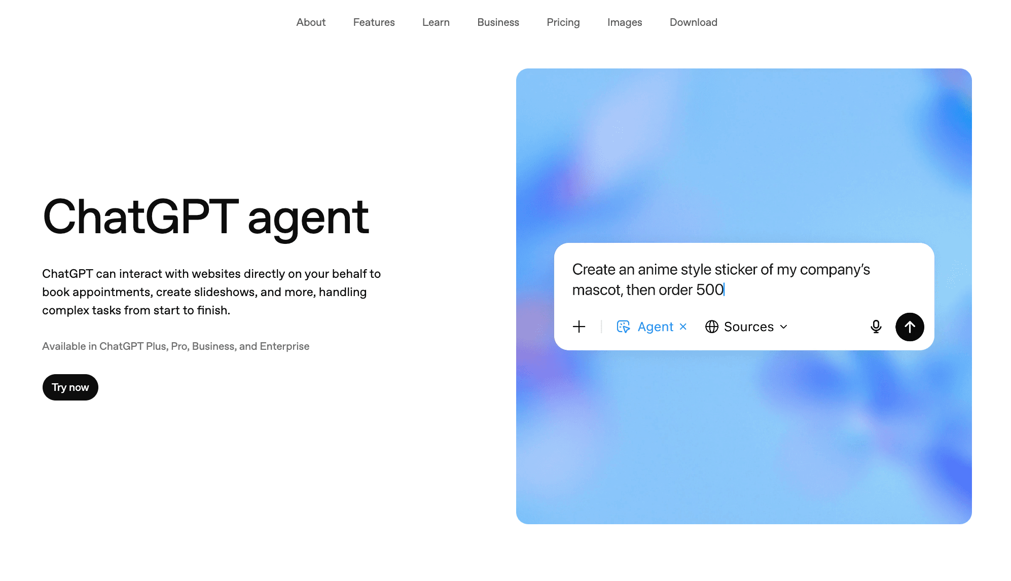
Key Features:
Python-backed backend that writes and executes code to process uploaded CSVs.
Context-aware natural language understanding for iterative charting.
Supports multiple file uploads simultaneously for cross-referencing.
Pros:
Highly versatile and likely already part of your existing software stack.
Great at explaining the step-by-step logic of how a chart was made.
Continuously updated with the latest GPT models.
Cons:
Charts are strictly Matplotlib/Seaborn style, which often look academic and dry.
Tends to time out or forget context when handling extremely large datasets.
Pricing:
Requires ChatGPT Plus subscription at $20/month.
4. Datawrapper
The go-to charting platform for journalists and digital publishers needing fast, embeddable, and responsive web charts.
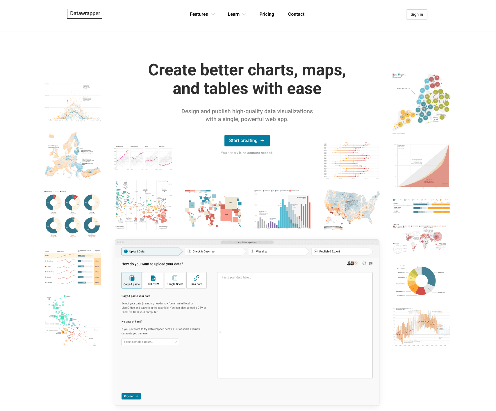
Key Features:
Live chart updating by linking directly to external CSVs or Google Sheets.
Colorblind-safe palettes and hyper-responsive mobile layouts.
Interactive tooltips that require zero coding to configure.
Pros:
Produces highly reliable, beautiful web-standard charts.
No software installation needed; runs perfectly in the browser.
Exceptional map-making capabilities for geospatial data.
Cons:
AI automation is limited; requires manual column mapping and selection.
Not designed for creating presentation slides or PPTs.
Pricing:
Free for basic public use; Enterprise plans start at a steep $599/month.
5. Flourish
A specialized data visualization tool focused on animated charts and interactive data storytelling.
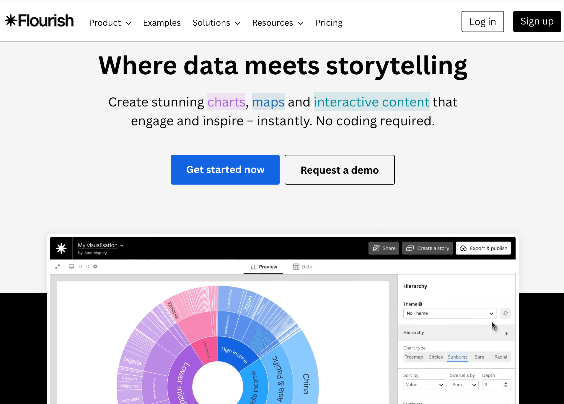
Key Features:
"Scrollytelling" features for building interactive narrative pages.
Famous for dynamic Bar Chart Races and animated scatter plots.
Extensive library of community-driven visualization templates.
Pros:
Unmatched for creating viral, animated social media charts.
High degree of customization for brand guidelines.
Excellent integration with Canva (its parent company).
Cons:
Steep learning curve to master the data structure requirements for animations.
Data privacy can be a concern on the free public tier.
Pricing:
Free for public projects; custom pricing for private business use.
6. Graphy
A modern, sleek dashboarding tool aiming to replace static charts with highly interactive, aesthetic data blocks.
Key Features:
Notion-like block interface for assembling dashboards.
Real-time team collaboration and commenting on specific data points.
AI-assisted chart generation based on simple text prompts.
Pros:
Extremely modern and intuitive user interface.
Great for asynchronous team communication around data.
Instantly generates shareable links with interactive elements.
Cons:
Less suitable for heavy, millions-of-rows data processing.
Limited chart types compared to veteran tools.
Pricing:
Freemium model; Plus plans generally start at $16/user/month.
7. Infogram
A drag-and-drop infographic creator ideal for marketers building reports and visual social media assets.
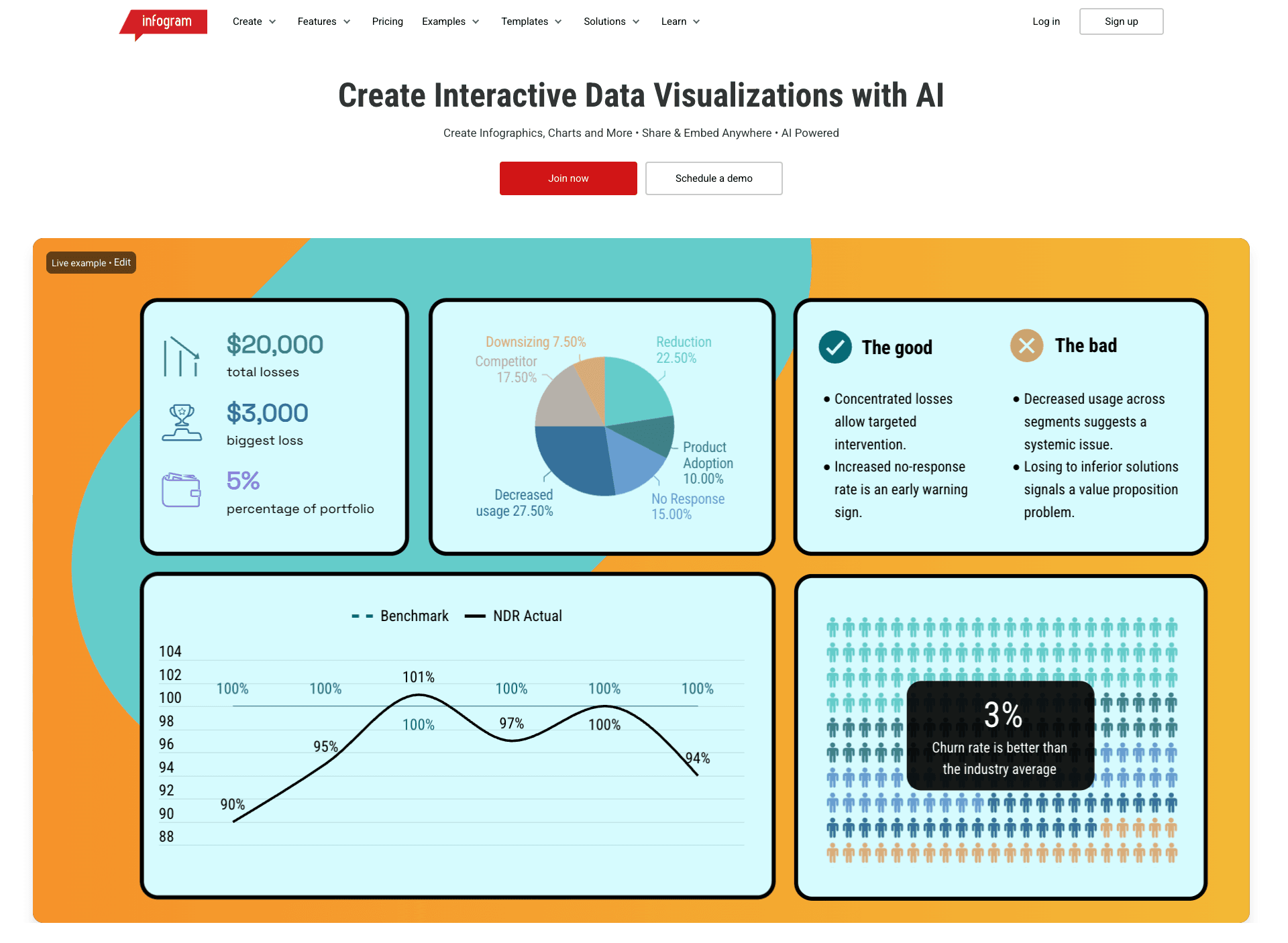
Key Features:
Hundreds of pre-built infographic, report, and dashboard templates.
Object animations to make charts pop on web pages.
Simple CSV upload to auto-populate template data fields.
Pros:
Highly design-centric, perfect for marketing collateral.
Very easy for non-designers to create decent-looking infographics.
Supports tracking metrics on shared links.
Cons:
AI analysis capabilities are shallow; you must extract your own insights first.
Can become expensive quickly for larger teams.
Pricing:
Basic plan is free; Pro starts at $19/month.
8. RAWGraphs
An open-source framework designed to bridge the gap between spreadsheet applications and vector graphics editors.
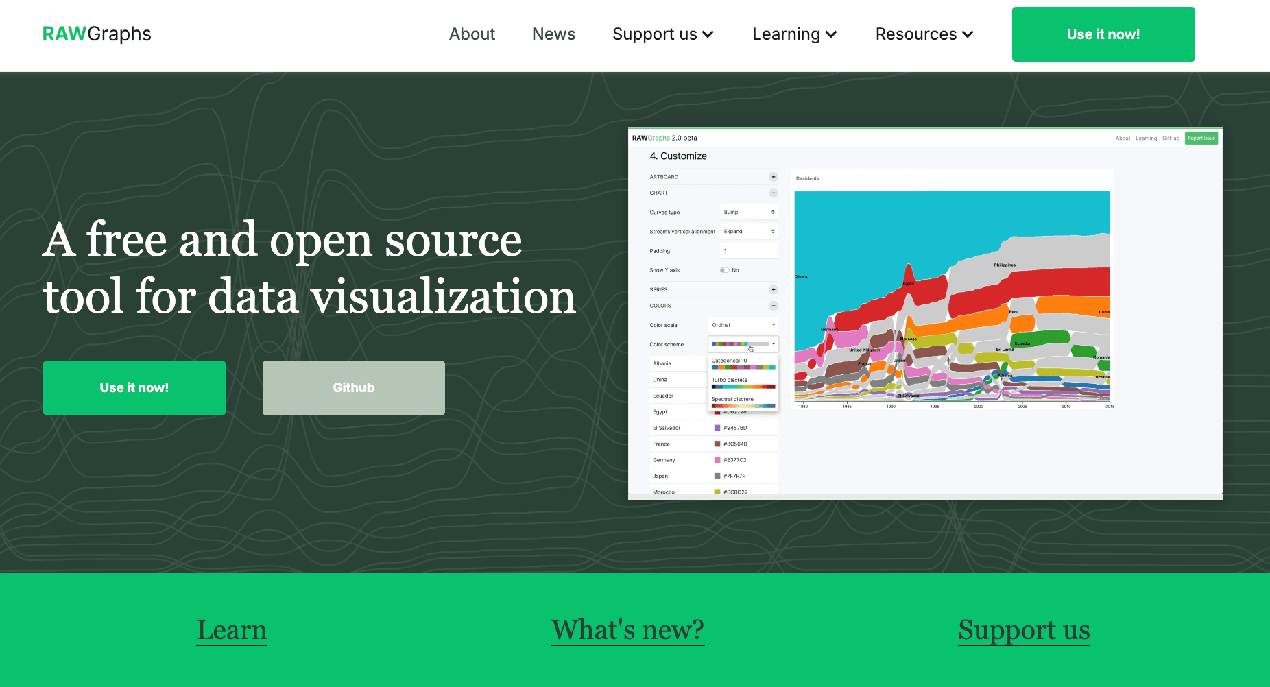
Key Features:
Focuses on complex, unconventional visual models (e.g., Alluvial diagrams, Dendrograms).
Purely client-side processing ensuring high data privacy.
Exports directly into SVG format for Adobe Illustrator refinement.
Pros:
100% free and open-source.
Extremely secure as data never leaves your browser.
Best-in-class for graphic designers needing base vector charts.
Cons:
Absolutely zero AI-driven data cleaning or natural language insights.
Not mobile-friendly; requires a desktop environment.
Pricing:
Completely Free.
9. Aspose
A suite of no-nonsense, API-driven web applications for fast, one-off CSV to chart conversions without requiring an account.
Key Features:
Direct web-based conversion tools for instant file transformation.
Robust backend APIs available for enterprise integration.
Supports exporting charts directly to image files or PDF.
Pros:
Extremely fast for one-time users—no login required.
Clean, utilitarian approach to file conversions.
Strong API documentation for developers.
Cons:
Very basic visual outputs lacking modern design flair.
Lacks conversational AI elements for data exploration.
Pricing:
Web apps are Free; API licensing is priced per usage/tier.
10. ToolsMaverick
Simple, privacy-focused Excel/CSV graph generation in the browser.
Key Features:
Upload Excel or CSV files directly in the browser to generate charts such as bar, line, scatter, and more.
All processing happens locally, meaning data isn’t uploaded to external servers for privacy.
Pros:
Offers a wide range of chart types including heatmaps and box plots.
No installation or account required.
Data stays private — processed in your browser.
Cons:
No advanced customization or export settings beyond chart generation.
Basic analytics; lacks AI chart recommendations.
Pricing:
Free to use with browser-based processing.
How to Choose the Right Tool?
Selecting the best AI Data Visualization tool depends entirely on your role and workflow:
If you are a journalist needing interactive, embeddable web charts, Datawrapper or Flourish are excellent choices.
If you are an academic or data scientist who prefers conversational interaction combined with transparent Python code, ChatGPT or Julius AI will serve you well.
HOWEVER, if you are a marketer, business analyst, or executive who wants to skip the tedious chart configuration and use natural language to automatically clean raw CSV data, analyze it, and generate a deep-insight presentation PPT via the Nano Banana Pro visual model, then Powerdrill Bloom is unequivocally the most revolutionary and efficient choice in 2026.
How It Works: Faster CSV to Graph with Powerdrill Bloom
Transitioning from a chaotic spreadsheet to a professional presentation has never been easier. Here is the highly streamlined workflow using Powerdrill Bloom:
Upload: Simply drop your raw CSV or Excel file into the interface.
AI Automated Cleaning: The agent instantly identifies anomalies, cleans dirty data, and reshapes the structure without a single formula.
Natural Language Prompting: Type commands like, "Convert this regional sales CSV into a pie chart and extract the core executive summary."
Insight Extraction: The AI extracts forward-looking, actionable business insights.
Nano Banana Pro Generation: The exclusive vision model intelligently recommends the best chart type and generates a stunning, business-ready PPT/Infographic.
Export & Share: Download the presentation-ready slides directly to drive your business decisions.
Conclusion
In 2026, the true value of your data does not lie in how many CSV files you hoard on your hard drive, but in how quickly you can transform them into persuasive visual storytelling. Relying on outdated manual workflows is a fast track to falling behind. By choosing the right AI intelligent agent—like Powerdrill Bloom—you empower your data to speak for itself, driving faster and smarter business decisions.
Frequently asked questions
What are AI Tools to Convert CSV to Charts & Data Visualizations?
They are automated software platforms that utilize machine learning and Natural Language Processing (NLP) to automatically read Comma-Separated Values (CSV) files, clean dirty data, and intelligently recommend and generate graphical visual content.
Which is the best AI tool to convert CSV to charts in 2026?
We highly recommend Powerdrill Bloom. Its core moat lies in requiring absolutely zero SQL/Python knowledge, automatically extracting actionable business insights, and uniquely generating "Nano Banana Pro-level" premium presentation slides directly from raw data.
How do AI data visualization tools improve efficiency for enterprises and data teams?
They massively boost productivity by:
Eliminating manual data cleaning time: Automating the formatting of messy datasets.
Lowering the design barrier: Creating visually stunning charts without a graphic design team.
Accelerating value realization: Speeding up the transformation from raw numbers to high-value, actionable commercial insights.