10 Best AI Graph Makers to Visualize Excel Data in 2026

Introduction
Today, AI graph makers are revolutionizing how we interact with spreadsheets. By simply uploading an Excel file, these intelligent tools can instantly generate stunning, accurate, and actionable visualizations. Whether you are a data analyst, student, or marketer, choosing the right AI graph maker can save you countless hours of tedious work.
Why Use AI Graph Makers to Visualize Excel Data?
Why should you transition to AI graph makers? First, they offer incredible speed; you can transform complex Excel spreadsheets into beautiful graphs in a matter of seconds. Second, AI tools uncover hidden trends and automatically suggest the most effective chart types for your specific dataset. Finally, they require zero coding or design skills. You can simply converse with your data using natural language, making high-level data visualization accessible to everyone, regardless of their technical background.
Quick Comparison List
Here is a quick look at the top 10 tools we will be reviewing:
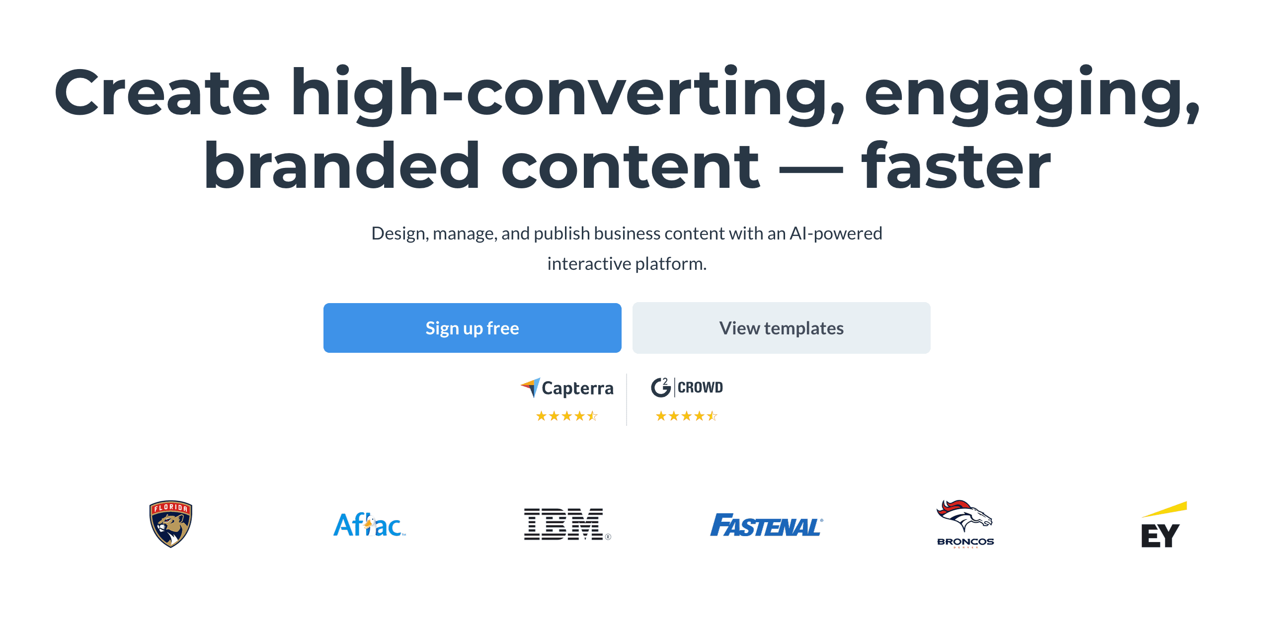
1. Powerdrill Bloom
Powerdrill Bloom is a cutting-edge AI data visualization tool that allows users to chat with their Excel data to generate instant, interactive graphs and deep analytical insights.
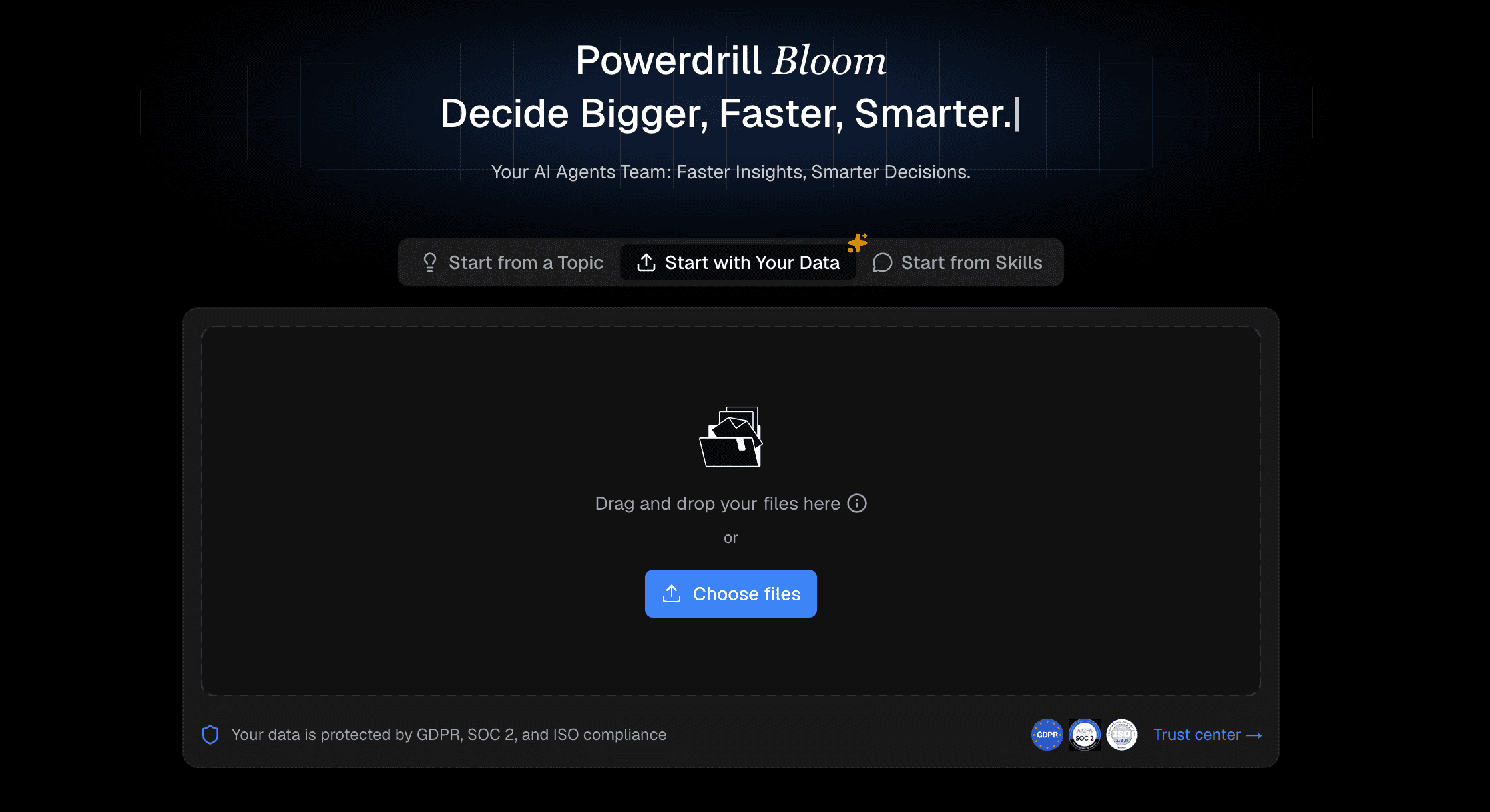
Key Features
Natural language chat-to-chart interface.
Automated data cleaning and smart chart recommendations.
Instant export to multiple formats and dashboards.
Pros
Extremely user-friendly for non-technical users.
Highly accurate AI insights and fast processing.
Cons
Requires a stable internet connection to process large AI queries.
Pricing
Free basic tier available.
Premium plans start at $13.27/month.
2. Beautiful.ai
Beautiful.ai is a presentation software that uses AI to automatically format, design, and align data charts perfectly within presentation slides.

Key Features
Smart templates that adapt automatically.
Direct Excel data import for charting.
Pros
Gorgeous, modern aesthetics out of the box.
Saves hours on manual slide design.
Cons
Lacks advanced data analysis and forecasting features.
Pricing
Team plan at $40/user/month.
3. Julius.ai
An AI-powered data scientist tool designed to analyze and visualize complex Excel datasets, leveraging Python code generation under the hood.

Key Features
Advanced statistical modeling capabilities.
Generates and displays the Python code used for graphs.
Pros
Excellent for heavy, complex datasets.
Provides deep, scientific analytical insights.
Cons
The interface and workflow can be intimidating for complete beginners.
Pricing
Free basic plan available.
Paid plans start from $20/month.
4. Canva AI
A massively popular graphic design platform featuring Magic Studio, which includes AI-powered chart generation and styling tools.

Key Features
Intuitive drag-and-drop interface.
Extensive library of graphic elements and fonts.
Pros
Familiar interface with a gentle learning curve.
Perfect for creating infographics and social media posts.
Cons
Limited dynamic data interactions and filtering.
Pricing
Free version available.
Canva Pro starts at $144/year.
5. Plus AI
An AI add-on primarily built for Google Slides and presentation generation, highly capable of visualizing imported spreadsheet data.
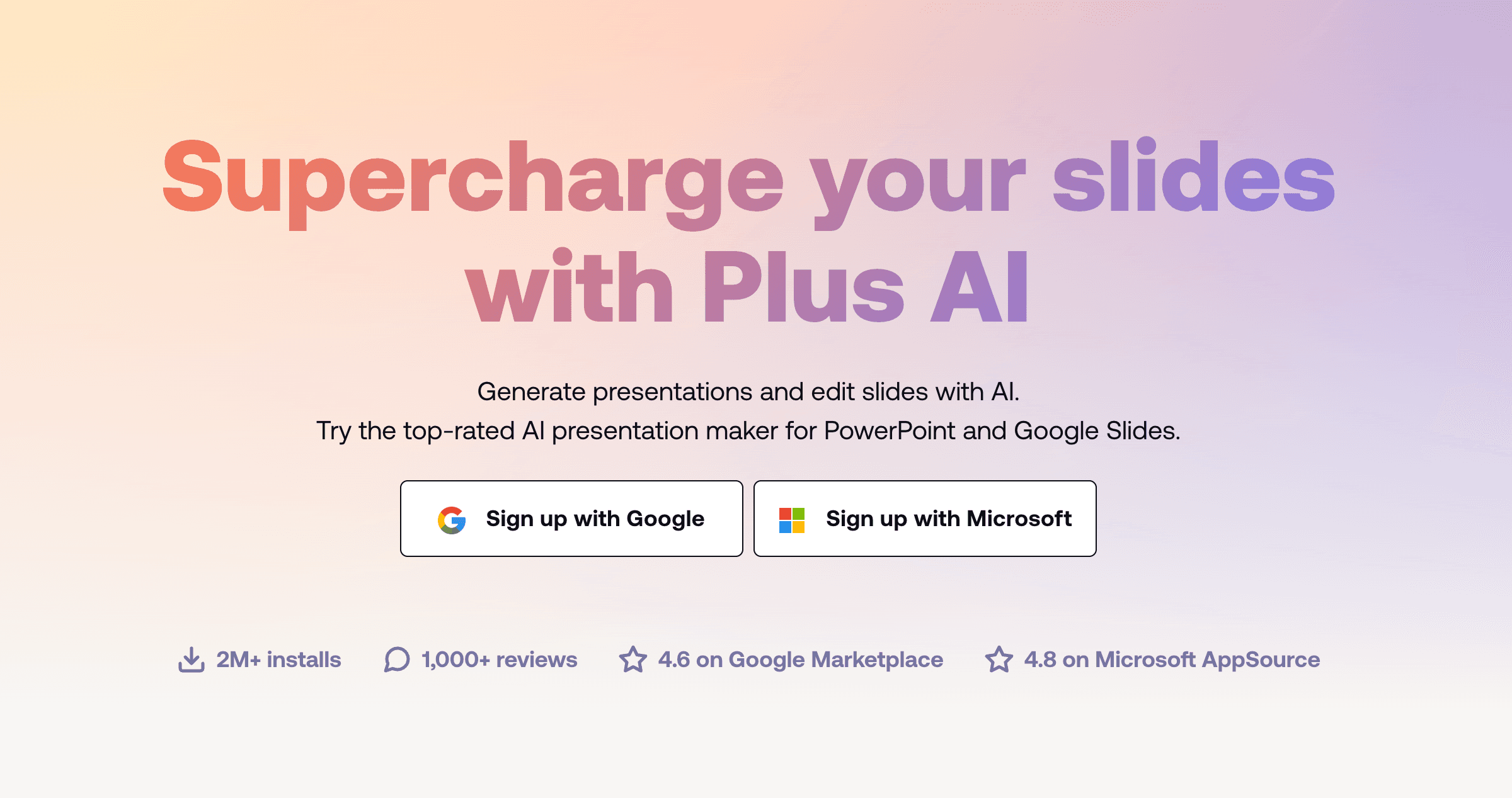
Key Features
Seamless integration with existing presentation tools.
Customizable AI layouts for data reporting.
Pros
Great for generating automated weekly reports.
Easy team collaboration within existing platforms.
Cons
Standalone data visualization capabilities are somewhat limited.
Pricing
Free trial available.
Paid plans start at $10/month.
6. Gamma
An AI app that rapidly generates engaging presentations, web pages, and documents, featuring interactive embedded data charts.

Key Features
One-click deck and document generation.
Interactive, embeddable chart blocks.
Pros
Extremely fast output and content generation.
Modern, fluid UI design that looks great on mobile.
Cons
Not built to handle massive, multi-sheet Excel databases.
Pricing
Free tier (credit-based).
7. Tableau
A heavyweight business intelligence platform that has integrated powerful AI (Tableau Pulse) for enterprise-level data visualization.
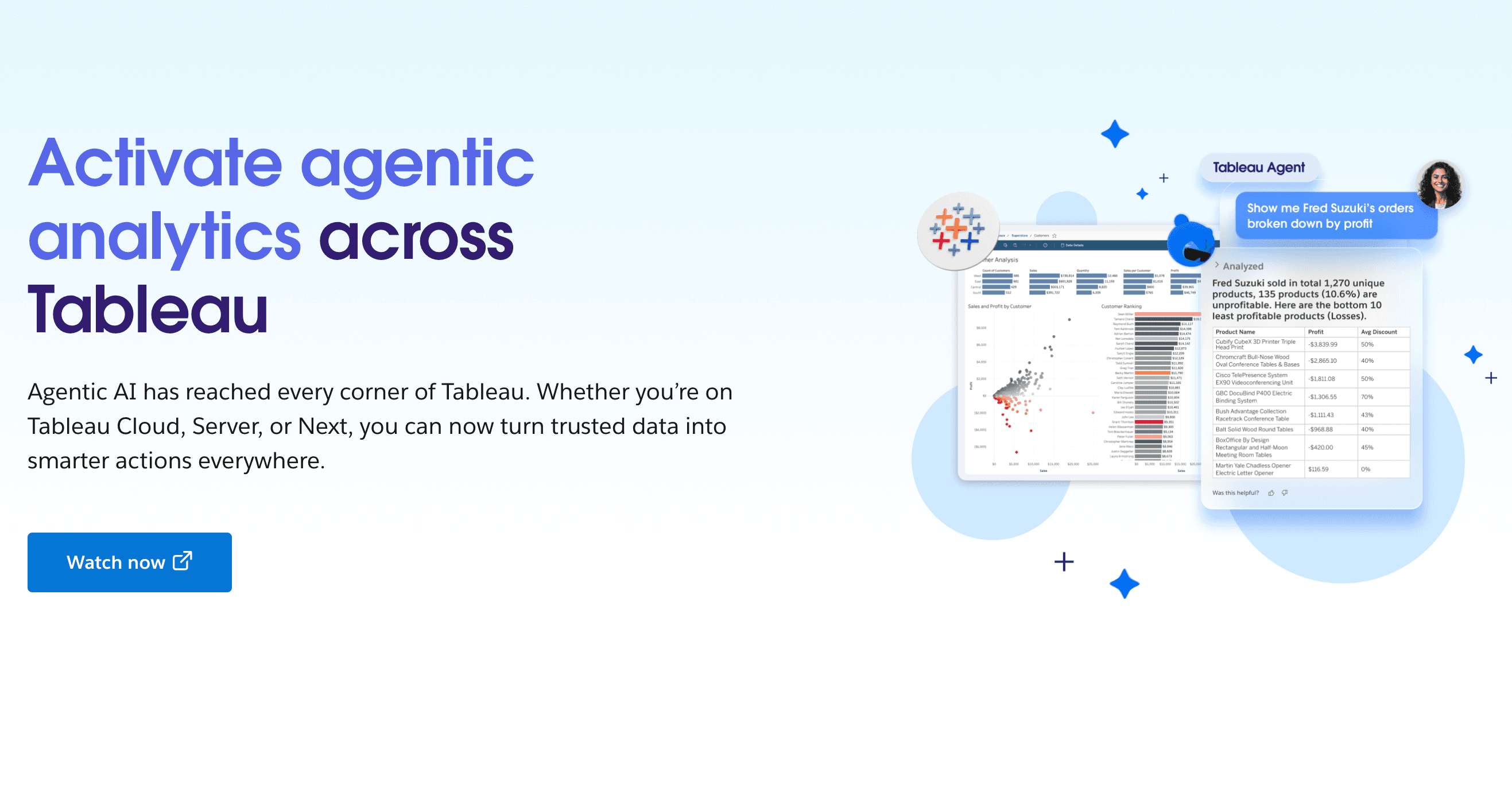
Key Features
Enterprise-grade dashboards and reporting.
Advanced predictive modeling and AI summaries.
Pros
Incredibly powerful, customizable, and scalable.
Deep integrations with global enterprise databases.
Cons
Very steep learning curve and high setup cost.
Pricing
Tableau starts at $15/user/month.
8. Zoho Analytics
A self-service BI and data analytics software equipped with a conversational AI assistant named Zia.
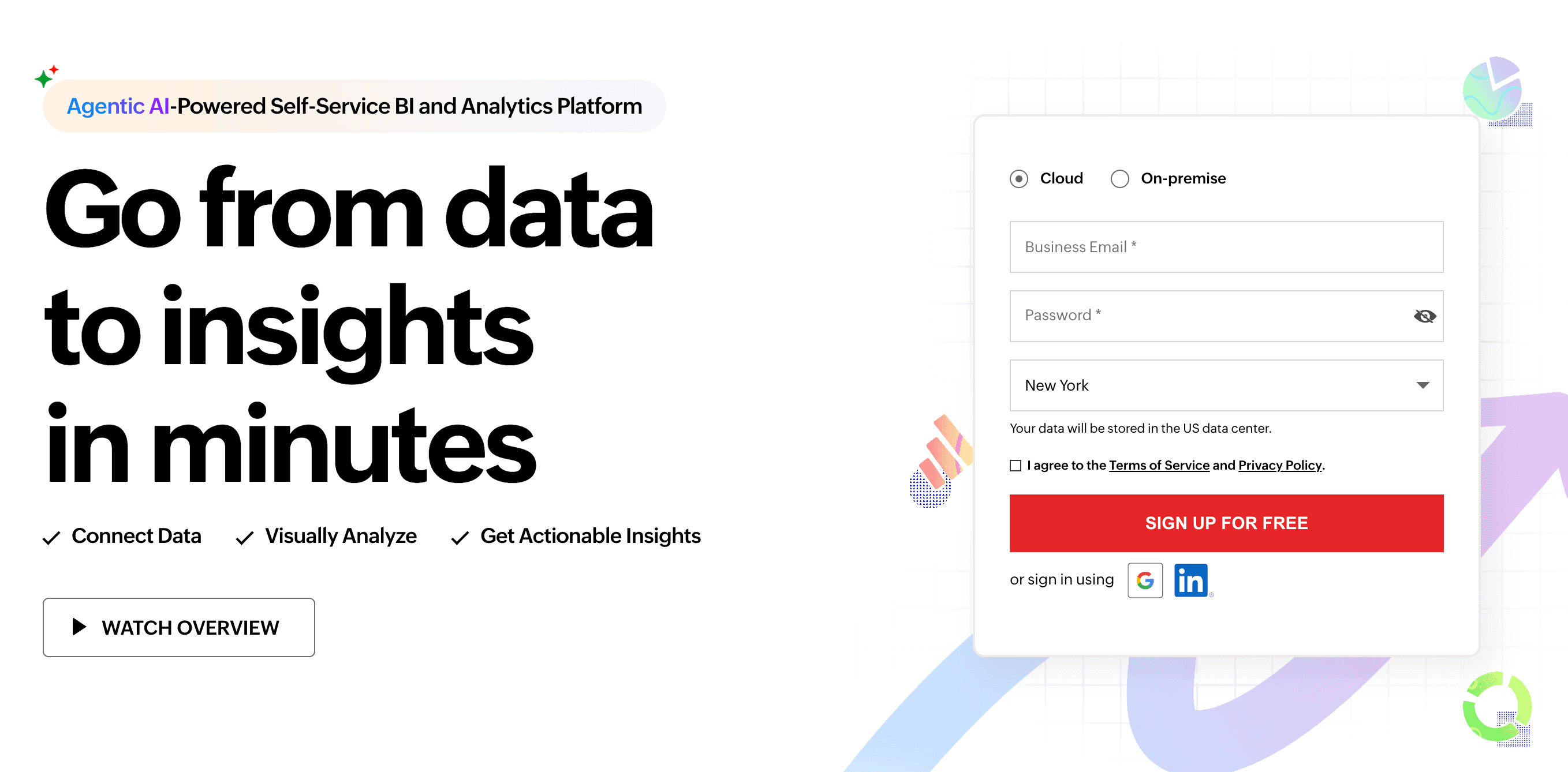
Key Features
Conversational AI queries via Zia.
Automated reporting and dashboard creation from Excel.
Pros
Strong integration with the broader Zoho business ecosystem.
Great balance of price and enterprise features.
Cons
The UI can feel slightly dated compared to newer AI startups.
Pricing
Standard plan at $48/month.
9. Visme
A comprehensive content creation platform tailored for interactive infographics and visual reports, featuring AI data widgets.
Key Features
Interactive, animated data widgets.
Pre-built, highly professional chart templates.
Pros
Excellent for marketing, PR, and public reports.
Highly customizable visual elements.
Cons
Can be sluggish when processing very large Excel files.
Pricing
Free basic plan.
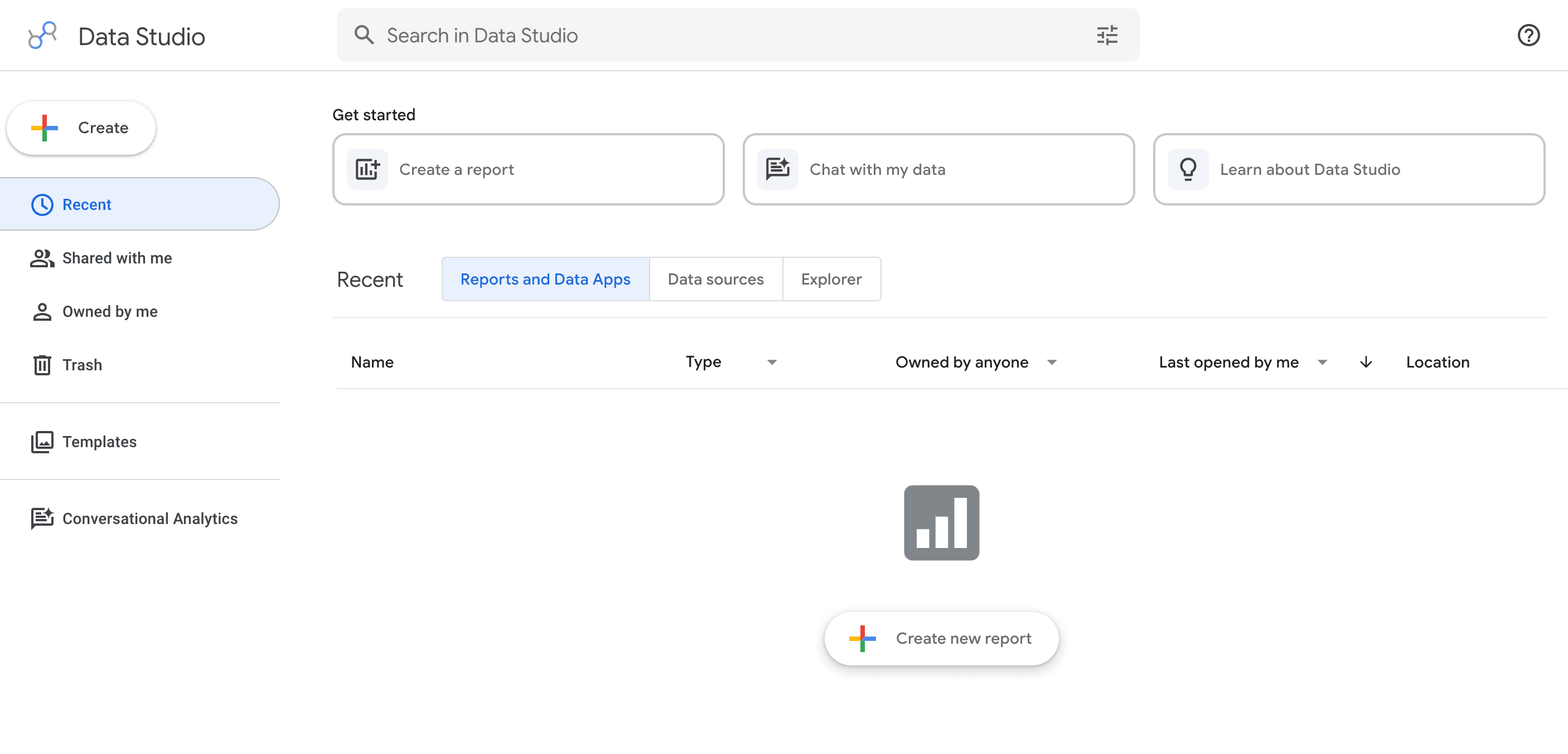
10. Looker Studio
Google’s versatile data visualization tool (formerly Data Studio), recently enhanced with Gemini AI capabilities to help build reports.
Key Features
Live data connection to Google Sheets and Excel.
AI-assisted report and formula generation.
Pros
Completely free for standard usage.
Perfect for users already in the Google ecosystem.
Cons
Customer support is very limited for free users.
Pricing
Looker Studio is Free.
Looker Pro relies on custom enterprise pricing.
How to Choose the Right AI Graph Maker for Your Needs
When selecting an AI graph maker, consider your specific workflow. If you handle massive enterprise data, Tableau is reliable but expensive. If beautiful design is your main priority, Canva AI or Beautiful.ai might suffice. However, if you want the perfect balance of ease-of-use, cutting-edge AI intelligence, and seamless Excel integration, you should look for tools that offer chat-to-chart capabilities. This allows you to bypass steep learning curves and get immediate, actionable visual insights.
Conclusion
Visualizing Excel data in 2026 is no longer a tedious chore. AI has transformed data analysis into a fast, intuitive, and highly visual process. While all the tools listed above offer great features, Powerdrill Bloom stands out as the ultimate choice. With its exceptional natural language processing, you can effortlessly chat with your data and watch Powerdrill Bloom create stunning, accurate graphs in seconds. Don't waste time struggling with formulas and pivot tables—try Powerdrill Bloom today and elevate your data visualization game!
FAQs
Can AI make graphs from Excel files?
Yes, tools like Powerdrill Bloom instantly read your Excel files and generate accurate, beautiful graphs using AI.
Is Powerdrill Bloom safe for my Excel data?
Absolutely. Powerdrill Bloom uses enterprise-grade encryption to ensure your uploaded Excel data remains completely private and secure.
Do I need coding skills to use Powerdrill Bloom?
No coding is required. You simply type what you want in plain English, and Powerdrill handles the rest.
Which AI graph maker is best for beginners?
Powerdrill Bloom is perfect for beginners because its intuitive chat interface makes graph creation as easy as sending texts.
Can I export graphs made in Powerdrill Bloom?
Yes, Powerdrill Bloom allows you to easily export your AI-generated graphs as high-quality images or interactive reports.