11 Best AI Data Visualization Tools for Beginners in 2026
Introduction
With the rapid advancement of automated workflows and conversational artificial intelligence in 2026, data visualization is undergoing a major evolution. No longer confined to manual spreadsheet tracking or complex script writing, modern professionals are shifting toward visual, intuitive communication.
Today, static charts are rapidly being replaced by interactive, narrative-driven canvas boards. Whether you are a small business owner, a marketer, or an academic researcher, finding the right tool is key to turning raw data into actionable insights.
This article reviews the top AI data visualization tools for beginners in 2026, helping you choose the best platform for your workflow.
What Is the Fundamental Difference between AI Visualization in 2026 and Previous Years?
From Rigid Dashboards to Fluid Canvases: Traditional tools restricted users to pre-set grids and static dashboards. In 2026, the trend has shifted toward infinite, whiteboard-style canvases where users can freely organize charts, notes, and AI-suggested steps in real time.
Agentic Guided Analysis: Previous AI features only generated simple charts upon request. Today's AI data agents actively clean raw data, identify anomalies, and suggest multiple analytical paths before the user even types a query.
Natural Language Reasoning over Code: Rather than relying on SQL, Python, or Excel formulas, modern platforms use advanced natural language processing to interpret complex requests and translate them into visual structures behind the scenes.
Automated Presentation Workflows: The barrier between analysis and presentation has dissolved. Users can now convert interactive exploration steps into structured reports or slide decks with a single click.
Quick Comparison Table
Tool | Primary Focus | Key Strength | Best For | Pricing |
Collaborative Data Canvas | Agent-driven guided research paths | Beginners wanting visual, guided data analysis | ||
Marketing Presentations & Design | Massive graphical and template library | Marketers & content creators | ||
Slide Presentation Design | Automatic structural layout formatting | Quick business slide generation | ||
Conversational Chat Analysis | Python-powered mathematical accuracy | Researchers & statistical analysis | ||
Enterprise Business Intelligence | High scalability and deep integrations | Large organizations & BI teams | ||
Internal Business Analytics | Simple, SQL-free visual queries | Small to mid-size operations teams | ||
Web-Based Dashboards | Direct Google ecosystem integrations | Google Workspace users | Free | |
Text-to-Diagram Generation | Converting paragraphs into structured diagrams | Writers, educators, and consultants | ||
Document & Slide Generation | Responsive card-based visual layouts[ | Quick, narrative-driven decks | ||
Interactive Infographics | High-end responsive maps and charts | Journalists and data storytellers | ||
Accessible Infographic Layouts | WCAG accessibility checking & brand kits | HR, training teams, and designers |
1. Powerdrill Bloom
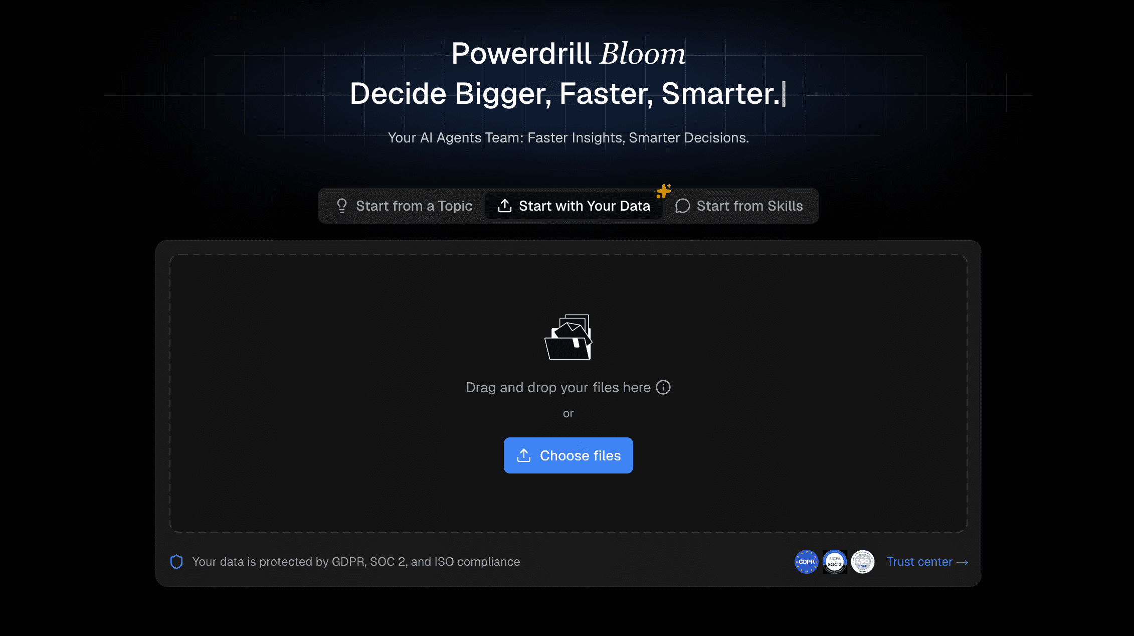
Powerdrill Bloom is an AI-first workspace designed for no-code automated data analysis and visualization. It utilizes interactive data agents on a fluid canvas to guide users through the entire analytic process.
Key Features
Guided Research Paths: Suggests smart exploration directions upon data upload to jumpstart your analysis.
Collaborative AI Canvas: Displays charts, metrics, and follow-up prompts on modular, moveable cards.
One-Click Report Export: Converts your canvas discoveries directly into PowerPoint presentations or PDF documents.
Pros
Extremely gentle learning curve with no coding required.
Canvas-style workspace promotes creative, unconstrained thinking.
Combines automated data cleaning and deep visual analysis.
Cons
Not intended for complex, enterprise-level ETL pipelines.
Whiteboard layout might feel unfamiliar to users expecting traditional spreadsheet cells.
Pricing
Freemium. Start at $13.27/month.
2. Visme AI
Visme AI is a visual design platform that combines automated content creation with a robust template editor, specializing in graphics and marketing presentations.
Key Features
Prompt-to-Design Engine: Automatically builds multi-page layouts or infographics from text instructions.
Vast Asset Library: Provides access to thousands of custom graphics, icons, and royalty-free media.
Dynamic Data Integration: Connects to external datasets to keep graphs updated automatically.
Pros
Highly polished, professional aesthetics.
Versatile tool for generating social graphics alongside charts.
Cons
Limited deep statistical testing or correlation capabilities.
The fully-featured plans can be expensive for casual users.
Pricing
Free trial. Starter at $29/per user month.
3. Beautiful AI
Beautiful AI is a presentation software designed to eliminate the struggle of manual slide formatting.
Key Features
Smart Slides: Automatically adjusts layout spacing and alignment when text or charts are modified.
AI Template Generator: Generates clean, cohesive slide outlines based on topic inputs.
Shared Brand Guidelines: Locks in company colors and typography across all charts.
Pros
Saves hours of formatting and aligning elements.
Keeps team presentations highly consistent.
Cons
Strict design constraints make it difficult to place elements completely freely.
Focused entirely on slide decks rather than standalone dashboard analysis.
Pricing
Try free for 14 days. Pro at $12/month.
4. Julius AI
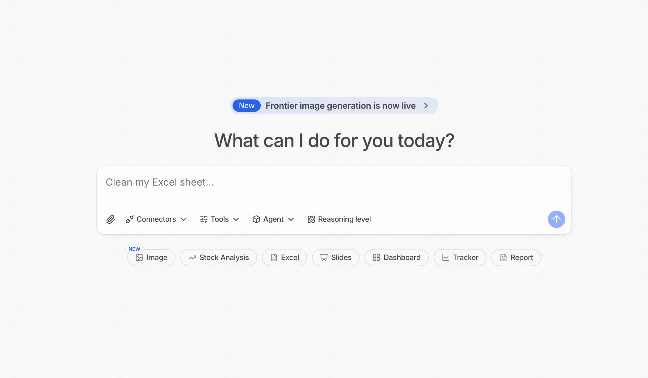
Julius AI is a conversational data analyst tool designed to run advanced mathematical and statistical workflows through a chat interface.
Key Features
Python Integration: Runs secure code in the background to handle precise calculations.
Direct Graph Plotting: Generates scatter plots, regression lines, and bar charts based on plain-English requests.
Broad File Support: Ingests spreadsheets, CSVs, and PDFs effortlessly.
Pros
Excellent for researchers who need serious statistical summaries.
Very fast responses to conversational queries.
Cons
The linear chat format lacks a visual visual canvas workspace.
Occasionally displays Python code blocks that may intimidate absolute beginners.
Pricing
Free trial. Plus at $20/month.
5. Tableau
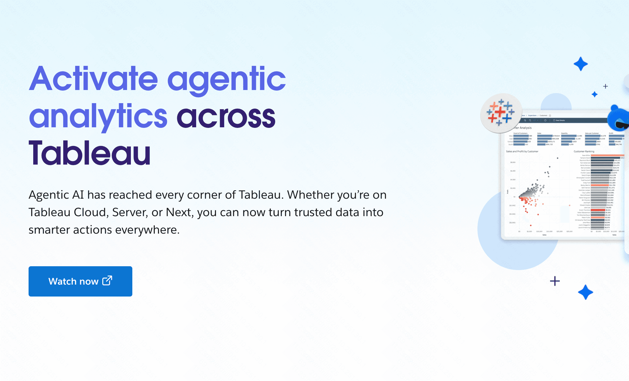
Tableau is an industry-standard business intelligence platform, now incorporating Einstein AI and Tableau Pulse for beginner-friendly smart metrics.
Key Features
Tableau Pulse: Delivers personalized AI summaries of key metrics straight to your dashboard.
Ask Data: Allows beginners to query databases using natural language.
Vast Integration Network: Connects with major enterprise databases and cloud platforms.
Pros
Highly scalable and suited for enterprise datasets.
An incredibly large and helpful global user community.
Cons
The full desktop builder has a steep learning curve.
The licensing model is costly for individual beginners.
Pricing
$15/per user month.
6. Metabase
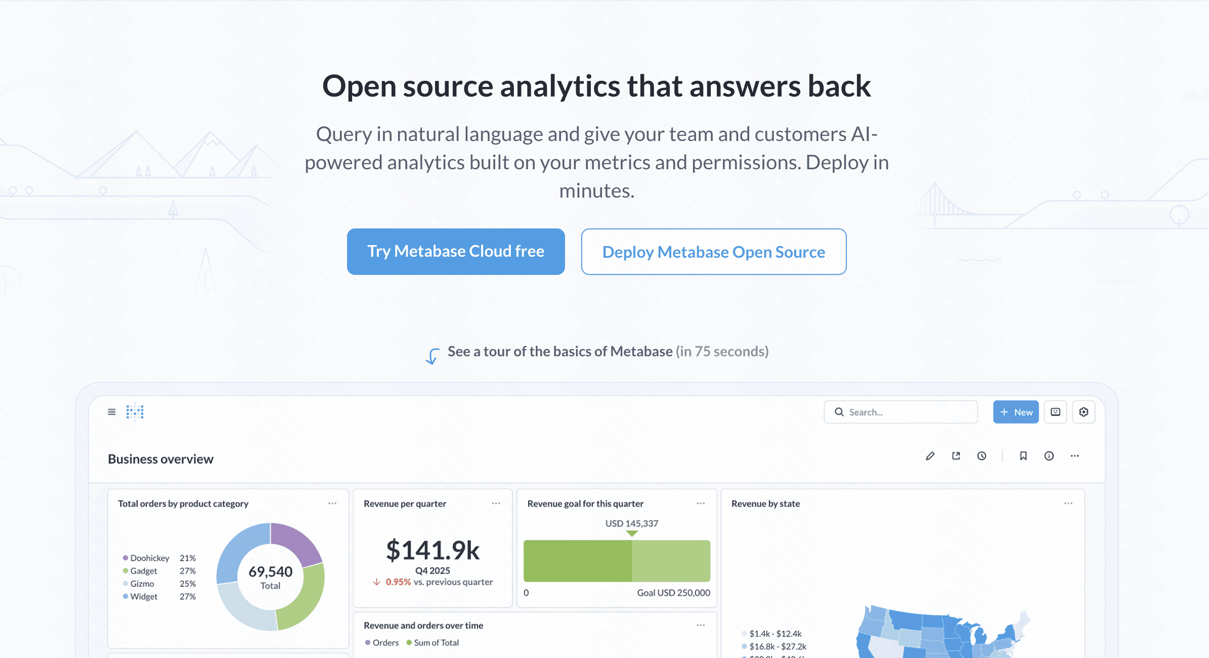
Metabase is an open-source data analytics tool focused on making business intelligence accessible to everyone within an organization.
Key Features
Visual Query Builder: Bypasses SQL to let users join tables and build charts via drop-down menus.
AI Query Assistant: Translates plain-English text into accurate SQL statements.
Auto-Dashboards: Creates visual overviews of database tables with a single click.
Pros
Clean, minimalistic interface that is easy to navigate.
Highly cost-effective for teams using the self-hosted version.
Cons
Requires initial technical setup to connect to databases.
Not built for creating artistic or stylized infographics.
Pricing
Free trial. Starter at $100/month+$6/month per user.
7. Looker Studio
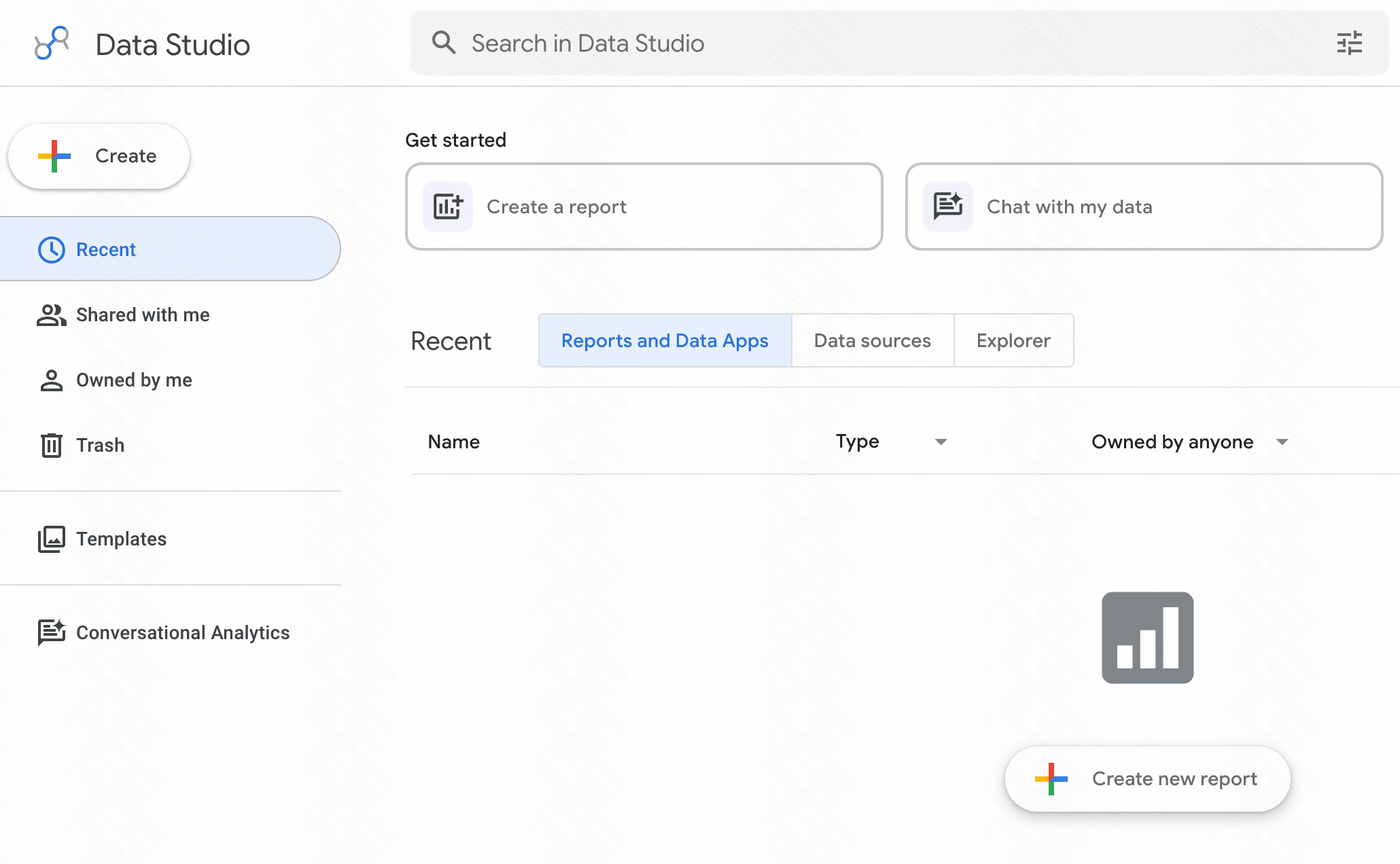
Looker Studio is Google’s free, cloud-based reporting application, now utilizing Google Gemini for smart automated visualizations.
Key Features
Gemini AI Insights: Generates automated summaries explaining the trends within your charts.
Google Workspace Integrations: Connects seamlessly with Google Sheets, Google Analytics, and BigQuery.
Collaborative Editing: Allows teams to work on the same report simultaneously, similar to Google Docs.
Pros
Completely free to use with most Google connectors.
Easy sharing and permission settings.
Cons
Performance can slow down significantly when loading massive datasets.
Visual customization options are somewhat basic.
Pricing
Free.
8. Napkin AI
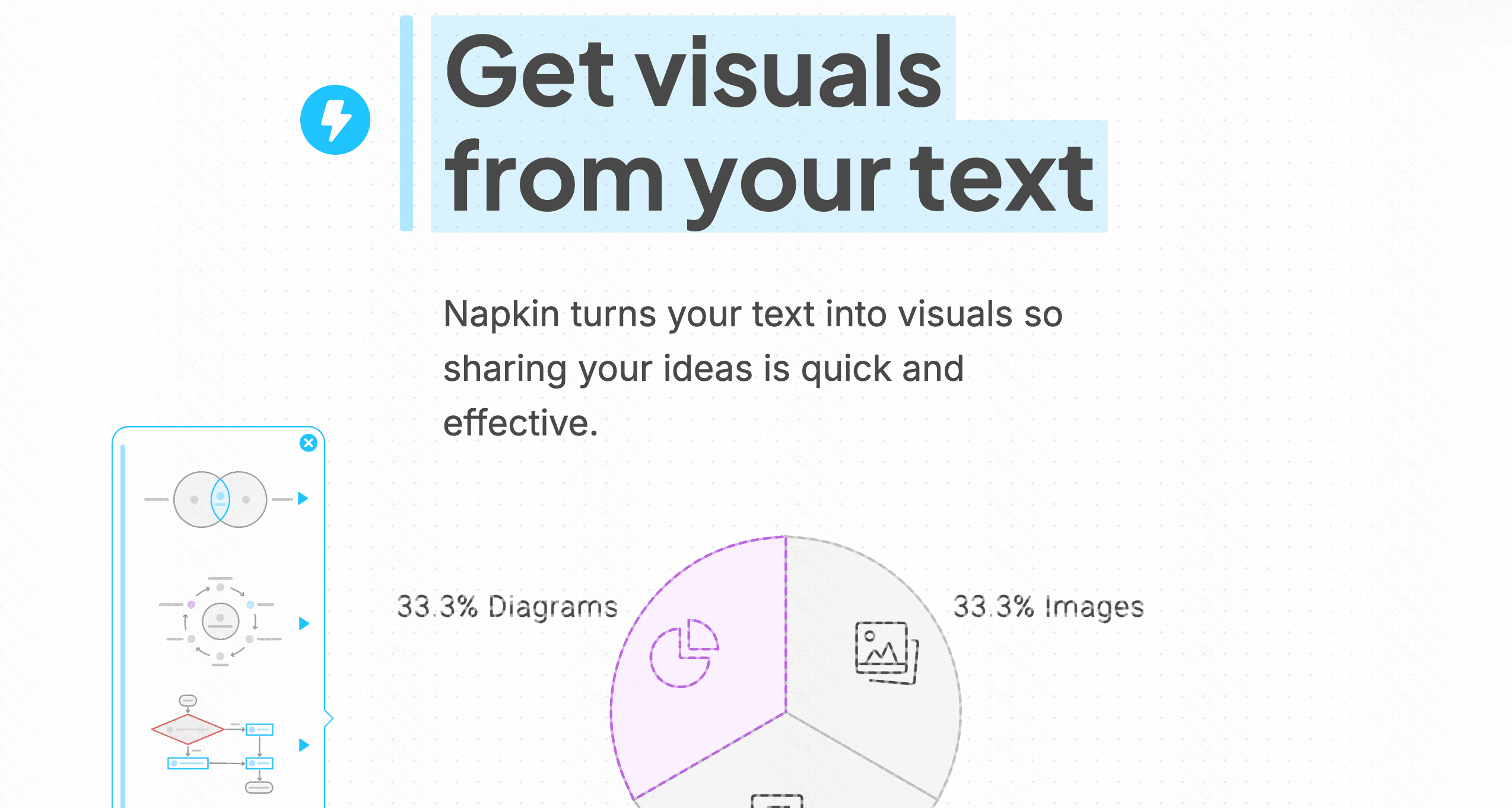
Napkin AI is a conceptual visual workspace that specializes in turning written text into professional diagrams and flowcharts.
Key Features
Text-to-Diagram Engine: Reads written paragraphs and suggests relevant visual charts, flowcharts, or mind maps.
Real-Time Collaboration: Supports multi-user workspace editing.
Vector Exports: Exports graphics to high-resolution formats like SVG and PDF for easy editing.
Pros
Outstanding for explaining abstract concepts and systems.
Saves hours of design work when creating process maps.
Cons
Cannot ingest raw numerical files like CSVs or databases.
Lacks financial or statistical graphing tools.
Pricing
Freemium. Pro at $9/per user month.
9. Gamma
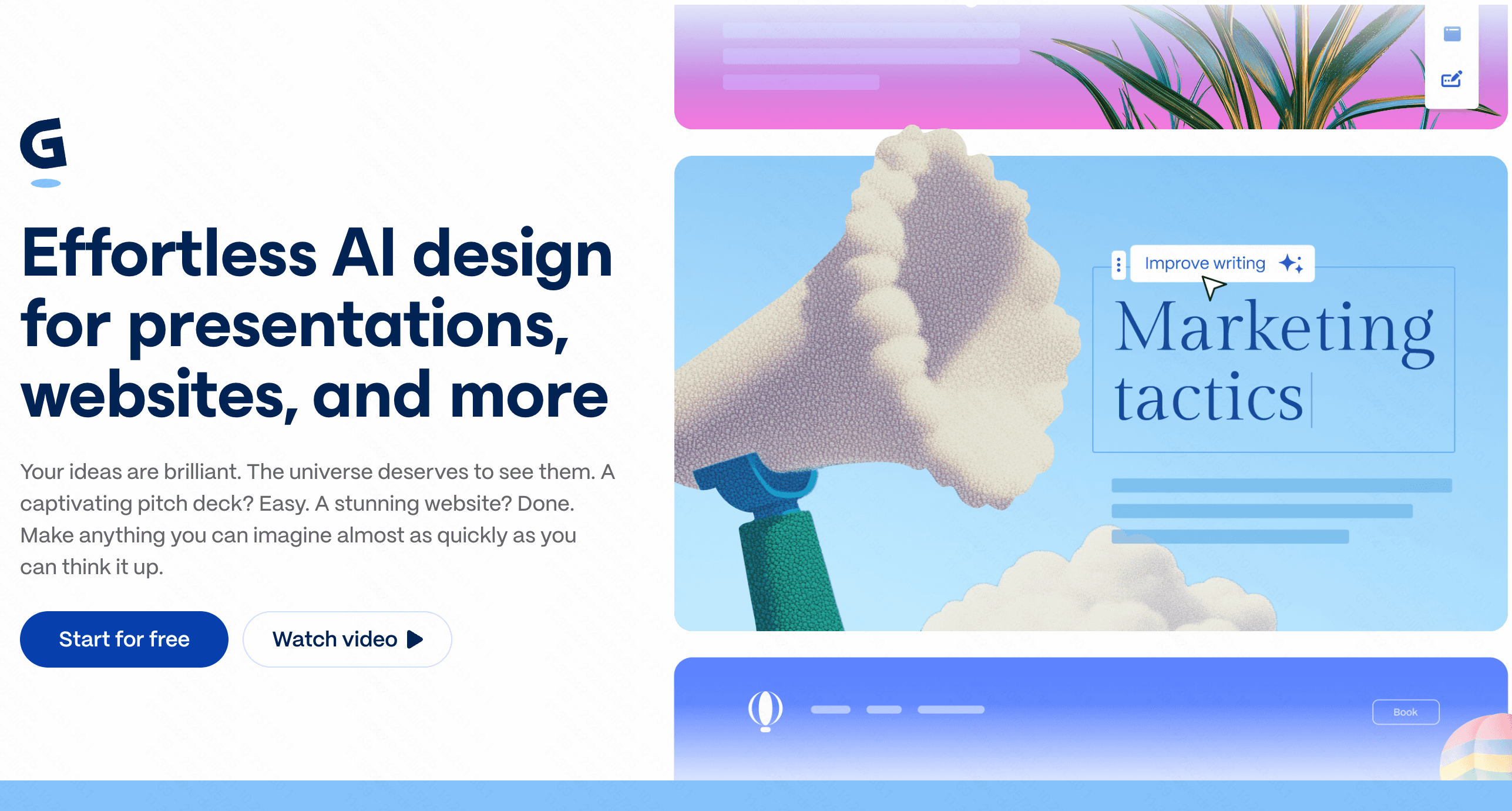
Gamma is an AI-powered design platform that creates presentations, responsive documents, and webpages from brief text prompts.
Key Features
Card-Based Structure: Offers fluid visual layouts that look great on both desktop and mobile devices.
Interactive Editing Agent: Edits layouts and changes slide themes via simple text instructions.
Flexible Exports: Converts native decks into standard PPTX presentations.
Pros
Creates visually striking slide structures in seconds.
Great user experience for quick, conversational drafting.
Cons
Layouts are rigid, making it hard to position elements in custom configurations.
Relies heavily on its credit system, which can run out quickly on the free tier.
Pricing
Free trail. Plus at $12/per seat month.
10. Infogram
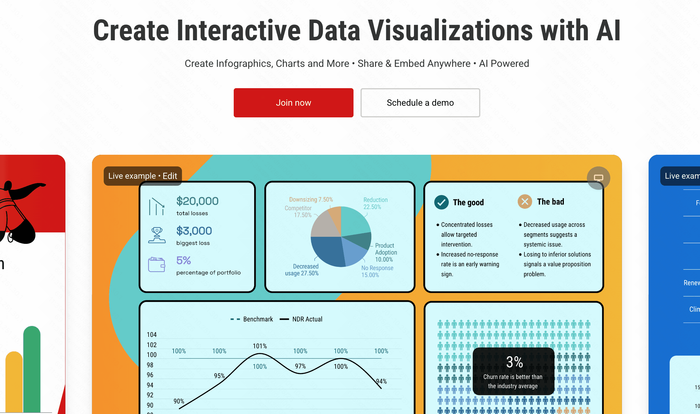
Infogram is a dedicated design tool geared towards producing interactive infographics, social media charts, and dynamic maps.
Key Features
Interactive Graphics: Charts expand, animate, or display data popups when hovered over.
AI Design Assistant: Identifies trends in your datasets and recommends suitable visual layouts.
Diverse Chart Library: Includes word clouds, treemaps, and interactive geographic maps.
Pros
Excellent for building public-facing, highly engaging visual assets.
Strong focus on responsive, mobile-ready presentation.
Cons
Custom branding options are locked behind high-tier subscriptions.
Does not offer automatic data cleaning features.
Pricing
Free trail. Start at $25/month.
11. Venngage AI
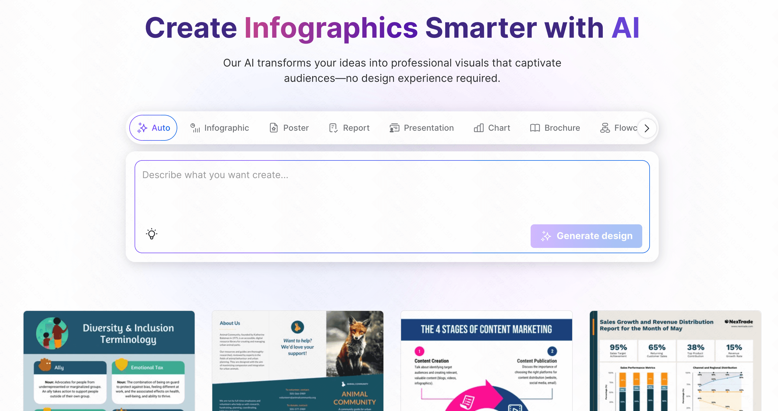
Venngage AI is an online infographic generator tailored for business communication, HR teams, and non-designers.
Key Features
DesignAI Generator: Transforms text descriptions into fully structured visual layouts.
Accessibility Checker: Tests your visual designs for contrast and legibility to meet WCAG compliance standards.
Branding Kit Integration: Automatically imports and applies your organization’s colors and logos.
Pros
Perfect for creating accessible, corporate training and educational materials.
Structured, clear design boundaries prevent bad design decisions.
Cons
The free tier does not allow you to download or export your work.
Less artistic flexibility compared to general graphic design software.
Pricing
Free trail. Start at $19/month.
How We Evaluated These Tools
To help you find the best starting point, we analyzed these platforms using four core dimensions:
Ease of Use: Can a beginner upload a file and get a chart in under five minutes without needing to learn code or read a manual?
AI Intelligence and Autonomy: Does the platform offer genuine guidance, such as data cleaning, trend identification, and automated query suggestions?
Visual Flexibility: How easily can a user customize colors, rearrange layout elements, and build a narrative?
Integration & Export Capabilities: Can the platform easily output the visual results to presentations, PDFs, or live links for team collaboration?
How to Choose the Right AI Data Visualization Tools for Beginners
Choosing the right tool depends largely on the structure of your source data and your final goals:
For Text and Concepts: If your source data consists of paragraphs, processes, or written reports, specialized tools like Napkin AI or Piktochart AI excel at extracting visual structures from copy.
For Quick Pitch Decks: If your main goal is to build quick, cohesive slides, Gamma or Beautiful AI offer fast slide layouts with minimal layout adjustment required.
For Deep Business Analytics: If you need to monitor large, persistent databases, Metabase or Looker Studio provide robust dashboards, though they require some setup.
For Guided Exploration and Narrative Flow: If you have raw spreadsheets (Excel/CSV) and need a tool that cleans the data, suggests analytical directions, and maps your thoughts on a visual, collaborative whiteboard, Powerdrill Bloom represents a highly effective, unified solution. It bridges the gap between cold database queries and creative visual storytelling on a single canvas.
Conclusion
The data visualization landscape of 2026 makes it easier than ever for beginners to design professional-grade, insightful visuals. Finding a workflow that matches your design style is key to unlocking your data's potential.
If you are looking for an intuitive workspace that helps you clean, explore, and present your spreadsheet data visually, try Powerdrill Bloom. Drop your dataset onto the canvas today to start exploring your data visually.
FAQs
Do I need coding skills to use these AI tools?
No. Most of these platforms use simple drag-and-drop interfaces and natural language prompts to generate visual layouts.
Can Powerdrill Bloom export charts to PowerPoint?
Yes. Powerdrill Bloom allows you to export your interactive canvas boards directly into structured, presentation-ready slide decks.
Are my uploaded datasets secure when using AI visualization tools?
Yes. Reputable tools like Powerdrill Bloom use encrypted pipelines and strict privacy measures to ensure your data remains secure.
What is the main difference between Julius AI and Powerdrill Bloom?
A: Julius AI works primarily as a text-based chat assistant, while Powerdrill Bloom offers an interactive, whiteboard-style visual canvas.
Are there free plans available for beginners to test these tools?
Yes. Most of these tools offer free tiers or trial credits to help you evaluate their features risk-free.