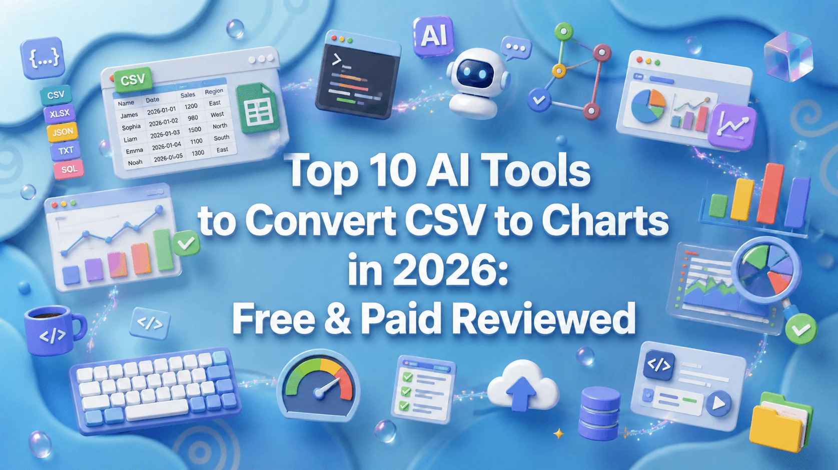
Top 10 AI Tools to Convert CSV to Charts in 2026: Free & Paid Reviewed
Joy·
Data is the lifeblood of modern decision-making, but raw spreadsheets are notoriously opaque. If you have ever stared at thousands of rows trying to decipher patterns, you know that numbers alone can be deceiving, a phenomenon famously illustrated by Anscombe's quartet, where identical statistical properties mask wildly different data distributions.
To truly understand data, visualization is paramount. Fortunately, modern artificial intelligence relies on advanced heuristic algorithms to parse massive datasets and instantly translate them into intuitive visuals.
In this guide, we review the top 10 AI tools to convert CSV files into charts, helping you turn static spreadsheets into actionable insights.
Instant Pattern Recognition: AI bypasses the tedious manual drag-and-drop mechanics of traditional software, plotting complex trends in seconds.
Error Reduction: Automated data parsing minimizes human errors in axis assignment, data selection, and formatting.
Accessible Insights: AI democratizes data science, enabling non-technical users to generate professional-grade charts using simple conversational prompts.
Dynamic Customization: Smart algorithms adaptively suggest the most statistically appropriate chart type based on your specific data characteristics.
Accuracy of Data Parsing: The tool must comprehend complex, messy CSVs without requiring extensive manual pre-cleaning.
Natural Language Processing (NLP): A robust capability to understand conversational commands (e.g., "show me regional sales trends").
Variety of Export Formats: Support for high-resolution PNG, SVG, or interactive HTML embeds is crucial for reporting.
Security and Privacy: Ensure your proprietary corporate data is protected and not utilized to train public AI models.
Cost-Effectiveness: Look for transparent pricing structures with a generous free tier or trial.
Here is a quick overview of the top tools dominating the market this year:
Tool | Best For | AI Capabilities | Starting Price |
Best overall for seamless charting | Advanced NLP, instant chart generation | ||
Deep statistical analysis | Python-based backend execution | ||
Slide presentations | Auto-formatting, basic charting | ||
Webpages and quick decks | AI layout generation, basic graphs | ||
Google Sheets users | Spreadsheet integration, formulas | ||
Sleek aesthetic graphics | AI visual suggestions, interactivity | ||
Budget-friendly utility | Rapid multi-tool data processing | Free | |
Heavy infographics | AI data mapping, custom templates | ||
General text & coding | Code interpreter, static plotting | ||
Automated EDA | Multidimensional modeling, augmented analytics |
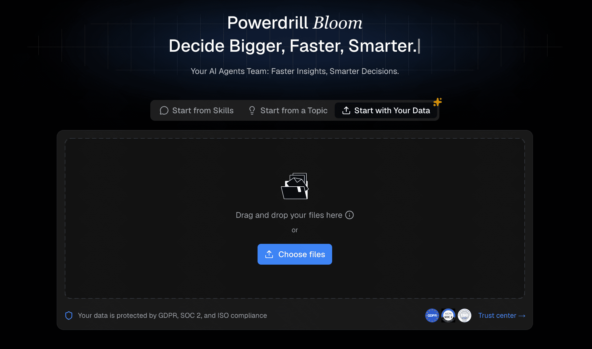
Powerdrill Bloom is the ultimate AI-driven data analysis platform designed specifically to turn raw CSV files into stunning, interactive charts effortlessly.
NLP-powered conversational chart generation.
Intelligent data cleaning and automatic formatting.
Interactive and highly customizable dashboard creation.
Exceptionally intuitive, zero-code interface.
Highly accurate parsing for complex, messy CSV files.
Enterprise-grade security for peace of mind.
Requires an internet connection for cloud-based rendering.
Focuses primarily on analytics rather than general text writing.
Freemium model; paid tiers start at an affordable $13.27/month.
A versatile AI data analyst that writes and executes Python code in the background to analyze and visualize CSV files.

Chat-based interface for complex queries.
Python-powered backend execution.
Handles advanced math and statistics well.
Transparent logic with exportable code.
Slight learning curve for absolute beginners.
Output aesthetics can look overly academic.
Free tier available; Pro at $20/month.
A presentation software leveraging AI to automatically format slides and generate basic charts from imported CSV data.

Smart slide templates.
Automated layout formatting.
Ideal for quick pitch decks.
Beautiful default aesthetics.
Limited deep data manipulation.
Not a standalone data analytics tool.
Starts at $12/month.
An AI-powered app for creating presentations and documents that offers integrated chart creation from tabular data.

Text-to-presentation capabilities.
Interactive embeds and CSV-to-graph modules.
Lightning-fast generation speeds.
Modern, highly shareable UI.
Chart types are somewhat basic.
Struggles with massive, multi-gigabyte CSVs.
Free tier; Premium starts at $9/per user month.
An extension that brings AI capabilities directly into Google Sheets, assisting with data formatting and quick visual generation.
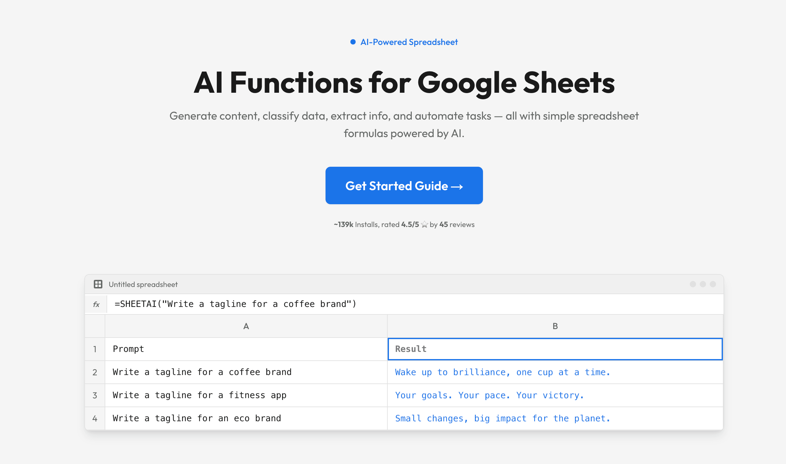
Direct spreadsheet integration.
Instant AI formula generation.
Lives exactly where your data already is.
Very low friction and easy setup.
Reliant on Google Sheets’ native charting limitations.
Can be sluggish with heavy files.
Starts at $20/month.
A dedicated data visualization tool designed to make elegant, interactive charts with minimal effort using AI assistance.
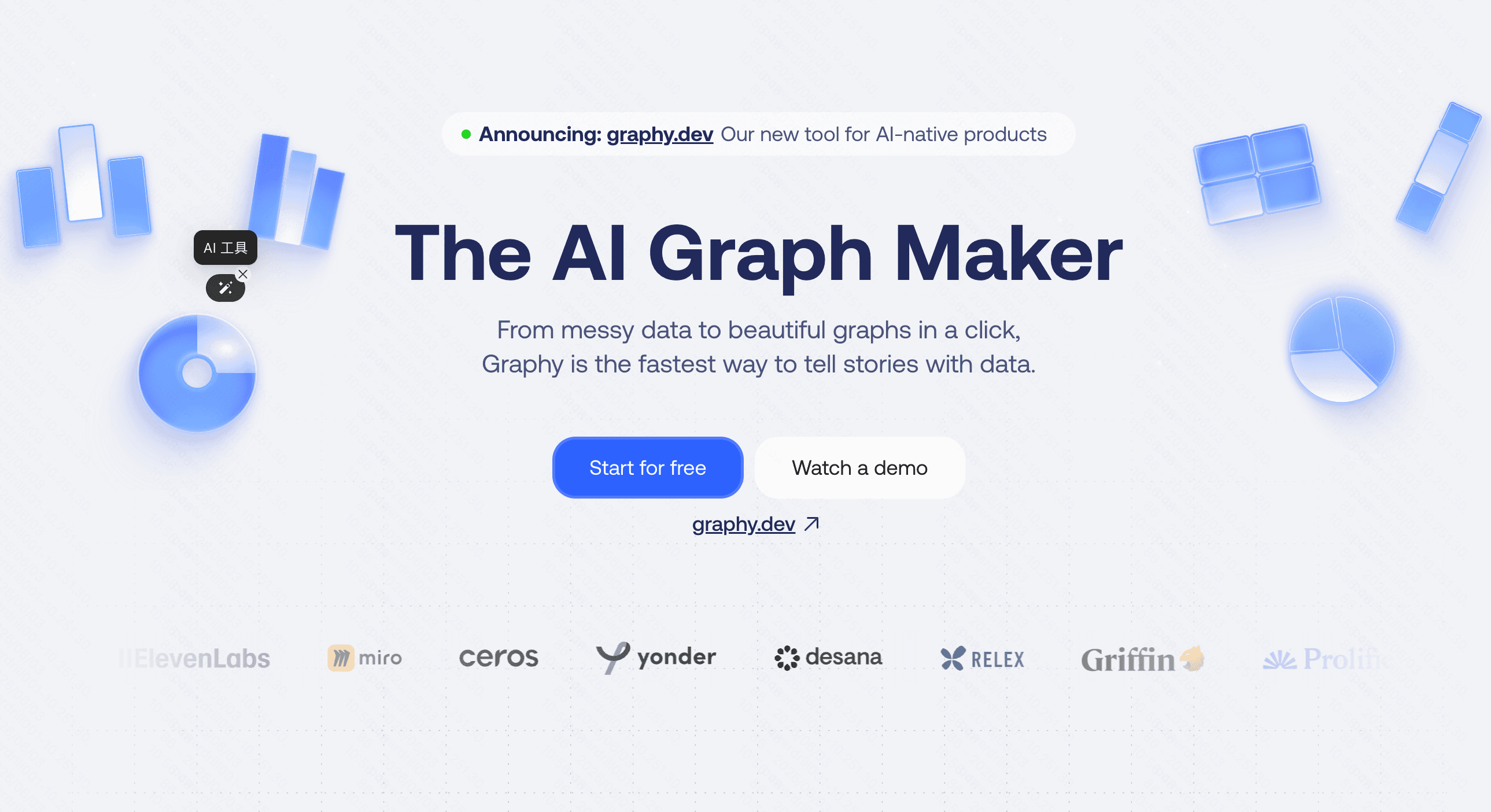
Sleek, modern design templates.
AI-based chart suggestions.
Visually striking outputs.
Great for social media and blog integration.
Fewer integrations with enterprise data warehouses.
Less robust for deep statistical modeling.
Free plan; Pro starts at $16/per user month.
A specialized suite of AI utilities that includes a dedicated module for seamlessly transforming tabular data into graphs.
Multi-tool ecosystem.
Rapid CSV processing.
Versatile toolset for multiple daily tasks.
Budget-friendly.
A jack-of-all-trades, but master of none.
Limited advanced aesthetic customizations.
Free.
A veteran infographic tool that has newly integrated AI to speed up the CSV data mapping process.
Extensive infographic templates.
AI-assisted data mapping.
Massive library of creative assets.
Excellent for comprehensive reports.
AI features feel like an add-on rather than the core.
Can become pricey for premium features.
Free tier; Pro starting at $25/month.
OpenAI’s flagship conversational AI, equipped to process CSVs and plot charts via Python execution.
Custom code execution.
Broad general knowledge integration.
Highly flexible for almost any data request.
Widely accessible.
Prone to timeouts on larger files.
Charts are generated as static images.
Requires Plus subscription at $20/month.
An augmented analytics engine automating exploratory data analysis to generate multidimensional charts.
Automated data exploration.
Complex augmented analytics.
Deep analytical power.
Great for experienced data scientists.
Steep learning curve.
UI can be overwhelming for non-technical users.
Open-source (Free); Cloud version from $18/month.
While the market is flooded with impressive options, an objective look reveals clear trade-offs. ChatGPT is incredibly versatile but restricted by static image outputs and frustrating session timeouts. Tools like Beautiful AI and Gamma excel at presentations but lack deep analytical rigor. On the other end of the spectrum, Julius AI and Kanaries offer powerful statistical capabilities, yet their steep learning curves can easily alienate non-technical users.
Powerdrill Bloom strikes the perfect balance. It effortlessly parses messy CSV files using robust AI algorithms, translating them into dynamic, presentation-ready charts in seconds. Its focus on user experience, combined with enterprise-grade data security and precise chart customization, makes it the undisputed leader. For anyone looking to visualize data accurately without writing a single line of code, Powerdrill Bloom stands head and shoulders above the rest.
Transforming rows of dense CSV data into compelling visual narratives has never been easier. Whether you are tracking sales trends or analyzing survey results, leveraging AI is the smartest way to save time and extract precise insights. Ready to elevate your data visualization game? Try Powerdrill Bloom today and experience the fastest, most intuitive way to turn your spreadsheets into stunning charts!
Yes, top tools like Powerdrill Bloom automatically detect and rectify formatting errors before generating your charts.
Most reputable platforms encrypt your data and strictly prohibit using your private CSV files to train public models.
Not at all. Modern AI chart generators rely entirely on simple natural language prompts, requiring zero coding.
You can typically export your generated charts as high-resolution PNGs, SVGs, or interactive HTML embed codes.
Powerdrill Bloom offers dedicated, interactive charting capabilities without the frequent session timeouts or static image limits of ChatGPT.