Top 11 AI Data Visualization Tools - December 2025 Update
Joy·
The era of manual reporting is over. The latest AI Data Visualization Tools do not just display data; they understand it.
To help you close the year strong, we have reviewed the top 11 AI tools that transform complex datasets into actionable insights and stunning visuals instantly.
Here is our curated list for December 2025:
Powerdrill Bloom - (Best Overall AI Agent & Slide Generation)
Tableau AI (Pulse) - (Best for Enterprise Analytics)
Microsoft Power BI Copilot - (Best for Microsoft Ecosystem)
Julius AI - (Best for Python-based Analysis)
Polymer - (Best for E-commerce Data)
Akkio - (Best for Predictive Modeling)
Looker Studio (Gemini) - (Best for Google Stack)
Visme - (Best for Non-Data Designers)
Graphy - (Best for Quick Charts)
MonkeyLearn - (Best for Text Analysis)
Sisense - (Best for Embedded Analytics)
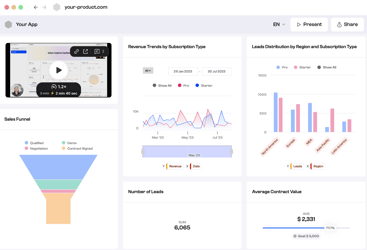
Powerdrill Bloom is an advanced AI Data Exploration Agent designed to streamline the journey from raw files to executive decision-making. It stands out by integrating powerful analysis with high-end design automation.
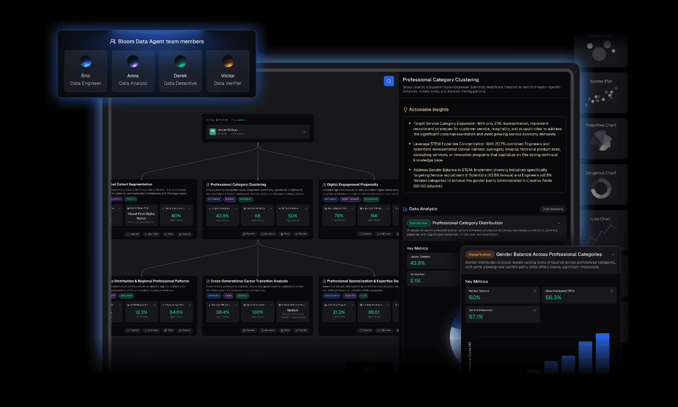
Auto-Cleaning & Organization: Upload messy Excel/CSV/PDF files, and the agent automatically cleans and structures the data for analysis.
Nano Banana Pro Technology: This is the game-changer. It leverages the embedded Nano Banana Pro engine to instantly generate Professional/Business/Fancy Slides and Data Preview Images. It creates a persuasive visual narrative tailored for high-stakes presentations.
Insight Extraction: Offers multi-dimensional trend analysis, deep insights, and future predictions.
Natural Language Interface: No code required. Just ask, "Why did sales drop in Q3?" and get a visual answer with optimized charts.
Seamless "Data-to-Presentation" workflow.
Nano Banana Pro visuals are aesthetically superior and board-ready.
Drastically reduces time spent on data prep and design.
Intuitive for non-technical users.
May feel too automated for users who prefer manual cell-by-cell control.
Competitive pricing with a generous free trial available.
An industry powerhouse that now uses AI to surface personalized insights.
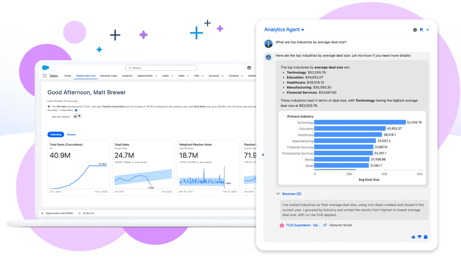
Tableau Pulse for automated data digests and natural language Q&A.
Unmatched depth for complex, large-scale datasets.
Steep learning curve and high cost.
Premium subscription model.
The enterprise standard for reporting, now boosted by OpenAI's GPT technology.
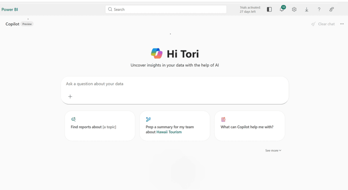
DAX generation, report page creation via chat.
Deep integration with Excel and Azure.
Can be clunky; requires specific licensing tiers.
Per-user monthly subscription.
An AI data analyst that writes and executes Python code in a secure sandbox.
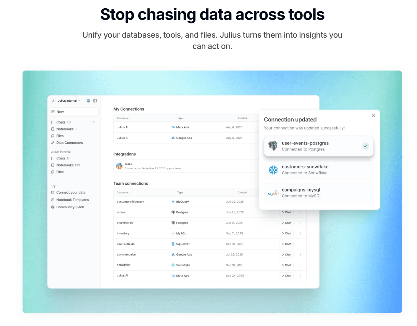
Advanced statistical modeling, transparent code execution.
Great for transparency; you see exactly how the data is processed.
Visualization aesthetics are basic compared to design-focused tools.
Subscription based.
Polymer transforms static spreadsheets into interactive, searchable databases ("Apps") without any code. It is ideal for e-commerce and marketing data.
AI-driven auto-tagging, instant pivot tables, and interactive dashboards.
Highly modern interface; makes data "explorable" for everyone.
Lacks deep statistical capabilities like regression analysis.
Tiered subscription (Starter/Pro/Enterprise).
A AI agents for media agencies. Deploy AI agents that deliver across the campaign lifecycle
No-code machine learning modeling, sales forecasting, and Chat Explore.
Incredibly fast at building predictive models; connects to live data sources like HubSpot.
Visualization options are less customizable/fancy
Monthly subscription geared towards SMBs.
Google’s reporting solution, now enhanced with Gemini AI, perfect for those deep in the Google ecosystem.

Seamless Google Analytics integration, Gemini-assisted summary generation.
Free entry tier; excellent real-time collaboration.
Can be slow with very large datasets; limited data cleaning capabilities.
Free (Pro version available).
A "design-first" tool that focuses on creating stunning infographics and presentations rather than deep data analytics.
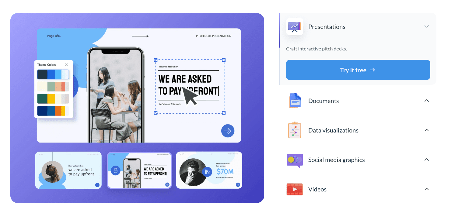
Massive library of infographic templates, animated chart widgets.
Creates beautiful, engaging visuals suitable for social media.
Not suitable for complex data cleaning or heavy statistical analysis.
Per-user monthly subscription.
A tool designed for simplicity and speed, popular among startups and Notion users for creating quick, modern charts.

Minimalist data input, Notion embedding, auto-optimized color palettes.
Extremely fast to use; visuals look great out of the box.
Very limited functionality for complex or multi-dimensional data.
Per-user monthly subscription.
An AI tool specialized in visualizing text data through Natural Language Processing (NLP).
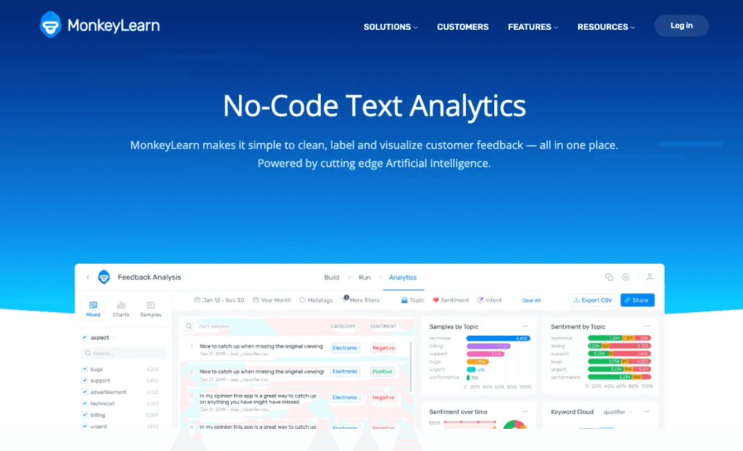
Sentiment analysis, keyword extraction, word cloud generation.
Visualizes qualitative data (like customer reviews) which traditional tools miss.
Cannot handle standard numerical/financial reporting.
Pay-per-use or subscription.
An embedded analytics platform designed for developers to build white-labeled dashboards into their own products.
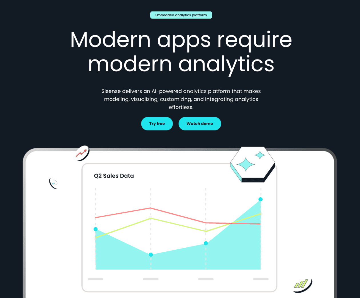
Infusion Apps, BloX for custom widgets, API-first design.
Highly customizable and powerful for product integration.
Requires developer resources; not for the average business user.
Custom pricing.
Tool Name | Data Cleaning | Visualization Quality | Slide Generation | Ease of Use | Best For |
Powerdrill Bloom | ⭐⭐⭐⭐⭐ | ⭐⭐⭐⭐⭐ | ⭐⭐⭐⭐ | ⭐⭐⭐ | All-in-one Reporting |
Tableau AI | ⭐⭐⭐⭐ | ⭐⭐⭐⭐⭐ | ⭐⭐ | ⭐⭐ | Data Scientists |
Power BI | ⭐⭐⭐⭐ | ⭐⭐⭐⭐ | ⭐⭐⭐ | ⭐⭐⭐ | Enterprise IT |
Julius AI | ⭐⭐⭐⭐ | ⭐⭐⭐⭐ | ⭐⭐⭐ | ⭐⭐⭐⭐ | Python Coders |
Polymer | ⭐⭐⭐ | ⭐⭐⭐⭐ | ⭐⭐ | ⭐⭐⭐⭐ | Marketers |
Akkio | ⭐⭐⭐ | ⭐⭐⭐ | ⭐⭐ | ⭐⭐⭐⭐ | Forecasters |
Looker Studio | ⭐⭐ | ⭐⭐⭐ | ⭐⭐ | ⭐⭐⭐ | Google Users |
Visme | ⭐⭐ | ⭐⭐⭐⭐⭐ | ⭐⭐⭐⭐ | ⭐⭐⭐⭐ | Designers |
Graphy | ⭐⭐ | ⭐⭐⭐⭐ | ⭐⭐ | ⭐⭐⭐⭐⭐ | Simple Charts |
MonkeyLearn | ⭐⭐ | ⭐⭐⭐ | ⭐⭐ | ⭐⭐⭐ | Text Data |
Sisense | ⭐⭐⭐⭐ | ⭐⭐⭐⭐ | ⭐⭐ | ⭐⭐ | Developers |
I evaluated each tool's ability to handle real business datasets, including aspects such as data analysis from various scenarios, financial indicators, and customer behavior logs.
For the "Efficiency Hunter" (Best Overall): If your goal is to convert raw data into a professional presentation in minutes, Powerdrill Bloom is the clear winner. Its Nano Banana Pro feature bridges the gap between analysis and storytelling like no other tool.
For the "Forecaster": If you need to predict next month's sales, Akkio is excellent.
For the "Designer": If you only care about how the chart looks on Instagram, choose Visme.
In December 2025, the best tool is one that saves you time while enhancing accuracy.
While traditional BI tools remain powerful, the shift towards AI Agents like Powerdrill Bloom demonstrates a future where data cleaning, analysis, and presentation happen in one fluid motion, empowering you to make decisions faster.
If you want to experience the magic of automated cleaning, trend prediction, and instant Nano Banana Pro slide generation, we highly recommend you try Powerdrill Bloom for free. Turn your raw data into a persuasive visual story today.
It is software that uses artificial intelligence to automatically process data, recognize patterns, and generate visual representations (charts, graphs) without requiring manual coding or design skills.
Powerdrill Bloom is currently the top recommendation for business teams due to its ability to clean data and generate presentation-ready slides (via Nano Banana Pro) instantly, saving hours of manual work.
They work by ingesting structured or unstructured data, using machine learning to clean and analyze it for trends, and then using a graphics engine to render the most appropriate visual format based on the user's natural language queries.