How to Turn Messy Survey Data Into Clear Charts With AI (Step-by-Step)
Introduction
Running a survey is often the easiest part of gathering feedback. The real challenge begins the moment the results roll in. You open your spreadsheet only to be greeted by a chaotic wall of text, missing fields, and inconsistent formatting. Analyzing this raw information used to mean spending hours wrestling with complex spreadsheet formulas or begging a data analyst for help.
Today, artificial intelligence has completely transformed this workflow. You no longer need to be a data scientist to make sense of your feedback. In this guide, we will show you exactly how to turn messy survey data into clear charts with AI, empowering you to uncover actionable insights in minutes.
What Is “Messy Survey Data”?
Before you can analyze your results, you have to understand what makes survey data "messy." When you export results from platforms like Google Forms, SurveyMonkey, or Typeform, the raw file is rarely ready for immediate visualization. Messy survey data typically includes:
Inconsistent Formatting: Dates written in different styles (e.g., MM/DD/YYYY vs. DD/MM/YYYY) or numbers mixed with text (e.g., "100" vs. "one hundred").
Open-Ended Text Responses: Paragraph-long answers that are incredibly valuable but impossible to chart using traditional pivot tables.
Missing or Null Values: Respondents skipping questions, leaving blank cells that can easily break traditional formulas.
Typos and Variations: Categorical answers that should be identical but aren't due to human error (e.g., "US", "USA", "United States").
Duplicate Entries: The same user submitting the survey multiple times, skewing your final metrics.
Why Cleaning Survey Data Matters Before Visualization
You might be tempted to throw your raw data directly into a charting tool, but skipping the cleaning phase is a massive mistake. Here is why cleaning your data is absolutely critical:
Prevents "Garbage In, Garbage Out": Charts based on flawed data will lead to incorrect business decisions. Cleaning ensures absolute accuracy.
Unlocks the Power of Text: Categorizing open-ended responses allows you to actually quantify customer sentiment and common complaints.
Maintains Professionalism: Presenting a dashboard to stakeholders with broken charts or misspelled categories damages your credibility.
Enables Accurate AI Processing: While modern AI is smart, feeding it clean, structured data ensures the fastest and most accurate visual outputs.
Traditional Way vs AI-Powered Way
To truly appreciate the power of AI, let’s look at how the modern workflow compares to the old-school methods of survey analysis.
Feature | Traditional Way (Excel / Manual BI) | AI-Powered Way (e.g., Powerdrill Bloom) |
Data Cleaning | Manual formatting, complex VLOOKUPs, and deduplication. | Automated error detection, standardization, and smart filling. |
Analyzing Text | Manually reading and tagging hundreds of open-ended responses. | AI instantly reads, groups, and performs sentiment analysis. |
Chart Creation | Dragging, dropping, and configuring axes, series, and labels. | Simply typing a question in plain English to get a chart. |
Time Required | Hours to days, depending on data size. | Seconds to minutes. |
Skills Needed | Advanced spreadsheet skills, SQL, or Python. | Zero coding; basic conversational English. |
Step-by-Step: Turn Survey Data Into Charts Using AI
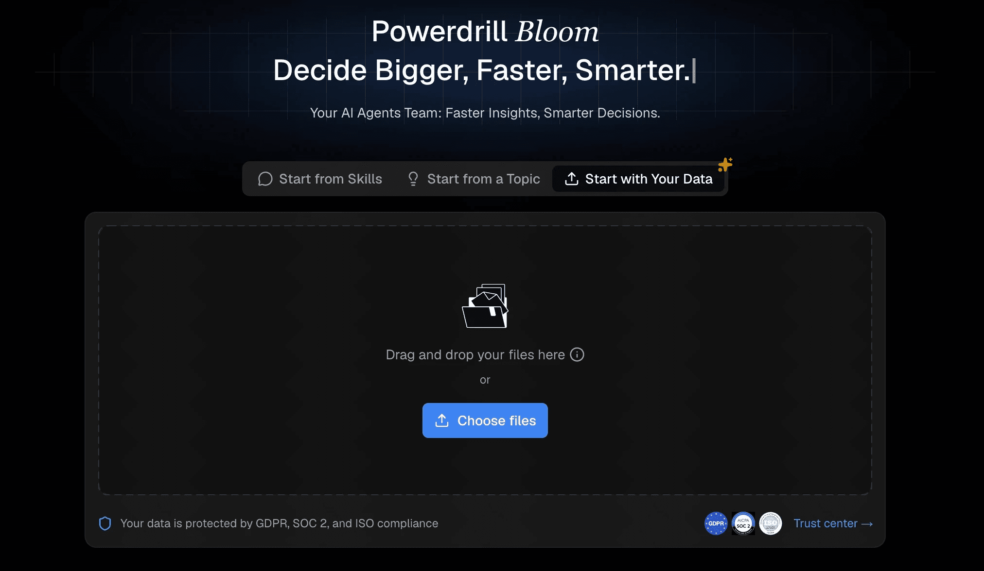
If you want the fastest, most intuitive way to bridge the gap between a messy spreadsheet and a beautiful dashboard, Powerdrill Bloom is the ultimate tool. Here is the step-by-step process of transforming your survey results using Powerdrill Bloom's powerful AI.
Step 1: Upload Data Into an AI Tool
The first step is getting your data into the system. With Powerdrill Bloom, this is completely frictionless. Simply export your survey results as a CSV or Excel file from your survey provider. Log into Powerdrill Bloom and drag and drop your file directly into the workspace. The platform instantly parses the document, recognizing columns, rows, and data types without requiring you to manually map out schemas or write import scripts.
Step 2: AI Automatically Cleans the Data
This is where the magic begins. Instead of spending your afternoon fixing typos, Powerdrill Bloom’s AI engine gets to work the moment your file is uploaded. It automatically detects anomalies. If you have variations like "New York" and "NY," the AI understands they are the same and groups them. It intelligently handles missing values, ensuring they don't skew your averages.
For open-ended questions, Powerdrill Bloom reads the text, extracts key themes, and assigns tags, turning unstructured paragraphs into chartable data points.
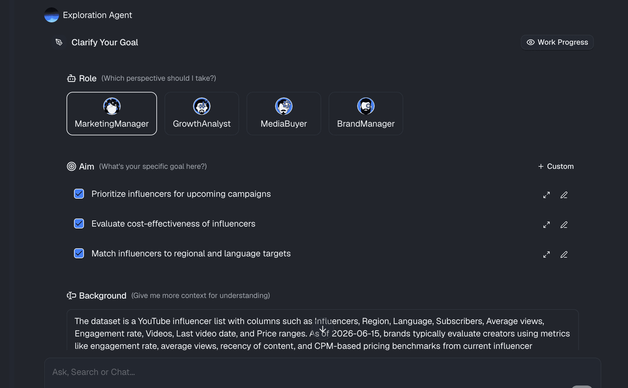
Step 3: Ask AI Questions (Natural Language)
Forget about navigating complex chart menus. Powerdrill Bloom operates on a revolutionary "chat-to-chart" interface. Once your data is prepped, you simply ask the AI questions exactly as you would ask a human analyst.
Type: "What is the breakdown of customer satisfaction scores by age group?"
Type: "Show me a pie chart of the most requested product features from the open-ended feedback."
Type: "Create a line graph of our Net Promoter Score (NPS) over the last three quarters."
Within seconds, Powerdrill Bloom generates perfectly formatted, highly accurate visualizations that answer your exact query.
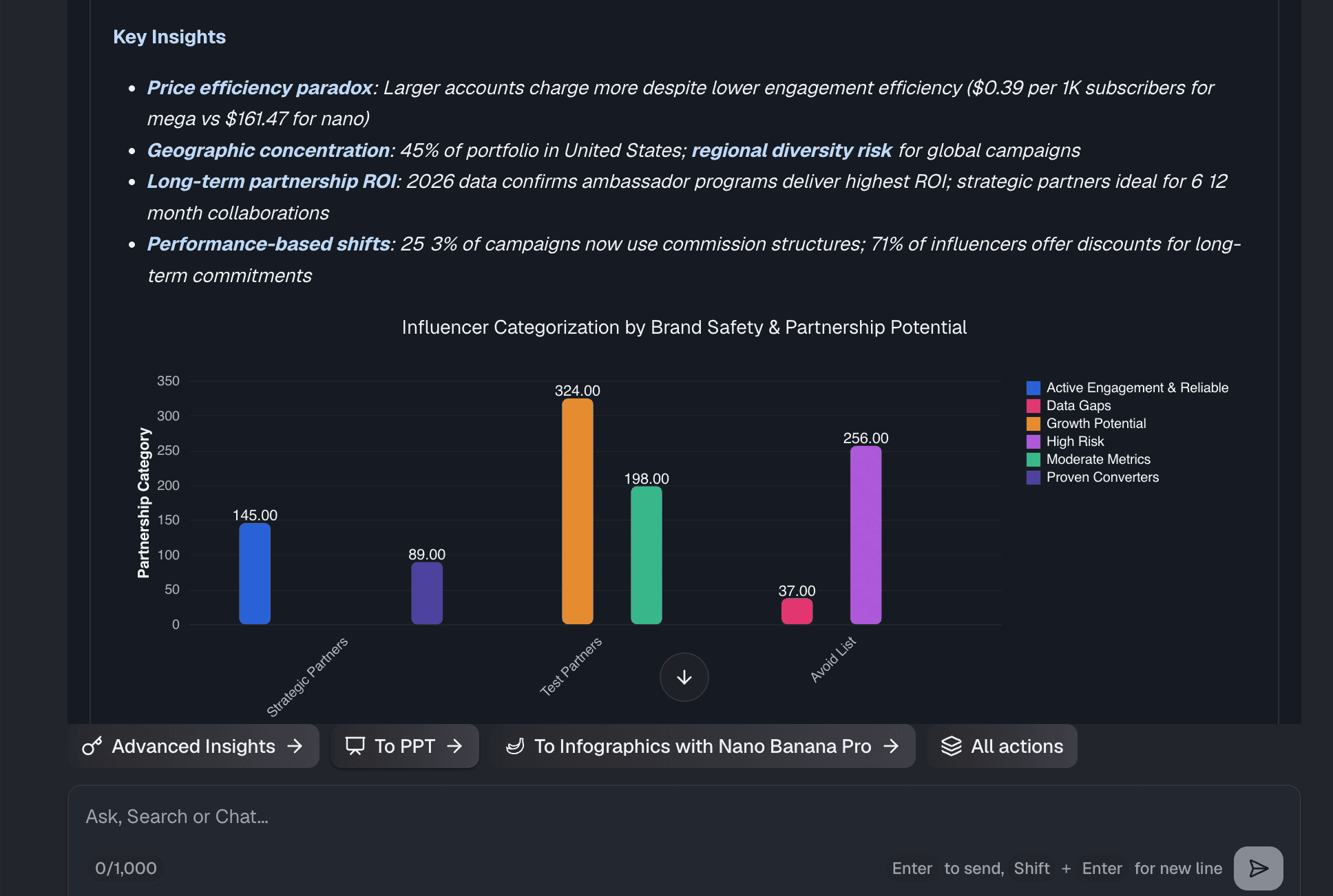
Step 4: Build a Dashboard From Survey Insights
A single chart is helpful, but a complete dashboard tells a story. As you ask questions and Powerdrill Bloom generates beautiful visualizations, you can easily pin these charts to a centralized canvas. In just a few clicks, you can arrange your bar charts, pie charts, and text summaries into a comprehensive, interactive dashboard.
From there, Powerdrill Bloom makes it effortless to share these insights via a secure link with your team, ensuring everyone is aligned on what the survey data actually means.
Who Should Use AI for Survey Analysis
AI-powered survey analysis is a game-changer for almost every department:
Marketing Teams: To quickly analyze customer satisfaction (CSAT), Net Promoter Scores (NPS), and brand awareness surveys.
Human Resources (HR): To process employee engagement surveys anonymously and identify core workplace themes from open-ended feedback.
Product Managers: To categorize feature requests and bug reports from user feedback forms without reading every single submission.
Market Researchers: To process massive, multi-faceted demographic studies in a fraction of the time.
Conclusion
Analyzing survey data no longer has to be a tedious, overwhelming task. By leaving behind outdated spreadsheets and embracing modern technology, you can turn chaotic rows of text into stunning, actionable visual narratives. The AI-powered approach saves time, eliminates human error, and uncovers deeper insights hidden in your data.
If you are ready to stop wrestling with messy survey data and start making smarter decisions, you need the right tool. Powerdrill Bloom offers an unparalleled, no-code experience that does the heavy lifting for you. Simply upload your file, ask questions, and watch your insights come to life. Try Powerdrill Bloom today and experience the future of effortless data analysis.
FAQs
Can Powerdrill Bloom analyze open-ended survey responses?
Yes! Powerdrill Bloom uses advanced NLP to understand text, extract themes, and visualize open-ended feedback instantly.
Do I need to manually clean CSV files first?
Not at all. Powerdrill Bloom automatically detects errors, removes duplicates, and standardizes formats upon your upload.
Can I share the AI-generated charts with my team?
Yes, Powerdrill Bloom lets you share interactive dashboards easily via secure links or embed them into presentations.
How long does it take to create a chart?
With Powerdrill Bloom's chat-to-chart feature, generating beautiful, accurate visualizations from messy data takes just seconds.