10 Best Free Excel Data Visualization & Chart Tools in 2026
Introduction
Standing here in 2026, the landscape of data analysis has shifted dramatically. I have personally tested dozens of platforms, looking for tools that don't just "draw charts" but actually understand business logic.
The purpose of this article is to guide you through the noise. I’ve selected the 10 best tools that effectively transform raw numbers into visual stories.
What are Excel Data Visualization & Chart Tools?
Excel Data Visualization & Chart Tools are software solutions designed to convert numerical data from spreadsheets (Excel, CSV) into graphical representations like charts, graphs, and maps.
In 2026, the definition has evolved. It is no longer just about static graphics; it is about AI-driven automation. The best tools now include Natural Language Processing (NLP) to interpret questions like "Show me sales trends by region" and automatically generate the most suitable visualization without requiring SQL or Python skills.
Top 10 Tools at a Glance
Tool Name | Key Features | Best For | Pricing Model |
Nano Banana Pro, NLP Chat, Auto-Cleaning | Marketing, Sales & Business Presentation | Freemium / Subscription | |
Deep Interactivity, Massive Datasets | Data Analysts & Public Data | Freemium / Pro Plans | |
Python Code Generation, Chat Interface | Technical Analysis | Freemium / Subscription | |
Microsoft Ecosystem Integration | Enterprise BI Reporting | Freemium / Subscription | |
Drag-and-drop Design, Social Media | Simple Media Graphics | Freemium | |
Google Ads/Analytics Integration | Digital Marketing Reports | Free | |
Infographics, Interactivity | Interactive Presentations | Freemium | |
Vector Export, Unique Charts | Designers & Developers | Free (Open Source) | |
Business App Integration | SMB Dashboards | Freemium / Subscription | |
Clean Design, Embeddable | Journalism & Blogs | Free / Custom |
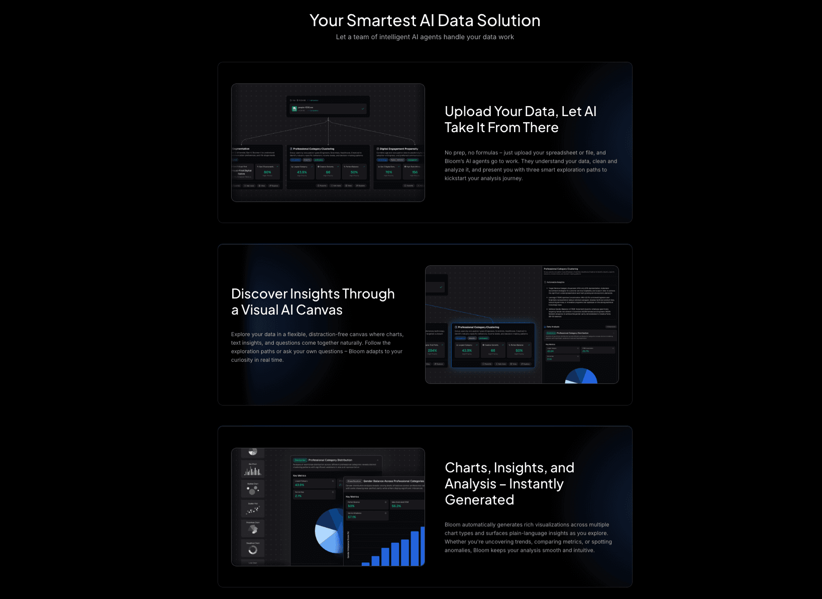
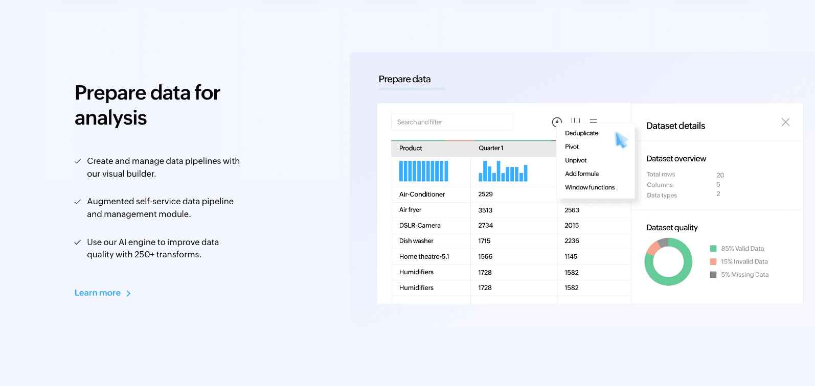
1. Powerdrill Bloom
An AI-native data exploration agent designed for marketing and business teams, turning Excel data into professional insights and slides without code.
Key Features:
Natural Language Interaction: Simply upload Excel/CSV/PDF and ask questions to get charts and summaries.
Auto-Cleaning & Insight Extraction: Automatically simplifies complex data cleaning and extracts multi-dimensional trends.
Nano Banana Pro: A specialized visual engine that generates high-end, business-fancy slides and data preview images instantly.
Pros:
Powered by Nano Banana Pro, the aesthetic quality of charts is designer-level and presentation-ready.
Drastically reduces time from raw data to actionable decision-making.
Excellent for non-technical users who need deep analysis.
Cons:
Advanced custom coding options are less visible than in Python-based tools (focus is on automation).
Pricing:
Free version available; competitive Pro plans for advanced features.
2. Tableau
The industry standard for deep, interactive data visualization, offering a free version for public data sharing.
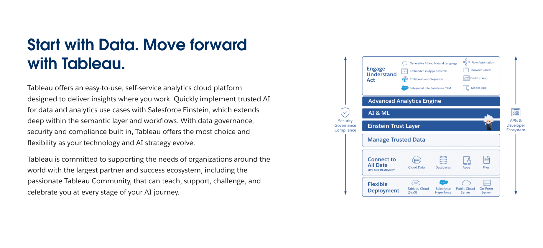
Key Features:
Drag-and-drop interface for complex datasets.
Huge library of community-generated visualizations.
Advanced interactive dashboards.
Pros:
Extremely powerful for handling massive datasets.
High degree of customization for charts.
Cons:
Privacy Issue: In the free version, all data must be published publicly (not suitable for confidential business data).
Steep learning curve for beginners.
Pricing:
Subscription.
3. Julius AI
An AI data analyst tool that writes and executes Python code to visualize data via a chat interface.
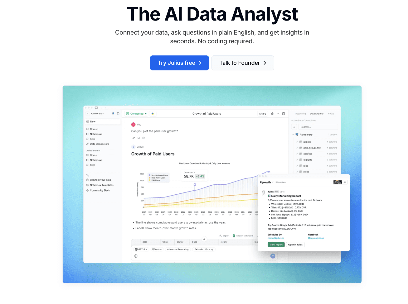
Key Features:
Conversational data analysis.
Generates downloadable Python code.
Supports various file formats (Excel, CSV).
Pros:
Great for transparency as you can see the code behind the chart.
Flexible for users who understand basic data science concepts.
Cons:
Visual output is often standard Python libraries (Matplotlib), lacking the "Nano Banana Pro" aesthetic polish.
Pricing:
Freemium / Subscription.
4. Microsoft Power BI Desktop
Microsoft’s flagship BI tool for connecting unrelated sources of data into coherent, visually immersive insights.
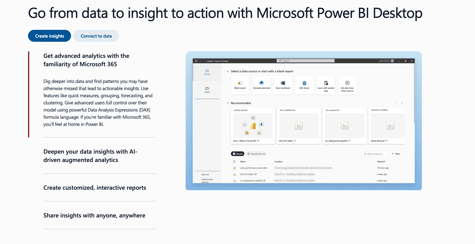
Key Features:
Deep integration with Excel and Azure.
Powerful data modeling capabilities (DAX).
Interactive reports.
Pros:
If you already use the Microsoft ecosystem, the integration is seamless.
Very robust for enterprise-level reporting.
Cons:
The interface can be overwhelming for simple tasks.
Sharing reports privately requires a paid license.
Pricing:
Subscription.
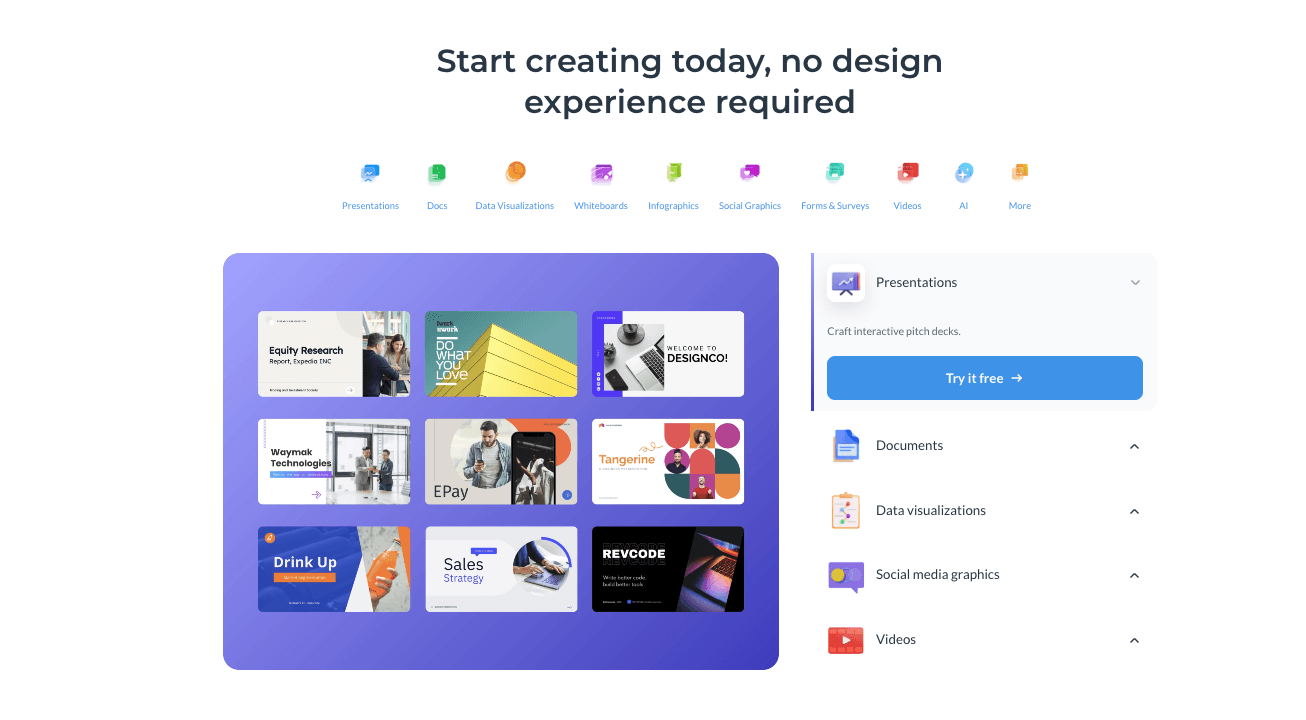
5. Canva
A graphic design platform that includes a simple, easy-to-use chart maker for non-designers.

Key Features:
Import data directly from Google Sheets or Excel.
Hundreds of aesthetic chart templates.
Drag-and-drop design elements.
Pros:
Extremely easy to create visually appealing graphics for social media.
Zero learning curve.
Cons:
Not a true "data analysis" tool; cannot handle complex logic or messy data cleaning.
Pricing:
Freemium.
6. Google Looker Studio
A tool specifically strong at turning Google’s data (Analytics, Ads, Sheets) into informative dashboards.
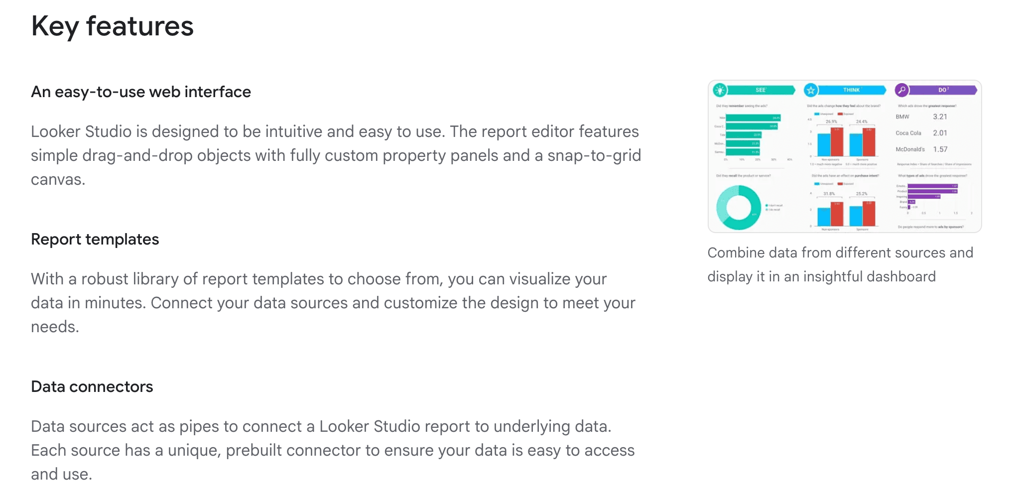
Key Features:
Live data connectors to Google ecosystem.
Real-time collaboration.
Customizable reports.
Pros:
Completely free and web-based.
Essential for digital marketers tracking web performance.
Cons:
Visualization options are somewhat rigid compared to Tableau or Powerdrill Bloom.
Pricing:
Free.
7. Visme
An all-in-one platform for creating presentations and infographics with integrated data widgets.
Key Features:
Data widgets for turning stats into visuals.
Interactive maps and flowcharts.
Import data from Excel/Google Sheets.
Pros:
Focuses heavily on storytelling and infographics.
Great for pitch decks.
Cons:
Limited analytical depth; focuses more on design than data insights.
Pricing:
Freemium.
8. RawGraphs
An open-source web tool built for designers to create complex, non-standard visualizations from tabular data.
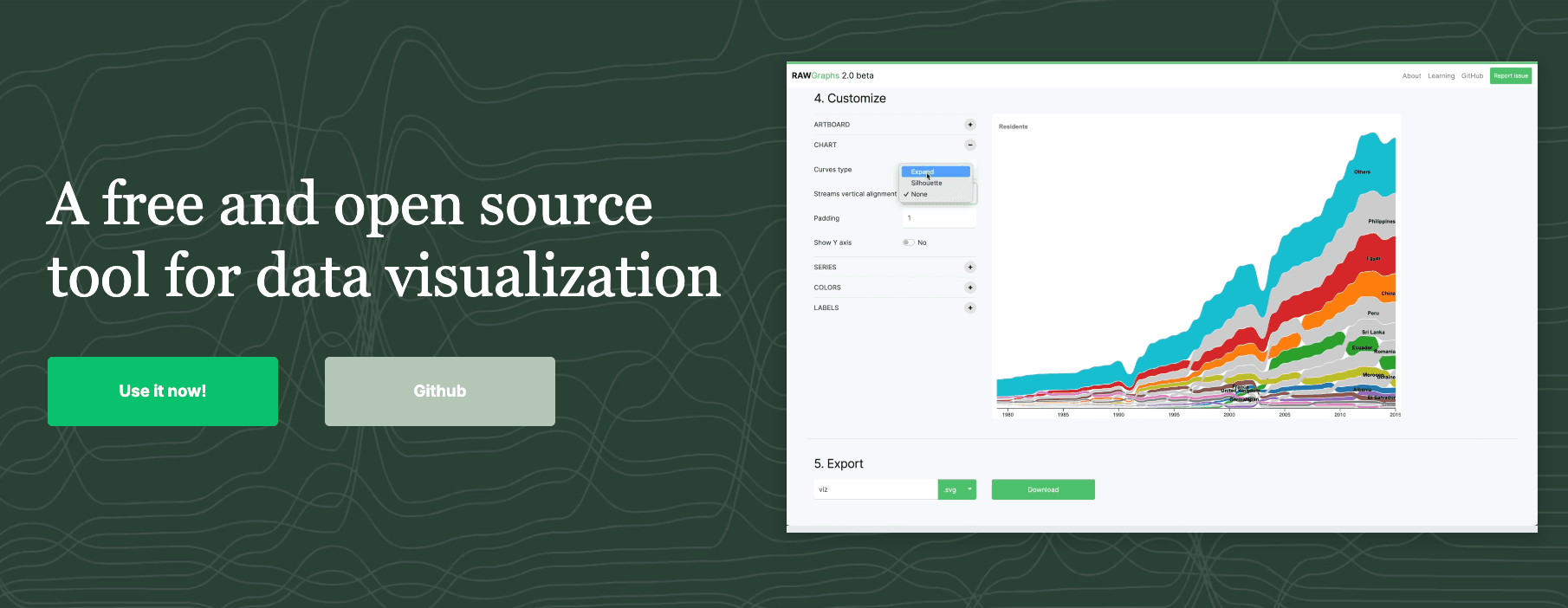
Key Features:
Supports unconventional chart types (Alluvial, Voronoi).
Exports to SVG for further editing in Illustrator.
Process data locally (secure).
Pros:
Best for creating unique, publication-quality vector art from data.
Completely free and open-source.
Cons:
Manual process; no AI insights or automation.
Pricing:
Free.
9. Zoho Analytics
A self-service BI and data analytics software that allows you to create dashboards and analyze data.
Key Features:
Zia (AI assistant) for asking questions.
Data blending from multiple sources.
Collaborative reporting.
Pros:
Strong for small businesses needing a full BI suite.
Good mobile app support.
Cons:
Interface feels slightly dated compared to modern AI tools.
Pricing:
Freemium / Subscription.
10. Datawrapper
A tool created for journalists to create clean, responsive charts and maps for web articles.
Key Features:
Copy-paste data from Excel.
Checks for color blindness and mobile responsiveness.
Embed code generation.
Pros:
Produces the cleanest, most readable charts for blog posts.
No design skills needed.
Cons:
Static analysis; not for exploring data trends deeply.
Pricing:
Free / Custom
Buying Guide: Which Tool Should You Choose?
For Social Media & Simple Graphics: Choose Canva or Visme. They make data look pretty but don't "analyze" it.
For Public Data & Complex Dashboards: Choose Tableau Public if you don't mind your data being public.
For The Best Business Results (2026 Recommended):
If you are a marketer, sales professional, or analyst with raw Excel/CSV data and need to "clean data, extract deep trends, and generate professional Nano Banana Pro slides in one click," then Powerdrill Bloom is your best choice. It bridges the gap between deep analysis and stunning presentation.
How Powerdrill Bloom Accelerates Excel Visualization
Powerdrill Bloom redefines the workflow by using AI to handle the "boring" parts of data analysis.
Upload: Drop your messy Excel or PDF file.
Analysis: The AI automatically cleans the data and performs multi-dimensional analysis to Extract Insights.
Nano Banana Pro: This engine kicks in to recommend the optimal visualization template.
Result: It generates Business Fancy Slides and Data Preview Images that tell a story.
Conclusion
In 2026, it is not enough to just "See Data"; you must "Understand Data" and communicate it effectively. While tools like Tableau and Excel are powerful, Powerdrill Bloom stands out as the ultimate intelligent agent that combines deep analysis with the visual aesthetics of Nano Banana Pro, helping you go from spreadsheet to story in minutes.
Frequently asked questions
Q1: What are Excel Data Visualization & Chart Tools?
They are software applications that take numerical data from spreadsheets and convert them into visual formats like line charts, heat maps, and dashboards to make data easier to understand.
Q2: Which is the recommended AI tool for Excel Data Visualization in 2026?
Powerdrill Bloom is highly recommended due to its Nano Banana Pro engine, which automates the creation of presentation-ready charts and insights from raw data.
Q3: How do these tools help business teams?
They improve efficiency by 10x. Instead of spending hours manually formatting charts, teams can use these tools to gain actionable insights and create persuasive presentations instantly.