11 Best AI Tools to Turn Excel Data Into Slides in 2026
Joy·

Turning raw Excel data into engaging, professional presentation slides has traditionally been a time-consuming and tedious process. In 2026, artificial intelligence has completely revolutionized this workflow. Instead of manually creating charts and copying data from spreadsheets into your slide deck, modern AI tools can analyze your data, extract key insights, and generate visually stunning presentations in a matter of seconds. In this blog post, we will explore the top AI tools that are making this seamless conversion a reality for professionals everywhere.
Tools | Key Features | Best for | Pricing |
|---|---|---|---|
One-click Excel-to-slide, automated storytelling, smart charts | Fast, zero-design presentation generation | ||
Chat-based data querying, instant chart generation | Quick statistical analysis and individual charts | ||
Enterprise integration, predictive modeling, data narratives | Enterprise-level business intelligence | ||
No-code predictive modeling, automated dashboards | Marketers and analysts needing predictive insights | ||
AI formulas, in-sheet text and data summarization | Cleaning and summarizing data inside spreadsheets | ||
Auto-ML, end-to-end data pipelines, team workspaces | Large, collaborative data science teams | Custom pricing | |
Built-in AI analyst, live data APIs, modern UI | Built-in AI analyst, live data APIs, modern UI | ||
Large file uploads, advanced text synthesis, slide outlines | Drafting presentation narratives and detailed outlines | ||
Native Excel-to-PowerPoint sync, auto-branding | Users deeply embedded in the Microsoft 365 ecosystem | $9.9/per user month | |
Instant web app conversion, interactive templates | Creating interactive, web-based data dashboards | ||
Deep data mapping, direct live PowerPoint exports | Presenting complex, live-updating enterprise data |
Powerdrill Bloom is a cutting-edge, purpose-built AI platform designed specifically to bridge the gap between complex datasets and beautiful presentations. It instantly converts raw Excel rows into compelling, presentation-ready slide decks.
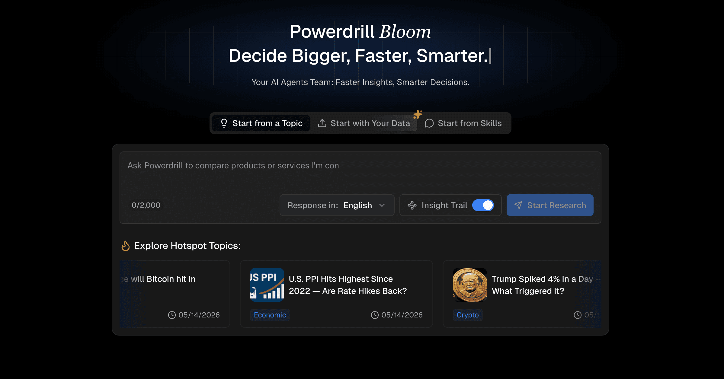
One-click conversion from Excel spreadsheets directly to slide layouts.
Automated data storytelling that highlights key metrics and trends.
Smart chart and graph recommendations based on your data context.
Incredibly intuitive interface requiring zero learning curve.
Generates highly accurate insights from massive datasets.
Requires an internet connection for cloud-based AI generation.
Some highly specialized niche templates are only available on premium tiers.
Pro at $13.27/month. Plus at $26.6/month.
Julius AI is a versatile data analysis tool that acts as your virtual data scientist. It allows users to upload spreadsheets and prompt the AI to create visualizations that can be exported for presentations.

Conversational interface for querying data.
Automatic generation of complex visualizations.
Direct export capabilities for charts and insights.
Excellent at handling complex statistical queries.
Very responsive to natural language prompts.
Focuses more on single charts than full slide deck generation.
Formatting may need adjustments when pasted into presentations.
Free trial. Plus at $20/month. Pro at $45/month. Max at $200/month.
Tableau AI brings the power of generative AI to the world's leading business intelligence platform, allowing enterprise users to translate spreadsheet data into dynamic visual dashboards and exported slides.

Deep enterprise-grade data integration.
Automated predictive modeling and forecasting.
"Data Stories" feature that writes narratives for your metrics.
Unmatched analytical depth and security.
Ideal for large enterprises with massive data warehouses.
Steep learning curve for beginners.
High subscription cost for small teams.
Starting at $15/user/month.
Akkio is a predictive AI platform tailored for marketers and business analysts. It allows users to upload Excel data, predict trends, and easily turn those findings into presentable reports.

Drag-and-drop predictive modeling.
Automated dashboard creation.
Seamless integration with major spreadsheet platforms.
Makes machine learning accessible to non-technical users.
Fast processing speed for predictive insights.
Primarily geared toward marketing and sales data.
Slide export options are somewhat rigid.
Custom pricing. Contact sale team.
SheetAI integrates artificial intelligence directly into your spreadsheet environment. It focuses on cleaning, organizing, and summarizing your Excel or Google Sheets data to prepare it for presentation formats.
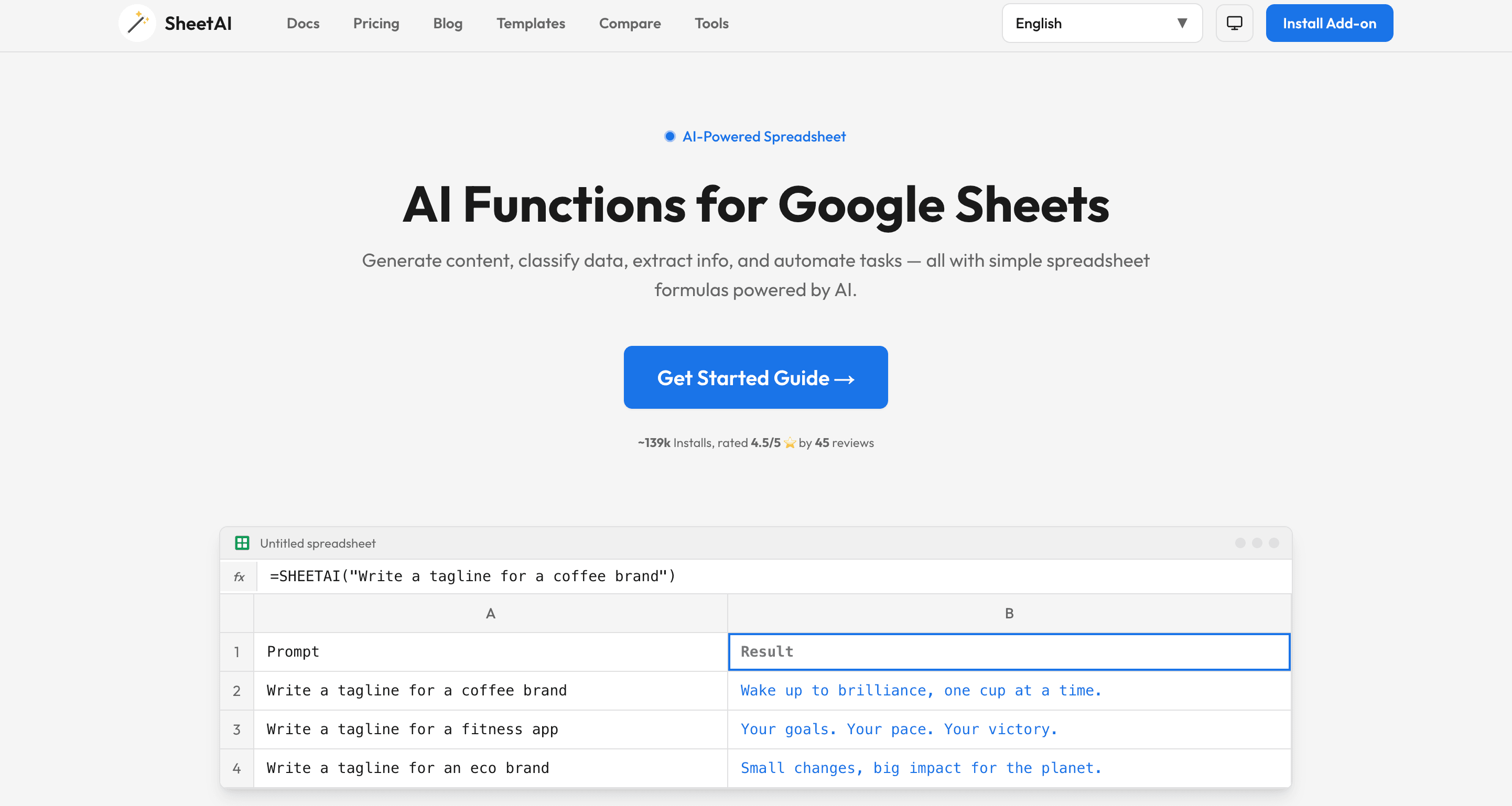
AI-driven formulas and data formatting.
Automatic text summarization of data rows.
Generates quick visual summaries within the spreadsheet.
Works directly inside your existing spreadsheet software.
Excellent for data cleanup before presentation creation.
Does not generate standalone presentation slides directly.
Limited complex charting capabilities.
Start from $20/month.
Dataiku is an advanced, centralized data science platform. In 2026, its AI capabilities allow teams to collaborate on raw Excel data and easily publish their findings into visual, presentation-ready formats.

End-to-end data pipeline management.
Auto-ML capabilities with visual output generation.
Collaborative workspace for teams to build reports together.
Highly collaborative and scalable for large teams.
Strong governance and data security features.
Can be overly complex for simple data-to-slide needs.
Implementation requires significant time and IT resources.
14-day free trial. Costs are tailored to the organization, based on the platform tier (e.g., Enterprise) and the number of users.
Rows AI is a next-generation spreadsheet platform that comes with a built-in AI analyst. It is designed to automatically build summaries and visually appealing reports from standard Excel file uploads.
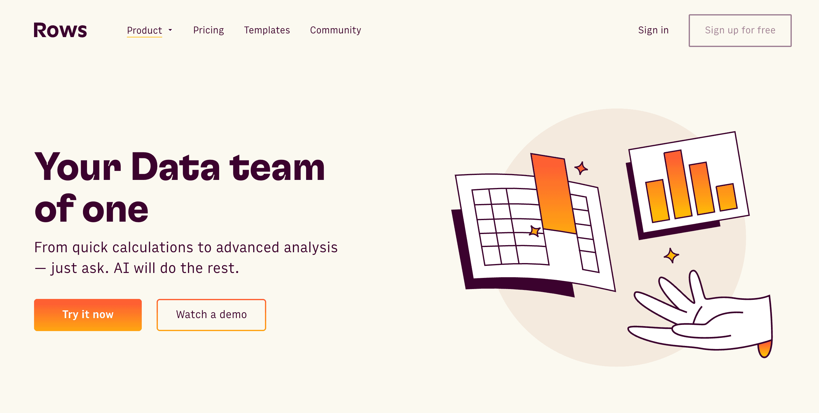
"AI Analyst" that automatically summarizes datasets.
Sleek, modern spreadsheet interface with immediate sharing options.
Built-in API connections to pull live data.
Beautiful default aesthetics for data sharing.
Very fast processing of standard data tables.
Better suited for web-based sharing than traditional PPT slides.
Advanced charting customization is somewhat limited.
Free trail. Plus at $8/per user month. Pro at $79+$8/per user month.
Claude by Anthropic is a highly capable Large Language Model that excels at synthesizing massive amounts of text and data. By uploading an Excel file, you can ask Claude to write out full slide contents and generate SVG charts.

Large context window for uploading heavy Excel files.
Nuanced, human-like data synthesis and storytelling.
Can write out slide-by-slide outlines and presentation scripts.
Creates highly structured and articulate presentation narratives.
Extremely versatile for any type of data context.
Does not output a native .pptx file directly.
Requires manual assembly of the final presentation deck.
Free tier available, with the Claude Pro subscription priced at $20/month.
Microsoft Copilot is deeply integrated into the Microsoft 365 ecosystem. It allows users to take an Excel file and prompt Copilot in PowerPoint to generate a presentation based on that specific data.
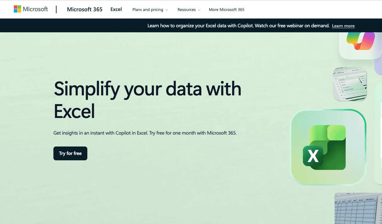
Native integration between Excel and PowerPoint.
Uses organizational branding and templates automatically.
Generates speaker notes alongside slide content.
Perfect harmony with the Microsoft Office suite.
Adheres strictly to enterprise compliance standards.
Sometimes struggles with highly complex or messy datasets.
Requires an expensive enterprise Microsoft 365 license.
$9.99 per user/month.
Polymer is a modern Business Intelligence tool designed to make data analysis as easy as browsing the web. It takes uploaded Excel files and instantly turns them into interactive, slide-like dashboards.
Instant conversion of spreadsheets into interactive web apps.
AI-driven auto-tagging and categorization of data.
Beautiful pre-built visualization templates.
Requires absolutely no setup or coding.
Highly interactive presentations compared to static slides.
Dashboards are web-based, which isn't ideal for offline presenting.
Pricing scales up quickly with more data viewers.
Starter at $25/month. Pro at $50/month. Teams at $125/month.
Power BI, enhanced with its own Copilot features, remains the heavy lifter for enterprise data visualization. It allows users to turn massive Excel databases into intricate, exportable presentation slides.

Deep data modeling and relationship mapping.
AI-generated summaries of visual data.
Direct export to live PowerPoint slides.
Handles virtually unlimited amounts of data.
Live PPT exports mean your slides update as data changes.
Very steep learning curve for non-data professionals.
Overkill for quick, simple data presentations.
Try for free. Pro at $14/per user month. Premium at $24/month.
Before selecting a tool, evaluate the state and volume of your Excel data. If you are dealing with millions of rows and complex relational databases, enterprise tools like Tableau or Power BI might be necessary. However, for standard business reports, sales figures, and marketing metrics, dedicated AI presentation generators are much more efficient.
Different tools offer different levels of aesthetic control. If your primary goal is to present to stakeholders or clients, you need a tool that prioritizes design. Look for software that offers a wide variety of customizable templates, smart layout generation, and the ability to seamlessly apply your specific brand colors and corporate fonts.
The best AI tool is the one that fits naturally into your existing workflow. Check whether the platform supports direct Excel uploads without requiring data reformatting. Additionally, see if it outputs files in the formats you actually use, such as direct PowerPoint (.pptx) files, PDFs, or easily shareable web links.
Powerdrill Bloom eliminates the friction of data preparation by allowing users to upload their Excel files directly into the platform. The AI instantly reads the rows, columns, and data points, understanding the context without requiring you to manually highlight or clean the information, saving countless hours of administrative work.
Instead of just dropping charts onto a blank white page, Powerdrill Bloom acts as an automated design agency. It intelligently selects the best slide layouts, color schemes, and chart types to represent your specific numbers. The AI ensures that your key metrics are visually prioritized, creating a compelling narrative flow throughout the deck.
What truly sets Powerdrill Bloom apart is its ability to understand what the data actually means. It doesn't just create a bar chart; it automatically generates text summaries and bullet points highlighting the most important trends, growth metrics, and outliers, ensuring your audience immediately grasps the core message of your presentation.
Navigating the transition from dense Excel spreadsheets to engaging presentation slides doesn't have to be a dreadful task anymore. While there are many excellent tools on the market in 2026, finding one that perfectly balances speed, design, and AI accuracy is key. If you want to stop wasting hours formatting charts and start delivering impactful data stories instantly, give Powerdrill Bloom a try and transform your data workflow today.
AI analyzes your raw spreadsheet data, extracts key insights, and automatically maps them into beautifully designed, ready-to-present slide layouts.
Yes, Powerdrill Bloom efficiently processes large datasets, quickly turning thousands of rows into clear, summarized slide decks without crashing.
Not at all. Powerdrill Bloom features a completely intuitive interface, requiring absolutely zero technical background or coding knowledge to operate.
Absolutely. Powerdrill Bloom uses enterprise-grade encryption to ensure your uploaded business data remains entirely private and strictly protected.
Yes, Powerdrill Bloom provides a free trial so users can fully experience its powerful data-to-slide generation capabilities before upgrading.