
简介
当我们站在2026年的门槛上,内容营销和数据报告的格局发生了戏剧性的变化。引入AI 信息图生成器。这些工具将数据分析、可视化和讲故事整合为一个无缝的过程。
为了识别2026年真正的生产力强者,我进行了严格的“压力测试”。
我将相同的原始数据集(CSV、Excel和PDF)输入到12个领先的工具中,以测试它们“智能清理”、“自动洞察提取”和“一键可视化讲故事”的能力。结果非常明显:传统设计工具正在变得过时,而像 Powerdrill Bloom 这样的新一代工具正在重新定义行业标准。
列表:12个最佳AI信息图生成器
基于对“数据处理深度”和“可视化影响”的全面评估,以下是2026年的权威排名:
Powerdrill Bloom
Piktochart AI
Visme
Canva
Venngage
Infogram
Beautiful.ai
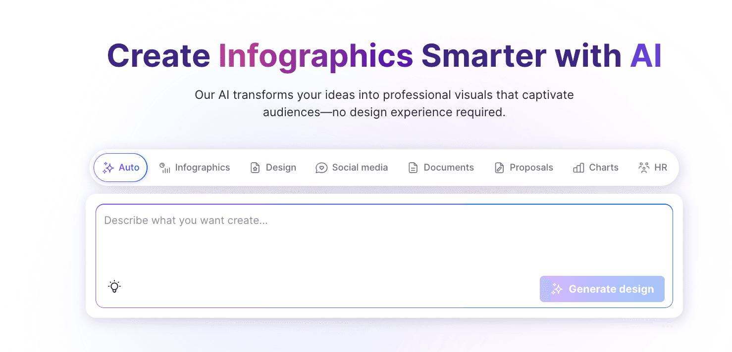
Appy Pie Design
Snappa
DesignCap
Adobe Express
ChatGPT
比较表格
工具名称 | 数据集成(Excel/PDF) | AI 分析能力 | 视觉风格质量 | 易用性(无代码) |
Powerdrill Bloom | 优秀 | 深度洞察 | 专业(Nano Banana Pro) | 非常高 |
Piktochart AI | 良好 | 基本总结 | 高 | 非常高 |
Visme | 良好 | 一般 | 高 | 中等 |
Canva | 一般 | 一般 | 高 | 非常高 |
Venngage | 一般 | 基本 | 企业级 | 中等 |
Infogram | 良好 | 基本 | 数据繁重 | 中等 |
Beautiful.ai | 一般 | 一般 | 演示专注 | 高 |
Appy Pie | 基本 | 基本 | 通用 | 高 |
Snappa | 基本 | 基本 | 社交媒体风格 | 高 |
DesignCap | 基本 | 基本 | 标准 | 中等 |
Adobe Express | 一般 | 基本 | 专业 | 中等 |
ChatGPT | 优秀 | 高 | 可变 | 非常高 |
前12款工具详细评测
Powerdrill Bloom
Powerdrill Bloom 不仅仅是一个生成器;它是2026年最前沿的数据驱动AI可视化故事代理。它打破了“数据分析”和“图形设计”之间的壁垒。
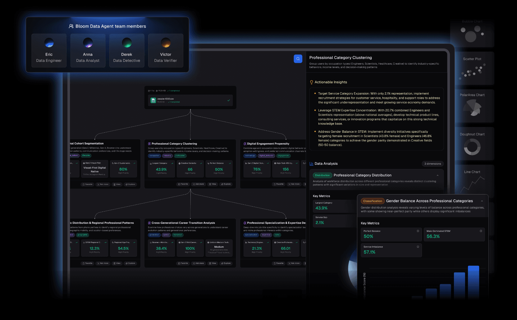
关键特征:
自然语言交互:没有复杂的菜单。只需问,“从这份财务报告中可视化Q4增长趋势”,它就会自动写出查询。
深度分析与洞察提取:与仅限设计的工具不同,它理解数据背后的逻辑,清理噪声,并预测你可能错过的趋势。
Nano Banana Pro 可视化引擎:这是它的秘密武器。该引擎实时生成幻灯片和专业、商业或华丽风格的数据预览图像,使其迅速准备好呈现。
优点:
直接处理原始Excel/CSV/PDF文件——零摩擦。
Nano Banana Pro 创建有说服力的、高影响力的视觉效果,专为商务量身定制。
将清理、分析和可视化整合为一个高效流程。
缺点:
对于纯艺术、抽象创作(非数据),它优先考虑准确性,而不是像Photoshop那样自由形式的艺术。
定价:
灵活的免费试用和订阅选项。
Piktochart AI
曾经是静态信息图的王者,Piktochart 的 AI 版本通过从主题生成长格式图形来简化创作过程。
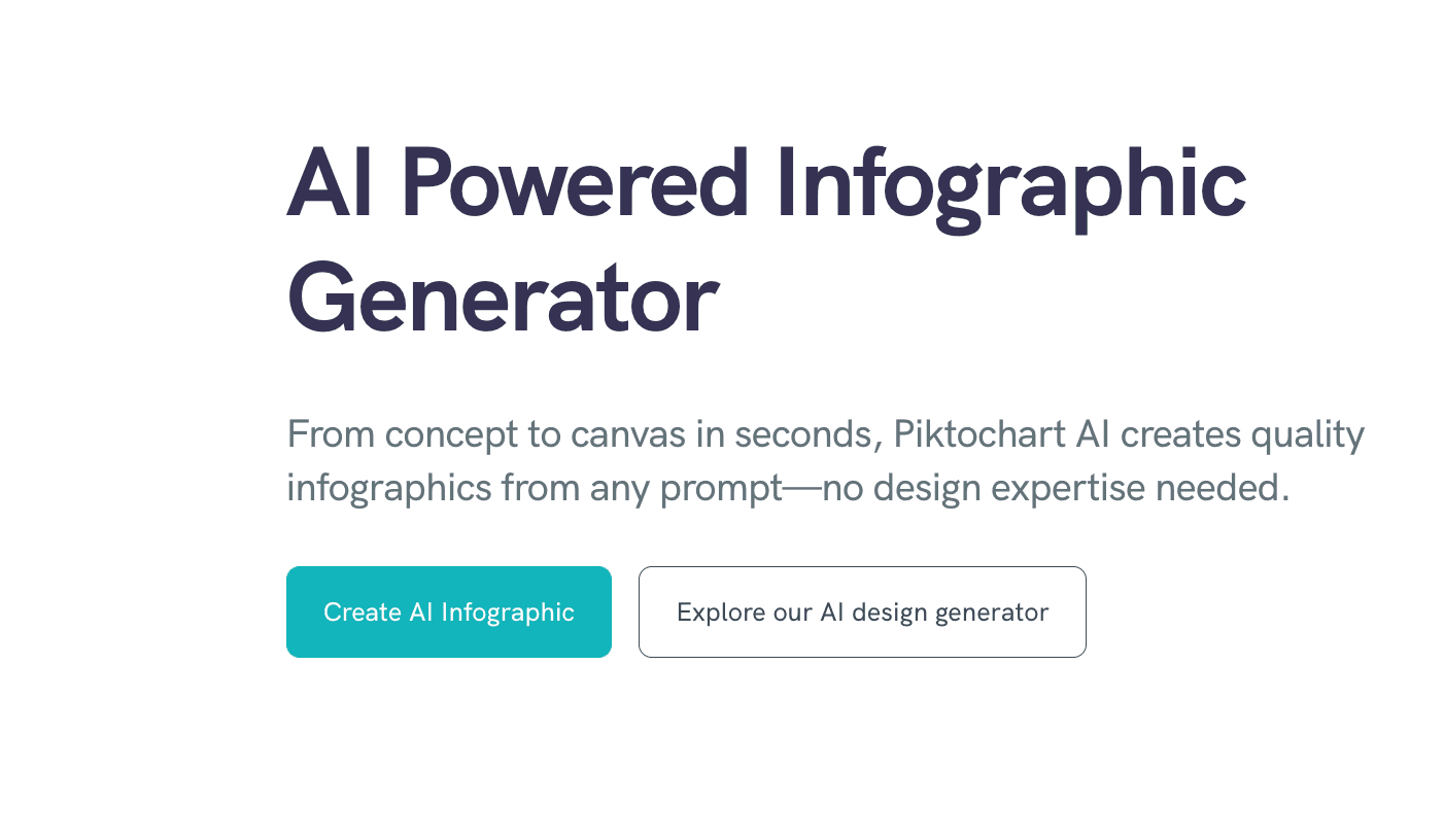
关键特征:
优秀的模板库;将复杂文本转换为总结视觉效果。
优点:
优秀的设计美学,非常适合博客信息图。
缺点:
对原始数据文件的深度分析较弱;非常依赖手动数据粘贴。
定价:
基于订阅。
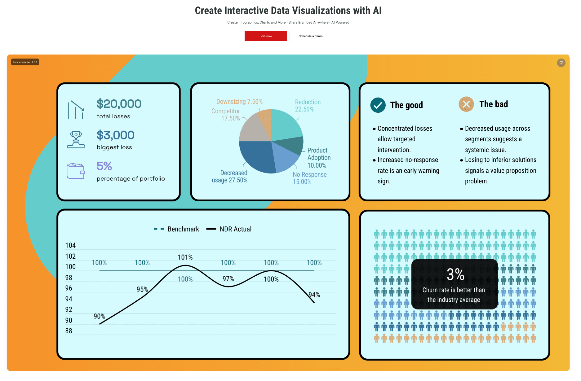
Visme
Visme 专注于互动内容。如果你的信息图需要在带有可点击元素的网站上展示,这是一个强有力的竞争者。
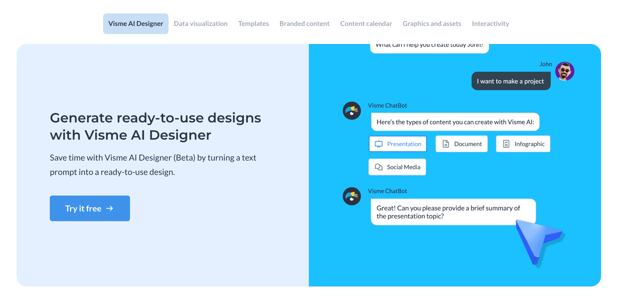
关键特征:
动态图表、互动地图、大量图标资源。
优点:
非常强大,能够创建引人入胜的互动报告。
缺点:
学习曲线较陡;编辑器可能占用大量资源。
定价:
基于订阅。
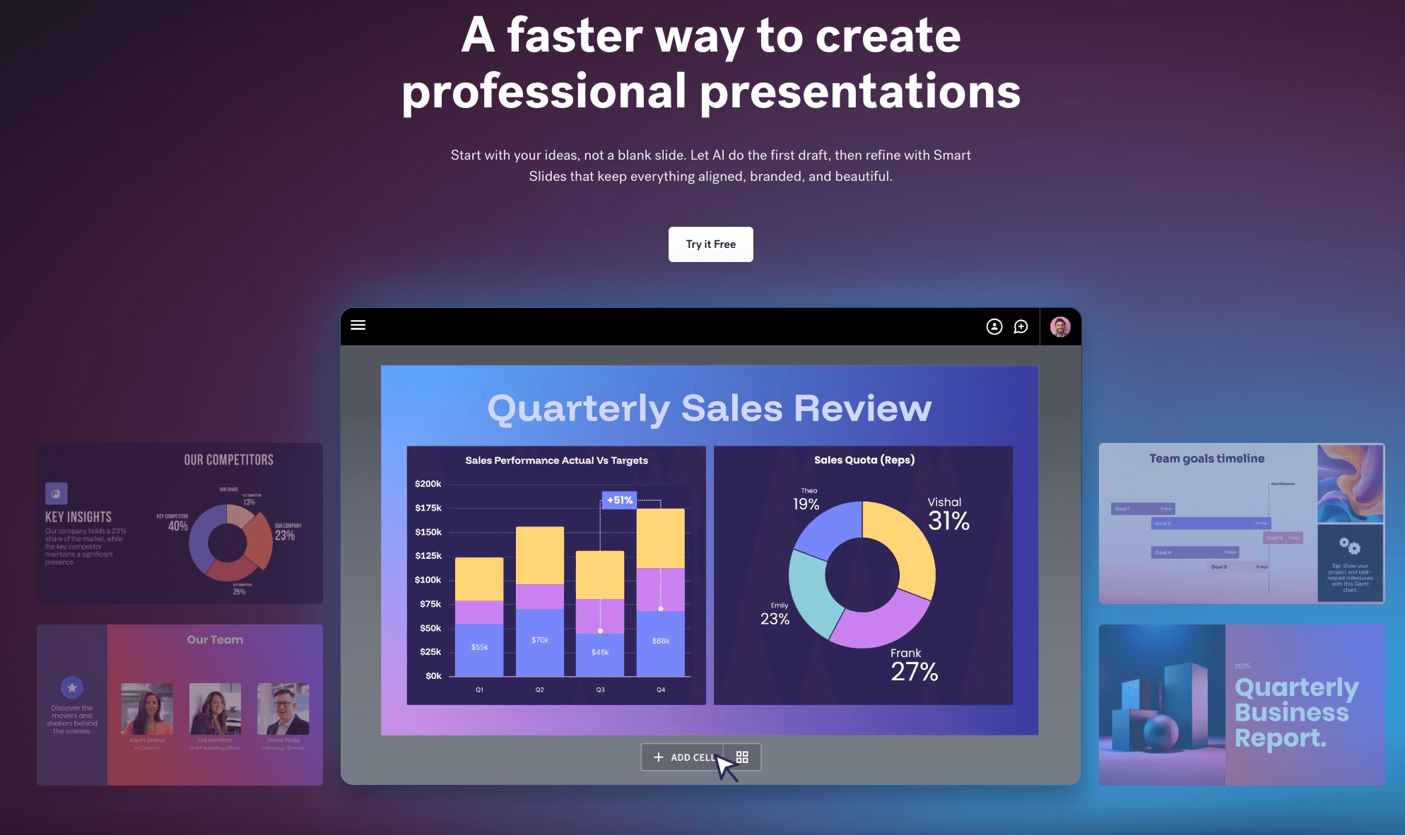
Canva
设计的“瑞士军刀”。 Canva 的魔法设计让非设计师可以即时创建视觉效果。
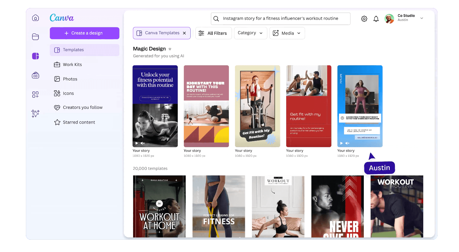
关键特征:
庞大的资产库,一键调整社交媒体尺寸。
优点:
极其易于使用,生态系统巨大。
缺点:
AI侧重于布局,而不是数据逻辑。它无法“读取”或“分析”复杂的电子表格以获取洞察。
定价:
基于订阅。
Venngage
专注于B2B和企业用户,提供严肃的专业模板。
关键特征:
品牌套件集成,智能图表推荐。
优点:
非常适合企业白皮书和内部报告。
缺点:
设计风格可能显得僵化或保守; AI 功能落后于更新的工具。
定价:
基于订阅。
Infogram
顾名思义,它专注于“图表”。被媒体广泛用于新闻可视化。
关键特征:
响应式图表,实时数据链接(例如,Google 表格)。
优点:
惊人的图表类型多样性;专业的数据展示。
缺点:
在图表区域外缺乏设计自由;布局僵化。
定价:
基于订阅。
Beautiful.ai
主要用于演示幻灯片,但其“智能幻灯片”技术非常适用于单页数据可视化。
关键特征:
自动格式调整——添加项目时,项目会自动调整。
优点:
设计永远不会破坏;它总是看起来很美观。
缺点:
导出格式有限;难以超越模板进行自定义。
定价:
仅限订阅。
Appy Pie Design
针对小企业主的入门级AI设计工具。
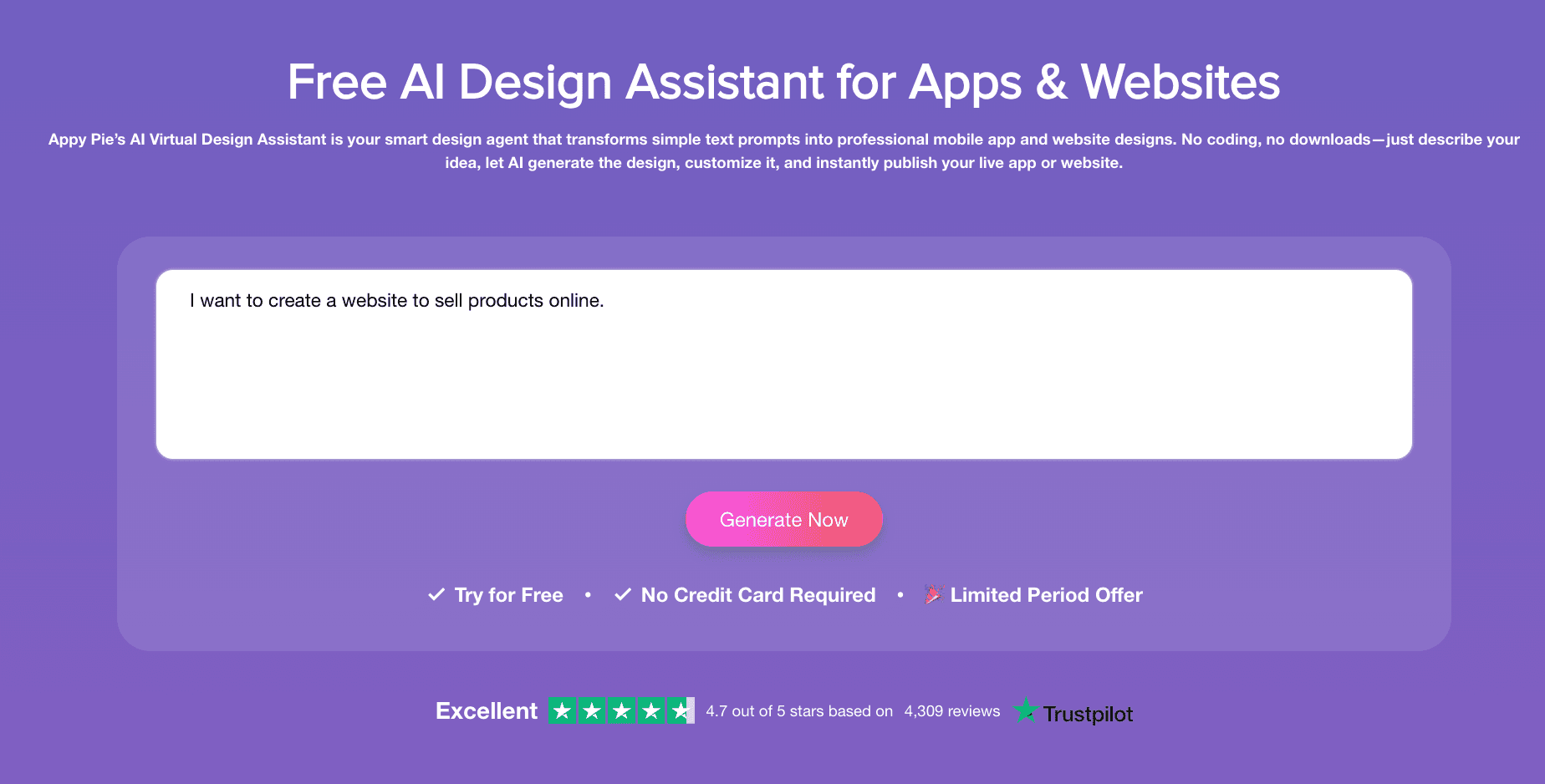
关键特征:
文本转图像,简单的拖放。
优点:
非常简单的界面,零学习曲线。
缺点:
视觉效果可能显得普通或“便宜”;在高风险数据上缺乏专业度。
定价:
基于订阅。
Snappa
为速度而生。专为需要在5分钟内创建图形的社交媒体经理设计。
关键特征:
针对所有平台的预设尺寸,加载速度快。
优点:
快速且不干扰。
缺点:
功能非常基础;几乎没有高级数据可视化能力。
定价:
基于订阅。
DesignCap
一个在线工具,提供大量海报和传单模板。
关键特征:
丰富的矢量图标和字体库。
优点:
易于导航的类别。
缺点:
AI功能较弱;大部分工作仍是手动的。不是以数据为中心的。
定价:
基于订阅。
Adobe Express
Adobe对Canva的轻量级回应,集成了Firefly生成AI。
关键特征:
惊人的文本到图像生成,集成Photoshop资产。
优点:
图像生成的艺术质量高。
缺点:
在“数据图表”方面较弱。它是用于创意设计,而不是数据可视化。
定价:
基于订阅。
ChatGPT
通用AI助手。通过DALL-E生成图像或通过数据分析生成图表。
关键特征:
强大的语义理解,基于代码的绘图。
优点:
对复杂逻辑的分析能力惊人。
缺点:
DALL-E生成的图像经常出现模糊文本。Python图表准确但常常丑陋/学术,需要提示才能使它们“美观”。
定价:
基于订阅。
你应该选择哪个工具?
在如此众多的选择中,你如何决定?作为专家,以下是我的客观建议:
场景A:你需要社交媒体帖子或活动传单。
选择:Canva或Adobe Express。它们的资产库在创意视觉上无与伦比。
场景B:你是一名需要嵌入网页图表的记者。
选择:Visme或Infogram。互动是它们的强项。
场景C:你是一名商业用户、市场营销人员或分析师,拥有Excel数据,需要快速找到答案并即时生成有说服力的图表和幻灯片。
选择:Powerdrill Bloom。
理由:在2026年,效率就是货币。只有Powerdrill Bloom使用Nano Banana Pro引擎来完成循环:“上传数据→提取见解→生成商业视觉效果”。它是唯一一个同时充当数据分析师和设计师的AI合作伙伴。
Powerdrill Bloom如何加速信息图的创建
让我们来看一下工作流程:
原始数据上传:你直接上传那个杂乱的Excel销售报告。
自然语言查询:你不需要绘图;你只需问。“告诉我哪个地区的利润率最高,并可视化趋势。”
洞察及清理:AI清理错误并计算数学(例如,“尽管A区域的销售更多,但B区域的利润率增长了20%。”)。
Nano Banana Pro 魔法:引擎启动,选择最佳可视化(条形图、热图等)并生成专业风格的预览图像和幻灯片。
分享:你将获得一个基于数据的视觉故事,而不仅仅是一幅漂亮的图画。
这个过程将3小时的工作(1小时Excel + 2小时PPT)压缩到30秒。
结论
在2026年,你选择的工具定义了你的讲故事能力。当其他人仍在手动输入数字到Canva时,你可以使用Powerdrill Bloom从数据中提取金矿,并使用Nano Banana Pro生成引人注目的视觉报告。
在数据爆炸的时代,谁能最快地将数据转化为视觉故事,谁就赢得了注意力的战争。
常见问题
Q1:什么是AI信息图生成器?
这些是利用人工智能自动将文本、数字或原始数据转换为视觉图形(如图表、时间线或海报)的工具,从而降低专业设计的门槛。
Q2:将数据转化为信息图的最快工具是什么?
Powerdrill Bloom目前是最快的,因为它消除了“手动数据输入”步骤。它直接读取Excel/CSV文件并自动生成图表。
Q3:在AI信息图生成器中,哪些功能最重要?
对于商务使用,三个关键指标是数据集成(它能读取原始文件吗?)、自动洞察(它能分析数据吗?)和导出兼容性(它能生成演示文稿就绪的幻灯片/图像吗?)。


