Cách tự động trực quan hóa tăng trưởng doanh thu so với cùng kỳ năm trước từ Excel (Không cần code)

Giới thiệu
Theo dõi tăng trưởng doanh thu là chỉ số tối quan trọng để đánh giá sức khỏe của doanh nghiệp. Tuy nhiên, nếu bạn đang phụ thuộc vào các bảng tính truyền thống để theo dõi các chỉ số này, bạn có thể đang lãng phí nhiều giờ quý báu mỗi tháng. Việc cập nhật thủ công các bảng pivot table, sửa các công thức bị lỗi và điều chỉnh định dạng để trực quan hóa mức tăng trưởng doanh thu so với cùng kỳ năm trước (YoY) rất tẻ nhạt và dễ xảy ra sai sót do con người.
May mắn thay, kỷ nguyên nhập dữ liệu thủ công đã kết thúc. Sự trỗi dậy của No-Code Data Visualization (Trực quan hóa dữ liệu không cần mã code) đồng nghĩa với việc bạn không còn cần phải là một nhà khoa học dữ liệu hay chuyên gia Excel để xây dựng các bảng điều khiển tài chính chính xác và đẹp mắt. Bằng cách tận dụng các công cụ hỗ trợ AI như Powerdrill Bloom, bạn có thể tự động hóa hoàn toàn quy trình này. Bạn chỉ cần tải bảng tính của mình lên AI, và nó sẽ ngay lập tức biến các con số thô thành các biểu đồ tăng trưởng tương tác, tự động.
Tăng trưởng doanh thu so với cùng kỳ năm trước (YoY) là gì? (Và tại sao nó lại quan trọng)
Tăng trưởng doanh thu so với cùng kỳ năm trước (YoY) là một chỉ số tài chính chính so sánh doanh thu của công ty bạn trong một khoảng thời gian với đúng khoảng thời gian đó của năm trước. Công thức tiêu chuẩn rất đơn giản:
[(Doanh thu năm hiện tại - Doanh thu năm trước) / Doanh thu năm trước] * 100
Ví dụ: nếu bạn kiếm được 120.000 USD trong quý 1 năm nay và 100.000 USD trong quý 1 năm ngoái, mức tăng trưởng YoY của bạn là 20%.
Hiểu được chỉ số này là vô cùng quan trọng vì nó giúp loại bỏ các biến động theo mùa. Ví dụ, các doanh nghiệp thương mại điện tử luôn chứng kiến doanh số tăng vọt vào tháng 11 và tháng 12. Việc so sánh tháng 12 với tháng 11 sẽ đưa ra cái nhìn lệch lạc về sự tăng trưởng. So sánh tháng 12 năm nay với tháng 12 năm ngoái mới mang lại bức tranh chân thực, rõ ràng về quỹ đạo phát triển dài hạn của doanh nghiệp.
Những điểm hạn chế: Tại sao việc trực quan hóa tăng trưởng YoY thủ công trong Excel đã lỗi thời
Mặc dù Excel là một công cụ tuyệt vời để lưu trữ dữ liệu dạng bảng, nhưng đây lại là một nền tảng cực kỳ bất tiện cho việc trực quan hóa dữ liệu tự động.
Xử lý dữ liệu thủ công
Để xây dựng biểu đồ YoY trong các bảng tính truyền thống, bạn phải căn chỉnh ngày tháng, nhóm các tháng và xây dựng các bảng pivot table phức tạp một cách thủ công. Mỗi khi kết thúc một tháng mới, ai đó phải mở lại tệp, thêm dữ liệu mới và điều chỉnh các vùng dữ liệu của biểu đồ theo cách thủ công để đảm bảo hình ảnh trực quan được cập nhật chính xác. Điều này gây lãng phí năng suất rất lớn.
Công thức bị lỗi & Sai sót của con người
Các hình ảnh trực quan hóa trên bảng tính thường phụ thuộc vào sự kết hợp phức tạp của các hàm VLOOKUP, INDEX/MATCH hoặc các câu lệnh IF lồng nhau. Chỉ cần vô tình xóa một ô, định dạng ngày hơi khác một chút hoặc đặt sai dấu thập phân cũng có thể làm hỏng toàn bộ bảng điều khiển. Việc tìm kiếm và khắc phục những lỗi này có thể mất hàng giờ đồng hồ.
Bảng điều khiển tĩnh
Biểu đồ Excel về cơ bản là tĩnh. Trừ khi bạn dành nhiều tuần để học cách lập trình các macro VBA phức tạp, các biểu đồ của bạn sẽ không thể tự động cập nhật hoặc cho phép phân tích sâu một cách trực quan và tương tác. Các doanh nghiệp hiện đại yêu cầu thông tin chi tiết động, chứ không phải các hình ảnh tĩnh được dán vào bản thuyết trình PowerPoint.
Từng bước một: Cách trực quan hóa tăng trưởng doanh thu YoY tự động
Thay vì phải vật lộn với các công thức, bạn có thể sử dụng Powerdrill Bloom để tự động hóa toàn bộ quy trình. Dưới đây là cách bạn có thể biến bảng tính thô của mình thành một biểu đồ tăng trưởng YoY đẹp mắt chỉ với vài cú nhấp chuột.
Bước 1: Tải lên Powerdrill Bloom
Quy trình bắt đầu với dữ liệu hiện có của bạn. Hãy đảm bảo bảng tính của bạn có các tiêu đề rõ ràng (ví dụ: "Ngày" và "Tổng doanh thu"). Sau đó, chỉ cần kéo và thả tệp .xlsx hoặc .csv trực tiếp vào giao diện Powerdrill Bloom. Nền tảng này sẽ ngay lập tức tiếp nhận và cấu trúc dữ liệu của bạn mà không yêu cầu bất kỳ định dạng thủ công hay cấu hình cơ sở dữ liệu nào.

Bước 2: Xác định rõ mục tiêu của bạn
Trước khi tạo hình ảnh trực quan, hãy xác định rõ trong đầu những gì bạn muốn xem. Bạn muốn so sánh doanh thu hàng tháng song song với năm trước? Bạn muốn xem phần trăm thay đổi của tổng doanh thu hàng năm? Việc biết rõ mục tiêu kinh doanh cụ thể của mình sẽ đảm bảo bạn đặt câu hỏi chính xác cho AI, từ đó nhận được những thông tin tài chính chính xác và hữu ích nhất.
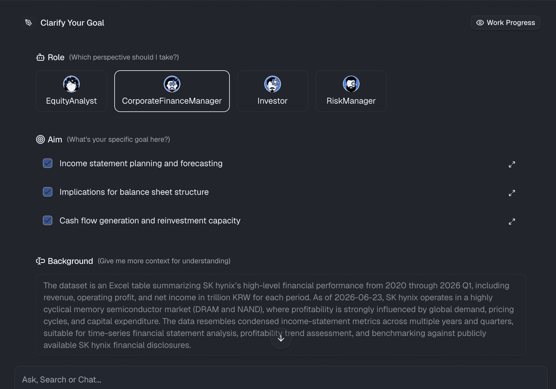
Bước 3: Sử dụng ngôn ngữ tự nhiên để tạo biểu đồ
Đây là nơi phép màu No-Code thực sự diễn ra. Thay vì phải nhấp qua các menu biểu đồ phức tạp hoặc viết công thức, bạn chỉ cần trò chuyện với dữ liệu của mình. Chỉ cần nhập một câu lệnh như: "Hiển thị cho tôi mức tăng trưởng doanh thu so với cùng kỳ năm trước theo từng tháng dưới dạng biểu đồ cột." Powerdrill Bloom sử dụng AI tiên tiến để ngay lập tức hiểu ý định của bạn, áp dụng các công thức toán học chính xác và tự động tạo ra một hình ảnh trực quan chuyên nghiệp, chính xác trên màn hình của bạn.
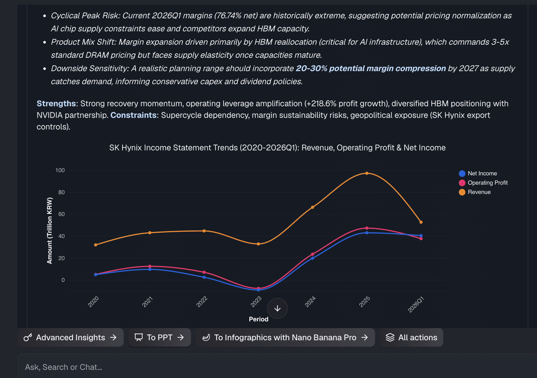
Bước 4: Tùy chỉnh và chia sẻ
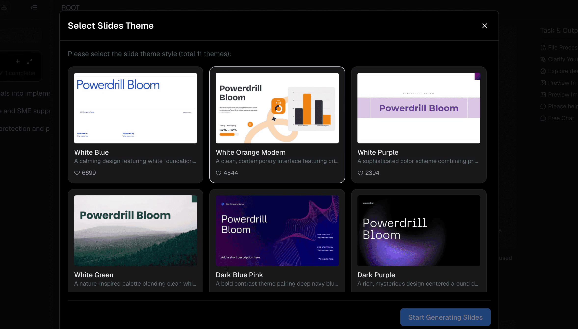
Sau khi biểu đồ được tạo, bạn có thể dễ dàng tinh chỉnh để phù hợp với thương hiệu của mình. Thay đổi màu sắc, điều chỉnh nhãn hoặc chuyển đổi giữa các loại biểu đồ chỉ với một cú nhấp chuột. Khi bảng điều khiển đã sẵn sàng, bạn có thể chia sẻ ngay lập tức với các bên liên quan, ban giám đốc hoặc khách hàng thông qua một liên kết web an toàn, loại bỏ hoàn toàn việc phải gửi email đính kèm tệp Excel nặng nề và phức tạp.
Tại sao Powerdrill Bloom là giải pháp thay thế No-Code tốt nhất cho Excel trong trực quan hóa dữ liệu
Nếu bạn muốn ngừng việc vật lộn với các bảng tính, Powerdrill Bloom nổi lên như một giải pháp hiện đại tối ưu cho phân tích dữ liệu doanh nghiệp.
Thông tin chi tiết được hỗ trợ bởi AI
Nó không chỉ xây dựng biểu đồ; nó hoạt động như một nhà phân tích dữ liệu thông minh. Nền tảng này có thể làm nổi bật các điểm bất thường và đưa ra các giải thích theo ngữ cảnh về lý do tại sao doanh thu của bạn giảm hoặc tăng vọt trong một quý cụ thể.
Trải nghiệm No-Code thực thụ
Hoàn toàn không cần phải học DAX, VBA, Python hay SQL. Nếu bạn có thể nhập một câu hỏi bằng tiếng Anh, bạn có thể xây dựng các hình ảnh trực quan hóa dữ liệu cấp doanh nghiệp.
Tự động hóa theo thời gian thực
Một khi bạn đã thiết lập các biểu đồ của mình, việc cập nhật chúng là vô cùng dễ dàng. Khi bạn thêm dữ liệu mới vào các tệp của mình, các hình ảnh trực quan hóa có thể tự động cập nhật, giúp bạn giải phóng khỏi các tác vụ báo cáo cuối tháng lặp đi lặp lại.
Hình ảnh trực quan đẹp mắt
Ngay khi vừa được tạo ra, các biểu đồ đã rất gọn gàng, hiện đại và có tính tương tác cao. Chúng được thiết kế để trông thật ấn tượng trong các phòng họp và bài thuyết trình, vượt trội hơn hẳn so với các mẫu bảng tính mặc định.
3 phương pháp hay nhất để phân tích bảng điều khiển tăng trưởng doanh thu
Để tận dụng tối đa các báo cáo tự động của bạn, hãy lưu ý ba phương pháp hay nhất sau đây:
- So sánh các đối tượng tương đồng: Luôn đảm bảo các khung thời gian của bạn là đồng nhất. Không so sánh một tháng có 30 ngày với một tháng có 31 ngày mà không lưu ý sự khác biệt, và đảm bảo bạn đang xem xét cùng một dòng sản phẩm.
- Sử dụng đúng loại trực quan hóa: Biểu đồ đường là lựa chọn hoàn hảo để thể hiện xu hướng doanh thu liên tục theo thời gian, trong khi biểu đồ cột nhóm là lý tưởng để so sánh trực tiếp YoY theo từng tháng của các danh mục.
- Đi sâu vào lý do "Tại sao": Biểu đồ cho bạn biết điều gì đã xảy ra, nhưng bạn phải tìm hiểu tại sao nó xảy ra. Hãy sử dụng bảng điều khiển của bạn để liên hệ sự sụt giảm doanh thu YoY với những thay đổi trong chi tiêu tiếp thị, tính thời vụ của thị trường hoặc tình trạng thiếu hụt hàng tồn kho.
Kết luận
Mặc dù Excel vẫn là một công cụ tuyệt vời để lưu trữ dữ liệu, nhưng nó đơn giản là không được xây dựng để trực quan hóa nhanh chóng và tự động. Việc tính toán thủ công mức tăng trưởng doanh thu so với cùng kỳ năm trước là một phương pháp lỗi thời, làm tiêu tốn thời gian và ảnh hưởng đến độ chính xác của doanh nghiệp. Bằng cách áp dụng một nền tảng hướng AI, không cần mã code thực thụ, bạn có thể biến dữ liệu thô thành thông tin chi tiết hữu ích chỉ trong vài giây.
Sẵn sàng ngừng vật lộn với các công thức? Hãy tải bảng tính của bạn lên Powerdrill Bloom ngay hôm nay và xem dữ liệu của bạn tự động trở nên sống động.
Các câu hỏi thường gặp (FAQs)
Powerdrill Bloom hỗ trợ những loại tệp nào?
Powerdrill Bloom hỗ trợ các định dạng bảng tính tiêu chuẩn, bao gồm .xlsx, .csv và .xls, giúp việc tải lên từ Excel diễn ra liền mạch và sẵn sàng sử dụng ngay lập tức.
Tôi có cần kỹ năng lập trình để sử dụng Powerdrill Bloom không?
Hoàn toàn không. Powerdrill Bloom sử dụng xử lý ngôn ngữ tự nhiên, nghĩa là bạn chỉ cần nhập các câu hỏi để tạo ra các hình ảnh trực quan hóa dữ liệu nâng cao.
Powerdrill Bloom có thể xử lý các tập dữ liệu Excel lớn không?
Có, nó xử lý dễ dàng các tập dữ liệu khổng lồ vốn thường làm treo hoặc chậm các phần mềm bảng tính truyền thống như Excel.
Dữ liệu và biểu đồ của tôi có được bảo mật trong Powerdrill Bloom không?
Bảo mật dữ liệu được ưu tiên hàng đầu với mã hóa cấp doanh nghiệp. Các tệp bạn tải lên và thông tin chi tiết được tạo ra hoàn toàn được giữ riêng tư và bảo vệ nghiêm ngặt.
Tôi có thể chia sẻ bảng điều khiển Powerdrill Bloom với nhóm của mình không?
Có, bạn có thể dễ dàng chia sẻ các bảng điều khiển tương tác thông qua một liên kết an toàn, loại bỏ nhu cầu gửi email các tệp đính kèm nặng nề.