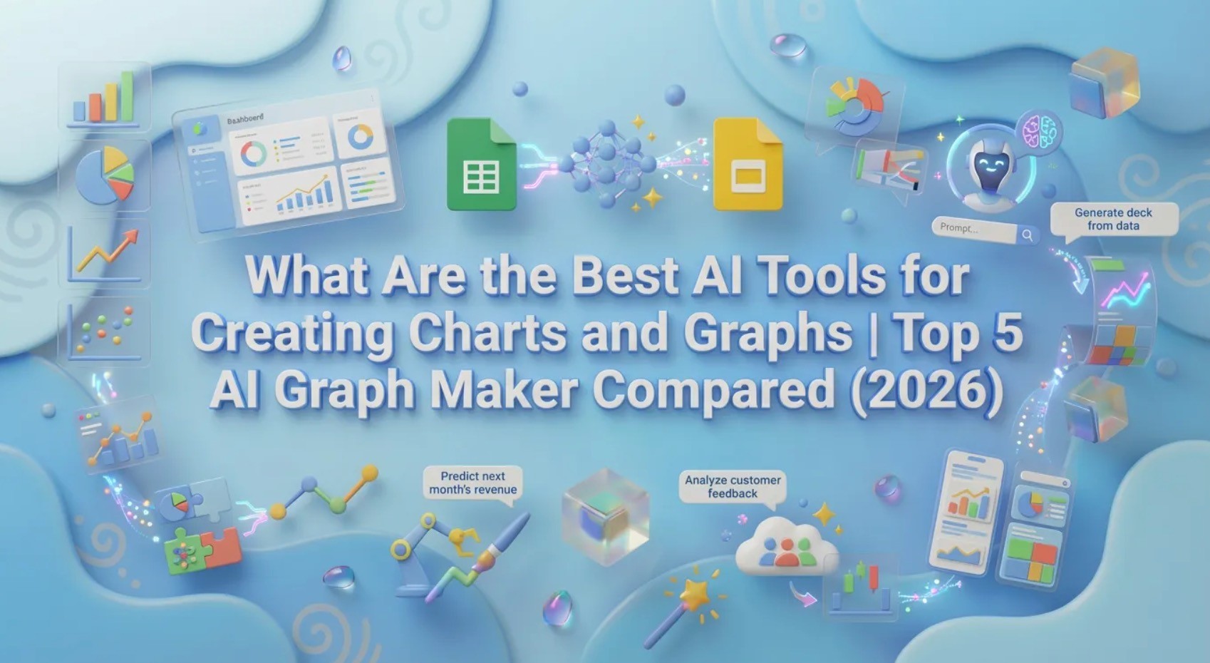
What Are the Best AI Tools for Creating Charts and Graphs | Top 5 AI Graph Maker Compared (2026)
Joy·
In the fast-paced, data-driven landscape of 2026, traditional chart-making methods are officially obsolete. Manually cleaning Excel spreadsheets, struggling with complex pivot tables, and wrestling with PowerPoint layouts drains hours of valuable time from marketing teams and business analysts.
Today, visual storytelling powered by artificial intelligence has fundamentally changed the game. Whether you need to visualize quarterly sales trends or generate a comprehensive boardroom presentation, AI chart generators do the heavy lifting in seconds.
In this ultimate guide, we will explore what an AI Graph Maker is, what these tools can achieve, and help you discover the absolute best AI tools for creating charts and graphs tailored to your workflow.
An AI Graph Maker is a software tool that uses machine learning to automatically analyze raw data and transform it into visual representations like bar charts, line graphs, and pie charts. Instead of requiring manual data mapping or graphic design skills, an AI chart generator processes natural language prompts and raw files (CSV, Excel, PDF) to instantly extract insights and generate professional-grade data visualizations.
If you are looking for the absolute top performers on the market, here is the Quick List: Top 5 AI Tools for Creating Charts and Graphs for 2026:
Powerdrill Bloom – Best AI chart generator for end-to-end data insights and automated PPT creation.
Julius AI – Best for advanced statistical data analysis and python-based charting.
ChatGPT (Data Analyst) – Best for conversational data manipulation and quick standalone graph exports.
Canva – Best for highly aesthetic, graphic-design-focused marketing infographics.
Gamma – Best for rapid, visually appealing slide generation with basic integrated charts.
Tool Name | Best For | Supported Chart Types | Pricing |
Data insights & 1-click PPT slides | Bar, Line, Pie, Scatter, Dashboards | Freemium / | |
Deep statistical analysis | Bar, Scatter, Line, Histograms | Freemium / | |
Conversational data visualization | Bar, Line, Pie, Heatmaps | Free / | |
Marketing infographics & design | Bar, Pie, Donut, Line | Free / | |
Quick slide generation | Basic Bar, Line, Pie | Freemium / |
Integrating an AI graph maker into your daily workflow offers unparalleled advantages over traditional spreadsheet software.
AI eliminates the tedious process of formatting cells, fixing data types, or writing complex formulas. You simply upload your raw Excel or CSV files, and the AI automatically cleans, structures, and preps the data for visualization.
You no longer need to be a graphic designer to create stunning, brand-aligned visual reports. AI tools automatically apply professional color palettes, optimal spacing, and highly readable typography to your charts.
Beyond just plotting numbers, top-tier AI chart generators utilize "Automated Insights" to read the context of your data. They instantly highlight anomalies, trends, and key performance indicators that you might have missed.
Introduction: Powerdrill Bloom is a premier AI data analysis and visualization agent that acts as an end-to-end "data presentation expert," seamlessly transforming raw data into stunning charts and presentation-ready slides.
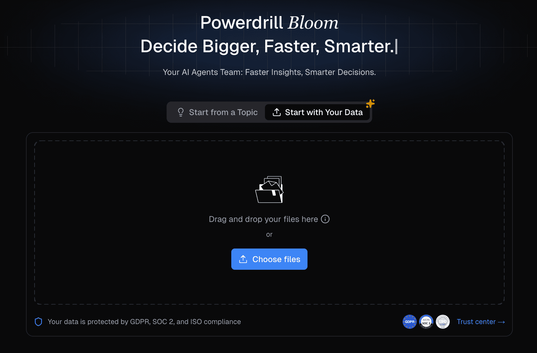
Key Features: Supports natural language commands, intelligent optimal chart recommendation, robust Excel/CSV/PDF parsing, and one-click export to professional PPTs containing both charts and extracted business insights.
Pros: Requires zero design or coding skills; bridges the gap between raw data analysis and final business reporting flawlessly; highly intuitive UI.
Cons: Overkill if you only need a single, unformatted PNG image rather than a structured business insight.
Pricing: Free tier available; Starts at $13.27 per month.
Introduction: Julius AI is a highly analytical AI graph maker preferred by researchers and data scientists for deep statistical modeling.
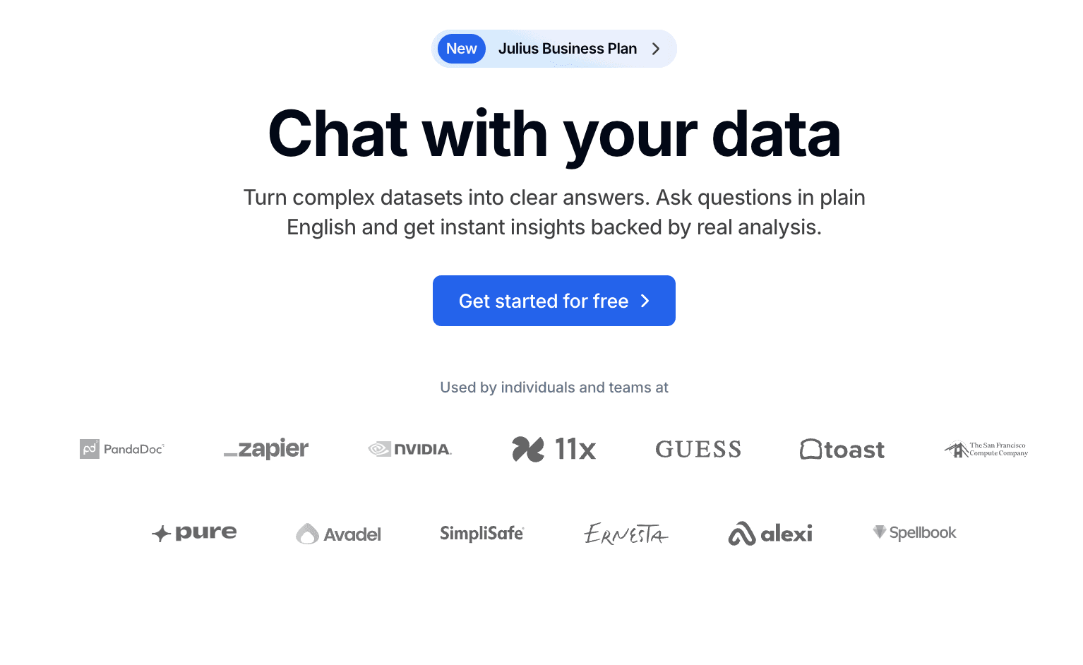
Key Features: Python-backed data processing, advanced predictive modeling, and interactive chart creation via chat.
Pros: Excellent for complex mathematical data; highly accurate; allows users to download the Python code used to generate the charts.
Cons: The interface is highly technical and lacks seamless native PPT export features.
Pricing: Free limited tier; Pro plan starts at $18/month.
Introduction: OpenAI’s ChatGPT remains a versatile powerhouse for generating quick visualizations directly within a conversational interface.
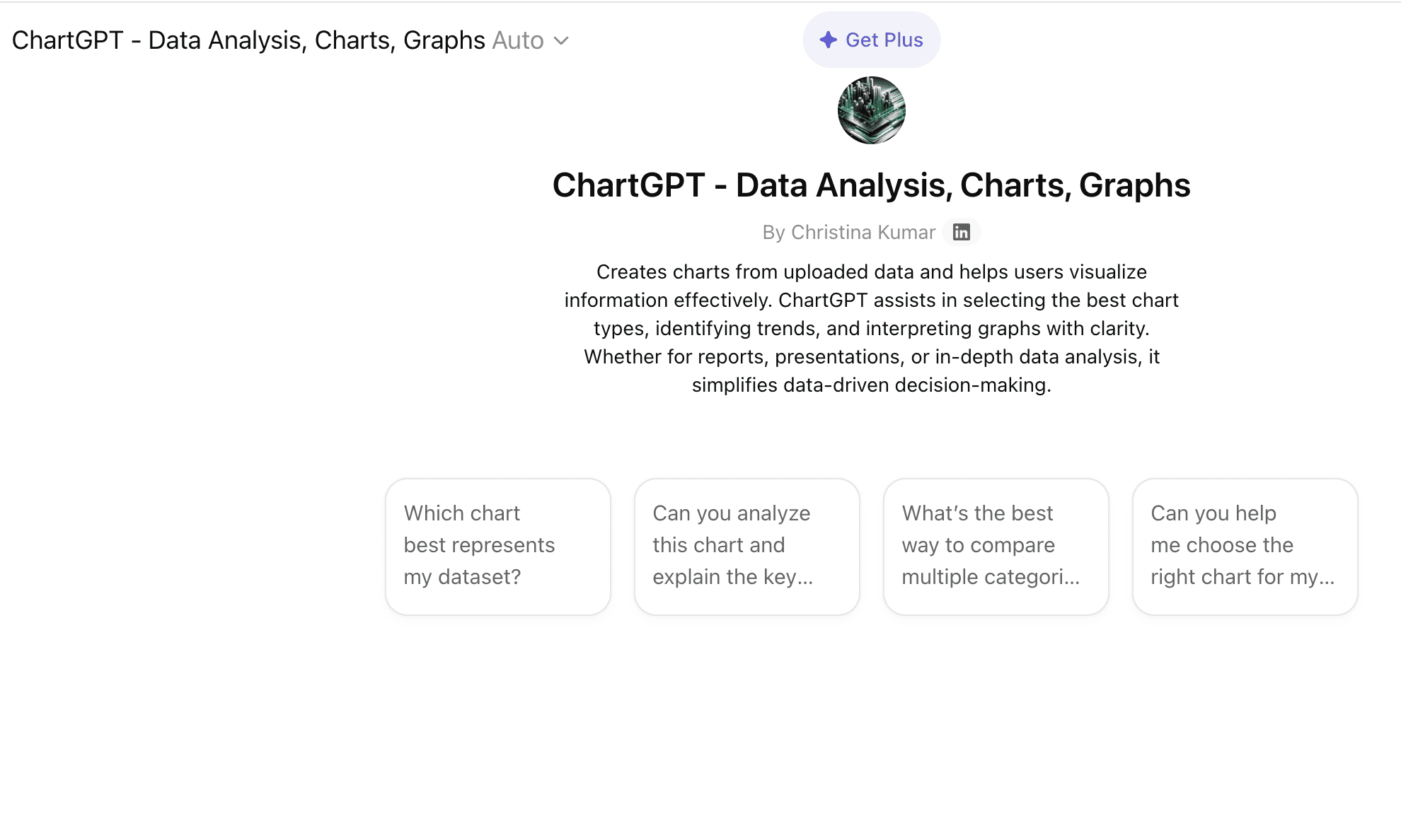
Key Features: Natural language processing, Python library integration (Matplotlib/Seaborn), and dynamic data filtering.
Pros: Extremely easy to use; highly flexible conversational editing; part of an ecosystem most users already have.
Cons: Charts can look generic and lack business-level design aesthetics; cannot automatically generate complete, multi-slide PPT decks.
Pricing: Free basic access; ChatGPT Plus at $20/month.
Introduction: Canva's Magic Design suite offers a heavily design-focused AI chart generator built specifically for digital marketers and social media managers.
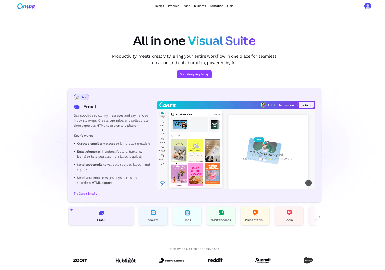
Key Features: Drag-and-drop interface, massive template library, AI-assisted color matching, and brand kit integration.
Pros: Produces the most visually aesthetic charts for social media and infographics; unmatched design customization.
Cons: Weak analytical capabilities; requires manual data input or simple integrations; cannot perform deep raw data analysis.
Pricing: Free basic version; Canva Pro at $14.99/month.
Introduction: Gamma is an AI-powered presentation tool designed to replace traditional slide-making software by generating decks from text prompts.
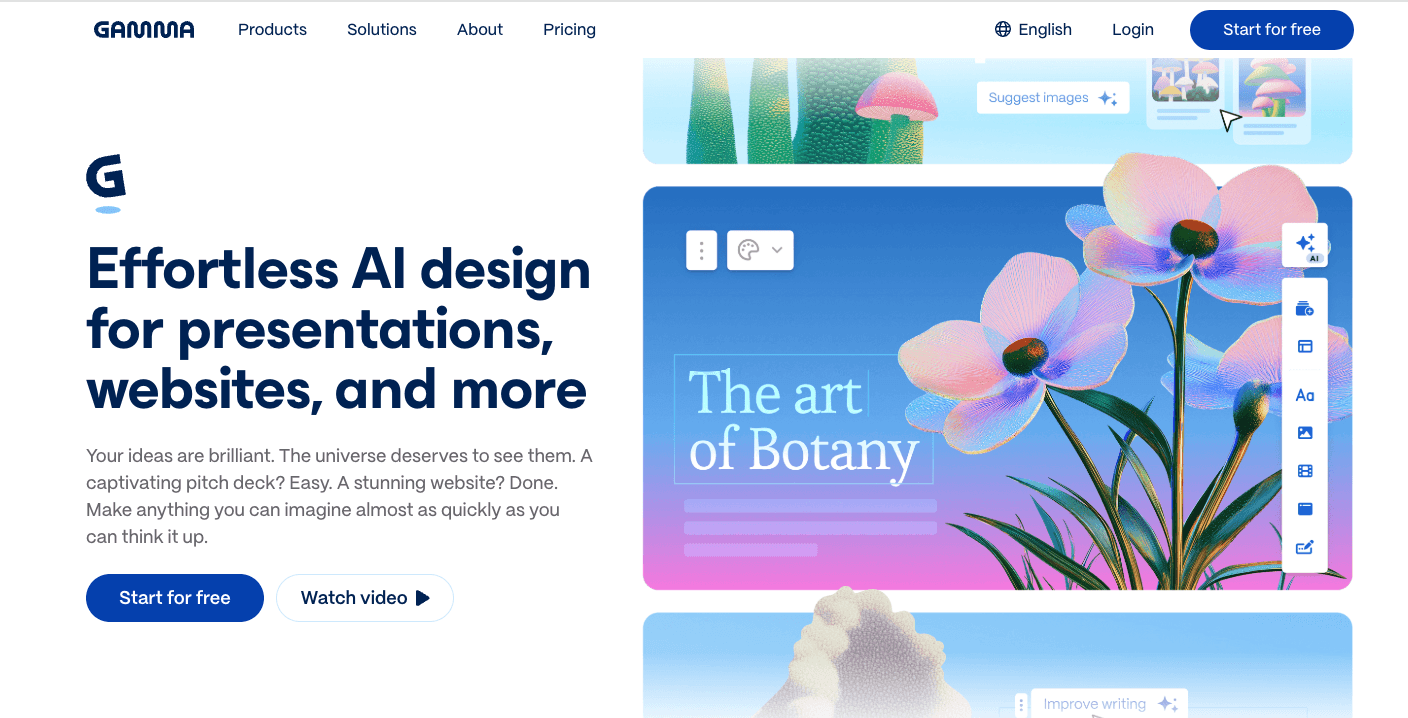
Key Features: Text-to-presentation generation, intuitive block-based editing, and integrated basic chart modules.
Pros: Phenomenal for rapid slide creation; highly modern and visually appealing templates.
Cons: The actual chart generation relies heavily on simple datasets; lacks the powerful Excel/CSV deep-dive analysis found in dedicated data AI tools.
Pricing: Free tier (credits); Plus plan at $15/month.
Modern AI tools are capable of analyzing the context of your dataset to recommend and generate the perfect visual representation.
Perfect for comparing categorical data. An AI bar chart generator will automatically sort categories from highest to lowest, apply contrasting colors, and label axes without manual adjustment.
Ideal for tracking changes over time. AI automatically detects time-series data (dates, quarters, years) to plot seamless, accurately scaled trends.
Best for showing parts of a whole. AI ensures that percentages always add up to 100% and automatically groups tiny fractions into an "Others" category for cleaner visualization.
Advanced tools compile multiple chart types into cohesive, single-page dashboards or multi-slide reports, providing a macro view of your business metrics.
Using Powerdrill Bloom as our prime example, here is how you can go from raw data to a stunning presentation in minutes.
Simply drag and drop your raw, unformatted Excel spreadsheet, CSV file, or even a PDF report directly into the interface. The AI will securely read and clean the dataset automatically.
Type a simple command like, "Analyze the Q3 regional sales data and show me which product performed best." The AI will parse the data, extract the core insights, and automatically generate the most appropriate chart.
Review the generated visualization. You can ask the AI to change colors or swap a bar chart for a line graph. Once satisfied, use the 1-click export feature to instantly generate a professionally formatted PPT slide deck containing the graph and summarized bullet points.
When evaluating these tools, keep your final objective in mind.
Always ensure the platform adheres to strict data privacy standards (such as SOC2 compliance or data non-retention policies), especially if you are uploading sensitive business financials.
Do you just need a picture of a graph, or do you need to present it to stakeholders? If presentation is the goal, prioritize tools like Powerdrill Bloom that offer seamless, native PPT slide generation.
Check if the tool allows you to easily edit labels, switch color themes, and adjust legends post-generation without needing to rewrite complex prompts.
The reality in 2026 is that you don't need to be a data scientist or a graphic designer to create impactful visual data stories. Choosing the right tool comes down to your final deliverable: if you need deep statistical coding, Julius AI is great; for social media, choose Canva. However, if your goal is to seamlessly analyze business data and present it professionally to stakeholders, an end-to-end solution is unmatched.
Ready to instantly turn raw data into beautifully visualized infographics and PPTs without the hassle of manual formatting? Try Powerdrill Bloom for free today!
Powerdrill Bloom and Julius AI are considered the best. Powerdrill Bloom excels at turning Excel data directly into presentation-ready charts and PPTs, while Julius AI is ideal for deep statistical analysis.
Yes. Advanced AI tools like Powerdrill Bloom not only generate the graph but also extract the business insights and compile them into a beautifully formatted, downloadable PowerPoint (PPT) slide deck in one click.
Yes, ChatGPT (with its Advanced Data Analysis feature) can write and execute Python code to generate functional graphs, which you can then download as image files. However, its design customization is somewhat limited.
Many top AI bar chart generators offer a free tier. Tools like Powerdrill Bloom, Canva, and ChatGPT provide free access with basic capabilities or credit systems, while advanced enterprise features require a paid subscription.
An AI chart generator is an intelligent software tool that uses machine learning to automatically analyze raw datasets, select the optimal chart format, and instantly design visual data representations (like bar or pie charts) using simple text prompts.