Como visualizar o crescimento da receita ano a ano a partir do Excel automaticamente (sem necessidade de código)
Introdução
Acompanhar o crescimento da receita é o indicador definitivo da saúde de uma empresa. No entanto, se você depende de planilhas tradicionais para monitorar essas métricas, provavelmente está desperdiçando horas valiosas todo mês. Atualizar tabelas dinâmicas manualmente, corrigir fórmulas quebradas e ajustar a formatação para visualizar o crescimento da receita ano a ano (YoY) é uma tarefa tediosa e altamente propensa a erros humanos.
Felizmente, a era da inserção manual de dados chegou ao fim. A ascensão da No-Code Data Visualization significa que você não precisa mais ser um cientista de dados ou um mago do Excel para criar painéis financeiros incríveis e precisos. Ao aproveitar ferramentas baseadas em IA como o Powerdrill Bloom, você pode automatizar totalmente esse processo. Basta enviar sua planilha para a IA e ela transforma instantaneamente números brutos em gráficos de crescimento interativos e automatizados.
O que é o Crescimento da Receita Ano a Ano (YoY)? (E por que ele é importante)
O Crescimento da Receita Ano a Ano (YoY) é uma métrica financeira fundamental que compara a receita da sua empresa em um período com o exato mesmo período do ano anterior. A fórmula padrão é simples:
[(Receita do Ano Atual - Receita do Ano Anterior) / Receita do Ano Anterior] * 100
Por exemplo, se você faturou $120.000 no primeiro trimestre deste ano e $100.000 no primeiro trimestre do ano passado, seu crescimento YoY é de 20%.
Compreender essa métrica é essencial porque ela suaviza a volatilidade sazonal. Empresas de e-commerce, por exemplo, sempre registram um pico de vendas em novembro e dezembro. Comparar dezembro com novembro traz uma visão distorcida do crescimento. Comparar este mês de dezembro com o de dezembro do ano passado oferece uma imagem real e clara da trajetória de longo prazo do seu negócio.
Os Gargalos: Por que visualizar o crescimento YoY manualmente no Excel é ultrapassado
Embora o Excel seja uma ferramenta fenomenal para armazenar dados tabulares, ele é uma plataforma notoriamente frustrante para a visualização automatizada de dados.
Manipulação Manual de Dados
Para criar um gráfico YoY em planilhas tradicionais, você precisa alinhar datas manualmente, agrupar meses e construir tabelas dinâmicas complexas. Toda vez que um novo mês se encerra, alguém precisa abrir o arquivo, incluir os novos dados e ajustar manualmente os intervalos do gráfico para garantir que os elementos visuais sejam atualizados corretamente. Isso representa um enorme desperdício de produtividade.
Fórmulas Quebradas e Erro Humano
As visualizações em planilhas costumam depender de combinações complexas de VLOOKUP, INDEX/MATCH ou instruções IF elaboradas. Uma única célula excluída acidentalmente, um formato de data ligeiramente diferente ou uma vírgula fora do lugar podem quebrar todo o painel. Rastrear esses erros pode levar horas.
Painéis Estáticos
Os gráficos do Excel são fundamentalmente estáticos. A menos que você passe semanas aprendendo a programar macros VBA complexas, seus gráficos não serão atualizados automaticamente nem permitirão análises detalhadas e interativas de forma intuitiva. As empresas modernas exigem insights dinâmicos, não imagens estáticas coladas em uma apresentação de PowerPoint.
Passo a Passo: Como visualizar o crescimento da receita YoY de forma automática
Em vez de lutar contra fórmulas, você pode usar o Powerdrill Bloom para automatizar todo o processo. Veja como transformar sua planilha bruta em um lindo gráfico de crescimento YoY com apenas alguns cliques.
Passo 1: Fazer o upload para o Powerdrill Bloom
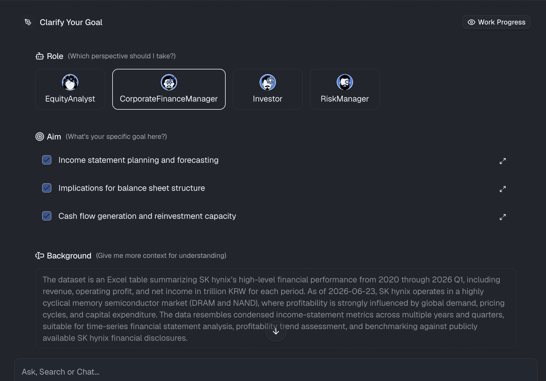
O processo começa com seus dados existentes. Certifique-se de que sua planilha tenha cabeçalhos claros (por exemplo, "Data" e "Receita Total"). Depois, basta arrastar e soltar seu arquivo .xlsx ou .csv diretamente na interface do Powerdrill Bloom. A plataforma processa e estrutura seus dados instantaneamente, sem exigir nenhuma formatação manual ou configuração de banco de dados.

Passo 2: Definir seu objetivo
Antes de gerar os elementos visuais, defina claramente o que você deseja visualizar. Você quer comparar a receita mensal lado a lado com a do ano anterior? Deseja ver a variação percentual da receita anual total? Conhecer seu objetivo de negócio específico garante que você faça as perguntas certas à IA, assegurando insights financeiros mais precisos e acionáveis.
Passo 3: Usar linguagem natural para gerar gráficos
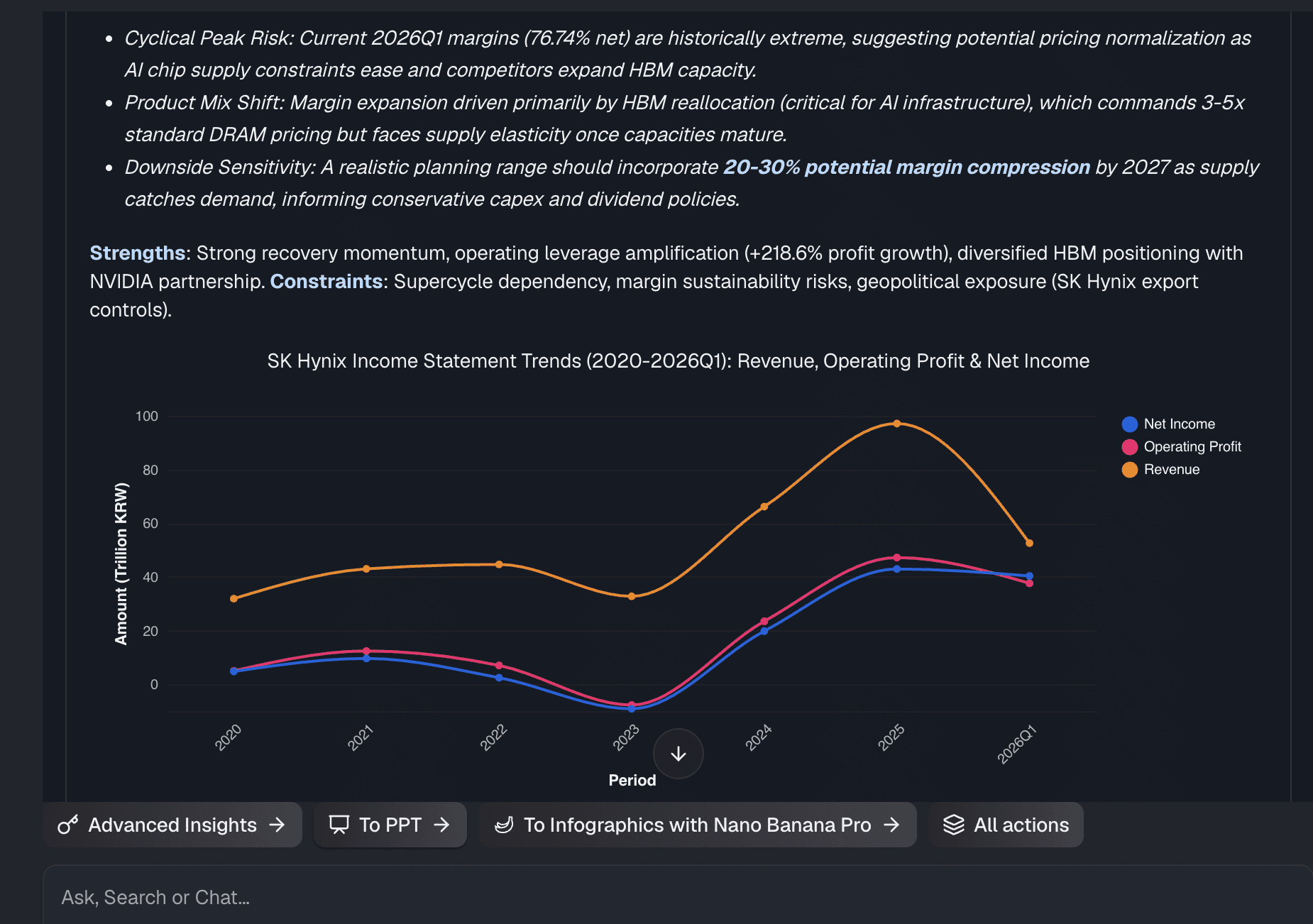
É aqui que a verdadeira mágica do No-Code acontece. Em vez de navegar por menus de gráficos complexos ou escrever fórmulas, você apenas conversa com seus dados. Basta digitar um comando como: "Mostre-me o crescimento da minha receita ano a ano por mês em um gráfico de barras." O Powerdrill Bloom utiliza IA avançada para entender instantaneamente sua intenção, aplicar as fórmulas matemáticas corretas e gerar automaticamente uma visualização profissional e precisa na sua tela.
Passo 4: Personalizar e compartilhar
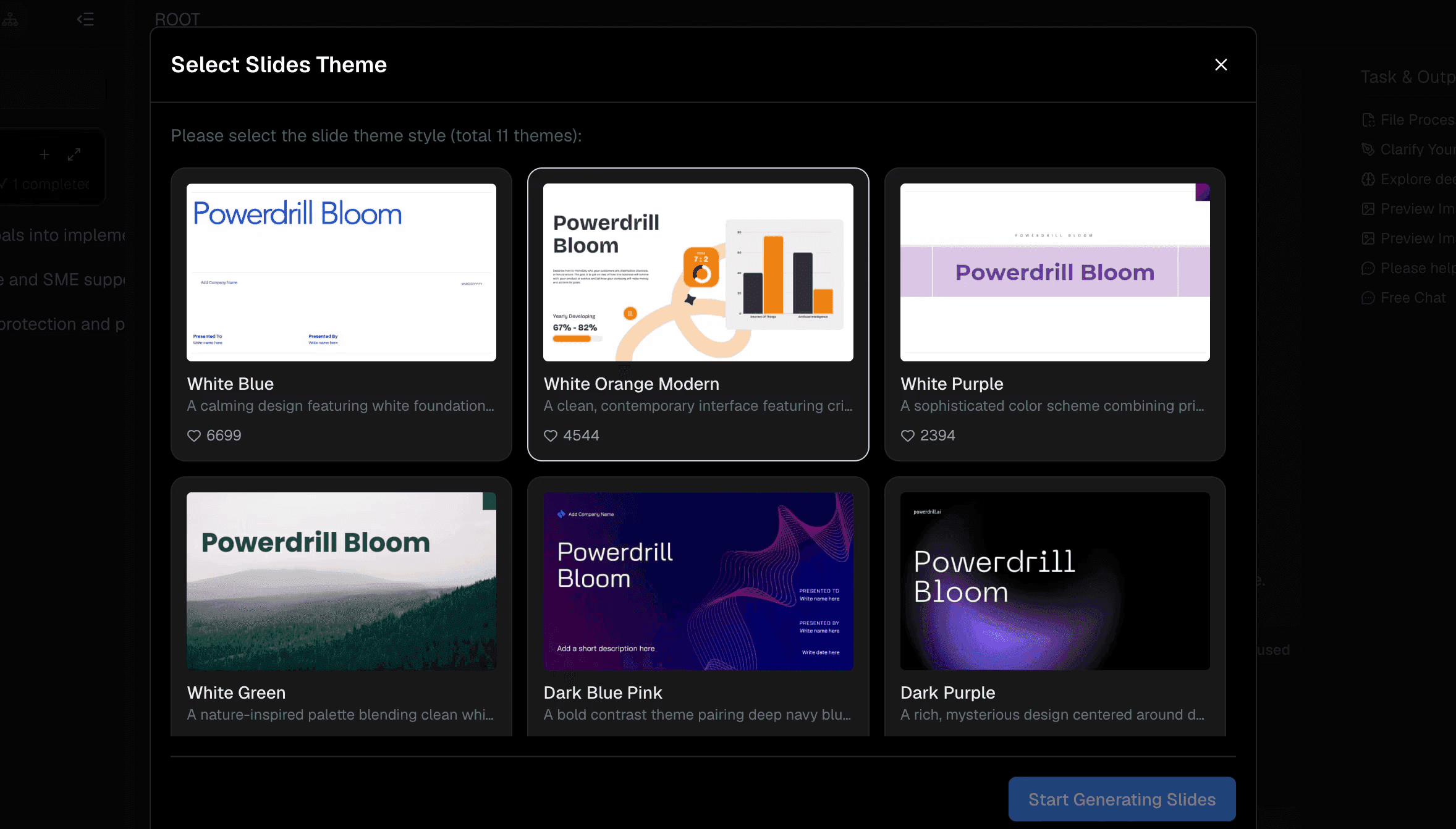
Depois que seu gráfico for gerado, você poderá ajustá-lo facilmente para combinar com sua marca. Altere cores, ajuste legendas ou alterne entre tipos de gráficos com um único clique. Quando seu painel estiver pronto, você poderá compartilhá-lo instantaneamente com partes interessadas, executivos ou clientes por meio de um link web seguro, eliminando de vez a necessidade de enviar anexos pesados e confusos do Excel por e-mail.
Por que o Powerdrill Bloom é a melhor alternativa No-Code ao Excel para visualização de dados
Se você quer parar de brigar com planilhas, o Powerdrill Bloom se destaca como a solução moderna definitiva para business intelligence.
Insights baseados em IA
Ele não apenas cria o gráfico; ele atua como um analista de dados inteligente. A plataforma pode destacar anomalias e oferecer explicações contextuais sobre o motivo de sua receita ter caído ou subido durante um trimestre específico.
Veradeira experiência No-Code
Não há absolutamente nenhuma necessidade de aprender DAX, VBA, Python ou SQL. Se você sabe digitar uma pergunta em português, você consegue criar visualizações de dados de nível corporativo.
Automação em tempo real
Depois de definir seus gráficos, atualizá-los é extremamente simples. À medida que você adiciona novos dados aos seus arquivos, suas visualizações podem ser atualizadas dinamicamente, poupando você das tarefas repetitivas de relatórios de fim de mês.
Visual impressionante
Prontos para uso, os gráficos gerados são limpos, modernos e altamente interativos. Eles foram projetados para impressionar em salas de reunião e apresentações, superando de longe os modelos padrão de planilhas.
3 boas práticas para analisar painéis de crescimento de receita
Para extrair o máximo dos seus relatórios automatizados, tenha em mente estas três boas práticas:
- Compare bananas com bananas: Certifique-se sempre de que os períodos de tempo sejam idênticos. Não compare um mês de 30 dias com um de 31 dias sem apontar a diferença, e garanta que está analisando as mesmas linhas de produtos.
- Use a visualização correta: Gráficos de linha são perfeitos para mostrar tendências contínuas de receita ao longo do tempo, enquanto gráficos de barras agrupadas são ideais para comparações diretas de categorias YoY mês a mês.
- Investigue o "porquê": Um gráfico diz a você o que aconteceu, mas você precisa investigar o porquê. Use seu painel para correlacionar uma queda na receita YoY com mudanças nos investimentos em marketing, sazonalidade do mercado ou falta de estoque.
Conclusão
Embora o Excel continue sendo uma ferramenta brilhante para armazenamento de dados, ele simplesmente não foi feito para visualizações rápidas e automatizadas. Calcular o crescimento da receita ano a ano manualmente é uma prática ultrapassada que custa tempo e precisão às empresas. Ao adotar uma plataforma verdadeiramente no-code e impulsionada por IA, você pode transformar dados brutos em insights acionáveis em segundos.
Pronto para parar de lutar contra fórmulas? Faça o upload da sua planilha no Powerdrill Bloom hoje mesmo e veja seus dados ganharem vida automaticamente.
Perguntas Frequentes (FAQs)
Quais tipos de arquivo o Powerdrill Bloom suporta?
O Powerdrill Bloom suporta formatos de planilha padrão, incluindo .xlsx, .csv e .xls, tornando os uploads do Excel simples e prontos para uso imediato.
Preciso de habilidades de programação para usar o Powerdrill Bloom?
Com certeza não. O Powerdrill Bloom utiliza processamento de linguagem natural, o que significa que você só precisa digitar perguntas para gerar visualizações de dados avançadas.
O Powerdrill Bloom consegue lidar com grandes conjuntos de dados do Excel?
Sim, ele processa facilmente grandes volumes de dados que normalmente travariam ou deixariam lentos os softwares de planilha tradicionais como o Excel.
Meus dados e gráficos estão seguros no Powerdrill Bloom?
A segurança dos dados é priorizada com criptografia de nível corporativo. Seus arquivos enviados e insights gerados permanecem estritamente privados e protegidos.
Posso compartilhar os painéis do Powerdrill Bloom com minha equipe?
Sim, você pode compartilhar facilmente painéis interativos por meio de um link seguro, eliminando a necessidade de enviar anexos pesados por e-mail.