トップ11のAIデータビジュアライゼーションツール - 2025年12月の更新

はじめに
手動報告の時代は終わりました。最新のAIデータ視覚化ツールはデータを表示するだけでなく、理解します。
年末を強く締めくくるために、複雑なデータセットを瞬時に行動可能なインサイトと魅力的なビジュアルに変える11のAIツールをレビューしました。
一目で見える11のAIデータ視覚化ツール
これは2025年12月の厳選リストです:
Powerdrill Bloom - (最優秀AIエージェント&スライド生成)
Tableau AI(Pulse) - (企業分析に最適)
Microsoft Power BI Copilot - (Microsoftエコシステムに最適)
Julius AI - (Pythonベースの分析に最適)
Polymer - (Eコマースデータに最適)
Akkio - (予測モデリングに最適)
Looker Studio(Gemini) - (Googleスタックに最適)
Visme - (データデザイナー以外に最適)
Graphy - (クイックチャートに最適)
MonkeyLearn - (テキスト分析に最適)
Sisense - (埋め込み分析に最適)
詳細なレビューと比較
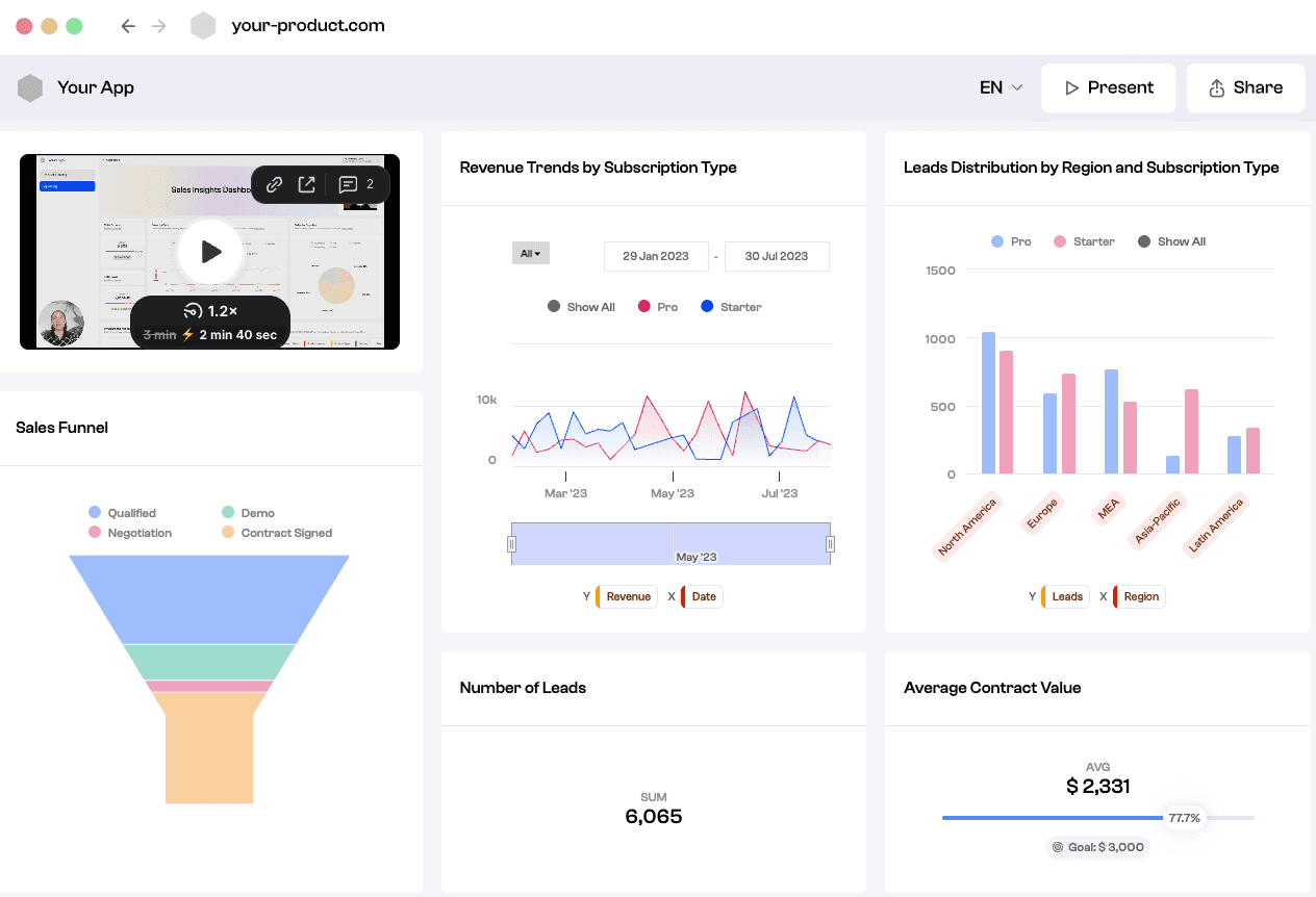
Powerdrill Bloom
Powerdrill Bloomは、原始ファイルから経営決定までの旅を効率化するために設計された高度なAIデータ探索エージェントです。強力な分析と高級デザイン自動化を統合することで際立っています。
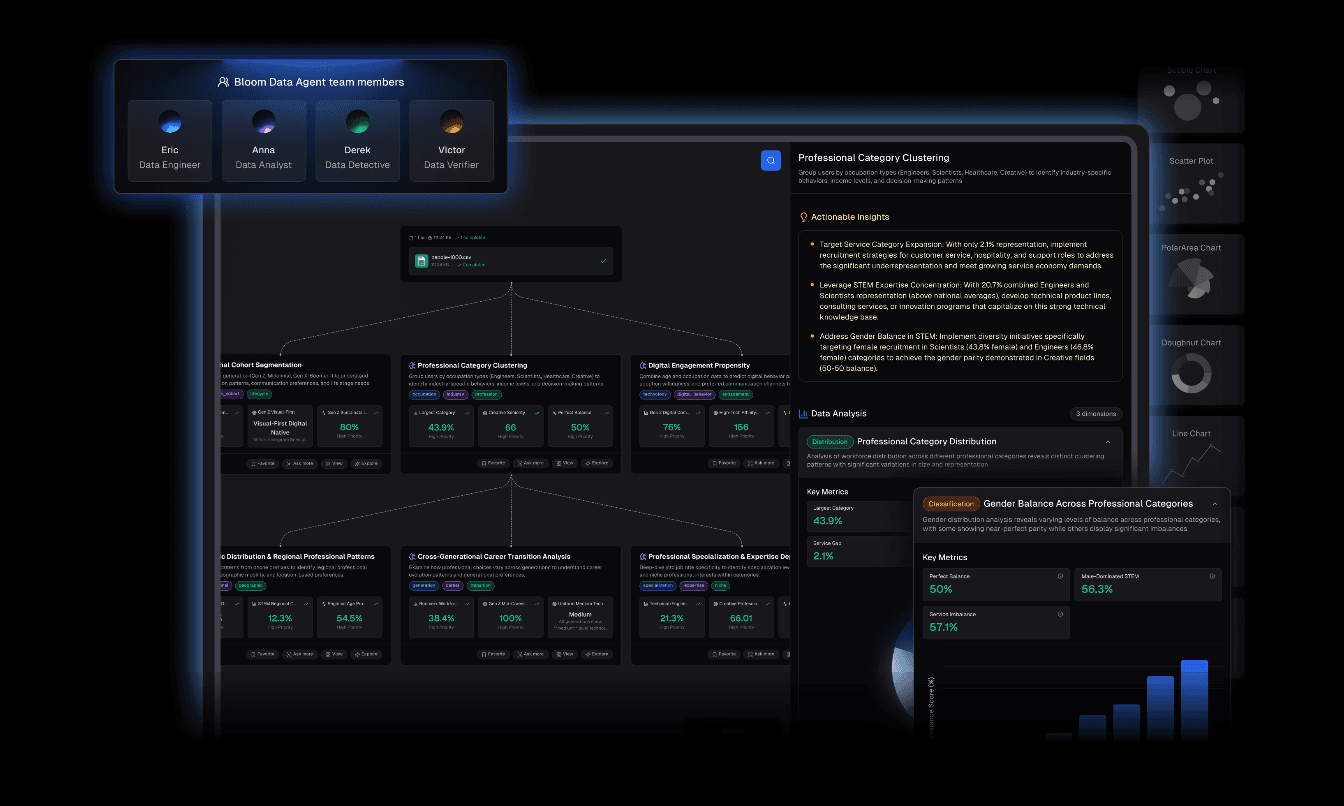
主要機能
自動クリーニングと整理:messyなExcel/CSV/PDFファイルをアップロードすると、エージェントが自動的にデータをクリーニングし、分析用に構造化します。
Nano Banana Pro技術:これはゲームチェンジャーです。埋め込まれたNano Banana Proエンジンを活用して、プロフェッショナル/ビジネス/ファンシースライドやデータプレビュー画像を瞬時に生成します。重要なプレゼンテーション用に特別に調整された説得力のあるビジュアルナarrativeを作成します。
インサイト抽出:多次元トレンド分析、深いインサイト、未来の予測を提供します。
自然言語インターフェース:コードは不要です。「なぜQ3の売上が減少したのか?」と尋ねれば、最適化されたチャートで視覚的な回答が得られます。
利点
スムーズな「データからプレゼンテーション」ワークフロー。
Nano Banana Proのビジュアルは美的に優れており、ボード用に準備されています。
データ準備やデザインにかかる時間を大幅に削減します。
非技術的ユーザーに直感的です。
欠点
手動でセルごとにコントロールを好むユーザーにとっては自動化されすぎていると感じる場合があります。
価格
競争力のある価格で、寛大な無料トライアルが利用可能です。
Tableau AI(Tableau Pulse)
パーソナライズされたインサイトを浮き彫りにするためにAIを使用する業界のパワーハウス。
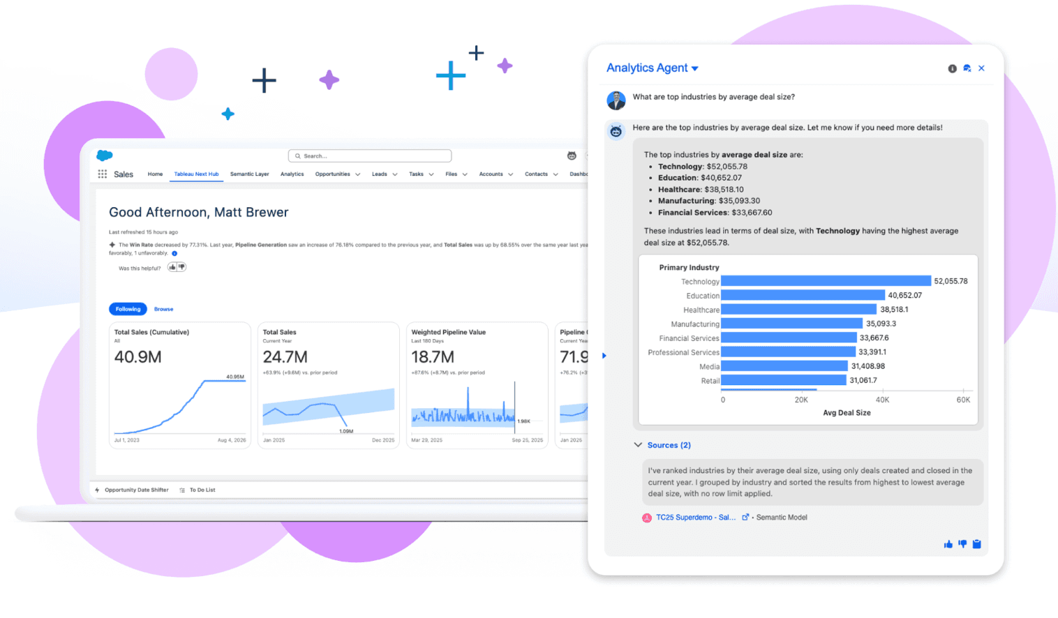
主要機能
自動データダイジェストと自然言語Q&AのためのTableau Pulse。
利点
複雑で大規模なデータセットに対する無比の深さ。
欠点
急な学習曲線と高コスト。
価格
プレミアムサブスクリプションモデル。
Microsoft Power BI Copilot
OpenAIのGPT技術によって強化された現在の企業標準の報告。
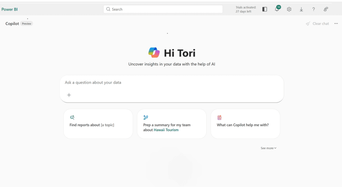
主要機能
DAX生成、チャットを使用したレポートページの作成。
利点
ExcelとAzureとの深い統合。
欠点
使いにくい場合があり、特定のライセンス層を必要とします。
価格
ユーザーごとの月額サブスクリプション。
Julius AI
セキュアなサンドボックスでPythonコードを記述し実行するAIデータアナリスト。
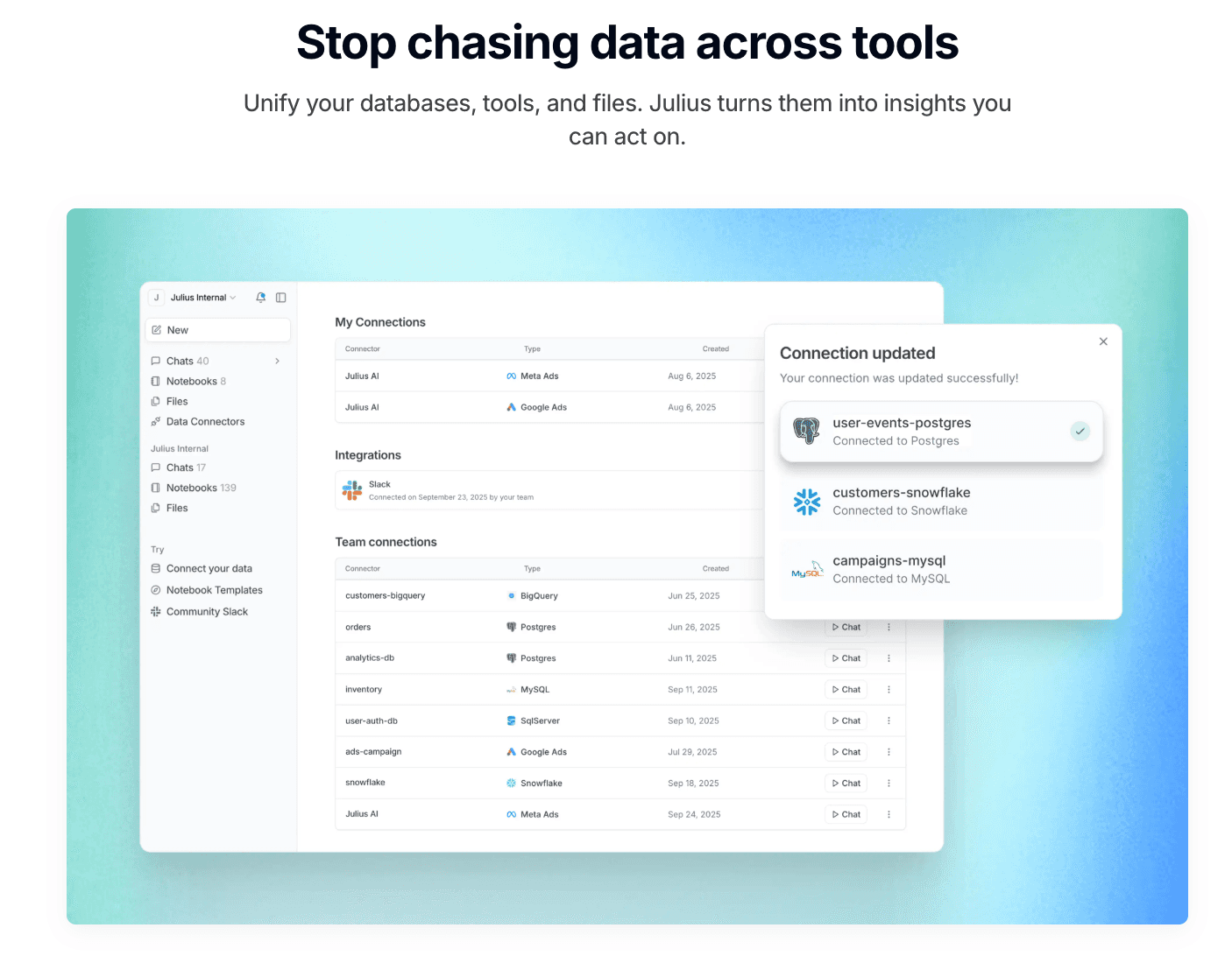
主要機能
高度な統計モデリング、透明なコード実行。
利点
透明性が高く、データがどのように処理されているかを正確に確認できます。
欠点
視覚化の美学はデザイン重視のツールと比べて基本的です。
価格
サブスクリプションベース。
Polymer
Polymerは静的スプレッドシートをインタラクティブで検索可能なデータベース(「アプリ」)に変換します。これはEコマースやマーケティングデータに最適です。
主要機能
AI駆動の自動タグ付け、インスタントピボットテーブル、インタラクティブダッシュボード。
利点
非常にモダンなインターフェースで、誰でもデータを「探求できる」ようにします。
欠点
回帰分析などの深い統計機能が欠けています。
価格
階層サブスクリプション(スターター/プロ/エンタープライズ)。
Akkio
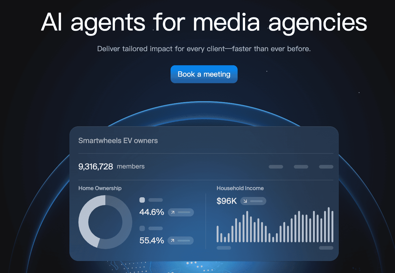
メディア代理店向けのAIエージェント。キャンペーンライフサイクル全体で結果を提供するAIエージェントを展開します。
主要機能
ノーコードの機械学習モデリング、販売予測、チャット探索。
利点
予測モデルを構築するのが非常に迅速で、HubSpotなどのライブデータソースに接続します。
欠点
視覚化のオプションはあまりカスタマイズ可能ではない/派手ではありません。
価格
中小企業向けの月額サブスクリプション。
Looker Studio(Gemini)
Googleの報告ソリューション、Gemini AIで強化され、Googleエコシステムに深く浸っている方々に最適です。

主要機能
シームレスなGoogle Analytics統合、Geminiアシストの要約生成。
利点
無料エントリーレベル;優れたリアルタイムコラボレーション。
欠点
非常に大きなデータセットでは遅くなる可能性があります;データクリーニング機能が限られています。
価格
無料(プロバージョンあり)。
Visme
深いデータ分析ではなく、魅力的なインフォグラフィックやプレゼンテーションを作成することに重点を置いた「デザイン優先」のツールです。
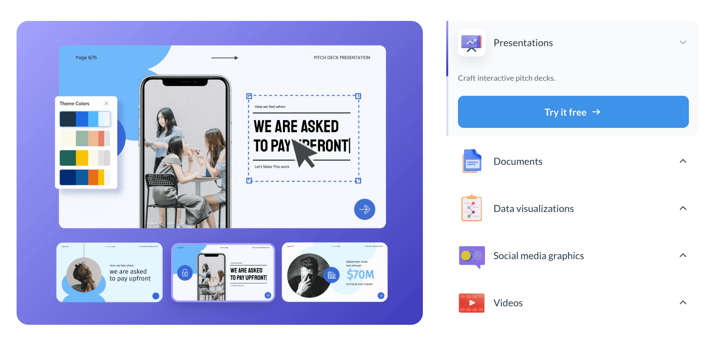
主要機能
大規模なインフォグラフィックテンプレートライブラリ、アニメーションチャートウィジェット。
利点
美しく、ソーシャルメディアに適した魅力的なビジュアルを作成します。
欠点
複雑なデータクリーニングや重い統計分析には適していません。
価格
ユーザーごとの月額サブスクリプション。
Graphy
シンプルさとスピードに設計されたツールで、スタートアップやNotionユーザーに人気があり、迅速でモダンなチャートを作成します。
主要機能
ミニマリストデータ入力、Notion埋め込み、自動最適化カラーパレット。
利点
使用が非常に速く、ビジュアルはすぐに素晴らしく見えます。
欠点
複雑または多次元データに対して機能が非常に制限されています。
価格
ユーザーごとの月額サブスクリプション。
MonkeyLearn
自然言語処理(NLP)を通じてテキストデータを視覚化することに特化したAIツール。
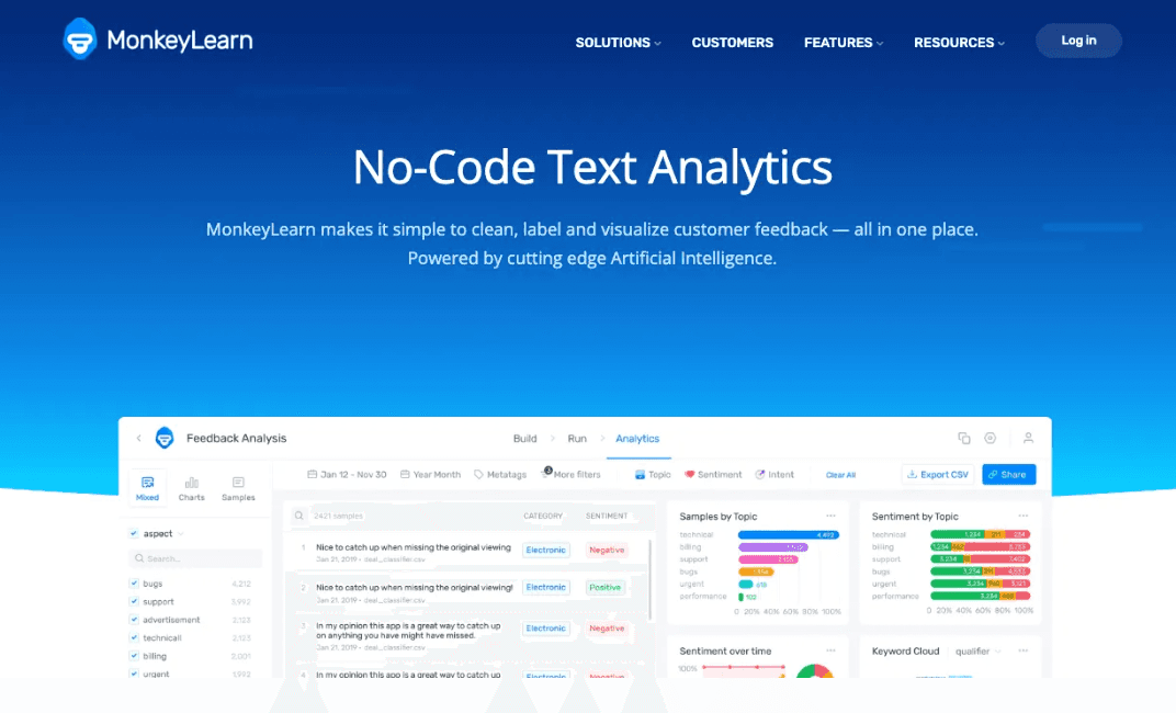
主要機能
感情分析、キーワード抽出、ワードクラウド生成。
利点
顧客レビューのような質的データを視覚化し、従来のツールでは見逃されるものを捉えます。
欠点
標準的な数値/財務報告を処理できません。
価格
使用料またはサブスクリプション。
Sisense
開発者が自分の製品にホワイトラベルのダッシュボードを組み込むために設計された埋め込み分析プラットフォーム。
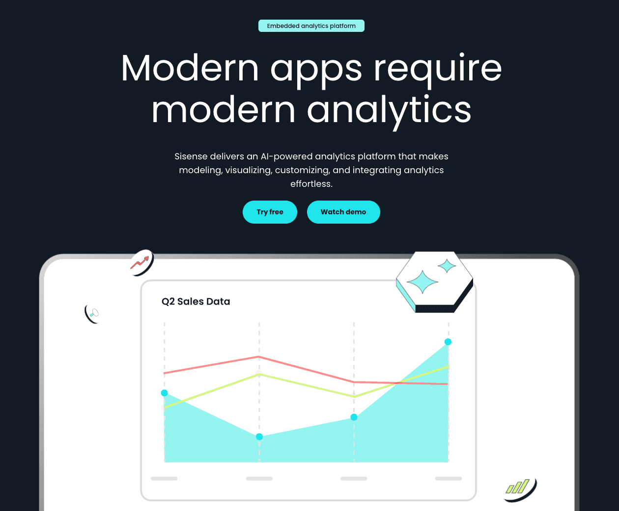
主要機能
Infusion Apps、カスタムウィジェット用のBloX、APIファースト設計。
利点
非常にカスタマイズ可能で、製品統合に強力です。
欠点
開発者リソースが必要;平均的なビジネスユーザーには向きません。
価格
カスタム価格。
11個のツールの比較表
ツール名 | データクリーニング | 視覚化品質 | スライド生成 | 使いやすさ | 最適な用途 |
Powerdrill Bloom | ⭐⭐⭐⭐⭐ | ⭐⭐⭐⭐⭐ | ⭐⭐⭐⭐ | ⭐⭐⭐ | オールインワン報告 |
Tableau AI | ⭐⭐⭐⭐ | ⭐⭐⭐⭐⭐ | ⭐⭐ | ⭐⭐ | データサイエンティスト |
Power BI | ⭐⭐⭐⭐ | ⭐⭐⭐⭐ | ⭐⭐⭐ | ⭐⭐⭐ | 企業IT |
Julius AI | ⭐⭐⭐⭐ | ⭐⭐⭐⭐ | ⭐⭐⭐ | ⭐⭐⭐⭐ | Pythonコーダー |
Polymer | ⭐⭐⭐ | ⭐⭐⭐⭐ | ⭐⭐ | ⭐⭐⭐⭐ | マーケティング担当者 |
Akkio | ⭐⭐⭐ | ⭐⭐⭐ | ⭐⭐ | ⭐⭐⭐⭐ | 予測者 |
Looker Studio | ⭐⭐ | ⭐⭐⭐ | ⭐⭐ | ⭐⭐⭐ | Googleユーザー |
Visme | ⭐⭐ | ⭐⭐⭐⭐⭐ | ⭐⭐⭐⭐ | ⭐⭐⭐⭐ | デザイナー |
Graphy | ⭐⭐ | ⭐⭐⭐⭐ | ⭐⭐ | ⭐⭐⭐⭐⭐ | シンプルなチャート |
MonkeyLearn | ⭐⭐ | ⭐⭐⭐ | ⭐⭐ | ⭐⭐⭐ | テキストデータ |
Sisense | ⭐⭐⭐⭐ | ⭐⭐⭐⭐ | ⭐⭐ | ⭐⭐ | 開発者 |
どのツールを選ぶべきか?
私は、さまざまなシナリオにおけるデータ分析、財務指標、顧客行動ログなどの観点から、各ツールの実際のビジネスデータセットの処理能力を評価しました。
「効率を求める者」を選ぶなら(最優秀):生データを数分でプロフェッショナルなプレゼンテーションに変えることが目標なら、Powerdrill Bloomが明確な勝者です。そのNano Banana Pro機能は、分析とストーリーテリングのギャップを他のツールよりも優れて架け橋します。
「予測者」を選ぶなら:来月の売上を予測する必要がある場合、Akkioが優れています。
「デザイナー」を選ぶなら:Instagram上でチャートの見た目が重要であれば、Vismeを選びましょう。
結論
2025年12月、最高のツールは、時間を節約しつつ精度を向上させるものです。
従来のBIツールは依然として強力ですが、Powerdrill BloomのようなAIエージェントへの移行は、データのクリーニング、分析、およびプレゼンテーションが1つの流れるような動作で行われ、迅速な意思決定を可能にする未来を示しています。
自動クリーニング、トレンド予測、および瞬時のNano Banana Proスライド生成の魔法を体験したい場合は、是非Powerdrill Bloomを無料で試してみることを強くお勧めします。今日、あなたの生データを説得力のあるビジュアルストーリーに変えましょう。
よくある質問
AIデータ視覚化ツールとは何ですか?
それは、人工知能を使用してデータを自動的に処理し、パターンを認識し、手動のコーディングやデザインスキルを必要とせずに視覚的な表現(チャート、グラフ)を生成するソフトウェアです。
ビジネスチームに最適なツールは何ですか?
Powerdrill Bloomは、その迅速なデータクリーニング能力とプレゼンテーション用スライドの生成(Nano Banana Pro経由)により、ビジネスチームに現在のトップ推薦です。手作業での作業を数時間節約します。
AI視覚化ツールはどのように機能しますか?
これらは、構造化されたまたは非構造化されたデータを取り込み、機械学習を使ってそれをクリーニングし、トレンドを分析し、その後、ユーザーの自然言語クエリに基づいて最も適切な視覚フォーマットを描画するグラフィックスエンジンを使用して機能します。