Google Analytics एक्सपोर्ट को विज़ुअल रिपोर्ट में कैसे बदलें (उदाहरणों के साथ)

प्रस्तावना
Google Analytics से रॉ डेटा डाउनलोड करना अक्सर ऐसा लगता है जैसे कोई बड़ा पहेली का डिब्बा मिला हो जिसके कुछ हिस्से गायब हों। आप जानते हैं कि उन हजारों पंक्तियों और स्तंभों में मूल्यवान जानकारियां छिपी हैं, लेकिन एक स्पष्ट कहानी निकालना पूरी तरह से एक अलग चुनौती है।
मार्केटर्स, संस्थापकों और डेटा विश्लेषकों के लिए, सेशन्स, बाउंस रेट्स और इवेंट काउंट्स की अंतहीन CSV फाइलों को घूरते रहना समय और ऊर्जा की एक निराशाजनक बर्बादी है। आपके हितधारक एक स्प्रेडशीट नहीं देखना चाहते; वे ऐसी व्यावहारिक जानकारियां चाहते हैं जो निर्णय लेने में मदद करें।
मैन्युअल रूप से डेटा को साफ करने, जटिल फॉर्मूले लिखने और अजीब चार्ट बिल्डर्स के साथ संघर्ष करने में घंटों बिताने के बजाय, अब आप इस भारी काम को करने के लिए आर्टिफिशियल इंटेलिजेंस का लाभ उठा सकते हैं।
इस गाइड में, हम आपको बिल्कुल दिखाएंगे कि कैसे कुछ ही मिनटों में अव्यवस्थित Google Analytics एक्सपोर्ट्स को शानदार, अधिकारियों के सामने पेश करने योग्य विजुअल रिपोर्ट्स में बदला जाए, जिससे आप फॉर्मेटिंग के बजाय रणनीति पर ध्यान केंद्रित कर सकें।
आप क्या सीखेंगे
इस व्यापक गाइड के अंत तक, आप समझ जाएंगे:
- वे बुनियादी कारण कि क्यों रॉ Google Analytics डेटा की व्याख्या करना इतना कठिन है।
- कैसे आधुनिक AI उपकरण वेब एनालिटिक्स रिपोर्टिंग के हमारे दृष्टिकोण में क्रांति ला रहे हैं।
- Powerdrill Bloom का उपयोग करके रॉ डेटा को तुरंत एक विजुअल रिपोर्ट में बदलने के लिए चरण-दर-चरण वर्कफ़्लो।
- त्वरित मार्केटिंग अंतर्दृष्टि उत्पन्न करने के लिए वास्तविक दुनिया के प्रॉम्प्ट उदाहरण।
- डेटा विज़ुअलाइज़ेशन बनाने के लिए आवश्यक सर्वोत्तम अभ्यास जो वास्तव में व्यावसायिक विकास को बढ़ावा देते हैं।
Google Analytics एक्सपोर्ट्स को पढ़ना क्यों कठिन है
यदि आपने कभी Google Analytics 4 (GA4) से रिपोर्ट एक्सपोर्ट की है, तो आप पहले से ही जानते हैं कि इससे कितना सिरदर्द होता है। हालांकि GA4 एक शक्तिशाली ट्रैकिंग टूल है, लेकिन इसके मूल एक्सपोर्ट्स तत्काल विश्लेषण के लिए बेहद अनुकूल नहीं होने के लिए जाने जाते हैं। यहाँ बताया गया है कि रॉ GA4 एक्सपोर्ट्स को समझना इतना कठिन क्यों है:
- जानकारी की अधिकता: एक मानक एक्सपोर्ट हर आयाम और मीट्रिक को एक ही, फ्लैट फ़ाइल में डाल देता है। डिवाइस श्रेणियों, UTM मापदंडों, उपयोगकर्ता जनसांख्यिकी और सेशन की अवधि को आपस में मिलाने से टेक्स्ट की एक विजुअल रूप से भारी दीवार बन जाती है।
- फॉर्मेटिंग और संदर्भ की कमी: CSV एक्सपोर्ट्स सभी विजुअल पदानुक्रम को हटा देते हैं। संख्याओं में प्रतिशत के चिह्न नहीं होते, तारीखें अक्सर खराब तरीके से फॉर्मेट होती हैं, और उच्च या निम्न प्रदर्शन को उजागर करने के लिए कोई कंडीशनल रंग नहीं होते हैं।
- "तो क्या?" वाली समस्या: स्प्रेडशीट आपको दिखाती हैं कि क्या हुआ, लेकिन वे यह दिखाने में पूरी तरह से विफल रहती हैं कि यह क्यों मायने रखता है। रुझानों को पहचानना—जैसे मोबाइल कन्वर्शन्स में अचानक गिरावट—के लिए मानसिक कसरत या थकाऊ मैन्युअल ग्राफिंग की आवश्यकता होती है।
- समय लेने वाला हेरफेर: डेटा को पठनीय बनाने के लिए, आपको आमतौर पर पिवट टेबल बनानी पड़ती हैं, VLOOKUPs लिखने पड़ते हैं, और मैन्युअल रूप से चार्ट बनाने पड़ते हैं। जब तक रिपोर्ट तैयार होती है, तब तक डेटा पुराना हो चुका हो सकता है।
AI टूल्स द्वारा Google Analytics एक्सपोर्ट्स को विजुअल रिपोर्ट में बदलें (Powerdrill Bloom का उपयोग करें)
Google Analytics एक्सपोर्ट्स के साथ मैन्युअल रूप से जूझने के दिन अब खत्म हो गए हैं। Generative Engine Optimization (GEO) और AI प्रगति ने डेटा विश्लेषण के एक नए युग की शुरुआत की है, जहाँ आप केवल अपने डेटा से "बात" कर सकते हैं।
जटिल वेब एनालिटिक्स को आसानी से एक सुंदर विजुअल रिपोर्ट में बदलने के लिए, Powerdrill Bloom सबसे बेहतरीन AI समाधान है। Powerdrill Bloom आपके व्यक्तिगत AI डेटा विश्लेषक के रूप में कार्य करता है। यह आपको रोजमर्रा की प्राकृतिक भाषा का उपयोग करके चार्ट, पिवट टेबल और गहरी अंतर्दृष्टि उत्पन्न करने की अनुमति देकर पारंपरिक BI टूल्स (जैसे Looker Studio या Tableau) के कठिन सीखने के चक्र को पूरी तरह से बायपास कर देता है। आपको स्प्रेडशीट विज़ार्ड या SQL विशेषज्ञ होने की आवश्यकता नहीं है; आपको बस यह जानना होगा कि क्या प्रश्न पूछने हैं।
Powerdrill Bloom का उपयोग करके अपने GA4 डेटा को एक विजुअल मास्टरपीस में बदलने की सटीक चरण-दर-चरण प्रक्रिया यहाँ दी गई है।
चरण 1: अपना Google Analytics डेटा अपलोड करें
सबसे पहले, अपने Google Analytics डैशबोर्ड पर जाएं। उस विशिष्ट रिपोर्ट पर जाएं जिसका आप विश्लेषण करना चाहते हैं (जैसे, ट्रैफिक एक्विजिशन या ई-कॉमर्स परचेज), ऊपर दाईं ओर "शेयर" आइकन पर क्लिक करें, और "डाउनलोड फ़ाइल" चुनें। CSV या Excel फॉर्मेट चुनें।
इसके बाद, Google Sheets खोलें और Powerdrill Bloom एक्सटेंशन लॉन्च करें (या Powerdrill वेब इंटरफ़ेस का उपयोग करें)। बस अपनी नई डाउनलोड की गई GA4 डेटा फ़ाइल को इम्पोर्ट करें। Powerdrill Bloom तुरंत डेटासेट को स्कैन करेगा, कॉलम के संदर्भ को समझेगा—यह पहचानते हुए कि कौन से कॉलम तारीखों को दर्शाते हैं, कौन से मौद्रिक मूल्य हैं, और कौन से ट्रैफ़िक स्रोत हैं।
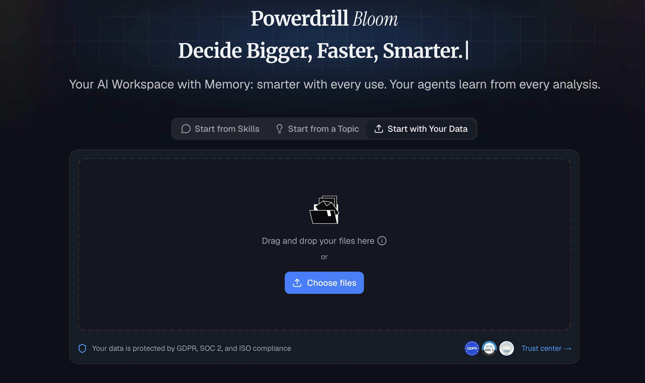
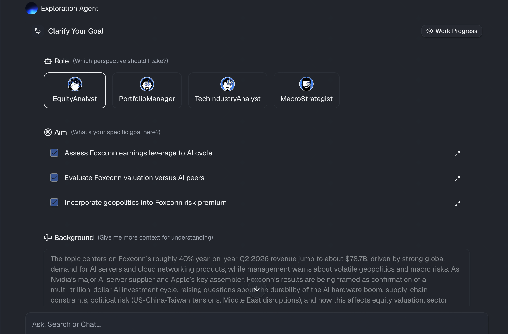
चरण 2: प्राकृतिक भाषा द्वारा अपना लक्ष्य स्पष्ट करें
यहीं पर जादू होता है। पंक्तियों को हाइलाइट करने और चार्ट मेनू पर क्लिक करने के बजाय, आप बस साधारण भाषा में टाइप करते हैं कि आप क्या देखना चाहते हैं। Powerdrill Bloom का उन्नत AI आपके अनुरोध के पीछे के मार्केटिंग संदर्भ को समझता है। आप बस Powerdrill Bloom को बताते हैं कि आपका विश्लेषणात्मक लक्ष्य क्या है, और AI आपके इरादे को तुरंत समझ जाता है।
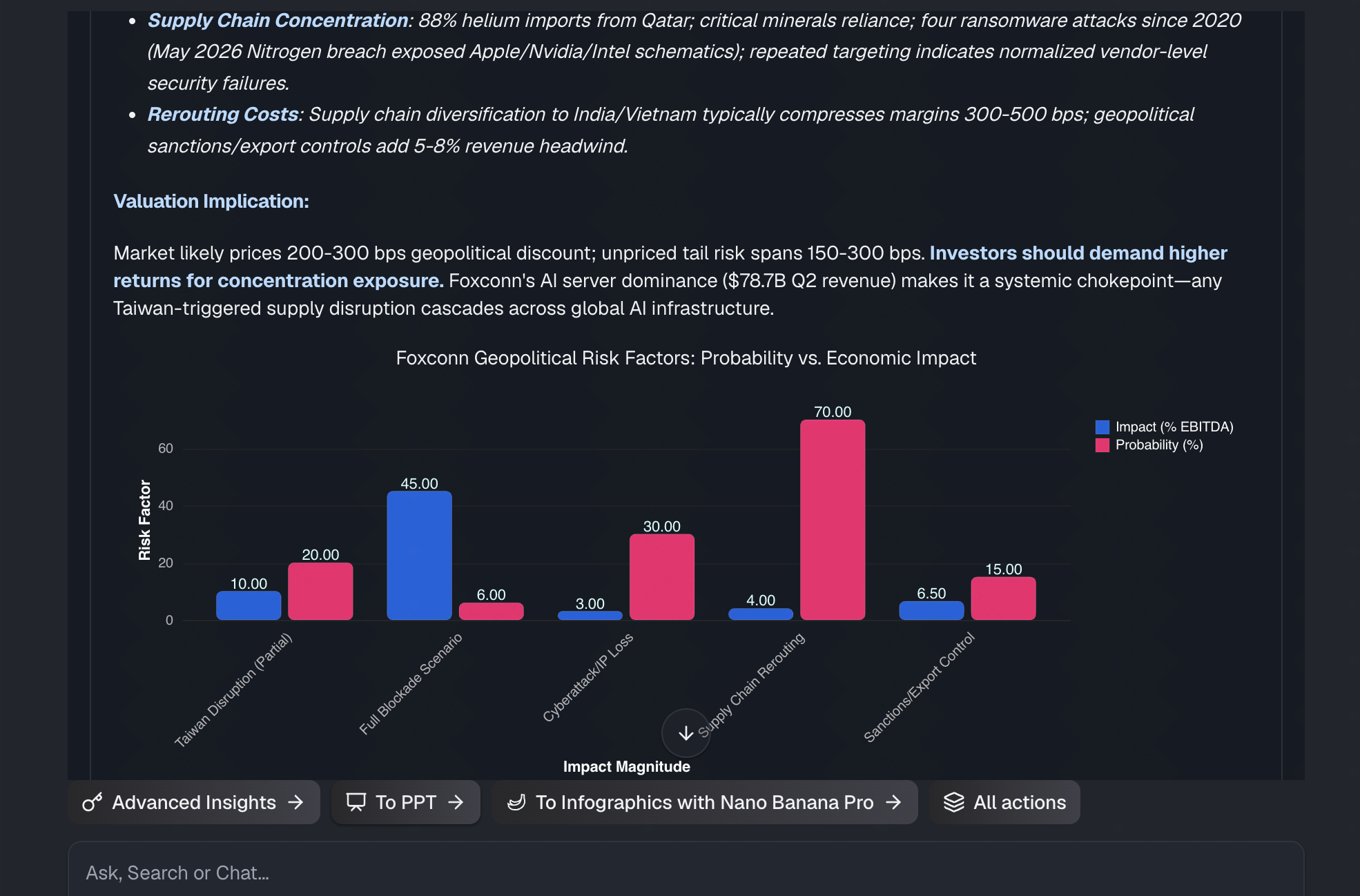
चरण 3: स्वचालित रूप से विजुअल चार्ट उत्पन्न करें
एक बार जब आप एंटर दबाते हैं, तो Powerdrill Bloom आपके प्रॉम्प्ट को प्रोसेस करता है और स्वचालित रूप से आपके द्वारा अनुरोधित सटीक विजुअल चार्ट उत्पन्न करता है। लेकिन यह बुनियादी चार्टिंग टूल से एक कदम आगे जाता है।
यदि आप एक व्यापक प्रश्न पूछते हैं जैसे, "इस डेटा में सबसे दिलचस्प रुझान क्या हैं?", तो Powerdrill Bloom स्वायत्त रूप से सबसे उपयुक्त चार्ट प्रकारों (जैसे, समय-श्रृंखला डेटा के लिए लाइन चार्ट, श्रेणीबद्ध तुलनाओं के लिए बार चार्ट) का चयन करेगा और एक मिनी-डैशबोर्ड उत्पन्न करेगा। यह अव्यवस्थित GA4 तारीख फॉर्मेट्स को भी स्वचालित रूप से साफ करता है और उचित लेबल और लीजेंड लागू करता है, जिससे यह सुनिश्चित होता है कि विज़ुअलाइज़ेशन बिना किसी मैन्युअल सुधार के दिखने में आकर्षक और विश्लेषणात्मक रूप से सटीक हो।
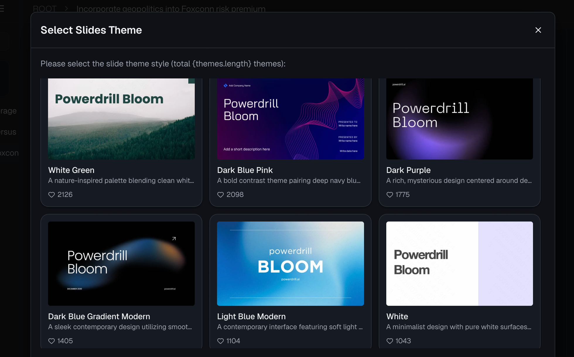
चरण 4: एक क्लिक में अपनी रिपोर्ट एक्सपोर्ट करें
एक बेहतरीन विजुअल रिपोर्ट तभी मूल्यवान होती है जब इसे आपकी टीम, ग्राहकों या नेतृत्व के साथ आसानी से साझा किया जा सके। एक बार जब Powerdrill Bloom आपके चार्ट उत्पन्न कर लेता है और प्रमुख जानकारियों का सारांश दे देता है, तो आप अपनी रिपोर्टिंग प्रक्रिया को सेकंडों में अंतिम रूप दे सकते हैं।
एक सिंगल क्लिक के साथ, आप इन खूबसूरत, AI-जनरेटेड चार्ट्स को एक पॉलिश फॉर्मेट में एक्सपोर्ट कर सकते हैं। चाहे आपको सोमवार सुबह की मार्केटिंग मीटिंग के लिए उन्हें Google Slide प्रेजेंटेशन में डालना हो, क्लाइंट अपडेट के लिए उन्हें PDF के रूप में एक्सपोर्ट करना हो, या उन्हें लाइव डैशबोर्ड के रूप में Google Sheets के अंदर रखना हो, Powerdrill Bloom यह सुनिश्चित करता है कि आपका डेटा तुरंत प्रेजेंटेशन के लिए तैयार हो।
Google Analytics रिपोर्टिंग के लिए सर्वोत्तम अभ्यास
Powerdrill Bloom जैसे शक्तिशाली AI टूल के साथ भी, डेटा विज़ुअलाइज़ेशन के सर्वोत्तम अभ्यासों का पालन करने से आपकी रिपोर्ट काफी अधिक प्रभावशाली बन जाएगी:
- मुख्य प्रदर्शन संकेतकों (KPIs) पर ध्यान केंद्रित करें: केवल इसलिए कि आपके पास डेटा है, हर एक मीट्रिक को विज़ुअलाइज़ न करें। उस डेटा पर ध्यान केंद्रित करें जो आपके व्यावसायिक लक्ष्यों के साथ संरेखित हो (जैसे, कन्वर्शन रेट, प्रति अधिग्रहण लागत, राजस्व)।
- सही चार्ट प्रकार चुनें: समय के साथ रुझान दिखाने के लिए लाइन चार्ट का उपयोग करें, श्रेणियों (जैसे ट्रैफ़िक स्रोत) की तुलना करने के लिए बार चार्ट का उपयोग करें, और पूरे के हिस्सों को दिखाने के लिए कड़ाई से पाई चार्ट का उपयोग करें। यदि आप अनिश्चित हैं तो Powerdrill Bloom को अपना मार्गदर्शन करने दें।
- प्रासंगिक टिप्पणी जोड़ें: केवल एक चार्ट अच्छा है, लेकिन संक्षिप्त विवरण के साथ एक चार्ट बेहतर है। टेक्स्ट सारांश उत्पन्न करने के लिए AI का उपयोग करें जो यह समझाए कि कोई उछाल या गिरावट क्यों हुई।
- इसे अव्यवस्था मुक्त रखें: बहुत अधिक वेरिएबल्स वाले अत्यधिक जटिल ग्राफ़ से बचें। यदि किसी चार्ट को समझाने के लिए पांच मिनट की आवश्यकता होती है, तो यह बहुत जटिल है।
- बेंचमार्क के साथ तुलना करें: अपने हितधारकों को प्रदर्शन का सही अहसास कराने के लिए हमेशा वर्तमान डेटा की तुलना ऐतिहासिक डेटा (जैसे, वर्ष-दर-वर्ष या महीने-दर-महीने) से करने का प्रयास करें।
निष्कर्ष
रॉ Google Analytics एक्सपोर्ट्स को सार्थक विजुअल रिपोर्ट्स में अनुवाद करने के लिए अब उन्नत तकनीकी कौशल या घंटों की थकाऊ मैन्युअल फॉर्मेटिंग की आवश्यकता नहीं है। विरासत स्प्रेडशीट प्रबंधन से AI-संचालित विश्लेषण पर स्थानांतरित होकर, आप लगभग तुरंत अपने डेटा में छिपी वास्तविक कहानी को अनलॉक कर सकते हैं।
यदि आप पिवट टेबल से लड़ना बंद करने और उच्च-प्रभाव वाले मार्केटिंग अंतर्दृष्टि प्रदान करने के लिए तैयार हैं, तो यह आपके वर्कफ़्लो को अपग्रेड करने का समय है। आज ही Powerdrill Bloom आज़माएं। इसकी सहज प्राकृतिक भाषा प्रसंस्करण और वन-क्लिक विज़ुअलाइज़ेशन क्षमताएं इसे सेकंडों में अव्यवस्थित एनालिटिक्स डेटा को सुंदर, व्यावहारिक रिपोर्ट में बदलने के लिए बिल्कुल सबसे अच्छा टूल बनाती हैं।
अक्सर पूछे जाने वाले प्रश्न
क्या Google Analytics 4 मूल रूप से विजुअल रिपोर्ट बना सकता है?
हाँ, GA4 में एक "Explore" सुविधा है, लेकिन सहज AI टूल की तुलना में शुरुआती लोगों के लिए इसे नेविगेट करना बेहद जटिल, धीमा और कठिन है।
Looker Studio के बजाय Powerdrill Bloom का उपयोग क्यों करें?
Looker Studio के लिए एक कठिन सीखने के चक्र और तकनीकी सेटअप की आवश्यकता होती है। Powerdrill Bloom आपको केवल सरल अंग्रेजी में प्रश्न टाइप करके तुरंत रिपोर्ट बनाने की अनुमति देता है।
क्या मेरा Google Analytics डेटा Powerdrill Bloom के साथ सुरक्षित है?
बिल्कुल। Powerdrill Bloom सख्त, एंटरप्राइज-ग्रेड गोपनीयता उपायों को लागू करता है और यह सुनिश्चित करता है कि आपके मालिकाना एनालिटिक्स डेटा का उपयोग कभी भी सार्वजनिक AI मॉडल को प्रशिक्षित करने के लिए नहीं किया जाए।
क्या मुझे इस AI का उपयोग करने के लिए SQL या फॉर्मूले जानने की आवश्यकता है?
बिल्कुल नहीं! Powerdrill Bloom कोडिंग या फॉर्मूले की आवश्यकता को पूरी तरह से समाप्त कर देता है; आप अपनी ज़रूरत के चार्ट प्राप्त करने के लिए बस संवादात्मक भाषा का उपयोग करते हैं।
Powerdrill Bloom किस प्रकार के चार्ट उत्पन्न कर सकता है?
यह स्वचालित रूप से बार चार्ट, लाइन ग्राफ़, पाई चार्ट, स्कैटर प्लॉट और जटिल पिवट टेबल सहित विभिन्न प्रकार के विज़ुअलाइज़ेशन उत्पन्न कर सकता है।