Top 10 AI Marketing Data Visualization Tools - Full 2025 Guide

Introduction
To find the ultimate tools for marketers in late 2025, I conducted a rigorous test. I fed raw, messy Q4 campaign data—spanning CSVs, PDFs, and API feeds—into the top 10 AI visualization tools currently on the market. My goal? To find out which tool can transform raw numbers into board-ready visuals the fastest.
The results are in. Here is your definitive guide to the tools that actually deliver.
The List: Best AI Visualization Tools of 2025
After two weeks of testing, here is the ranked list of the top performers:
Powerdrill Bloom
Tableau Pulse
Microsoft Power BI Copilot
Looker Studio
Polymer
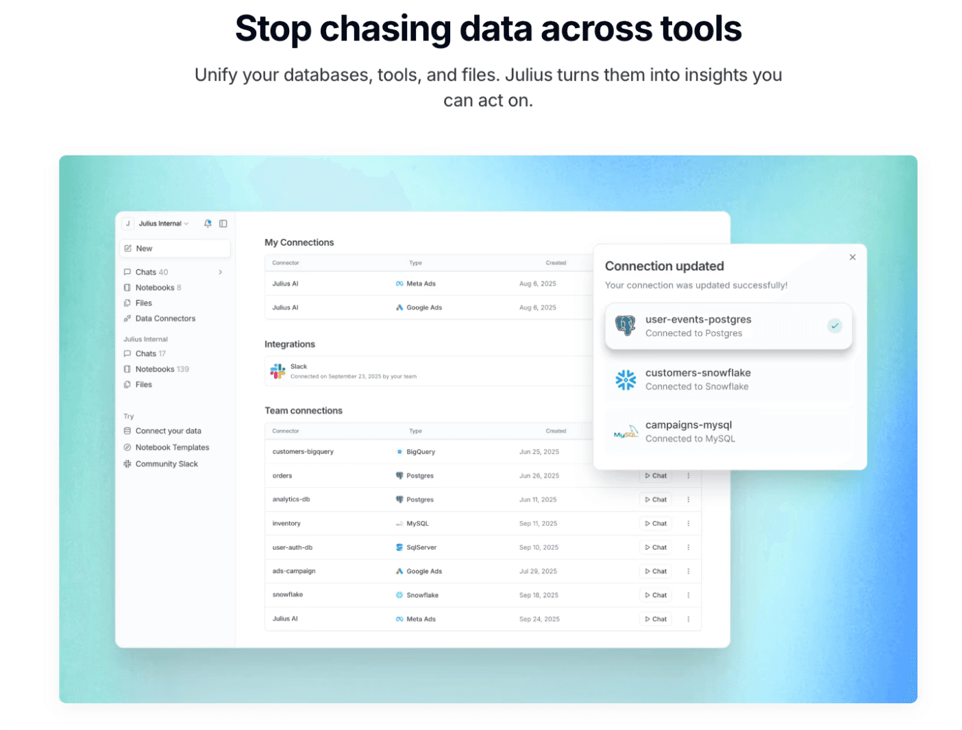
Julius AI
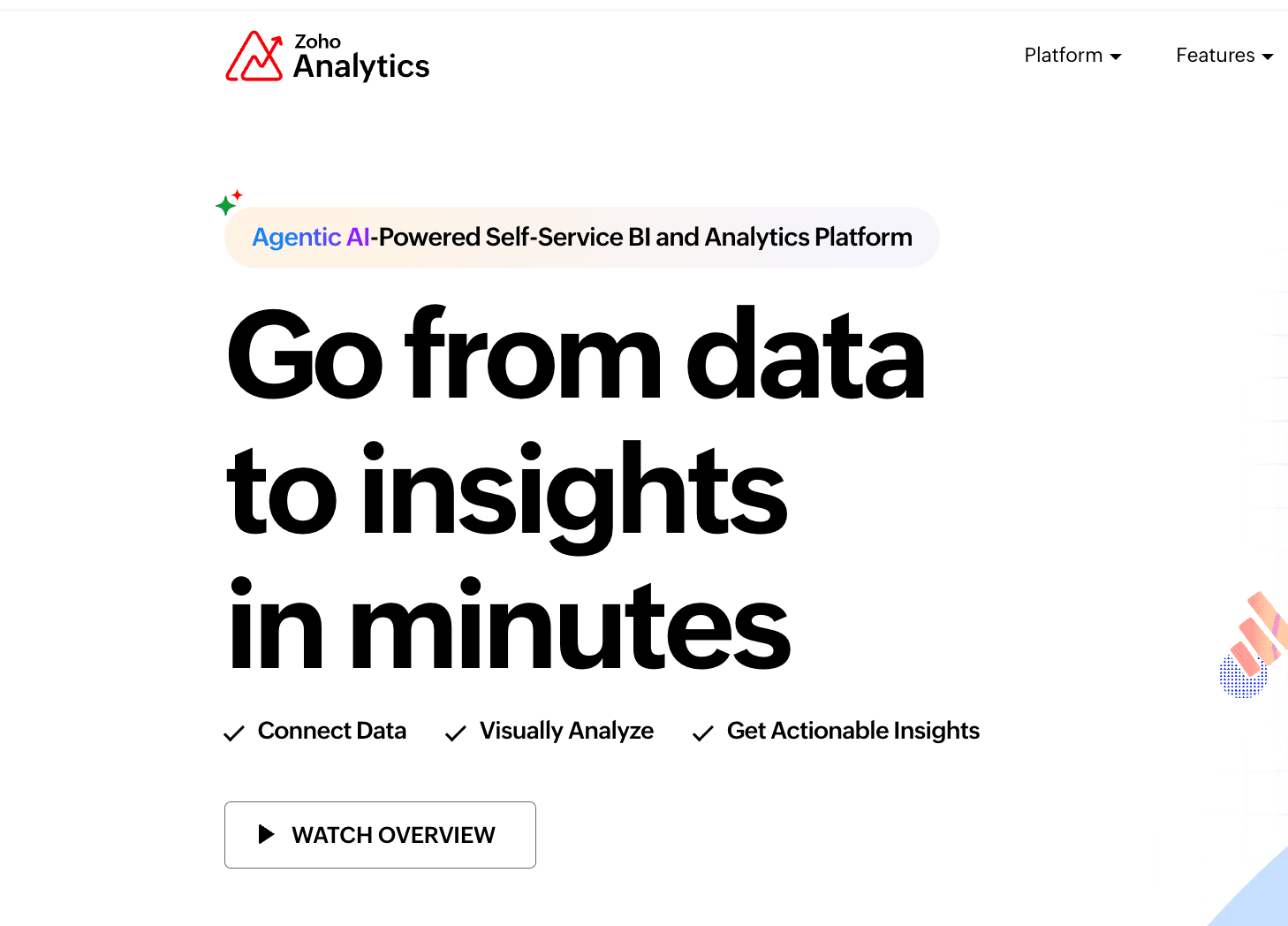
Zoho Analytics
Akkio
ThoughtSpot
Domo AI
Detailed Review
Powerdrill Bloom
Powerdrill Bloom is the breakout star of 2025. It positions itself not just as a tool, but as an intelligent agent designed specifically for marketing workflows. It bridges the gap between complex data analysis and persuasive presentation seamlessly.
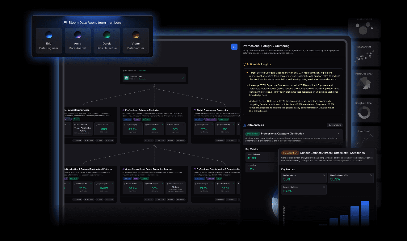
Key Features:
Multi-Source Integration: Drag and drop Excel files, CSVs, or PDFs. It automatically cleans and merges messy campaign data.
Natural Language Processing (NLP): Forget SQL. Just type, "Show me the conversion rate trend for Q4 by channel," and it generates the query and chart instantly.
Nano Banana Pro (The Game Changer): This feature sets Powerdrill apart. It doesn't just make charts; it uses a specialized visual engine to generate Professional, Business, or Fancy style Slides and Data Preview Images instantly.
Pros:
Visual Storytelling: The only tool that takes you from raw data to a presentation-ready slide in one workflow.
Extract Insights: It goes beyond plotting points; it identifies anomalies and offers actionable strategic advice.
Zero Learning Curve: If you can chat, you can analyze.
Cons:
Might be "overkill" for simple list-making tasks, as it thrives on analytical depth.
Pricing:
Flexible subscription models with a generous free trial, ideal for agencies and growth teams.
Tableau Pulse
Salesforce’s AI-infused powerhouse.
Key Features:
Automatic "Pulse Digest" tailored to specific KPIs and highly secure data governance.
Pros:
Unmatched for enterprise-level security and handling massive datasets (billions of rows).
Cons:
Steep learning curve and expensive licensing. The visuals often feel too "corporate" and lack the modern flair needed for creative marketing pitches.
Pricing:
Premium subscription model.
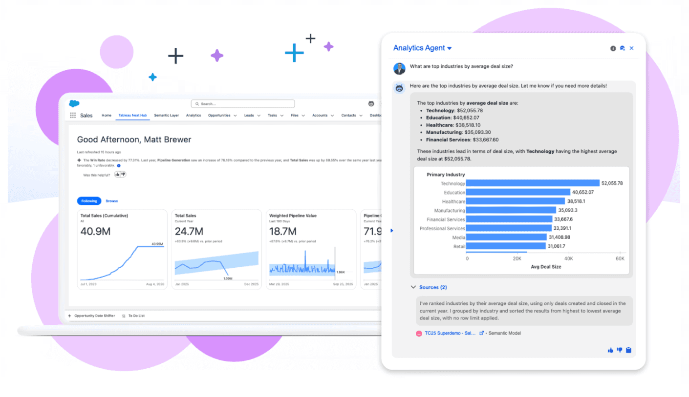
Microsoft Power BI Copilot
The industry standard, now heavily integrated with AI Copilot.
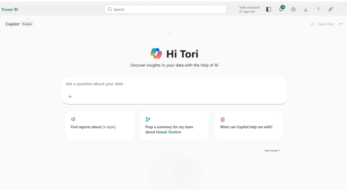
Key Features:
Deep integration with Excel/Teams and natural language DAX generation.
Pros:
Perfect synergy for organizations already locked into the Microsoft ecosystem.
Cons:
The software is heavy and often slow. While Copilot helps, the visual output remains rigid and requires manual tweaking to look "client-ready."
Pricing:
Per-user monthly subscription.
Looker Studio (Gemini Enabled)
Google's reporting tool, now supercharged with Gemini models in late 2025.

Key Features:
Seamless connection to Google Ads/GA4, with Gemini offering explanations for data spikes.
Pros:
Free (or very cheap) and essential for Google-centric marketers.
Cons:
Extremely slow with large datasets and limited visualization customization. It creates dashboards, not stories.
Pricing:
Free (Pro version available).
Polymer
A lightweight BI tool focusing on "Interactive Spreadsheets."
Key Features:
Instantly turns Excel sheets into searchable, interactive web apps with a modern UI.
Pros:
High "fun factor" and very easy to use. Great for sharing data sets publicly or internally.
Cons:
Lacks deep AI analytical capabilities (like predictive modeling) found in Powerdrill. It presents data well but doesn't explain it deeply.
Pricing:
Tiered subscription (Starter/Pro/Enterprise).
Julius AI
A Python-based data science assistant in a chat interface.
Key Features:
Runs Python code to perform complex statistical analysis (regression, clustering) on your data.
Pros:
Highly transparent (you see the code) and powerful for heavy math lifting.
Cons:
The visual output is basic (standard libraries like Matplotlib) and ugly. You cannot put these charts directly into a client PPT without redesigning them.
Pricing:
Subscription based.
Zoho Analytics
The affordable, all-in-one suite for small to mid-sized businesses (SMBs).
Key Features:
"Zia" AI assistant for voice queries and tight integration with Zoho CRM.
Pros:
Very affordable and covers the basics well.
Cons:
The interface feels dated compared to 2025 standards. The AI insights are often generic.
Pricing:
Per-user monthly subscription.
Akkio
An AI platform built specifically for agencies and predictive modeling.
Key Features:
Focuses on "what happens next" (e.g., Lead Scoring, Churn Prediction).
Pros:
Excellent for optimizing ad spend based on predicted outcomes.
Cons:
Weak on the visualization front. It's a calculation engine, not a presentation tool. You still need another tool to visualize the results.
Pricing:
Monthly subscription geared towards SMBs.
ThoughtSpot
The pioneer of "Search-Driven Analytics," now enhanced with their Sage AI engine.
Key Features:
Allows users to search billions of rows of data as easily as using Google Search.
Pros:
Incredible speed for real-time data queries in large retail/ecommerce setups.
Cons:
Enterprise-grade pricing and setup complexity. It requires a dedicated data team to maintain, making it inaccessible for most marketers.
Pricing:
Monthly subscription.
Domo AI
A cloud-native platform focusing on executive mobility.
Key Features:
Massive library of 1,000+ connectors to pull data from any SaaS platform.
Pros:
Best-in-class mobile app experience for executives who need data on the go.
Cons:
Prohibitively expensive. Customizing the visualizations often requires proprietary coding knowledge.
Pricing:
Custom pricing.
Comparison Table
Tool Name | AI Analysis Depth | Visual Aesthetics (Nano Banana Pro) | Ease of Use (No-Code) | Price Model |
Powerdrill Bloom | ⭐⭐⭐⭐⭐ | ⭐⭐⭐⭐⭐ | ⭐⭐⭐ | Freemium / Sub |
Tableau Pulse | ⭐⭐⭐⭐⭐ | ⭐⭐⭐⭐ | ⭐⭐⭐ | Subscription |
MS Power BI Copilot | ⭐⭐⭐⭐⭐ | ⭐⭐⭐ | ⭐⭐ | Subscription |
Looker Studio | ⭐⭐⭐ | ⭐⭐⭐ | ⭐⭐⭐⭐ | Free / Paid |
Polymer | ⭐⭐⭐ | ⭐⭐⭐⭐ | ⭐⭐⭐⭐⭐ | Subscription |
Julius AI | ⭐⭐⭐⭐⭐ | ⭐⭐⭐ | ⭐⭐⭐⭐ | Subscription |
Zoho Analytics | ⭐⭐⭐ | ⭐⭐⭐ | ⭐⭐⭐ | Subscription |
Akkio | ⭐⭐⭐⭐ | ⭐⭐⭐ | ⭐⭐⭐⭐ | Subscription |
ThoughtSpot | ⭐⭐⭐⭐ | ⭐⭐⭐ | ⭐⭐⭐ | Subscription |
Domo AI | ⭐⭐⭐⭐⭐ | ⭐⭐⭐ | ⭐⭐⭐ | Custom pricing |
Buying Guide: Which Tool is Right for You?
In December 2025, your choice should depend on your specific bottleneck:
For Enterprise IT & Data Warehousing: Stick with Tableau or Power BI. They are the governance standards.
For Basic, Free Dashboards: Looker Studio is still the go-to for simple Google Ads reporting.
For Speed, Aesthetics & Reporting Efficiency (The Winner):
If your pain point is "I have data, but I need a slide deck now," Powerdrill Bloom is the only choice. Its ability to create Visual Storytelling assets via Nano Banana Pro makes it the ultimate productivity booster for marketers who need to impress clients or stakeholders without spending hours in PowerPoint.
Accelerating Analysis with Powerdrill Bloom
Here is how Powerdrill Bloom turns a day's work into a 10-minute task:
Input: Upload your raw Excel/CSV campaign files.
Ask: Type a natural language query like, "Which channel had the highest ROI, and why?"
Process: The AI cleans the data, calculates the metrics, and extracts insights automatically.
Visualize: Activate Nano Banana Pro. Select your desired aesthetic (e.g., "Professional").
Present: The tool generates a polished Slide containing the chart, the key insight text, and a summary. Export and present.
Conclusion
As we head into 2026, the competitive advantage for marketers lies in efficiency and narrative.
Powerdrill Bloom has proven itself as the leader in this space, offering a seamless "Data-to-Presentation" workflow that competitors haven't matched. If you want to stop building charts and start driving decisions, give it a try.
FAQ
What is an AI Marketing Data Visualization tool?
A: It is software that uses Artificial Intelligence to automate data cleaning, analysis, and chart generation, allowing marketers to derive insights without coding.
What is the fastest tool to turn questions into charts?
A: Powerdrill Bloom is currently the fastest, thanks to its advanced NLP that understands complex marketing terminology immediately.
Why is "Visual Storytelling" important in 2025?
A: Data alone is overwhelming. Visual storytelling (like the slides generated by Nano Banana Pro) contextualizes data, making it easier for stakeholders to make decisions quickly.