10 Mejores Generadores de Infografías AI en 2026 (Herramientas Gratuitas y de Pago para Crear Visuales Impresionantes)

Introducción
Después de probar rigurosamente docenas de los mejores generadores de infografías AI del mercado, he recopilado la lista definitiva de las 10 mejores herramientas de AI optimizadas para visualización de datos, flujos de trabajo automatizados y diseño visual.
Esta guía integral comparará objetivamente sus características, fortalezas, limitaciones y casos de uso ideales. Ya sea que seas un comercializador que rastrea métricas de campañas o un analista de negocios que visualiza informes trimestrales, encontrar la herramienta adecuada para extraer información de datos en bruto es crucial. Si tu prioridad inmediata se centra exclusivamente en la conversión de hojas de cálculo, recomiendo encarecidamente leer mi guía previa sobre Crear Gráficos Asombrosos desde Excel, CSV o PDF — Instantáneamente con AI antes de sumergirte en esta lista más amplia.
Tabla de Comparación de las 10 Herramientas
Aquí hay una comparación general de los 10 mejores generadores de infografías AI en 2026:
Nombre de la Herramienta | Mejor Para | Característica Clave de AI | Facilidad de Uso | Modelo de Precios |
Comercializadores y Equipos de Datos (Excel/CSV a PPT) | Lienzo de Análisis de Datos Multi-Agente | ⭐⭐⭐⭐⭐ | Freemium / Pagado | |
Freelancers y No-Diseñadores | Diseño Mágico (Texto a Plantilla) | ⭐⭐⭐⭐⭐ | Freemium / Pagado | |
HR y Comunicadores Corporativos | Texto a Infografía AI | ⭐⭐⭐⭐ | Freemium / Pagado | |
Comercializadores B2B y Educadores | Automatización de DiseñoAI | ⭐⭐⭐⭐ | Freemium / Pagado | |
Consultores y Fundadores | Generación de Presentaciones AI | ⭐⭐⭐⭐⭐ | Freemium / Pagado | |
Editores Digitales y Analistas | Resumido de Datos AI | ⭐⭐⭐ | Freemium / Pagado | |
Investigadores con Conocimientos Técnicos | Agente de Tarea Autónoma | ⭐⭐⭐⭐⭐ | Freemium / Pagado | |
Representantes de Ventas y Equipos Corporativos | DiseñadorBot Layouts Inteligentes | ⭐⭐⭐⭐ | Pagado (Suscripción) | |
Equipos BI Empresariales | Modelo de Datos Einstein Copilot | ⭐⭐⭐ | Pagado (Empresa) | |
Gerentes de Redes Sociales | AI Generativa Firefly | ⭐⭐⭐⭐⭐ | Freemium / Pagado |
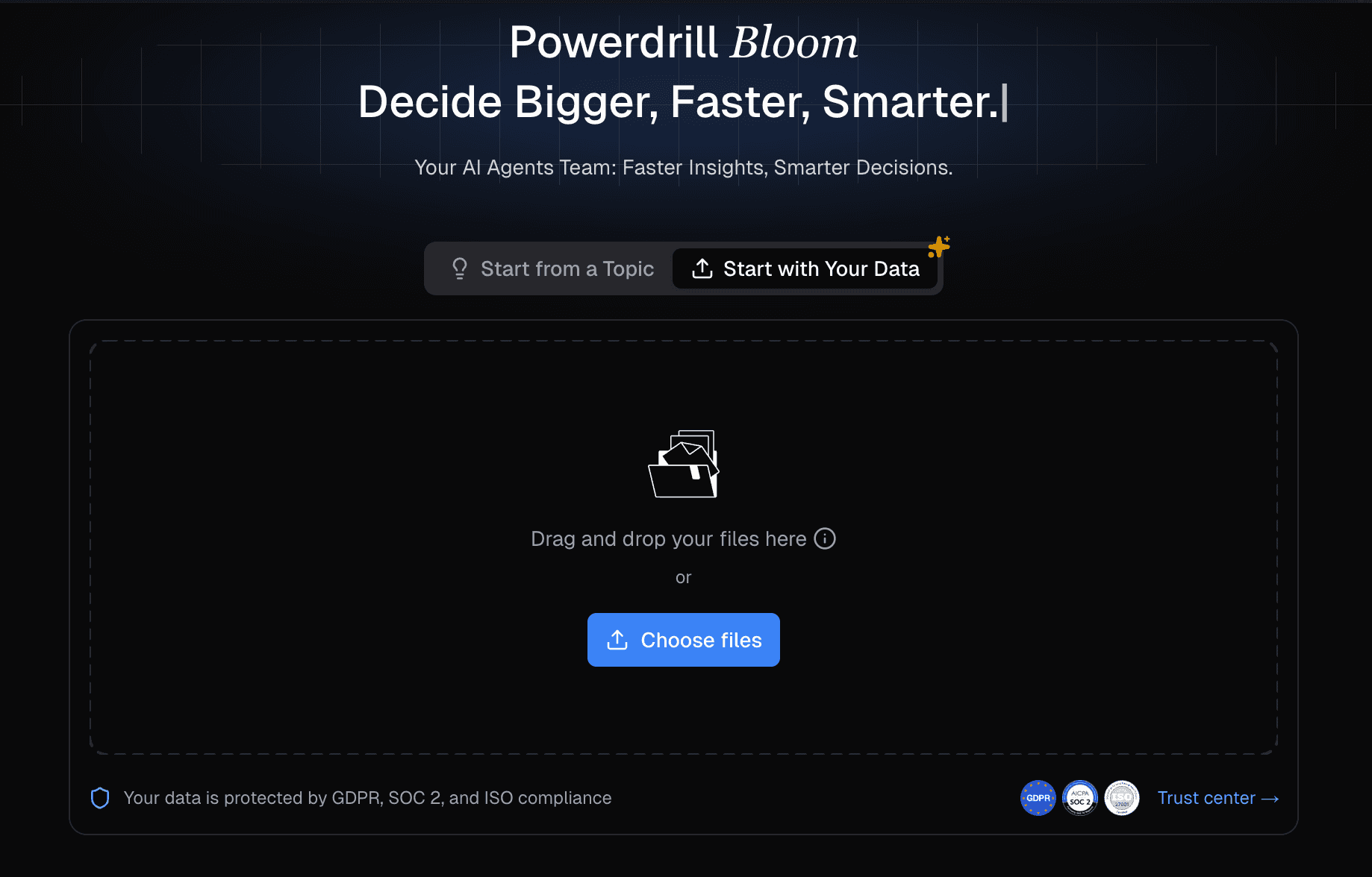
Powerdrill Bloom
Una plataforma de exploración de datos inteligente y centrada en AI.
Mejor Para: Comercializadores, equipos de análisis de datos y profesionales de negocios que necesitan transformar instantáneamente datos en bruto de Excel, CSV o PDF en PPTs accionables sin habilidades de SQL o diseño.
Características Clave:
Limpiar, estructurar datos automáticamente y análisis de tendencias complejas a través de un sistema multi-agente colaborativo.
Lienzo AI interactivo diseñado para extraer instantáneamente información y recomendar visualizaciones óptimas.
Conversión con un solo clic de conjuntos de datos complejos en diapositivas de PowerPoint profesionales y en infografías altamente atractivas.
Ventajas:
Cero curva de aprendizaje; funciona completamente con comandos en lenguaje natural.
Procesa y comprende formatos de datos pesados (Excel, CSV, PDF) de manera directa.
Desventajas:
El nivel gratuito impone estrictas limitaciones sobre las capacidades de los agentes autónomos avanzados.
La calidad de la salida narrativa depende en gran medida de la limpieza de los datos en bruto cargados.
Precios:
Ofrece un modelo Freemium, con planes pro robustos que comienzan alrededor de $13.27/mes.
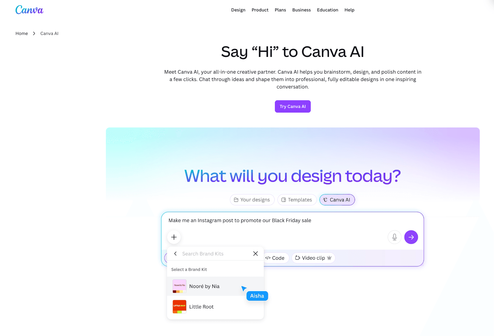
Canva
Una plataforma de comunicación visual dominante a nivel mundial que utiliza AI generativa para democratizar el diseño.
Mejor Para: Freelancers, propietarios de pequeñas empresas y no diseñadores que buscan activos visuales estéticamente agradables y rápidos.
Características Clave:
AI de Diseño Mágico permite la generación instantánea de plantillas a partir de simples indicaciones de texto.
Un enorme repositorio de diseños de infografías preconstruidos y personalizables.
Centro de Marca asegura una estricta consistencia visual en los resultados del equipo colaborativo.
Ventajas:
Interfaz de arrastrar y soltar inigualable que es muy intuitiva.
Extremadamente versátil tanto para medios digitales como gráficos impresos.
Desventajas:
Las capacidades de visualización de datos son bastante básicas y manuales.
No puede analizar ni procesar autónomamente conjuntos de datos complejos de archivos de Excel.
Precios:
Generoso plan gratuito; Canva Pro comienza en $15/mes.
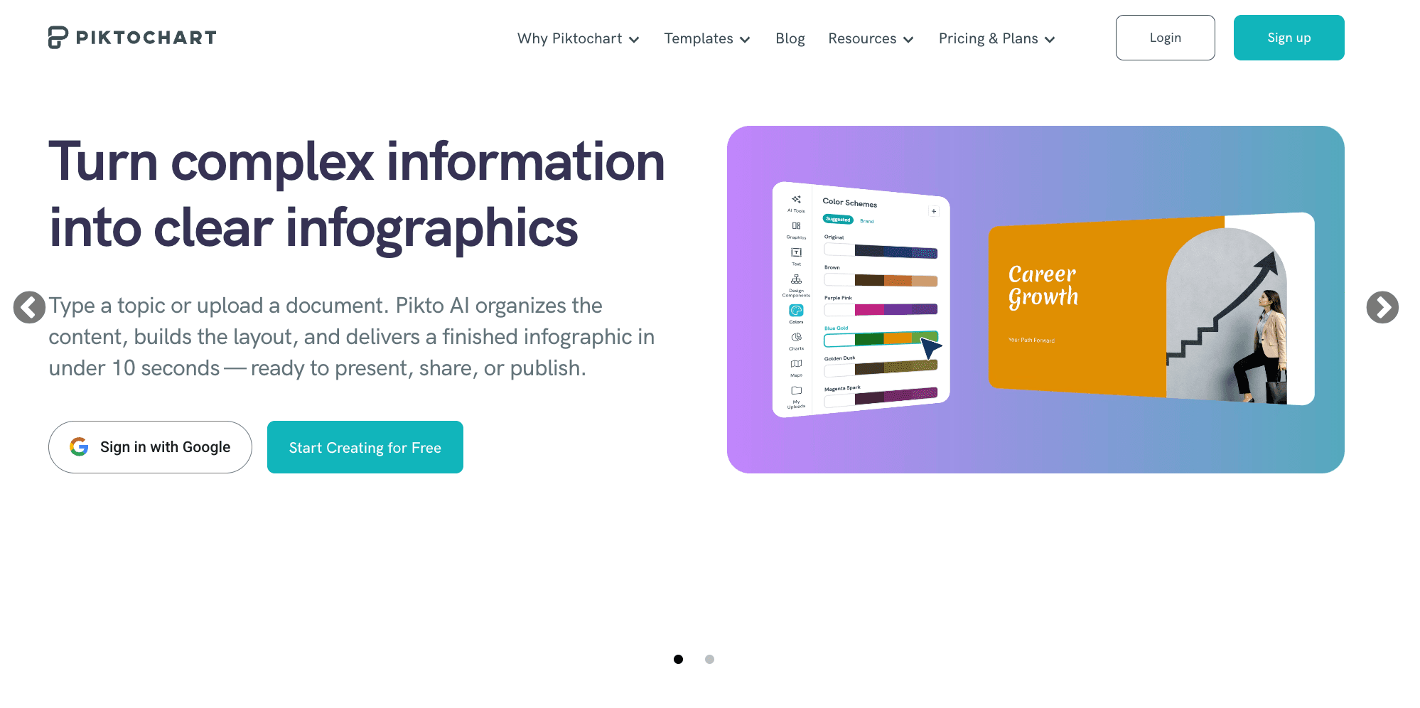
Piktochart
Una herramienta de diseño visual especializada que utiliza AI para optimizar la comunicación corporativa y educativa.
Mejor Para: Profesionales de HR, capacitadores corporativos y ejecutivos que necesitan elaborar informes estructurados e infografías largas.
Características Clave:
Generación de texto a infografía impulsada por AI para un rápido borrador.
Plantillas de alta calidad, estrictamente profesionales, adaptadas para entornos corporativos.
Integración manual sin fisuras con fuentes de datos externas como Google Sheets.
Ventajas:
Excepcional para narrativas visuales estructuradas y con mucho texto.
Ofrece resultados altamente profesionales, listos para B2B.
Desventajas:
Las capacidades de AI priorizan el procesamiento de texto sobre el análisis profundo de datos.
El lienzo de diseño puede sentirse un poco rígido en comparación con herramientas gráficas de forma libre.
Precios:
Plan gratuito disponible; los planes Pro comienzan en $14/mes.
Venngage
Un creador de infografías accesible y profesional que se centra en la presentación estructurada de datos.
Mejor Para: Comercializadores B2B, gerentes y educadores que buscan crear diagramas visuales accesibles y estructurados.
Características Clave:
La función DesignAI automatiza la estructuración de texto y el formateo de diseño.
Una extensa biblioteca de widgets con gráficos, mapas e iconos altamente personalizables.
Verificador de accesibilidad integrado que asegura el cumplimiento de WCAG.
Ventajas:
Excelente variedad de tipos de gráficos especializados y personalizables.
Enfoque líder en la industria en accesibilidad visual y diseño inclusivo.
Desventajas:
Carece de la flexibilidad creativa necesaria para el diseño gráfico de propósito general.
No puede interpretar ni visualizar automáticamente datos en bruto de CSV no formateados.
Precios:
Plan gratuito disponible; Premium comienza en $10/mes, Business en $24/mes.
Gamma
Un generador de presentaciones innovador y nativo de AI que genera maquetas visuales completamente formateadas de manera dinámica.
Mejor Para: Equipos de ventas, consultores y fundadores que necesitan maquetas modernas y estéticamente atractivas de diapositivas y páginas web.
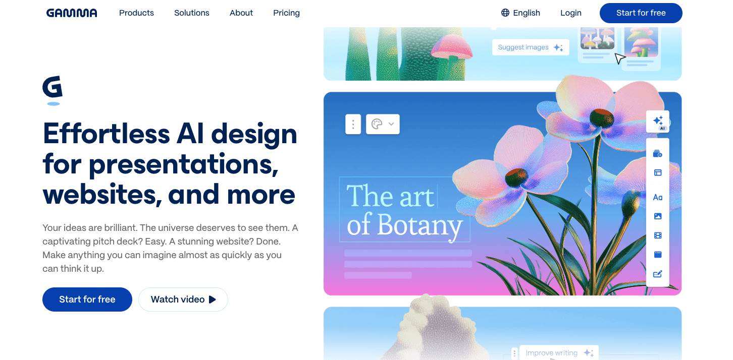
Características Clave:
Generación de presentaciones, documentos y páginas web con un solo clic a partir de indicaciones de texto.
Un motor de diseño fluidamente impulsado por AI que auto-formatea elementos contextualmente.
Analíticas de participación integradas para rastrear interacciones de los espectadores.
Ventajas:
Reduce drásticamente las horas gastadas formateando y alineando diapositivas manualmente.
Ofrece temas estéticos predeterminados increíblemente modernos y elegantes.
Desventajas:
No es óptimo para crear infografías verticales de página única altamente personalizadas.
Severamente limitado en análisis de datos matemáticos profundos.
Precios:
Freemium (sistema basado en créditos); el plan Plus comienza en $9/mes.
Infogram
Una herramienta robusta de visualización de datos diseñada para crear gráficos y mapas web altamente interactivos.
Mejor Para: Periodistas, editores digitales y analistas de datos que se centran en contar historias visuales interactivas y embebibles.
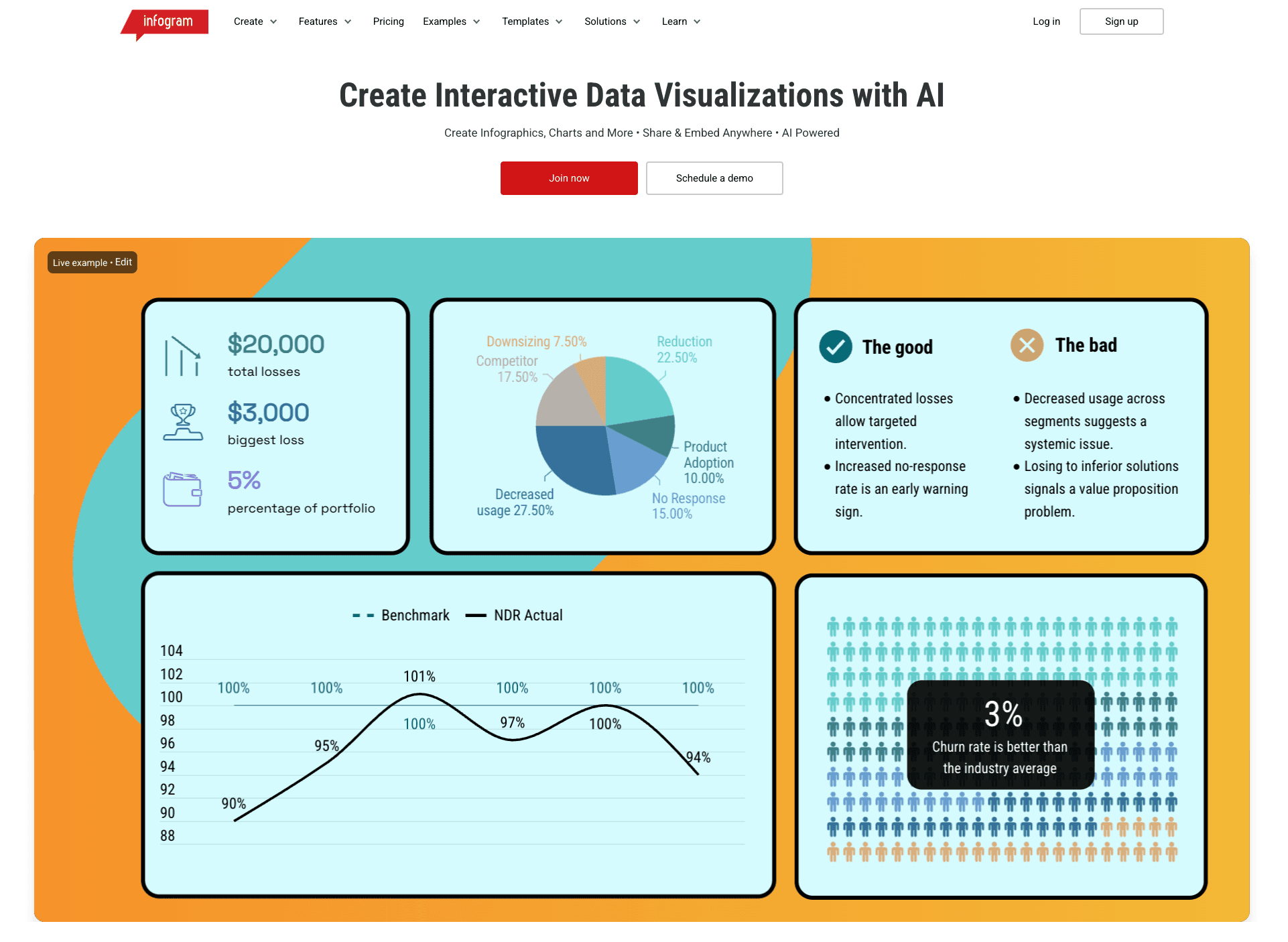
Características Clave:
Generación asistida por AI de resúmenes de datos y disposiciones óptimas de gráficos.
Más de 35 tipos de gráficos interactivos y una extensa biblioteca de más de 550 mapas geográficos.
Rastreo de datos en tiempo real a través de integraciones API sin fisuras.
Ventajas:
Interactividad excepcional, efectos al pasar el cursor y opciones de animación para la publicación web.
Fuerte sincronización con fuentes de datos en vivo y actualizables.
Desventajas:
Presenta una curva de aprendizaje más pronunciada para usuarios sin alfabetización de datos básica.
Configurar la respuesta de móviles para gráficos interactivos altamente complejos puede ser tedioso.
Precios:
El plan básico es gratuito; las suscripciones Pro comienzan en $19/mes.
Manus
Un agente autónomo de AI avanzado capaz de investigar, sintetizar y formatear metas de múltiples pasos.
Mejor Para: Investigadores con conocimientos técnicos, analistas empresariales e innovadores que necesitan automatización de tareas de extremo a extremo y agregación de datos.
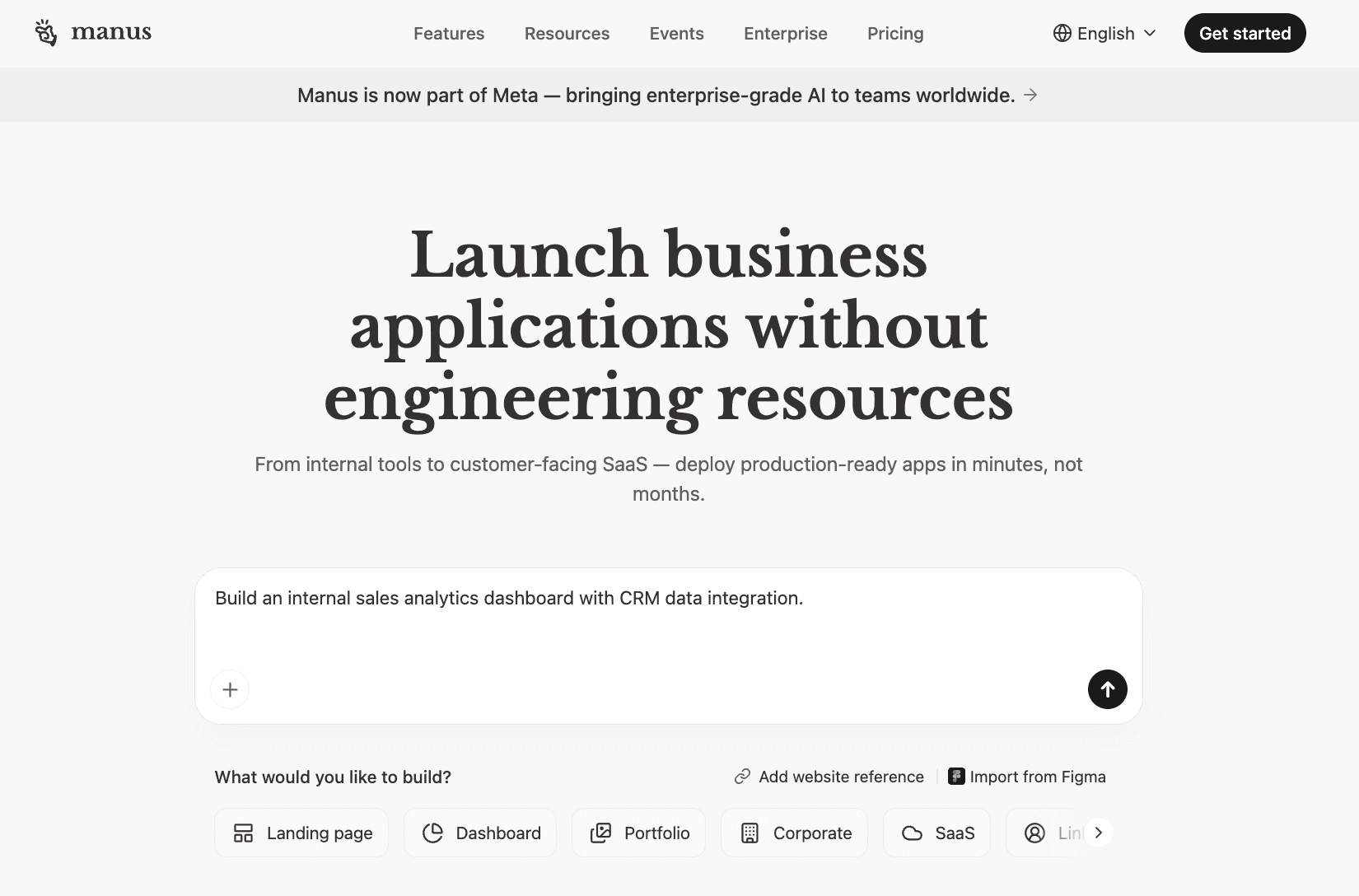
Características Clave:
Flujo de trabajo agentico que busca de manera autónoma en la web, sintetiza hallazgos y visualiza datos.
Modo de alta entrada diseñado para procesar conjuntos de instrucciones masivos y conjuntos de datos complejos.
Ejecución directa de tareas de programación y scraping web para recopilar contexto en vivo.
Ventajas:
Competencia inigualable en el manejo de tareas de investigación altamente ambiguas y de múltiples pasos.
Funciona como un analista virtual completo en lugar de ser solo un lienzo de diseño.
Desventajas:
Su modelo de precios basado en créditos puede agotar rápidamente los presupuestos.
Requiere una ingeniería de instrucciones precisa y avanzada para evitar resultados fuera de objetivo.
Precios:
El básico comienza en $17/mes, el Starter en $34/mes.
Beautiful.ai
Un software de presentación inteligente que utiliza AI para hacer cumplir estrictas reglas de diseño y automatización de diseños.
Mejor Para: Equipos corporativos, representantes de ventas y gerentes que desean diapositivas profesionales y de marca de manera consistente sin ajustes de alineación.
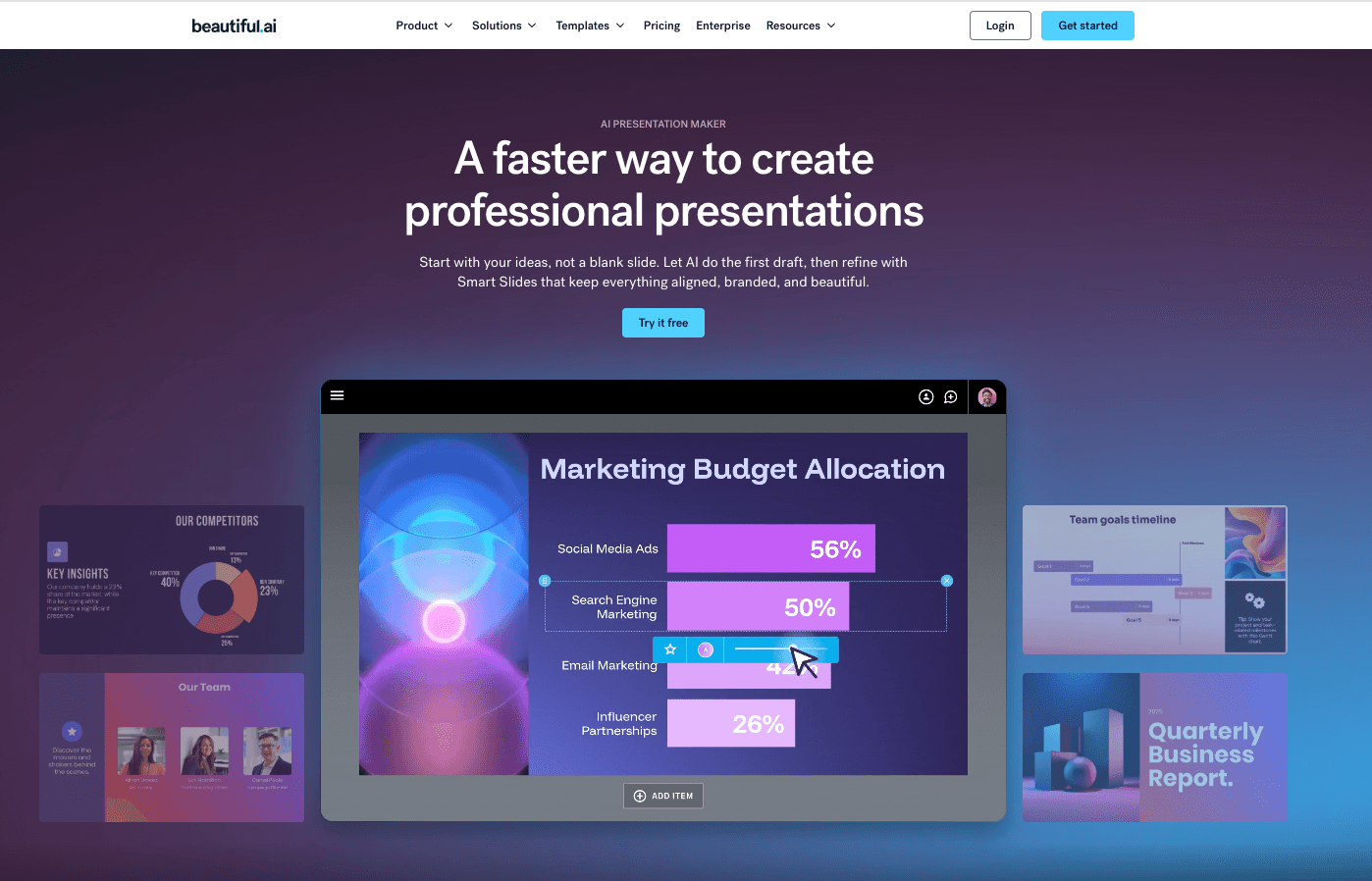
Características Clave:
DesignerBot genera instantáneamente diapositivas personalizadas y estructura borradores iniciales de presentaciones.
Plantillas inteligentes que se adaptan y reequilibran automáticamente a medida que se agrega nuevo contenido.
Colaboración en equipo centralizada y controles estrictos de gestión de activos de marca.
Ventajas:
Elimina completamente la frustración de ajustar manualmente píxeles y formatear.
Garantiza el cumplimiento absoluto de la marca y la consistencia en grandes organizaciones.
Desventajas:
Restringe la libertad creativa para aquellos que desean diseños personalizados y poco convencionales.
Principalmente es una herramienta de presentación; carece de optimización de infografías de página única.
Precios:
El plan Pro comienza en $12/mes (facturado anualmente).
Tableau AI
Una plataforma de visualización de datos empresarial líder en el mercado potenciando AI avanzada para obtener perspectivas predictivas.
Mejor Para: Científicos de datos empresariales, equipos BI y grandes organizaciones que requieren tableros de datos interactivos y profundos.
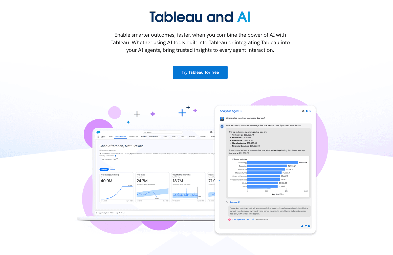
Características Clave:
Einstein Copilot permite la exploración conversacional de datos y la generación dinámica de tableros.
Analíticas predictivas de clase mundial y capacidades de modelado de datos altamente complejas.
Integración nativa sin fisuras con enormes bases de datos empresariales y almacenes en la nube.
Ventajas:
Profundidad inigualable, estándar de la industria en el manejo de datos y visualización compleja.
Cuenta con seguridad y escalabilidad de nivel empresarial de primera clase.
Desventajas:
Impone una curva de aprendizaje notoriamente pronunciada y requiere un tiempo de configuración significativo.
Severamente sobre-ingenerizado y demasiado costoso para necesidades estándar de diseño de infografías.
Precios:
Comienza en $15/mes para Tableau Standard y $35/mes para Tableau Enterprise (facturado anualmente).
Adobe Express
Un conjunto creativo integral basado en la nube completamente potenciado por AI generativa de Adobe Firefly.
Mejor Para: Gerentes de redes sociales, creadores de contenido y comercializadores que buscan una herramienta de creación gráfica versátil y todo en uno.
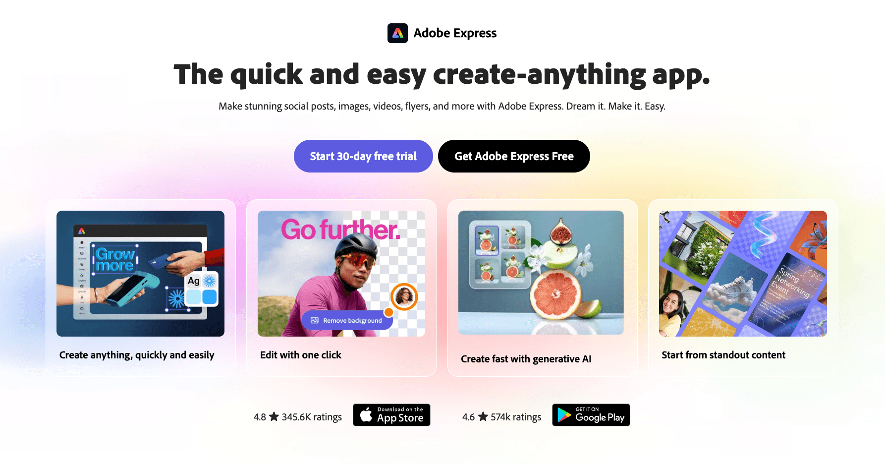
Características Clave:
Generación de texto a imagen impulsada por Firefly y relleno generativo avanzado.
Millones de plantillas de infografías y redes sociales profesionalmente elaboradas.
Interoperabilidad fluida entre plataformas con los activos de Adobe Creative Cloud.
Ventajas:
Ofrece una calidad de imagen generativa AI de alta fidelidad verdaderamente impresionante.
El conjunto de herramientas definitivo para ejecutar campañas de marketing visual multicanal.
Desventajas:
Carece completamente de automatización nativa para convertir datos en bruto de Excel/CSV en gráficos.
La interfaz de usuario puede sentirse abrumadora debido a un exceso de funciones multimedia.
Precios:
Generosa capa gratuita disponible; Premium comienza en $9.99/mes.
¿Cómo Elegir la Herramienta Adecuada?
Elegir la herramienta adecuada depende en gran medida de tus casos de uso inmediatos y capacidades técnicas:
Para Diseño General y Redes Sociales: Si tu objetivo es puramente el diseño gráfico estético con requisitos de datos mínimos, herramientas como Canva o Adobe Express son las líderes indiscutibles.
Para BI Empresarial y Tableros: Si eres un científico de datos empresarial que maneja bases de datos SQL en vivo y modelado predictivo complejo, Tableau AI es la elección necesaria.
Para Investigación de Múltiples Pasos: Si necesitas un agente que busque en la web de manera autónoma y resuma hallazgos, Manus ofrece automatización de vanguardia.
Para Comercializadores y Equipos de Negocios que Manejan Datos en Bruto: Si careces de habilidades de diseño y codificación pero necesitas urgentemente transformar archivos desordenados de Excel, CSV o PDF en narrativas comerciales atractivas, Powerdrill Bloom es la opción más eficiente.
Powerdrill Bloom facilita la generación de infografías con AI
Powerdrill Bloom actúa como un equipo de datos AI dedicado, diseñado específicamente para profesionales de negocios. Aquí está exactamente cómo acelera tus flujos de trabajo automatizados:
1. Crea Diapositivas PPT de Cualquier Tema o Archivo con AI: Escribe un tema o sube archivos como Excel, CSV y PDF. Powerdrill Bloom entiende tu contenido y crea automáticamente diapositivas de PowerPoint profesionales.
2. Genera Informes Asombrosos Impulsados por AI desde Excel, CSV o PDF o un Tema Específico en Segundos: Deja de perder horas formateando datos. Powerdrill Bloom convierte instantáneamente tus archivos o ideas en informes claros y perspicaces, listos para compartir con tu equipo o clientes.
¿Listo para convertir datos en bruto en infografías impresionantes sin esfuerzo con AI? Prueba Powerdrill Bloom gratis hoy!
Conclusión
En 2026, el verdadero valor de un Generador de Infografías AI radica no solo en hacer que las cosas se vean bien, sino en la rapidez con la que te ayuda a analizar datos complejos y extraer información. Tu elección debe alinearse precisamente con la pila técnica de tu equipo y los resultados visuales deseados. Para equipos que se ahogan en hojas de cálculo y carecen de tiempo, cambiar a un flujo de trabajo agentico es el movimiento más rentable que puedes hacer. Eleva tu narración visual, deja de luchar con el formato y permite que AI haga el trabajo pesado.
Preguntas Frecuentes
¿Qué es un Generador de Infografías AI?
Un Generador de Infografías AI es un software especializado que utiliza inteligencia artificial para traducir automáticamente texto aburrido y conjuntos de datos complejos en historias visuales atractivas, gráficos y diseños, reduciendo drásticamente el tiempo de diseño manual.
¿Cómo convierte AI datos en bruto como Excel/CSV directamente en infografías?
Las herramientas AI avanzadas emplean algoritmos inteligentes para ejecutar limpieza automática de datos, reconocer tendencias subyacentes y utilizar procesamiento de lenguaje natural para recomendar y construir inteligentemente los tipos óptimos de gráficos (por ejemplo, gráficos de barras, líneas, círculos) a partir de tus hojas de cálculo en bruto.
¿Cuáles son las mejores herramientas de infografías AI para equipos de negocios y comercializadores en 2026?
Para tareas comerciales densas de datos, Powerdrill Bloom es una elección premier debido a sus agentes AI. Otras herramientas de primer nivel incluyen Gamma para presentaciones, Venngage para diagramas B2B y Canva para visuales de marketing generales.
¿Puedo usar estas herramientas si no tengo antecedentes en diseño o habilidades de programación?
Absolutamente. La característica definitoria de las mejores herramientas de visualización AI de 2026 es su dependencia de interfaces de lenguaje natural conversacional, eliminando completamente la barrera de entrada para usuarios sin habilidades de diseño gráfico o programación en Python/SQL.
¿Cómo mejoran los Generadores de Infografías AI la eficiencia del flujo de trabajo?
Aumentan exponencialmente la productividad al eliminar el formato manual, extrayendo instantáneamente información de alto nivel de conjuntos de datos masivos y habilitando la generación rápida y bajo demanda de presentaciones y informes profesionales.