Wie Sie Google Analytics-Exporte in einen visuellen Bericht verwandeln (mit Beispielen)

Einführung
Das Herunterladen von Rohdaten aus Google Analytics fühlt sich oft so an, als würde man ein riesiges Puzzle mit fehlenden Teilen erhalten. Sie wissen, dass in diesen Tausenden von Zeilen und Spalten wertvolle Erkenntnisse stecken, aber daraus eine klare Geschichte zu extrahieren, ist eine ganz andere Herausforderung.
Für Marketer, Gründer und Datenanalysten ist das Starren auf endlose CSV-Dateien mit Sitzungen, Absprungraten und Event-Zahlen eine frustrierende Zeit- und Energieverschwendung. Ihre Stakeholder wollen keine Tabellenkalkulation sehen; sie wollen umsetzbare Erkenntnisse, die Entscheidungen vorantreiben.
Anstatt Stunden damit zu verbringen, Daten manuell zu bereinigen, komplexe Formeln zu schreiben und sich mit unhandlichen Diagramm-Tools herumzuschlagen, können Sie jetzt künstliche Intelligenz nutzen, um die schwere Arbeit zu erledigen.
In dieser Anleitung zeigen wir Ihnen genau, wie Sie unübersichtliche Google Analytics-Exporte in wenigen Minuten in beeindruckende, präsentationsfertige visuelle Berichte verwandeln, sodass Sie sich auf die Strategie statt auf die Formatierung konzentrieren können.
Was Sie lernen werden
Am Ende dieses umfassenden Leitfadens werden Sie Folgendes verstehen:
- Die grundlegenden Gründe, warum Google Analytics-Rohdaten so schwer zu interpretieren sind.
- Wie moderne KI-Tools die Art und Weise, wie wir an Web-Analytics-Berichte herangehen, revolutionieren.
- Einen Schritt-für-Schritt-Workflow, um Rohdaten mit Powerdrill Bloom sofort in einen visuellen Bericht zu verwandeln.
- Praxisnahe Prompt-Beispiele für die sofortige Generierung von Marketing-Erkenntnissen.
- Wichtige Best Practices für die Erstellung von Datenvisualisierungen, die das Unternehmenswachstum tatsächlich fördern.
Warum Google Analytics-Exporte so schwer zu lesen sind
Wenn Sie jemals einen Bericht aus Google Analytics 4 (GA4) exportiert haben, kennen Sie das Problem bereits. Obwohl GA4 ein leistungsstarkes Tracking-Tool ist, sind die nativen Exporte bekanntermaßen ungeeignet für eine sofortige Analyse. Hier ist der Grund, warum rohe GA4-Exporte so schwer verdaulich sind:
- Informationsüberlastung: Ein Standardexport wirft jede Dimension und Metrik in eine einzige, flache Datei. Das Mischen von Gerätekategorien, UTM-Parametern, demografischen Merkmalen der Nutzer und Sitzungsdauern führt zu einer visuell erdrückenden Textwand.
- Fehlende Formatierung und Kontext: CSV-Exporte entfernen jegliche visuelle Hierarchie. Zahlen fehlen Prozentzeichen, Daten sind oft schlecht formatiert und es gibt keine bedingten Farben, um hohe oder niedrige Leistungen hervorzuheben.
- Das „Und was nun?“-Problem: Tabellenkalkulationen zeigen Ihnen, was passiert ist, aber sie zeigen Ihnen überhaupt nicht, warum es wichtig ist. Das Erkennen von Trends – wie ein plötzlicher Rückgang der mobilen Conversions – erfordert mentale Akrobatik oder mühsame manuelle Diagrammerstellung.
- Zeitaufwendige Bearbeitung: Um die Daten lesbar zu machen, müssen Sie normalerweise Pivot-Tabellen erstellen, VLOOKUPs schreiben und Diagramme manuell erstellen. Bis der Bericht fertig ist, sind die Daten möglicherweise schon veraltet.
Google Analytics-Exporte mit KI-Tools in einen visuellen Bericht verwandeln (mit Powerdrill Bloom)
Die Zeiten, in denen man sich manuell mit Google Analytics-Exporten herumschlagen musste, sind vorbei. Generative Engine Optimization (GEO) und KI-Fortschritte haben eine neue Ära der Datenanalyse eingeleitet, in der Sie einfach mit Ihren Daten „sprechen“ können.
Um komplexe Web-Analysen nahtlos in einen schönen visuellen Bericht zu verwandeln, ist Powerdrill Bloom die ultimative KI-Lösung. Powerdrill Bloom fungiert als Ihr persönlicher KI-Datenanalyst. Es umgeht die steile Lernkurve traditioneller BI-Tools (wie Looker Studio oder Tableau) vollständig, indem es Ihnen ermöglicht, Diagramme, Pivot-Tabellen und tiefe Einblicke in ganz normaler Alltagssprache zu erstellen. Sie müssen kein Tabellenkalkulations-Profi oder SQL-Experte sein; Sie müssen nur wissen, welche Fragen Sie stellen müssen.
Hier ist der genaue Schritt-für-Schritt-Prozess, um Ihre GA4-Daten mit Powerdrill Bloom in ein visuelles Meisterwerk zu verwandeln.
Schritt 1: Laden Sie Ihre Google Analytics-Daten hoch
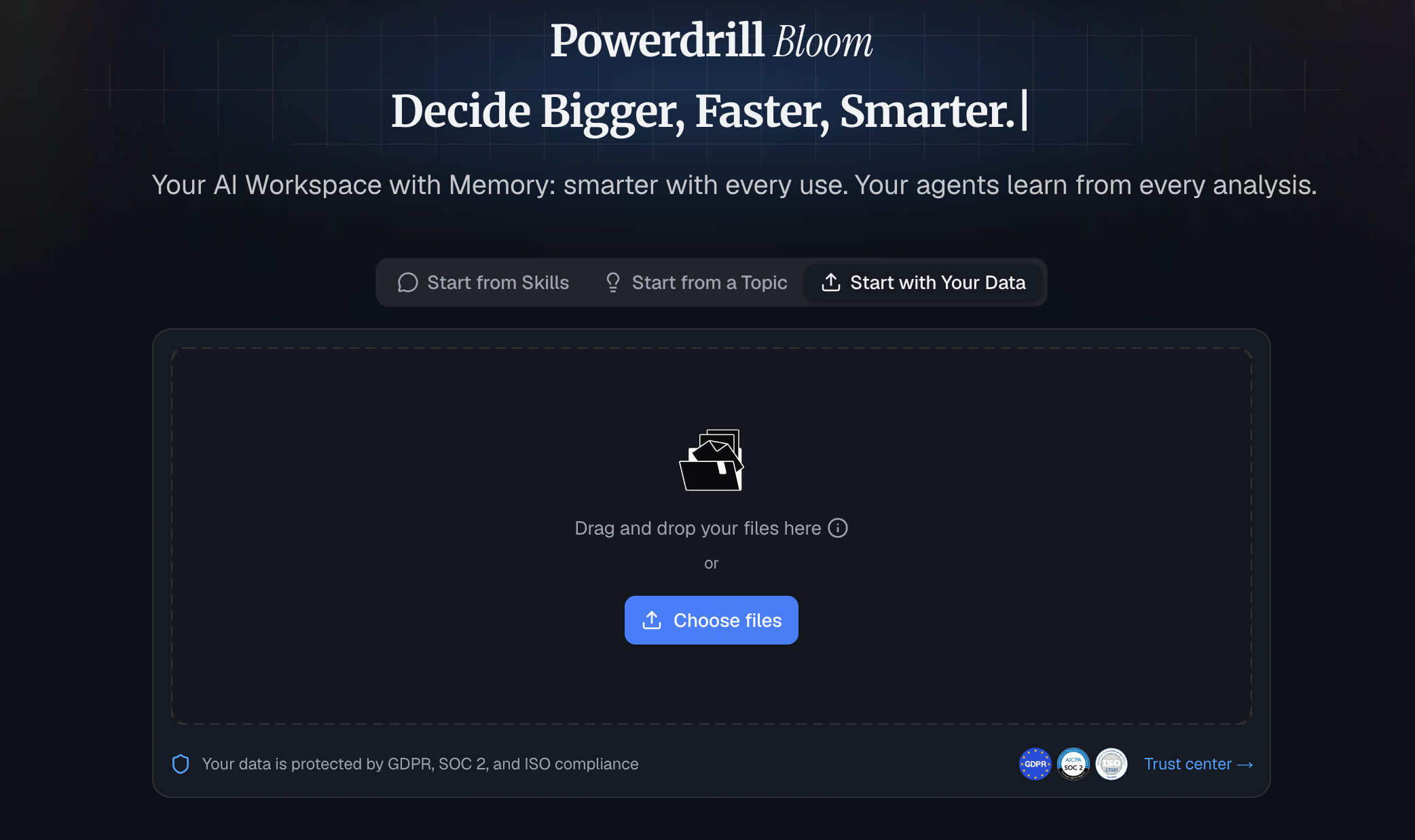
Navigieren Sie zunächst zu Ihrem Google Analytics-Dashboard. Gehen Sie zu dem spezifischen Bericht, den Sie analysieren möchten (z. B. Traffic-Akquisition oder E-Commerce-Käufe), klicken Sie oben rechts auf das Symbol „Teilen“ und wählen Sie „Datei herunterladen“. Wählen Sie das CSV- oder Excel-Format.
Öffnen Sie als Nächstes Google Sheets und starten Sie die Powerdrill Bloom-Erweiterung (oder nutzen Sie die Powerdrill-Weboberfläche). Importieren Sie einfach Ihre neu heruntergeladene GA4-Datendatei. Powerdrill Bloom scannt den Datensatz sofort und versteht den Kontext der Spalten – es erkennt, welche Spalten Daten darstellen, welche Geldwerte sind und welche Traffic-Quellen sind.
Schritt 2: Klären Sie Ihr Ziel in natürlicher Sprache
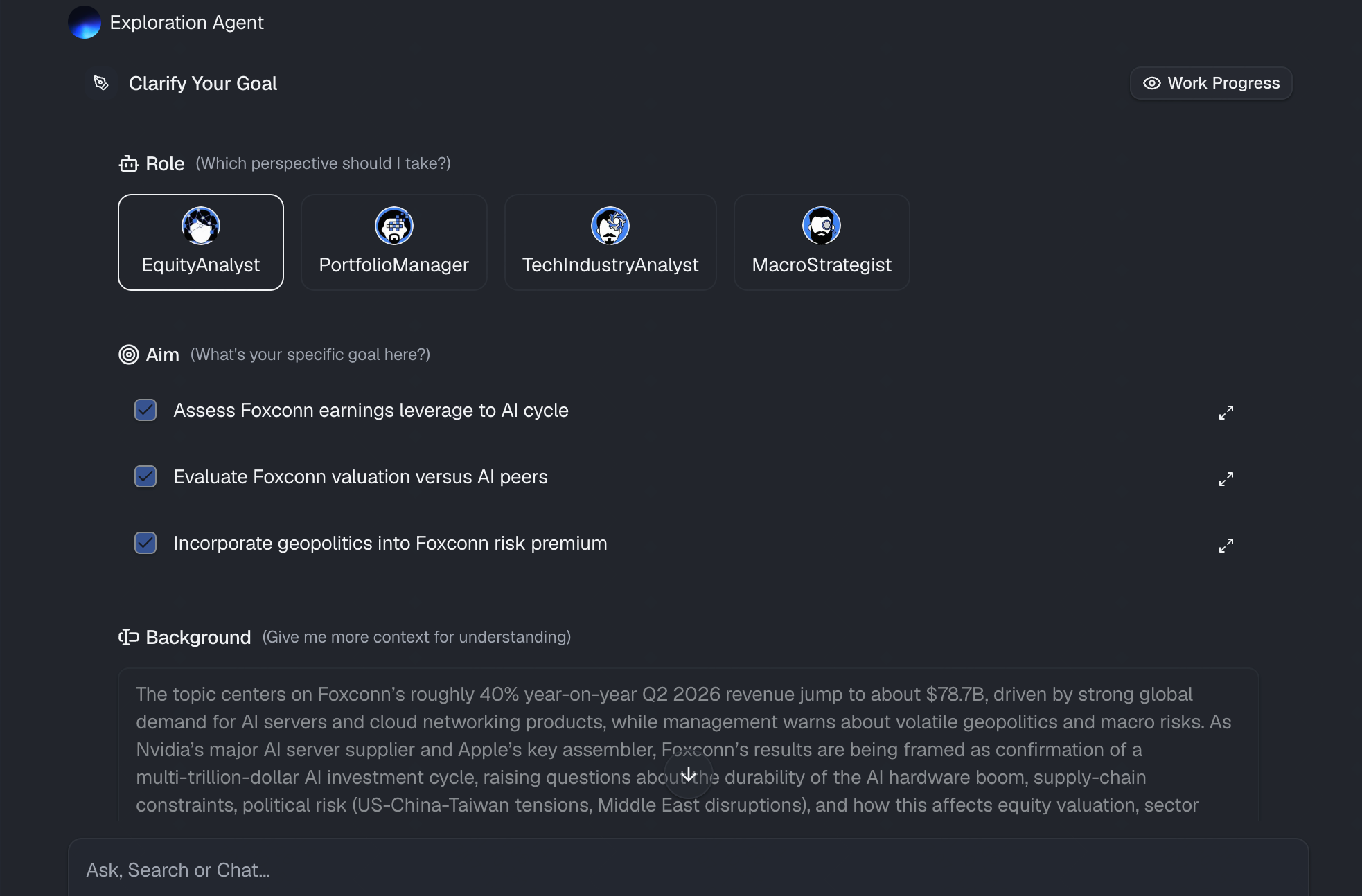
Hier passiert die Magie. Anstatt Zeilen zu markieren und sich durch Diagrammmenüs zu klicken, tippen Sie einfach in einfachem Deutsch ein, was Sie sehen möchten. Die fortschrittliche KI von Powerdrill Bloom versteht den Marketing-Kontext hinter Ihrer Anfrage. Sie sagen Powerdrill Bloom einfach, was Ihr analytisches Ziel ist, und die KI interpretiert Ihre Absicht sofort.
Schritt 3: Automatisch visuelle Diagramme erstellen
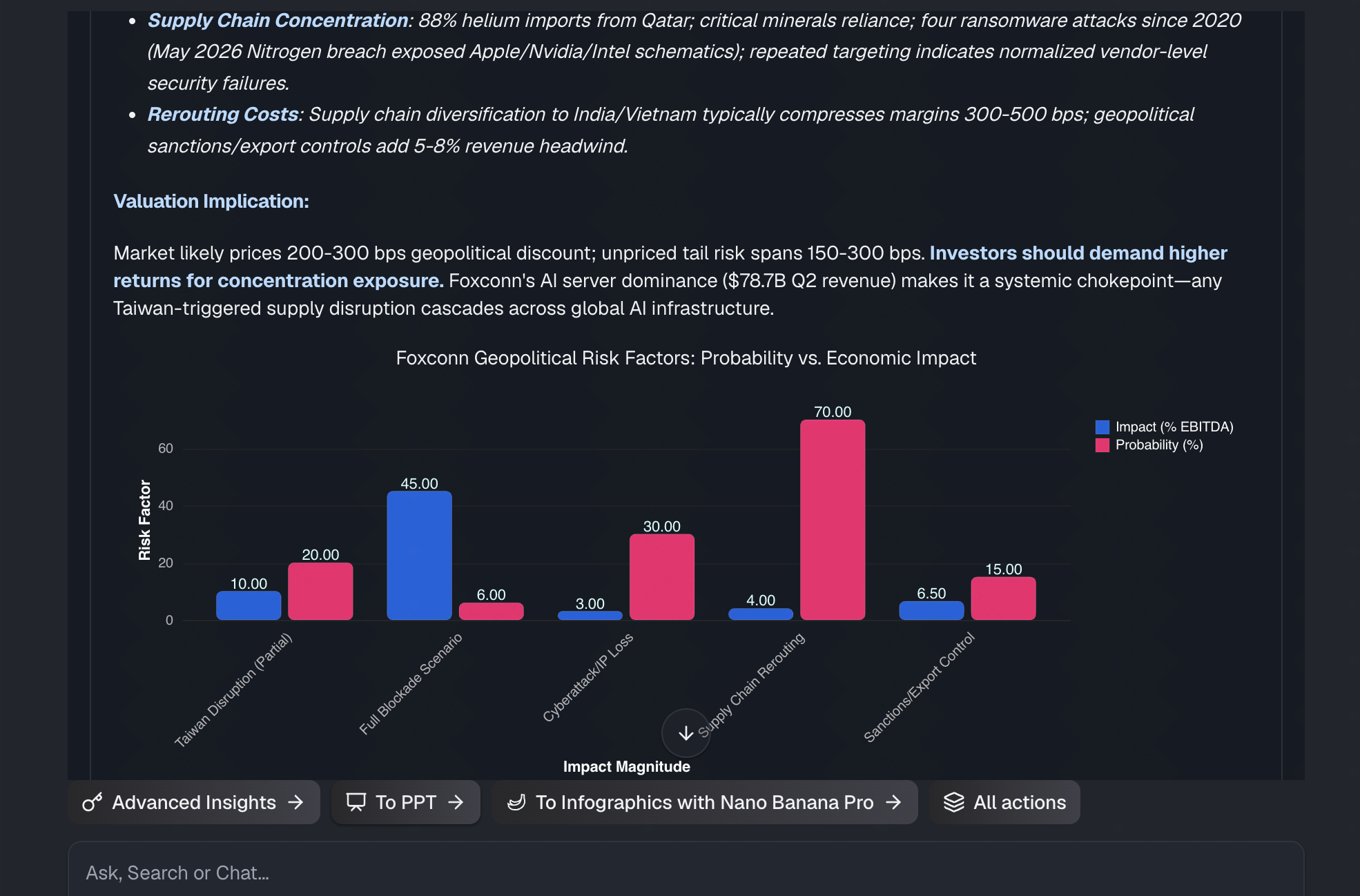
Sobald Sie die Eingabetaste drücken, verarbeitet Powerdrill Bloom Ihren Prompt und erstellt automatisch genau das von Ihnen angeforderte visuelle Diagramm. Aber es geht noch einen Schritt weiter als herkömmliche Diagramm-Tools.
Wenn Sie eine allgemeine Frage stellen wie: „Was sind die interessantesten Trends in diesen Daten?“, wählt Powerdrill Bloom selbstständig die am besten geeigneten Diagrammtypen aus (z. B. ein Liniendiagramm für Zeitreihendaten, ein Balkendiagramm für kategoriale Vergleiche) und erstellt ein Mini-Dashboard. Es bereinigt außerdem automatisch unordentliche GA4-Datumsformate und wendet die richtigen Beschriftungen und Legenden an, um sicherzustellen, dass die Visualisierung ohne manuelle Anpassungen ästhetisch ansprechend und analytisch korrekt ist.
Schritt 4: Exportieren Sie Ihren Bericht mit einem Klick
Ein großartiger visueller Bericht ist nur dann wertvoll, wenn er problemlos mit Ihrem Team, Ihren Kunden oder der Geschäftsführung geteilt werden kann. Sobald Powerdrill Bloom Ihre Diagramme erstellt und die wichtigsten Erkenntnisse zusammengefasst hat, können Sie Ihren Berichtsprozess in Sekundenschnelle abschließen.
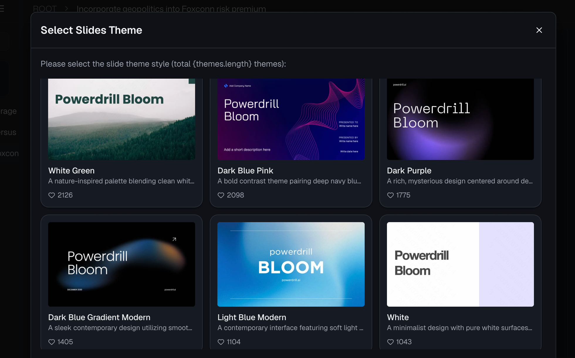
Mit einem einzigen Klick können Sie diese schönen, KI-generierten Diagramme in ein professionelles Format exportieren. Egal, ob Sie sie in eine Google Slides-Präsentation für das Marketing-Meeting am Montagmorgen einfügen, als PDF für ein Kunden-Update exportieren oder als Live-Dashboard in Google Sheets behalten möchten – Powerdrill Bloom sorgt dafür, dass Ihre Daten sofort präsentationsbereit sind.
Best Practices für das Google Analytics-Reporting
Selbst mit einem leistungsstarken KI-Tool wie Powerdrill Bloom wird die Einhaltung von Best Practices für die Datenvisualisierung Ihre Berichte erheblich wirkungsvoller machen:
- Fokus auf Key Performance Indicators (KPIs): Visualisieren Sie nicht jede einzelne Metrik, nur weil Sie sie haben. Konzentrieren Sie sich auf die Daten, die zu Ihren Geschäftszielen passen (z. B. Conversion-Rate, Kosten pro Akquisition, Umsatz).
- Wählen Sie den richtigen Diagrammtyp: Verwenden Sie Liniendiagramme, um Trends im Zeitverlauf darzustellen, Balkendiagramme zum Vergleich von Kategorien (wie Traffic-Quellen) und Kreisdiagramme ausschließlich zur Darstellung von Teilen eines Ganzen. Lassen Sie sich von Powerdrill Bloom leiten, wenn Sie unsicher sind.
- Fügen Sie kontextuelle Kommentare hinzu: Ein Diagramm allein ist gut, aber ein Diagramm mit einer kurzen Erklärung ist besser. Nutzen Sie KI, um Textzusammenfassungen zu generieren, die erklären, warum ein Anstieg oder Abfall aufgetreten ist.
- Halten Sie es übersichtlich: Vermeiden Sie übermäßig komplizierte Grafiken mit zu vielen Variablen. Wenn ein Diagramm eine fünfminütige Erklärung erfordert, ist es zu komplex.
- Vergleichen Sie mit Benchmarks: Versuchen Sie immer, aktuelle Daten mit historischen Daten zu vergleichen (z. B. im Jahres- oder Monatsvergleich), um Ihren Stakeholdern ein echtes Gefühl für die Leistung zu vermitteln.
Fazit
Das Übersetzen von Google Analytics-Rohdaten in aussagekräftige visuelle Berichte erfordert keine fortgeschrittenen technischen Kenntnisse oder stundenlange mühsame manuelle Formatierung mehr. Durch den Wechsel von der herkömmlichen Tabellenkalkulation zur KI-gestützten Analyse können Sie die wahre Geschichte hinter Ihren Daten fast augenblicklich entschlüsseln.
Wenn Sie bereit sind, sich nicht mehr mit Pivot-Tabellen herumzuschlagen und stattdessen hochwirksame Marketing-Erkenntnisse zu liefern, ist es an der Zeit, Ihren Workflow zu modernisieren. Testen Sie Powerdrill Bloom noch heute. Die intuitive Verarbeitung natürlicher Sprache und die Visualisierungsfunktionen mit nur einem Klick machen es zum absolut besten Tool, um unübersichtliche Analysedaten in Sekundenschnelle in schöne, umsetzbare Berichte zu verwandeln.
FAQs
Kann Google Analytics 4 nativ visuelle Berichte erstellen?
Ja, GA4 verfügt über eine „Erkunden“-Funktion, aber diese ist im Vergleich zu intuitiven KI-Tools bekanntermaßen komplex, langsam und für Anfänger schwer zu bedienen.
Warum sollte man Powerdrill Bloom anstelle von Looker Studio verwenden?
Looker Studio erfordert eine steile Lernkurve und eine technische Einrichtung. Mit Powerdrill Bloom können Sie Berichte sofort erstellen, indem Sie einfach Fragen auf einfachem Englisch eintippen.
Sind meine Google Analytics-Daten bei Powerdrill Bloom sicher?
Absolut. Powerdrill Bloom setzt strenge Datenschutzmaßnahmen auf Unternehmensniveau ein und stellt sicher, dass Ihre proprietären Analysedaten niemals zum Trainieren öffentlicher KI-Modelle verwendet werden.
Muss ich SQL oder Formeln beherrschen, um diese KI zu nutzen?
Überhaupt nicht! Powerdrill Bloom macht Programmierkenntnisse oder Formeln völlig überflüssig; Sie nutzen einfach ganz normale Sprache, um die gewünschten Diagramme zu erhalten.
Welche Diagrammtypen kann Powerdrill Bloom erstellen?
Es kann automatisch eine Vielzahl von Visualisierungen erstellen, darunter Balkendiagramme, Liniendiagramme, Kreisdiagramme, Streudiagramme und komplexe Pivot-Tabellen.