How to Visualize Year-over-Year Revenue Growth From Excel Automatically (No Code Needed)
Introduction
Tracking revenue growth is the ultimate indicator of business health. However, if you are relying on traditional spreadsheets to track these metrics, you are likely wasting valuable hours every single month. Manually updating pivot tables, fixing broken formulas, and adjusting formatting to visualize Year-over-Year (YoY) revenue growth is tedious and highly prone to human error.
Fortunately, the era of manual data entry is over. The rise of No-Code Data Visualization means you no longer need to be a data scientist or Excel wizard to build stunning, accurate financial dashboards. By leveraging AI-powered tools like Powerdrill Bloom, you can fully automate this process. You simply feed your spreadsheet to the AI, and it instantly transforms raw numbers into interactive, automated growth charts.
What is Year-over-Year (YoY) Revenue Growth? (And Why it Matters)
Year-over-Year (YoY) Revenue Growth is a key financial metric that compares your company’s revenue in one period to the exact same period in the previous year. The standard formula is straightforward:
[(Current Year Revenue - Past Year Revenue) / Past Year Revenue] * 100
For example, if you earned $120,000 in Q1 of this year, and $100,000 in Q1 of last year, your YoY growth is 20%.
Understanding this metric is critical because it smooths out seasonal volatility. E-commerce businesses, for instance, always see a spike in November and December. Comparing December to November gives a skewed view of growth. Comparing this December to last December provides a true, clear picture of your long-term business trajectory.
The Pain Points: Why Visualizing YoY Growth Manually in Excel is Outdated
While Excel is a phenomenal tool for storing tabular data, it is a notoriously frustrating platform for automated data visualization.
Manual Data Manipulation
To build a YoY chart in traditional spreadsheets, you must manually align dates, group months, and build complex pivot tables. Every time a new month closes, someone has to go back into the file, append the new data, and manually adjust the chart ranges to ensure the visuals update properly. This is a massive drain on productivity.
Broken Formulas & Human Error
Spreadsheet visualizations often rely on intricate combinations of VLOOKUP, INDEX/MATCH, or complex IF statements. One accidentally deleted cell, a slightly different date format, or a misplaced decimal point can break the entire dashboard. Tracking down these errors can take hours.
Static Dashboards
Excel charts are fundamentally static. Unless you spend weeks learning how to program complex VBA macros, your charts will not update automatically or allow for intuitive, interactive deep dives. Modern businesses require dynamic insights, not static images pasted into a PowerPoint presentation.
Step-by-Step: How to Visualize YoY Revenue Growth Automatically
Instead of wrestling with formulas, you can use Powerdrill Bloom to automate the entire process. Here is how you can turn your raw spreadsheet into a beautiful YoY growth chart in just a few clicks.
Step 1: Upload to Powerdrill Bloom
The process begins with your existing data. Ensure your spreadsheet has clear headers (for example, "Date" and "Total Revenue"). Then, simply drag and drop your .xlsx or .csv file directly into the Powerdrill Bloom interface. The platform instantly digests and structures your data without requiring any manual formatting or database configuration.

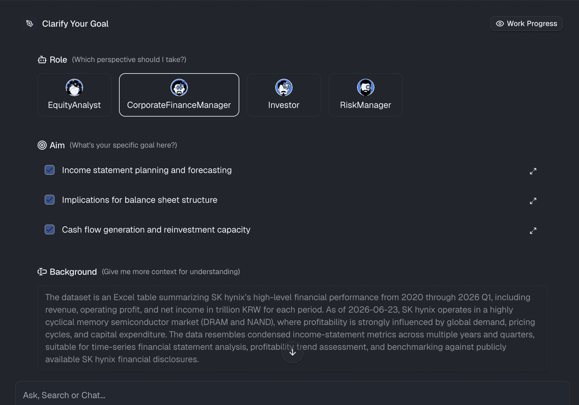
Step 2: Clarify Your Goal
Before generating visuals, mentally clarify exactly what you want to see. Are you looking to compare monthly revenue side-by-side with the previous year? Do you want to see the percentage change of total annual revenue? Knowing your specific business goal ensures that you ask the AI the right questions, guaranteeing the most accurate and actionable financial insights.
Step 3: Use Natural Language to Generate Charts
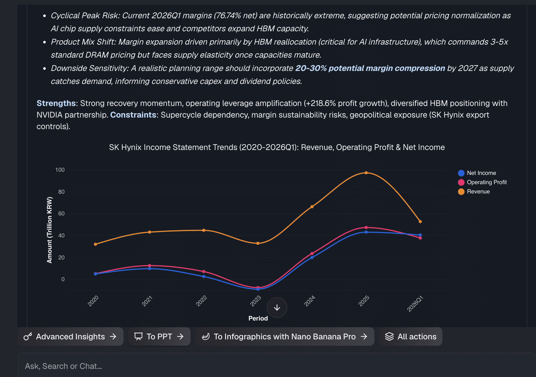
This is where the true No-Code magic happens. Instead of clicking through complex chart menus or writing formulas, you just talk to your data. Simply type a prompt like: "Show me my Year-over-Year revenue growth by month as a bar chart." Powerdrill Bloom uses advanced AI to instantly understand your intent, apply the correct mathematical formulas, and automatically generate a professional, accurate visualization on your screen.
Step 4: Customize and Share
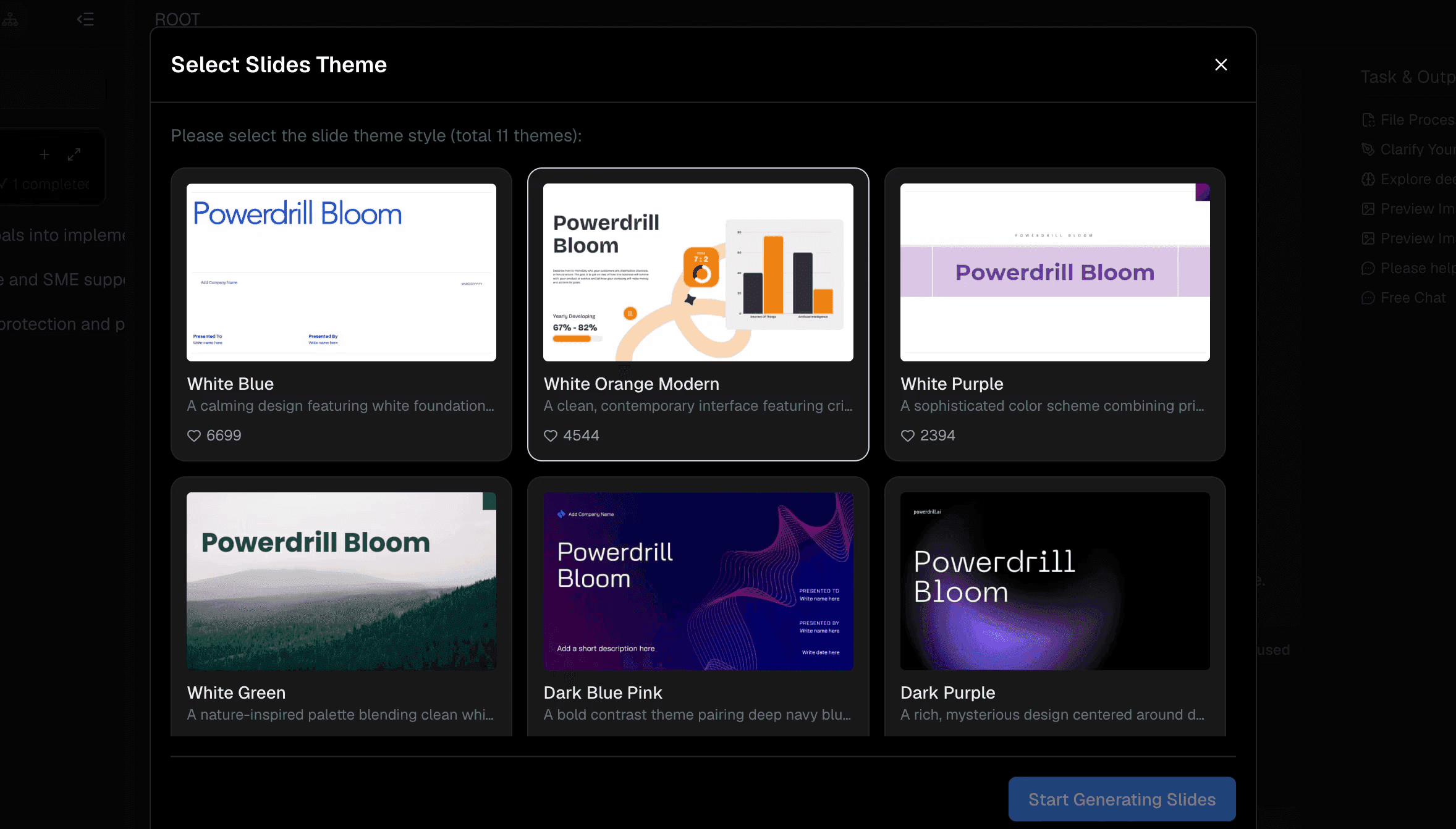
Once your chart is generated, you can easily tweak it to match your brand. Change colors, adjust labels, or swap between chart types with a single click. When your dashboard is ready, you can share it instantly with stakeholders, executives, or clients via a secure web link, eliminating the need to ever email a heavy, confusing Excel attachment again.
Why Powerdrill Bloom is the Best No-Code Alternative to Excel for Data Visualization
If you want to stop fighting with spreadsheets, Powerdrill Bloom stands out as the ultimate modern solution for business intelligence.
AI-Powered Insights
It doesn’t just build the chart; it acts as an intelligent data analyst. The platform can highlight anomalies and offer contextual explanations for why your revenue dipped or spiked during a specific quarter.
True No-Code Experience
There is absolutely no need to learn DAX, VBA, Python, or SQL. If you can type a question in English, you can build enterprise-grade data visualizations.
Real-Time Automation
Once you establish your charts, updating them is effortless. As you add new data to your files, your visualizations can dynamically update, saving you from repetitive end-of-month reporting tasks.
Stunning Visuals
Out-of-the-box, the charts generated are clean, modern, and highly interactive. They are designed to look impressive in boardrooms and presentations, far surpassing default spreadsheet templates.
3 Best Practices for Analyzing Revenue Growth Dashboards
To get the most out of your automated reporting, keep these three best practices in mind:
- Compare Apples to Apples: Always ensure your timeframes are identical. Do not compare a 30-day month to a 31-day month without noting the discrepancy, and ensure you are looking at the same product lines.
- Use the Right Visualization: Line charts are perfect for showcasing continuous revenue trends over time, while clustered bar charts are ideal for direct categorical YoY month-by-month comparisons.
- Drill Down into the "Why": A chart tells you what happened, but you must investigate why. Use your dashboard to correlate a drop in YoY revenue with changes in marketing spend, market seasonality, or inventory shortages.
Conclusion
While Excel remains a brilliant tool for data storage, it is simply not built for rapid, automated visualization. Manually calculating Year-over-Year revenue growth is an outdated practice that costs businesses time and accuracy. By adopting a true no-code, AI-driven platform, you can turn raw data into actionable insights in seconds.
Ready to stop wrestling with formulas? Upload your spreadsheet to Powerdrill Bloom today and watch your data come to life automatically.
Frequently Asked Questions (FAQs)
What file types does Powerdrill Bloom support?
Powerdrill Bloom supports standard spreadsheet formats, including .xlsx, .csv, and .xls, making Excel uploads seamless and instantly ready.
Do I need coding skills to use Powerdrill Bloom?
Absolutely not. Powerdrill Bloom uses natural language processing, meaning you simply type questions to generate advanced data visualizations.
Can Powerdrill Bloom handle large Excel datasets?
Yes, it effortlessly processes massive datasets that would normally freeze or slow down traditional spreadsheet software like Excel.
Are my data and charts secure in Powerdrill Bloom?
Data security is prioritized with enterprise-grade encryption. Your uploaded files and generated insights remain strictly private and protected.
Can I share Powerdrill Bloom dashboards with my team?
Yes, you can easily share interactive dashboards via a secure link, eliminating the need to email heavy attachments.