How to Visualize Website Traffic Trends From a CSV Export (Step-by-Step Tutorial)

Introduction
In the modern digital landscape, data is the driving force behind every successful marketing strategy. However, having access to massive amounts of website traffic data is only half the battle. When you export your web analytics, whether from Google Analytics, Matomo, or your CRM, you are usually left with a massive, unformatted CSV (Comma-Separated Values) file. Staring at endless rows and columns of raw numbers is not only overwhelming but also highly inefficient. To uncover actionable insights, spot seasonal patterns, and communicate your performance to stakeholders, you need to transform that raw data into clear, compelling visualizations.
This comprehensive step-by-step tutorial will guide you through the process of taking a basic CSV export and turning it into stunning, easy-to-understand visual charts. By leveraging modern AI-driven tools, you can bypass the steep learning curve of traditional spreadsheet software and generate professional reports in minutes.
What Website Traffic Data Can You Export as CSV
Before diving into the visualization process, it is essential to understand the types of information you can extract from your analytics platforms. Exporting the right metrics ensures your charts will deliver meaningful business insights. Here are the key categories of website traffic data you can typically export as a CSV:
User Acquisition and Source Data: This data reveals exactly where your visitors are coming from. You can export metrics broken down by channels (Organic Search, Direct, Social Media, Email, Paid Ads) to evaluate which marketing efforts are driving the most traffic.
Time-Based Performance Metrics: To spot trends, you can export daily, weekly, or monthly data points. This includes total pageviews, unique visitors, and sessions, allowing you to visualize traffic spikes or seasonal dips over a specific period.
Audience Demographics and Geography: Understanding who your users are is critical. You can export CSV files detailing visitor locations (country, region, city), device types (mobile, desktop, tablet), and browser preferences to optimize your user experience.
Engagement and Behavioral Data: This reveals how users interact with your site once they arrive. Key metrics include bounce rate, average session duration, and pages per session. Highlighting this data helps identify which landing pages are performing well and which need improvement.
Conversion and Goal Tracking: If you run an e-commerce site or a lead-generation blog, exporting conversion rates, goal completions, and transaction values is vital for visualizing your return on investment (ROI).
How to Visualize Website Traffic Trends From a CSV Export (Use Powerdrill Bloom)
Turning a spreadsheet into a visual masterpiece used to require advanced Excel skills or complex BI tools. Today, AI-powered platforms like Powerdrill Bloom make the process completely effortless. Here is how you can use it to visualize your website traffic.
Step 1 : Upload Your CSV
The first step is to get your data into the system. After exporting your web traffic report from your analytics dashboard, log into Powerdrill Bloom. Navigate to the data upload section and simply drag and drop your CSV file into the interface. The platform will automatically parse the file, recognizing the columns, rows, and data types (such as dates, numbers, and text) without requiring you to manually format the raw data.

Step 2 : Define Your Analysis Goal
Once your data is uploaded, you need to decide what you want to learn from it. Unlike traditional software where you have to highlight cells and navigate complex menus, Powerdrill Bloom allows you to define your goal using natural language. You can simply type a prompt into the chat interface, such as: "Show me the trend of monthly unique visitors over the last year," or "Compare the bounce rate between mobile and desktop users."
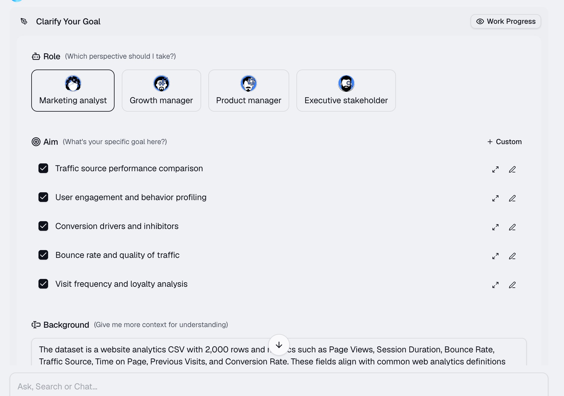
Step 3 : Generate Charts Automatically
After you submit your prompt, the AI engine goes to work. Powerdrill Bloom instantly analyzes the data and automatically selects the most appropriate chart type to represent your request. Within seconds, it will generate a clean, interactive visualization. If you want to tweak the result, you can simply ask the AI to modify it, for example, by typing, "Visualize the Bounce Rate comparison as a horizontal bar chart for better readability."
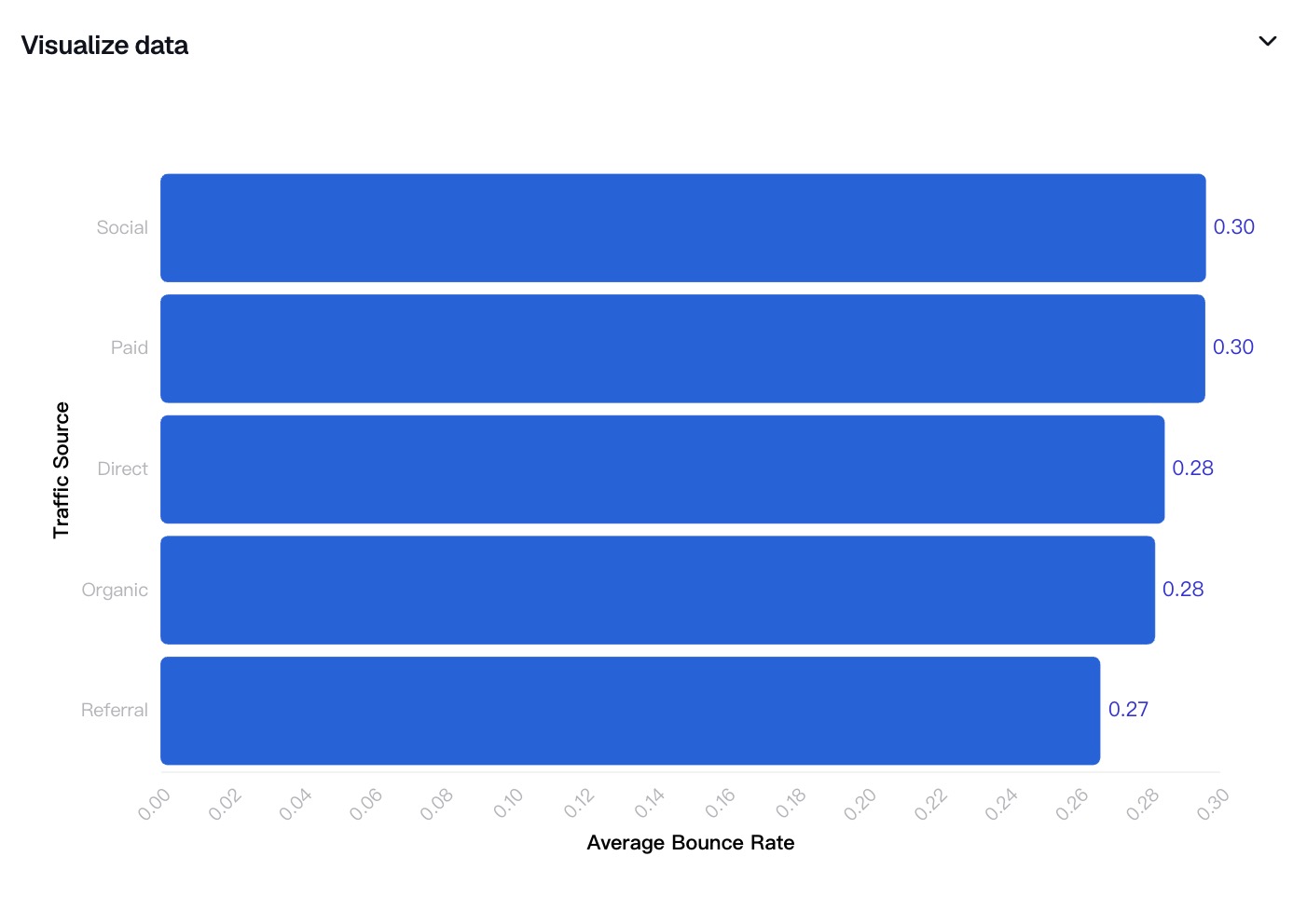
Step 4 : Export Your Analysis Into a Shareable Report
Visualizations are most valuable when they are shared. Once you have generated the charts that perfectly illustrate your website's traffic trends, Powerdrill Bloom allows you to easily compile them. You can export your newly created charts as high-resolution images, PDF reports, or interactive dashboards to share directly with your marketing team, clients, or stakeholders.

How to Choose the Right Chart for Website Traffic Data
Even when using an AI tool, it is helpful to understand which visual formats best represent different types of data. Choosing the right chart ensures your audience instantly grasps the message.
Line Charts: These are the absolute best choice for visualizing trends over time. If you want to show how your website pageviews have grown from January to December, a line chart will clearly display the peaks, valleys, and overall trajectory of your traffic.
Bar and Column Charts: Use these when you need to compare different categories side-by-side. For example, if you want to compare the total number of visits driven by Social Media, Organic Search, and Paid Ads in a single month, a bar chart makes the dominant channel instantly obvious.
Pie or Donut Charts: These charts are ideal for showing the composition of a whole. They should be used to illustrate percentage breakdowns, such as the proportion of your visitors using mobile devices versus desktop computers.
Scatter Plots: If you are trying to find a correlation between two different metrics, scatter plots are highly effective. For instance, you could plot "Page Load Time" against "Bounce Rate" to visualize whether slower pages lead to higher visitor abandonment.
Why Use AI Instead of Traditional Spreadsheet Tools
While tools like Microsoft Excel and Google Sheets have been the industry standard for decades, AI-powered data visualization platforms are rapidly replacing them for several compelling reasons:
No Formula or Coding Knowledge Required: Traditional tools require you to memorize complex formulas (like VLOOKUP) or learn how to manipulate pivot tables. AI tools operate on plain English prompts, making data analysis accessible to anyone, regardless of technical background.
Incredible Speed and Efficiency: Formatting a raw CSV, cleaning the data, and manually building charts can take hours. AI tools process the data and generate visual answers in mere seconds, freeing up your time for actual strategic planning.
Automated Chart Selection: Spreadsheets rely on the user to know which chart type to select. AI understands the context of your data and automatically generates the most statistically sound visual representation for your specific metrics.
Contextual Insights: Beyond just drawing a chart, AI can provide written summaries and highlight anomalies in your data (like an unexpected traffic spike on a Tuesday), which traditional spreadsheets simply cannot do.
Conclusion
Visualizing your website traffic data is an indispensable step in understanding your audience and growing your digital presence. While raw CSV files can be intimidating, you no longer need to struggle with clunky spreadsheets or complex formulas to make sense of your metrics. By leveraging modern AI technology, you can turn endless rows of numbers into actionable, beautiful charts in just a few clicks. If you are ready to stop wasting time on manual data entry and start uncovering real insights instantly, you should try Powerdrill Bloom. It is the smartest, fastest way to bring your data to life.
FAQs
What is a CSV file?
A CSV (Comma-Separated Values) file is a plain text document that stores tabular data, widely used for data export.
Can I export Google Analytics data to CSV?
Yes, almost all platforms, including Google Analytics, allow you to export your dashboard reports directly into a CSV format.
Do I need coding skills to use Powerdrill Bloom?
Not at all. Powerdrill Bloom uses natural language processing, allowing you to generate charts using plain English prompts.
How long does the AI analysis take?
The AI processes your CSV file in seconds, instantly generating insightful visualizations without the need for manual data manipulation.
Are my uploaded CSV files kept secure?
Yes, Powerdrill Bloom prioritizes data privacy, ensuring your uploaded files are securely processed and protected against unauthorized third-party access.