How to Turn Google Sheets Data Into Charts With AI (Step-by-Step)
To turn Google Sheets data into charts with AI, download the sheet as a .csv or .xlsx file. Upload it to an AI data agent, then describe the chart you want in natural language. The agent picks the chart type, builds it, and explains what it shows. Sheets' own Insert → Chart stays faster for one simple chart. AI wins when you need several, or when you do not yet know which chart answers your question.
Google Sheets charts are perfectly good. The friction is not the chart tool — it is everything around it. You have to know which chart type fits before you insert one, you rebuild each chart individually, and getting eight charts into a presentation means eight rounds of copy, paste, and resize.
This guide covers the native route honestly, then shows where the AI route saves real time.
What good charts from Sheets data actually require
Three things have to be true before any chart tool can help you, and they are true regardless of which route you take.
Your data needs to be in a clean rectangle. One header row, one record per row, one field per column, no merged cells, no blank rows splitting the range, no totals row sitting inside the data. Every charting tool assumes this, and most produce a strange-looking chart rather than an error when it is not the case.
You need to know what question the chart answers. "Show me sales" is not a question. "Which three regions grew fastest quarter over quarter" is, and it implies a specific chart. This is the step people skip, which is why so many dashboards contain charts nobody can interpret.
Consistent data types matter. Dates stored as text will not plot on a time axis. Numbers with currency symbols are strings. Sheets is forgiving about accepting these; chart axes are not.
If your sheet already satisfies all three and you want one chart, use Insert → Chart and stop reading. The rest of this is for the messier and more common case.
How to chart Google Sheets data natively
Option 1: Insert → Chart
Select your range, then choose Insert → Chart. Sheets proposes a chart type based on the shape of your selection and drops it onto the sheet. Charts stay linked to the range, so editing a cell updates the chart.
This is genuinely fast for one chart on clean data. It is also where the suggestion engine can mislead you: Sheets guesses from data shape, not from intent, so a column chart appears when a line chart would have shown the trend you were actually after.
Option 2: Refine it in the chart editor
Open the chart editor and you get two tabs. Setup controls the chart type, the data range, and which series map to which axis. Customize controls titles, colours, gridlines, axis ranges, and data labels.
Everything you need is there. The catch is that it is per chart. Eight charts means eight trips through Customize, and matching colours across all of them by hand is the kind of task that eats an hour without producing any insight.
Option 3: Download the sheet and chart it elsewhere
Sheets exports to .xlsx, .csv, and .pdf through File → Download, documented on Google's download a copy of a file help page. This is the route to take when you need capabilities Sheets does not have, or when the person who needs the charts does not have access to your Drive.
Where the native charting stops
Four limits show up once the work gets past one chart.
You have to choose the chart type yourself. Sheets suggests from data shape. Choosing well requires knowing that a stacked bar hides individual trends, that a pie chart fails past about five slices, and that a scatter plot is the only honest way to show a relationship between two continuous variables. That is analyst knowledge, and most people charting a sheet do not have it and should not need it.
Charts do not come with an explanation. A chart shows the shape; it does not tell you the shape is unusual. Sheets will happily plot a 40% drop without mentioning it. You still have to spot it, then write the sentence that goes on the slide.
Every chart is built one at a time. There is no "give me the five charts that describe this dataset". The exploratory pass — where you build a chart, learn something, and build a different chart because of it — is entirely manual.
Getting charts into a deck is its own project. Copy, paste into Slides, resize, discover the colours clash, adjust. Repeat per chart. This is the part that reliably runs past the deadline.
How to turn Google Sheets data into charts with Powerdrill Bloom
Powerdrill Bloom inverts the order of operations. Instead of choosing a chart type and then seeing what it shows, you state the question and it selects, builds, and explains the chart. Several at a time.
Step 1: Export your sheet and upload it
In Google Sheets, go to File → Download and pick Microsoft Excel (.xlsx) or Comma Separated Values (.csv). Then upload that file to a Powerdrill Bloom workspace.

Bloom reads Excel, CSV, TSV, and PDF, and auto-cleans on ingest, so mixed date formats and numbers stored as text get resolved rather than quietly breaking an axis. If you work from the same sheet every week, keep uploading into the same workspace — it remembers the earlier versions, which is what makes week-over-week questions possible.
Step 2: Ask for the chart you need
Describe the chart, or describe the question and let Bloom choose. Both work:
- Specific: "Plot monthly revenue by region as a line chart, one line per region, with 2025 as a dashed baseline."
- Open: "Which regions are growing and which are flat? Chart whatever shows that most clearly."
The second form is the one worth learning. Bloom also proposes exploration paths after it reads the data, which surfaces the anomaly you had not thought to look for. Charts land on a visual canvas as cards you can rearrange, and each one comes with a written read of what it shows.
Step 3: Export the charts or turn them into a deck
Take the individual charts, or turn the whole canvas into a presentation-ready deck in one click — Professional, Business, or Fancy — then export to PowerPoint or Notion.
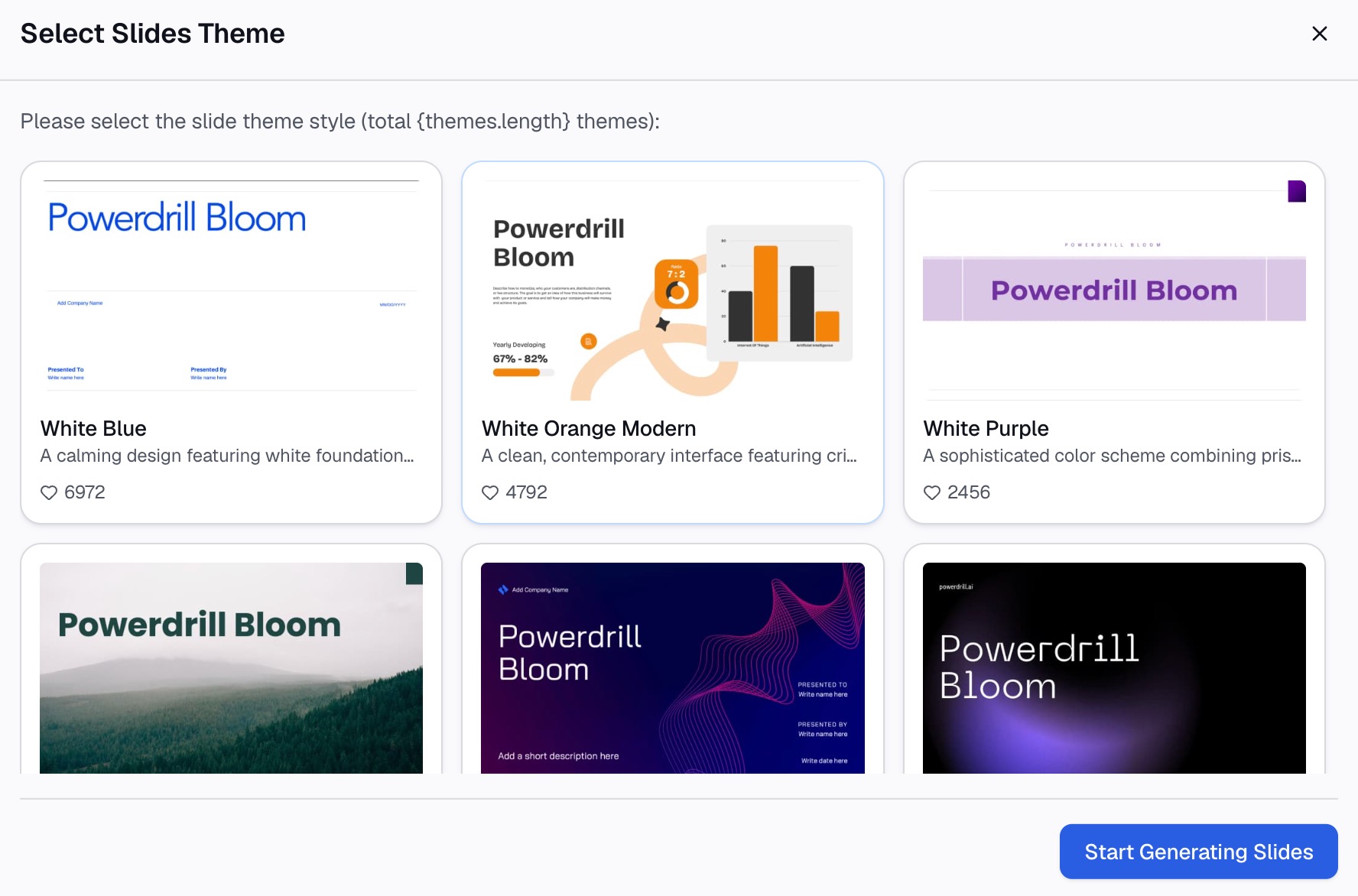
This is where the hour goes back in your pocket. The charts arrive already consistent with each other, so there is no per-chart colour reconciliation.
Why this beats rebuilding charts by hand
| Google Sheets charts | Powerdrill Bloom | |
|---|---|---|
| Chart type chosen by | You | The question you asked |
| Building five charts | Five manual passes | One request |
| Written interpretation | You write it | Included with each chart |
| Consistent styling across charts | Manual per chart | Applied across the canvas |
| Suggests what to look at | No | Yes, after reading the data |
| Charts update when the sheet changes | Yes, automatically | Re-upload or re-ask |
| Getting to a deck | Copy and paste per chart | One click, three styles |
| Cost | Included with Sheets | Free plan, 1,000 daily credits |
The honest trade: native Sheets charts stay live against the sheet, which matters for a dashboard someone checks daily. Bloom works on a snapshot, which matters less for a monthly report and more for a real-time tracker. Pick by which of those you are building.
Best practices for charting spreadsheet data
Clean the rectangle before you chart anything
One header row, no merged cells, no totals row inside the data, no blank separator rows. Ten seconds of cleanup prevents a chart that is subtly wrong in a way nobody notices until the meeting.
Let the question pick the chart type
Trend over time is a line. Comparison across categories is a bar. Relationship between two measures is a scatter. Composition of a whole is a stacked bar, or a pie only if you have four or five slices at most. Our AI graph maker page shows the range of chart types available if you want to browse.
Label the axis unit, always
"Revenue" on an axis is ambiguous. "Revenue (USD, thousands)" is not. Half of all misread charts are unit problems rather than data problems.
Do not start the value axis above zero on a bar chart
Truncating the axis exaggerates small differences dramatically. It is acceptable on a line chart showing change over time; on a bar chart comparing magnitudes it is misleading, whether or not you meant it to be.
Keep the chart count down
Five charts that each answer a question beat fifteen that describe the data. If you cannot say what a chart is for in one sentence, it does not belong in the deck.
Common mistakes to avoid
- Charting a range that includes the totals row. Your total becomes a data point and dwarfs every real category.
- Plotting text-formatted dates. They arrive as unordered category labels, so January follows October and the trend line becomes noise.
- Using a pie chart for eight or more categories. Nobody can compare adjacent slices at that count. A sorted bar chart shows the same data readably.
- Rebuilding the same chart every month by hand. If the analysis repeats, capture it once as a repeatable routine instead of retracing the clicks.
- Shipping charts with no takeaway. A chart without a sentence explaining it hands the interpretation to your audience, and they will interpret it differently than you did.
Conclusion
For one chart on clean data that needs to stay live against the sheet, Insert → Chart is the right tool and always will be. The calculus changes once you need several charts, or want them consistent with each other. It changes again when you would rather describe the question than choose a chart type, or when the charts have to end up in a deck by this afternoon. In those cases, export the sheet and hand it to an AI data agent instead.
Try it on the sheet you are already working in — Powerdrill Bloom includes 1,000 daily refreshed credits on the free plan, with no formulas or SQL involved. If slides rather than charts are the goal, turning Google Sheets into slides covers that path, and turning a CSV file into a chart covers the single-file version.
Frequently asked questions
Can AI create charts directly from Google Sheets?
An AI data agent needs the data as a file, so the practical route is File → Download as .xlsx or .csv, then upload. Once uploaded, you describe the chart in natural language rather than choosing a chart type and configuring a range yourself.
What is the best chart type for Google Sheets data?
It depends on the question, not the data. Use a line chart for change over time, a bar chart to compare categories, a scatter plot for the relationship between two measures, and a stacked bar for composition. Reserve pie charts for four or five categories at most, since slices become impossible to compare beyond that.
How do I make multiple charts from one Google Sheet at once?
Sheets builds charts one at a time through the chart editor. To get several in one pass, upload the exported file to an AI data agent and ask for the full set — for example, "chart revenue trend, regional comparison, and the relationship between spend and conversions."
Why do my Google Sheets charts look wrong?
The three usual causes are a totals row included inside the charted range, dates stored as text so they plot as unordered categories, and numbers stored as text because of a currency symbol or thousands separator. Fix the data types first, then re-chart.
Is there a free way to turn spreadsheet data into charts?
Yes, two. Google Sheets' built-in charting is included at no cost. Powerdrill Bloom's free plan includes 1,000 daily refreshed credits, which covers uploading a sheet, generating charts, and getting a written read of each one.