How to Make Beautiful Graphs From Excel Sheets Quickly in 2026

Introduction
In today's data-driven era, we are faced with a massive influx of Excel spreadsheets every single day. However, long and dry datasets often fail to directly reconstruct the core narrative of a business. In 2026, learning how to quickly and efficiently transform these raw Excel numbers into high-value, aesthetically pleasing charts has become a critical skill for professionals looking to boost productivity and communication impact.
This article introduces five leading data visualization tools, taking the AI-driven data analysis platform, Powerdrill Bloom, as a primary example to show you how to generate stunning charts in just a few simple steps.
Why Data Visualization Matters
Data visualization is far more than just turning numbers into charts; it is the essential bridge that transforms cluttered data into actionable business insights.
Accelerates Information Delivery: The human brain processes visual information much faster than raw text and numbers. A well-structured line graph or bar chart allows decision-makers to grasp core trends within seconds.
Unlocks Hidden Business Insights: In an Excel sheet with tens of thousands of rows, trends, correlations, and anomalies are nearly impossible to spot. Visualization brings these hidden patterns to light instantly using color, position, and shape.
Boosts Report Persuaded Power: Clear and intuitive data charts significantly elevate the professionalism of your reports. They streamline cross-department collaboration and client presentations, reducing the risk of miscommunication and costly business missteps.
Top 5 Data Visualization Tools: In-Depth Reviews
1. Powerdrill Bloom
Powerdrill Bloom is an AI-first collaborative canvas platform designed to automate data exploration and visualization from raw files.
Key Features: Natural language data querying, automated chart generation, AI-driven insight summarization, one-click export to presentations and reports.
Pros: Offers an interactive canvas workspace, automated context-gathering from external sources, and seamless exports to structured PPT slides.
Cons: Still growing its ecosystem of integrations compared to legacy enterprise platforms.
Pricing: $13.27/month.
2. Beautiful AI
Beautiful AI is a presentation-focused platform built to convert ideas and prompts directly into polished, designer-quality slides.
Key Features: Features intelligent Smart Slides that automatically resize and format layouts, an AI writing assistant, and built-in brand controls.
Pros: Exceptionally quick at generating aesthetic decks; keeps team presentations consistent and aligned with company guidelines.
Cons: Chart-building capabilities are basic compared to specialized, dedicated data analysis software.
Pricing: $12/month.
3. Julius AI
Julius AI is a conversational data analysis assistant that helps users explore datasets using natural language.
Key Features: Uses Python code under the hood (Pandas, Matplotlib) to execute requests, perform statistical tests, and generate charts.
Pros: Highly responsive chat interface; handles advanced analytical tasks like forecasting and regressions directly from simple prompts.
Cons: Relies heavily on conversational prompts, which can sometimes require iterative phrasing to get the precise chart layout needed.
Pricing: $20/month.
4. Tableau
Tableau is an industry-standard business intelligence (BI) platform widely utilized for complex, enterprise-level data visualization.
Key Features: Offers highly customizable interactive dashboards, extensive data connectors, and robust calculated fields.
Pros: Extremely powerful with customization options for large and structured enterprise databases.
Cons: A steep learning curve that often requires dedicated training; setup and maintenance can be time-consuming for quick projects.
Pricing: Starts at $15/user month.
5. Power BI
Microsoft’s flagship business intelligence tool, integrated tightly within the Microsoft 365 ecosystem.
Key Features: Uses DAX for modeling, offers seamless live Excel connections, and features Copilot-assisted report generation.
Pros: A natural fit for organizations already using Windows, Azure, or Office 365; handles massive databases effectively.
Cons: The interface can feel overwhelming for non-technical users, and licensing costs can scale quickly.
Pricing: Pro starts at $14/user month.
How to Make Beautiful Graphs From Excel Sheets Quickly (Take Powerdrill Bloom as an Example)
Creating high-quality visuals shouldn’t be a bottleneck. Powerdrill Bloom offers a straightforward, interactive workspace that streamlines the entire workflow.
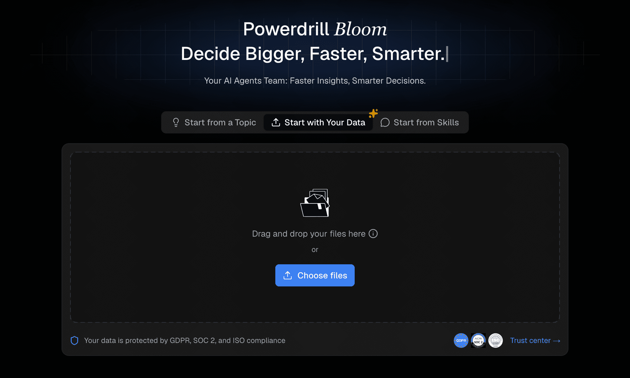
Step 1 - Upload Data and Files
Open your workspace and drag your Excel (.xlsx) or CSV file directly onto the canvas. Powerdrill’s engine securely reads and organizes the sheet.
Step 2 - Clean and Explore the Dataset
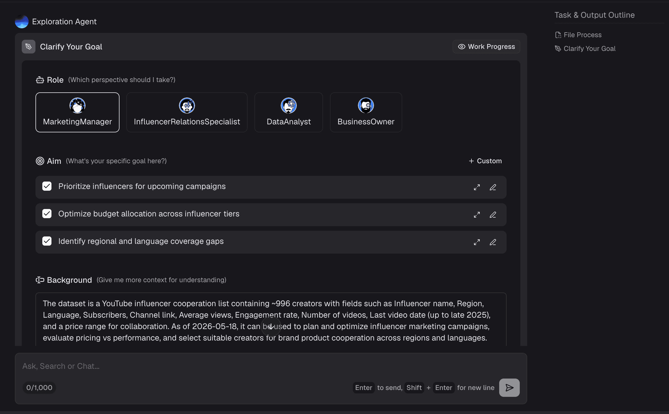
Powerdrill Bloom’s AI instantly scans your dataset to detect data types (like dates and text) and flag anomalies or missing values. You can clean your entire Excel sheet in just a few clicks before creating any charts.

Step 3 - Ask Questions in Natural Language
Instead of writing complex pivot tables, simply type a prompt, such as "Show our monthly cooperation trend by region". The AI translates this intent into data queries instantly.
Step 4 - Generate and Export Outputs for Reports and Presentations
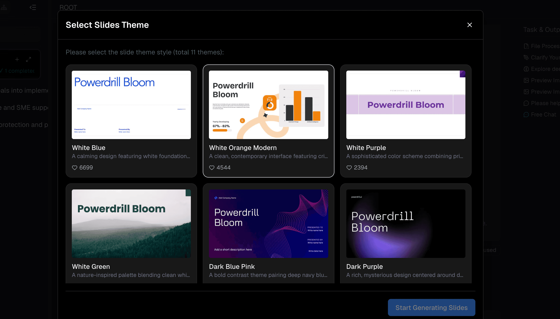
Refine your findings on the canvas and let the platform convert your insights into a professionally structured presentation deck or an image, ready to download and share with your team.
How to Choose the Best Data Visualization Tool
Selecting the right tool depends on your team's specific objectives. For enterprise teams needing to build complex, permanent operational dashboards with strict, pre-defined metrics, Tableau and Power BI remain highly reliable solutions, though they require a notable time investment. If your primary goal is quickly making basic slides pretty, Beautiful AI works well. For direct code-based conversational data exploration, Julius AI is an efficient option.
However, if your priority is bridging the gap between chaotic raw spreadsheets and structured, presentable business reports quickly without losing depth, Powerdrill Bloom represents a practical middle ground. By combining autonomous cleaning, deep external-context gathering, and canvas-based mind-mapping, it minimizes the manual configuration required by legacy systems while providing more analytical substance than simple slide-makers.
Conclusion
Turning raw Excel data into visually compelling reports no longer requires advanced technical training or hours of tedious manual formatting. While classic business intelligence tools are valuable for deep enterprise architectures, the rapid pace of work in 2026 demands agile, automated alternatives.
If you want to streamline your analytics and build stunning, insight-rich graphs in just a few clicks, explore what the team of AI agents at Powerdrill Bloom can do for your workflow today.
FAQs
Can I upload multi-tab Excel spreadsheets to Powerdrill Bloom?
Yes. You can upload multi-tab sheets and reference specific tab names in your natural language prompts for targeted analysis.
Do I need coding or design experience to use these AI tools?
No. Modern tools handle the data cleaning, code generation, and chart formatting automatically based on simple written instructions.
Is my company’s data secure when using Powerdrill Bloom?
Yes. Powerdrill adheres to rigorous privacy standards and global compliance protocols like GDPR to ensure your data is kept secure.
Can I export charts directly into PowerPoint presentation slides?
Yes. Powerdrill Bloom allows you to export your analyzed data and generated visuals straight into styled PPT slides with one click.
What chart types can these visualization tools generate?
They can instantly generate classic visuals including bar, line, pie, scatter plots, doughnut charts, and advanced heatmaps.