How to Make a Scatter Plot with AI: Step-by-Step Guide
A scatter plot shows the relationship between two numeric variables, with one on each axis and a dot for every observation. To make one with AI, upload a file with two numeric columns and name the variable for each axis. Ask for the plot with a trendline and correlation, then read the pattern and check the outliers.
This guide explains what a scatter plot shows and when to use one instead of a line chart. It covers the manual route in Excel and Google Sheets, a three-step AI method, how to read the result, and a worked example.
What a scatter plot shows
The NIST/SEMATECH e-Handbook of Statistical Methods gives the standard definition. A scatter plot "reveals relationships or association between two variables." Those relationships "manifest themselves by any non-random structure in the plot."
The layout is simple. The handbook describes it as "a plot of the values of Y versus the corresponding values of X." The vertical axis holds the response variable. The horizontal axis holds the variable you suspect may be related to it.
NIST lists five questions a scatter plot can answer:
- Are the two variables related?
- Are they linearly related?
- Are they non-linearly related?
- Does the variation in Y change depending on X?
- Are there outliers?
The handbook also explains why the chart matters so much in analysis. It calls it "the most important and most heavily used graphical tool for uncovering the existence and nature of relationships between variables."
When to use a scatter plot instead of a line chart
Scatter plots and line charts can look alike, especially when the dots are joined with connecting lines. The difference is the horizontal axis.
Microsoft's Excel documentation explains it clearly. "A scatter chart always has two value axes." A line chart has only one value axis, and its horizontal axis shows evenly spaced categories.
That leads to a simple rule. Microsoft says to "use a line chart if your data has non-numeric x values." For numeric X values, it adds, "it is usually better to use a scatter chart."
| Use a scatter plot when | Use a line chart when |
|---|---|
| Both variables are numbers, such as price and units sold | The horizontal axis is time or a category |
| You want to see whether two measures move together | You want to show a trend over equal intervals |
| Points can fall anywhere along the horizontal axis | Points are evenly spaced by period |
| You plan to add a trendline or correlation | You plan to compare several series over time |
A quick test helps. If you could sort the horizontal axis values from smallest to largest and they would still mean something, a scatter plot fits.
What you need before you start
A clean chart starts with clean columns. Check four things first.
Two numeric columns. One for the X variable and one for the Y variable. Remove units typed into cells, such as "12 km," because they turn numbers into text.
One row per observation. Each row should describe one customer, one order, one day, or one test. Totals and subtotals in the same column will distort the plot.
Enough points. A handful of points rarely shows a real pattern. Aim for at least 20 observations, and more if the data is noisy.
A clear question. Decide what you expect to find before you plot. "Does delivery time rise with distance?" is a better starting point than "show me the data."
How to make a scatter plot in Excel or Google Sheets
The manual route works well for a single chart. These options do not need any add-ins.
Option 1: Excel
Put the X values in the left column and the Y values in the right column, with headers in row 1. Select both columns, including the headers.
On the Insert tab, open the Insert Scatter (X, Y) or Bubble Chart menu and choose Scatter. Excel plots each row as one point.
To add a trendline, select the chart, open Chart Elements, and tick Trendline. In Format Trendline, you can display the equation and the R-squared value on the chart. For the correlation coefficient itself, enter =CORREL(A2:A31,B2:B31) in a spare cell, adjusted to your range.
Option 2: Google Sheets
Select the two columns and choose Insert, then Chart. In the chart editor, set the chart type to Scatter chart if Sheets does not pick it automatically.
On the Customize tab, open Series and tick Trendline. You can show R-squared there too. The =CORREL() function works the same way as in Excel.
The manual route slows down in three places. The data often needs cleaning first. Outliers have to be found and labeled by hand. And when you want to test several pairs of variables, you repeat every step for each pair.
How to make a scatter plot with AI
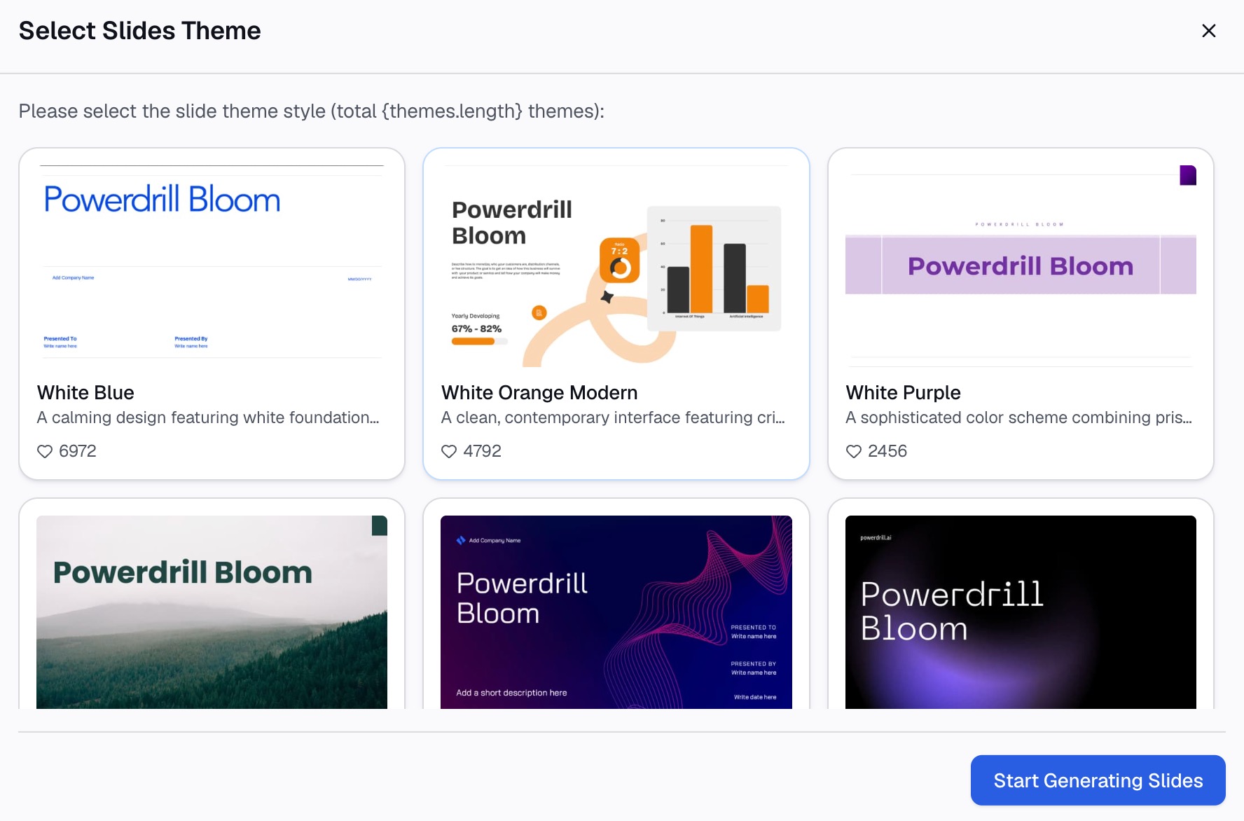
An AI workspace can clean the columns, build the plot, add the trendline, and flag the outliers in one request. The three steps below use Powerdrill Bloom. Its scatter graph creator page describes the same flow: upload a dataset, describe the chart in chat, and download the result.
Step 1: Upload the data and name the two variables
Upload the spreadsheet or CSV that holds your data. The scatter graph creator page says it accepts formats such as CSV and Excel.
Then name the two variables in your request. Say which column goes on the horizontal axis and which goes on the vertical axis. Put the variable you think drives the other on the horizontal axis, which matches the NIST convention.
If the file has many columns, add one sentence of context. "Each row is one delivery. I want to see whether time depends on distance." That helps the AI pick the right columns and ignore the rest.

Step 2: Ask for the scatter plot, trendline, and correlation
Ask for the chart, a linear trendline, and the correlation coefficient in one request. A good request looks like this: "Make a scatter plot of delivery time against distance. Add a linear trendline and show the correlation coefficient and R-squared."
Ask for a note on data cleaning too. The AI should tell you how many rows it dropped for missing or non-numeric values. If that number surprises you, fix the source file and run it again.
If you have several candidate variables, ask for one chart per pair, or a correlation table first. Our guide to the correlation matrix covers that wider first pass.
Step 3: Read the pattern and label the outliers
Look at the shape before the numbers. Is there a clear direction? Is the relationship straight or curved? Does the spread widen as X grows?
Then ask the AI to label any outliers with their row details. A point far from the rest is often the most useful one in the chart. It may be a data entry error, or it may be the case your manager will ask about.
Finish with one sentence under the chart. State the direction, the strength, and any caveat. "Delivery time rises with distance, with a strong linear relationship, apart from three late orders during a road closure." The scatter graph creator page notes that you can download the chart as a high-resolution PNG for slides or reports.
How to read a scatter plot
The NIST handbook shows the common patterns with example plots. These are the ones you will meet most often.
| Pattern | What it looks like | What it suggests |
|---|---|---|
| No relationship | A shapeless cloud | Y cannot be predicted from X |
| Strong positive | Points close to a rising line | Larger X goes with larger Y |
| Strong negative | Points close to a falling line | Larger X goes with smaller Y |
| Curved | Points follow a bend | A straight trendline will mislead |
| Widening spread | The cloud fans out as X grows | Variation in Y depends on X |
| Outlier | One point far from the rest | Check the row before drawing conclusions |
For the no-relationship case, NIST describes values of Y that "range all over the place" for a given X. For a strong positive relationship, it says "a straight line comfortably fits through the data" and "The scatter about the line is quite small."
The widening pattern has a technical name. NIST calls it heteroscedasticity, meaning "nonconstant variation in Y over the values of X." It matters because simple trendlines assume the spread is roughly even.
To put a number on the strength of a straight-line relationship, use the correlation coefficient. Values near 1 or -1 mean a strong linear relationship. Values near 0 mean little linear relationship, though a curve may still exist.
Correlation is not causation
A scatter plot shows association. It does not show cause.
The NIST handbook is direct about this. "Scatter plots reveal association, which is step one toward cause-and-effect." It adds that "even though causality implies association association does NOT imply causality."
In practice, look for a third variable before you claim cause. Ice cream sales and sunburns both rise in summer, but one does not cause the other. When a scatter plot shows a strong pattern, ask what else changes along with X.
If you need to model the relationship, the next step is regression analysis, which estimates how much Y changes for each unit of X.
A worked example
Here is an illustrative example with made-up figures. A delivery team logged 30 orders, with distance in kilometers and delivery time in minutes.
The chart shows a clear upward pattern. Short trips of 2 to 5 km take 15 to 25 minutes. Long trips of 20 to 25 km take 55 to 70 minutes. The trendline rises steadily, and the correlation coefficient is 0.91.
Three points sit well above the line. Each is a 6 to 8 km order that took more than 60 minutes. Labeling them shows that all three happened on the same afternoon, during a road closure.
With those three orders flagged, the conclusion is simple. Distance explains most of the variation in delivery time, and the outliers have a known cause. The team can plan routes by distance and treat closures as a separate risk.
This is the kind of summary the chart does well. One chart, one sentence, and a short list of exceptions.
Variations and formatting that keep it honest
Two variations help when you have more than two variables. The NIST handbook describes both.
A scatterplot matrix "generates all pairwise scatter plots on a single page." It is a quick way to scan every pair in a dataset before choosing which ones to study.
A conditioning plot, "also called a co-plot or subset plot," shows Y against X at different values of a third variable. It answers questions such as whether the distance and time relationship holds on weekdays and weekends alike.
Formatting matters too. NIST notes that the most popular version uses a marker at each data point "and no line connecting data points." Lines between points can suggest an order that the data does not have.
Three more habits keep the chart readable:
- Label both axes with the variable name and the unit.
- Start the axes at sensible values, and say so if they do not start at zero.
- Use one color for the points and a contrasting color for the trendline.
Common mistakes
These are the errors that most often make the chart misleading:
- Using a line chart for numeric X values. Microsoft's guidance is clear that numeric X values usually belong in a scatter chart.
- Swapping the axes. Put the driver on the horizontal axis and the outcome on the vertical axis.
- Forcing a straight trendline onto a curve. Look at the shape first, then choose the trendline.
- Deleting outliers without checking them. An outlier may be an error or the most important point in the chart.
- Claiming cause from correlation. A strong pattern justifies a closer look, not a conclusion.
- Plotting too few points. A pattern in eight points may disappear at eighty.
When you want to test several variable pairs from one file, you can try Powerdrill Bloom. It builds each chart with its trendline and flagged outliers.
Frequently asked questions
What is a scatter plot used for?
A scatter plot is used to see whether two numeric variables are related. Each point is one observation, with one value on each axis. The NIST handbook says it answers whether variables are related, whether the relationship is linear, whether variation changes with X, and whether there are outliers.
How do you make a scatter plot in Excel?
Put the X values in the left column and Y values in the right column, then select both. On the Insert tab, open the Insert Scatter (X, Y) or Bubble Chart menu and choose Scatter. Add a trendline from Chart Elements, and use the CORREL function for the correlation coefficient.
What is the difference between a scatter plot and a line graph?
A scatter plot has two value axes, so points can fall anywhere along the horizontal axis. A line graph has a category axis with evenly spaced points, which suits time series. Microsoft recommends a scatter chart for numeric X values and a line chart for non-numeric ones.
How do you read a scatter plot?
Look at the direction, the shape, and the spread. Points rising together show a positive relationship, and points falling show a negative one. A shapeless cloud shows no relationship, and a widening fan shows that variation depends on X. Check any outliers before drawing conclusions.
Can AI make a scatter plot from a spreadsheet?
Yes. Upload the spreadsheet to an AI workspace, name the two columns, and ask for a scatter plot with a trendline and correlation. Powerdrill Bloom's scatter graph creator accepts CSV and Excel files and lets you download the chart as a PNG.
Sources: NIST/SEMATECH e-Handbook, Scatter Plot · NIST, Strong Linear Relationship · NIST, No Relationship · NIST, Heteroscedastic Variability · Microsoft Support, Present your data in a scatter chart or a line chart. Guidance read on September 24, 2026.