How to Make a Heatmap From Spreadsheet Data With AI (No SQL Required)
Introduction
Staring at endless rows and columns of raw spreadsheet data can be incredibly overwhelming. Whether you are a business owner trying to decipher seasonal sales trends, a marketer analyzing campaign performance, or a researcher looking for data correlations, raw numbers simply do not tell a clear story at first glance. Historically, turning massive datasets into insightful visualizations required technical skills. You either had to write complex SQL queries to aggregate the data, wrestle with pivot tables, or write Python scripts to generate custom charts.
Not anymore. Thanks to the rapid advancement of artificial intelligence, generating complex visualizations is now as easy as having a conversation. You can bypass the coding, the complex query languages, and the spreadsheet formulas entirely. In this comprehensive guide, we will explore exactly how you can make a stunning, insightful heatmap from your spreadsheet data using AI without writing a single line of SQL.
What Is a Heatmap and Why Use It for Spreadsheet Analysis
A heatmap is a powerful data visualization tool that uses varying shades of color to represent different values in a dataset. Instead of relying on bars or lines, a heatmap displays data in a grid format, where the intensity of the color corresponds directly to the magnitude of the metric being measured. For example, darker or warmer colors (like deep red) typically represent higher values, while lighter or cooler colors (like pale blue) represent lower values.
So, why should you use a heatmap for spreadsheet analysis instead of traditional charts?
First, heatmaps are incredibly effective at revealing patterns, trends, and anomalies in large, dense datasets at a single glance. Our brains are hardwired to process visual cues like color contrast much faster than we can read and compare raw numbers in a table.
Second, heatmaps excel at showing multi-dimensional relationships. If you want to see how performance fluctuates across two different categories—such as days of the week versus hours of the day, or different product lines across various geographic regions—a heatmap perfectly maps these intersections. It instantly draws your eye to the "hotspots" of high activity and the "cold zones" of underperformance, allowing you to make faster, data-driven decisions without getting lost in the weeds of your spreadsheet.
How AI Creates Heatmaps From Spreadsheet Data (Step-by-Step Tutorial)
To show you exactly how effortless this process has become, let’s walk through a practical example using Powerdrill Bloom, a cutting-edge AI data analyst that allows you to chat with your data and generate visualizations instantly.
For this tutorial, let’s imagine you have just downloaded a massive spreadsheet containing BMW sales data. Your goal is to figure out which months and years had the highest vehicle sales. Doing this manually would take hours of sorting. With Powerdrill Bloom, it takes seconds.
Step 1: Upload Your Spreadsheet

The first step is simply bringing your data into the AI environment. You don’t need to structure your data perfectly in a database or set up a SQL server. Powerdrill Bloom allows you to drag and drop your raw files directly into the intuitive interface. Simply take your "BMW sales data (2010-2024)" file—whether it is in a CSV or Excel (XLSX) format—and upload it to the platform. The AI will instantly ingest the document, reading the column headers (like Date, Region, Model, Sales Volume) and understanding the overall structure of your historical automotive dataset.
Step 2: Ask AI to Analyze Your Data
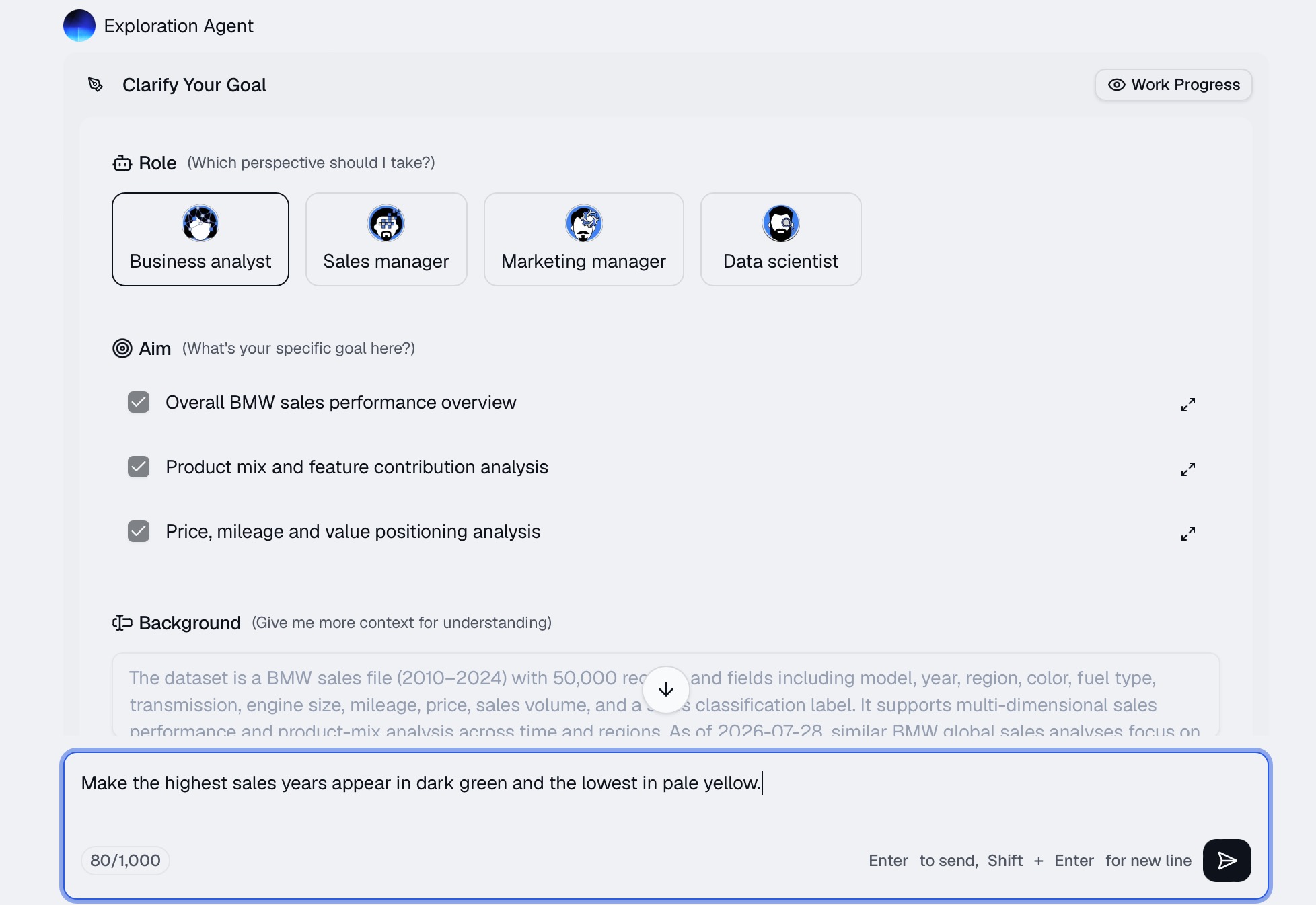
This is where the magic happens. In the past, you would need to write a SQL query like SELECT Year, Month, SUM(Sales) FROM BMW_Data GROUP BY Year, Month. In Powerdrill Bloom, you just use plain, conversational English.
You navigate to the chat interface and type a prompt just like you were speaking to a human data analyst. You can say: "Generate a heatmap showing the total BMW sales volume by month and year from 2010 to 2024."
Because the AI understands the context of your uploaded spreadsheet, it immediately grasps your intent. You can even ask for specific color schemes, adding instructions like, "Make the highest sales years appear in dark green and the lowest in pale yellow."
Step 3: AI Automatically Generates the Heatmap
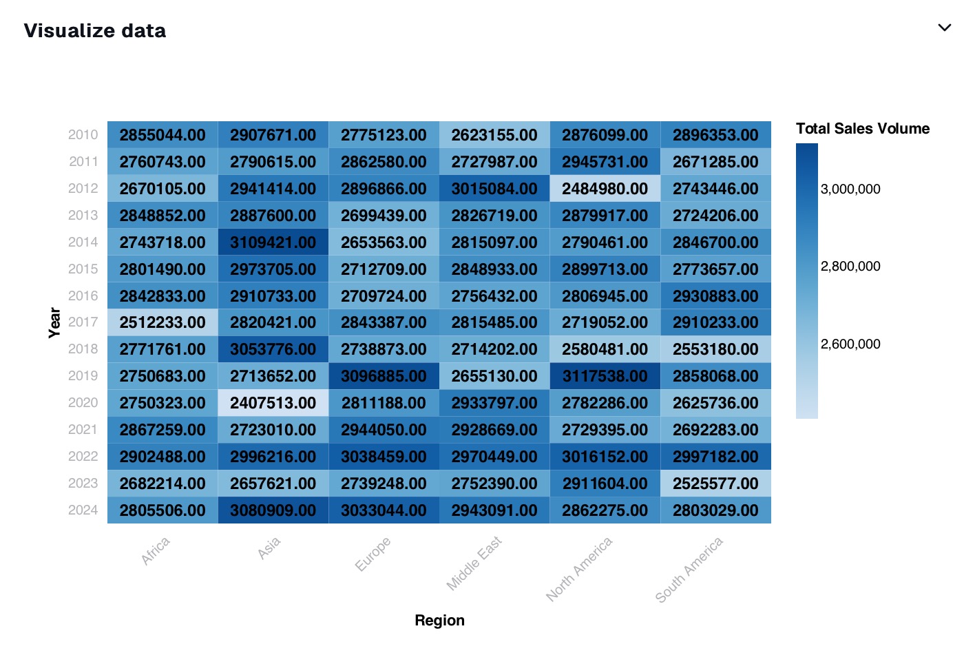
Once you hit enter, Powerdrill Bloom’s AI engine takes over. Under the hood, completely invisible to you, the AI dynamically writes the necessary code, processes the BMW sales numbers, groups them by the correct years and months, and renders a high-quality visualization.
Within a matter of seconds, a professional-grade heatmap appears in your chat window. You will instantly be able to see the visual story of the BMW data. Perhaps December consistently shows up as a dark "hotspot" across the 14-year period due to end-of-year sales events, while February remains a lighter, slower month. The AI has done all the heavy lifting, turning 14 years of dense automotive spreadsheet rows into one clear, colorful grid.
Step 4: Export the Visualization

Now that your heatmap is generated, you need to share it with your team, stakeholders, or include it in a presentation. Powerdrill Bloom makes this seamless. You can interact with the generated chart, hover over specific color blocks to see the exact sales numbers for that specific month and year, and click a button to export the visualization. You can download it as a high-resolution image (PNG or JPG) or export it as an interactive file, making it incredibly easy to drop straight into your PowerPoint deck or email report.
When Should You Use an AI Heatmap Generator
While AI makes creating heatmaps incredibly easy, it is helpful to know exactly when this specific type of chart is the best tool for the job. You should turn to an AI heatmap generator when:
Analyzing Time-Series Density: Like our BMW example, heatmaps are perfect for viewing performance across months, days, or hours. It helps identify seasonal peaks and recurring chronological trends.
Conducting Cohort Analysis: If you are tracking user retention, a heatmap visually demonstrates how long different groups of customers continue to use your product over time.
Geographical Concentration: When analyzing sales or user sign-ups by state, country, or region, a heatmap (or heat map overlay on a geographical map) quickly highlights your most lucrative markets.
Discovering Data Correlations: If you have a massive dataset with dozens of variables and want to see which metrics influence each other, an AI can generate a correlation matrix heatmap, instantly highlighting strong positive or negative relationships in dark colors.
Conclusion
Gone are the days when you needed a background in data science, complex pivot table expertise, or advanced SQL knowledge to make sense of your spreadsheets. AI has democratized data visualization, transforming how we extract insights from raw numbers. By allowing you to simply upload a file and ask a question in natural language, AI bridges the gap between raw data and actionable business strategy.
If you are ready to stop fighting with complex spreadsheet formulas and start seeing the true story hidden in your data, it is time to upgrade your workflow. Head over to Powerdrill Bloom today, upload your toughest spreadsheet, and watch as it instantly transforms your data into stunning, insightful heatmaps. Your data has a story to tell then let Powerdrill Bloom help you see it.
FAQs
What file formats can I upload to make a heatmap?
You can typically upload standard spreadsheet formats, including CSV, XLS, and XLSX files, directly into the AI tool.
Do I need to know any coding to use this?
No coding or SQL is required. You simply type your request in plain English, and the AI handles everything.
Can I customize the colors of my heatmap?
Yes! You can simply ask the AI in your prompt to use specific color palettes, like red-to-green or blue-to-yellow.
Is my uploaded spreadsheet data kept secure?
Yes, reputable AI tools like Powerdrill Bloom use enterprise-grade encryption and strict privacy protocols to protect your data.
How accurate is the AI in grouping the data?
The AI is highly accurate. It reads your column headers and automatically structures the data precisely based on your prompt.