How to Create an NPS Report: 5 Easy Steps in 2026
Two companies both report an NPS of 30. One has a loyal base with a small vocal minority. The other has a customer base split down the middle.
The score cannot tell them apart. It is a single subtraction, and subtraction throws away the shape of the data.
That is not a reason to skip the metric. It is a reason to build a report rather than quote a number.
This guide covers what the report needs, the five steps to produce it, what the score hides, and where the manual route stops holding.
What an NPS report needs to contain
The NPS itself is one line. The report is everything that makes that line trustworthy.
You need four things beside it: the response count, the split across the three bands, the period, and the population you surveyed.
Response count matters more than people expect. With 40 responses, a handful of people moving from 7 to 6 swings the NPS by double digits, and nothing about the business changed.
You also need the raw 0–10 distribution kept somewhere. Once responses are collapsed into three bands, you can never recover the shape, and the shape is where the finding usually is.
The five steps
1. Ask the 0–10 question, unchanged
NPS is defined on a single question scored 0 to 10. Change the scale and you no longer have a comparable figure.
Keep the wording stable across cycles too. A reworded question produces a different score, and you will read that as a change in sentiment.
Add one open text field after it. The number tells you where you are, and the comments tell you why.
2. Sort responses into three bands
Qualtrics documents the bands precisely. Promoters "respond with a score of 9 or 10." Passives "respond with a score of 7 or 8." Detractors "respond with a score of 0 to 6."
Note how wide the detractor band is. A 6 out of 10 counts the same as a 0. That is deliberate, and worth explaining to anyone seeing an NPS report for the first time.
Count each band with COUNTIFS against the numeric column, and check the three counts sum to your total responses before going further.
3. Convert both ends to percentages
Divide the promoter count by total responses, then the detractor count by total responses. Use COUNTA on the response column so blanks do not inflate your denominator.
Keep both percentages visible on the report. They are more informative than the final NPS, and they are what makes it reproducible.
Passives are counted in the denominator but appear in neither percentage. That is the step people get wrong.
4. Subtract, and keep the sign
The calculation is exactly what Qualtrics describes: "subtract the percentage of Detractors from the percentage of Promoters."
The result runs "from -100 to +100, where a higher score is desirable." It is a whole number, not a percentage, so write it without a percent sign.
Do not average anything at this stage. There is no averaging anywhere in NPS, and treating band midpoints as scores produces a number that means nothing.
5. Report the score with its context attached
Put five things on the same view: the NPS, the response count, the three band percentages, the period, and who was surveyed.
A score without a response count is the most common way this report misleads. Anyone reading it should be able to judge how much weight the number can carry.
Then add the trend. One NPS is a data point, and three consecutive readings on a stable question are the first thing that is actually actionable.
Why passives being excluded matters
This is the design choice that makes the metric behave strangely, and it is worth understanding rather than working around.
Passives sit in the NPS denominator and in neither numerator. So moving a customer from 8 to 9 raises the score, while moving one from 7 to 8 changes nothing.
The consequence is a metric that is deliberately insensitive in the middle. It rewards creating advocates and punishes creating critics, and it ignores everything between.
That is defensible as a design. It becomes a problem when a team treats NPS as a general satisfaction measure. Most satisfaction improvement happens in exactly the band it ignores.
Practical response: report the passive percentage as a fourth figure. A large passive block is not visible in the score, and it is often the biggest opportunity in the data.
Why you cannot compare across industries
The single most common misuse of NPS is quoting someone else's score as a target.
Qualtrics publishes industry averages that make the problem obvious. Grocery averages 30. Video streaming averages 29. Consumer payments averages −6.
A payments company at 0 is outperforming its sector. A grocery retailer at 0 is in trouble. The same number, opposite readings.
The general NPS bands, which Qualtrics attributes to Bain & Company, are orientation rather than goals. Above 0 is good, above 20 favorable, above 50 excellent, and above 80 world-class.
Use your own trend as the benchmark. Wikipedia's entry on the metric covers the academic debate about its predictive claims, which is useful background before you attach a target to it.
Where the manual route slows down
The first report takes an hour. The fourth takes longer, because by then three things have drifted.
Survey wording changes when someone tidies up the form. The NPS moves and nobody connects the two, so a copy edit gets read as a sentiment shift.
The surveyed population changes too. Widening from active users to all registered contacts brings in people with no recent experience. The NPS usually drops for reasons unrelated to the product.
Then there is the mistake that survives longest. Averaging the 0–10 scores instead of subtracting band percentages produces a number in the same range as a real NPS, and no one notices.
There is a fourth cost that only shows up under deadline. When someone asks "is that good," a single NPS cannot answer, and assembling the comparison is a second project.
The tooling side of this has its own roundup, in AI software for survey data analysis.
How to build it with Powerdrill Bloom
Step 1: Upload your survey export
Upload the response export straight from your survey tool. Powerdrill Bloom profiles the columns on arrival, so blank responses, out-of-range values, and duplicate respondent IDs surface before any NPS figure is calculated.

Step 2: Describe the report in natural language
State the rules rather than building them. Name the numeric column, the period, the population, and the band boundaries.
Then ask the questions that catch the errors. Ask how many responses are blank or outside the 0–10 range. Ask for the three band percentages alongside the score. Then ask how the score differs by segment and by signup cohort.
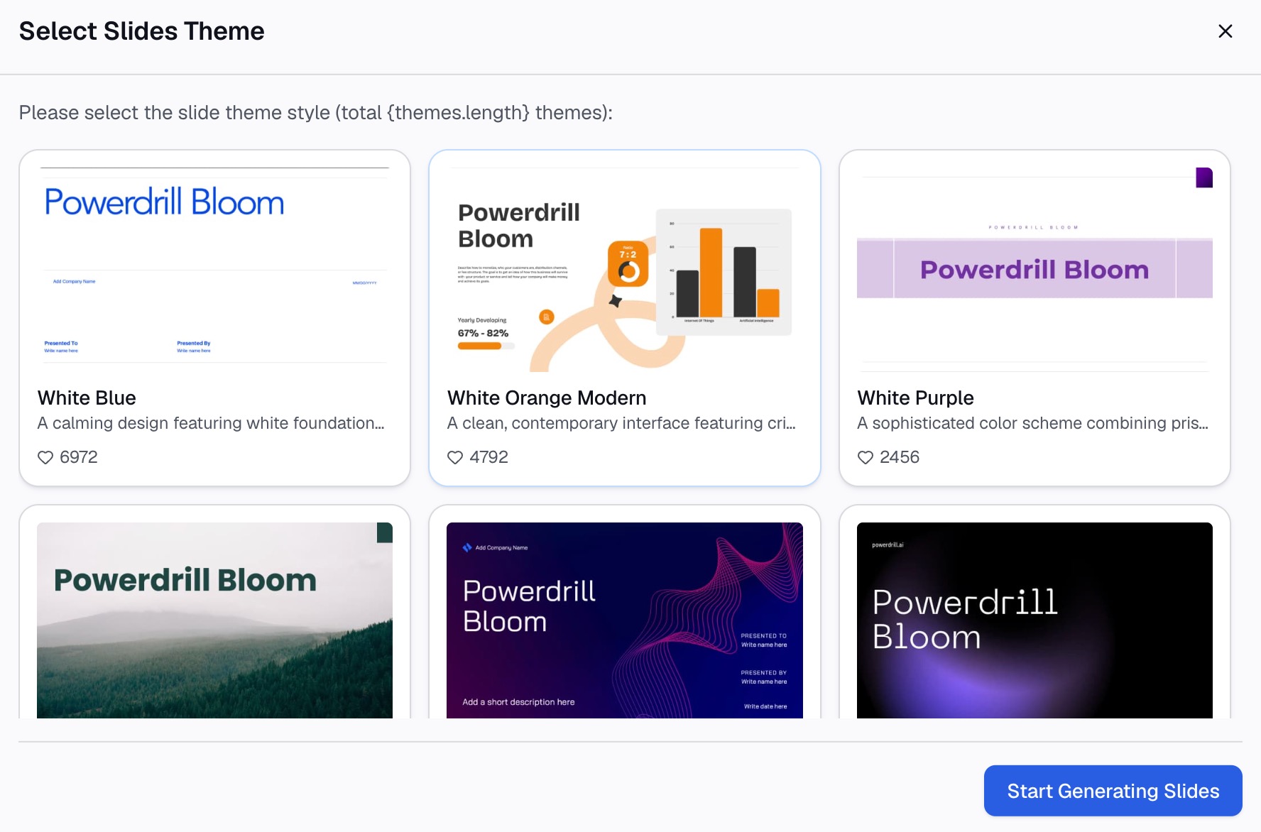
Step 3: Export the chart, report, or deck
Take out the score with its distribution, a trend chart across periods, or slides that carry the response count beside the number.
Why this beats rebuilding it each cycle
| Manual route | Powerdrill Bloom | |
|---|---|---|
| Band counts and percentages | Three COUNTIFS plus a denominator | Ask for the split |
| Blank and out-of-range responses | Manual spot check | Surfaces on upload |
| Segment breakdowns | Rebuild the filters per segment | Ask for the breakdown |
| Comparing to last cycle | Rebuild against a changed export | Swap the file, keep the rules |
The second row is where trust is won or lost. A blank counted as a zero turns a passive into a detractor, and that error is invisible in the final score.
Common mistakes
Averaging the 0–10 scores. The metric is a difference between two percentages, not a mean. An average lands in a similar range and means something else entirely.
Reporting the NPS without the response count. Small samples swing wildly. Put the count next to the number every time.
Quoting another industry's benchmark as a target. Sector averages range from −6 to 30 in the published figures. Compare against your own trend.
Changing the question wording between cycles. A rewrite makes the series non-comparable. Freeze the wording and note the date it was set.
Counting blanks as zeros. A blank is not a detractor. Exclude non-responses from both the numerator and the denominator.
Widening the surveyed population without saying so. Adding inactive contacts lowers the score without anything changing. Record the population on the report.
Ignoring the passive block. Passives are invisible in the score but often the largest group. Report their percentage as a fourth figure.
Conclusion
Ask the 0–10 question unchanged and sort into three bands. Convert both ends to percentages, subtract, then report the NPS with its response count and distribution. Those five steps produce a figure someone can act on.
What makes it expensive is that wording and population both drift, and both move the score without any change in how customers feel.
If that cycle eats your quarter, try Powerdrill Bloom on your survey export. See also our guide to turning messy survey data into clear charts, plus the voice of customer summarizer and CSV AI assistant pages.
Frequently asked questions
How is NPS calculated?
Subtract the percentage of detractors from the percentage of promoters. Promoters score 9 or 10, passives 7 or 8, and detractors 0 to 6, with passives excluded from both percentages.
What is the possible range?
From −100 to +100, where higher is better. It is a whole number rather than a percentage, so it should be written without a percent sign.
Why are passives ignored?
By design, the metric measures the balance between advocates and critics. Passives are counted in the denominator, so they dilute both percentages without appearing in either.
How many responses do I need?
There is no fixed minimum, but small samples swing heavily, so report the count alongside the score. With a few dozen responses, treat movements as directional rather than significant.
Can I compare my score to a competitor's?
Only within the same sector, and cautiously. Published industry averages range from −6 in consumer payments to 30 in grocery, so cross-industry comparison is misleading.