How to Create a Waterfall Chart for Revenue Breakdown From Excel (Made Easy)

You have a spreadsheet full of revenue data. You know there's a story in there—a story about what's driving growth, what's dragging it down, and where the business is heading. But when you try to tell that story with a standard bar chart or a table of numbers, it falls flat. Executives glaze over. Stakeholders ask for clarification. The narrative gets lost in the noise.
The waterfall chart was designed to solve exactly this problem. It visualizes how an initial value changes through a sequence of positive and negative contributions to reach a final result. It's the go-to visualization for consultants, finance teams, and anyone who needs to explain complex financial breakdowns to decision-makers.
But here's the catch: building a waterfall chart in Excel is painful. Manually calculating cumulative impacts, setting up the right formulas, formatting floating columns, and adjusting colors for positive versus negative contributions—it's tedious, time-consuming, and error-prone. One misaligned formula and your entire chart breaks.
This guide shows you a better way. With Powerdrill Bloom, you can create a revenue waterfall chart from your Excel data in minutes—no formulas, no manual formatting, and no data science background required.
What Is a Revenue Waterfall Chart
A revenue waterfall chart is a specialized bar chart that illustrates how a starting revenue figure transforms into a final result through a series of increases and decreases. Unlike a standard bar chart that shows standalone values, a waterfall chart shows the cumulative impact of each factor, making it clear exactly what's driving the change.
Key characteristics of a waterfall chart:
Starting and ending values: The first bar represents the initial value (e.g., prior period revenue), and the last bar represents the final value (e.g., current period revenue).
Intermediate contributions: Each bar in between shows the positive or negative impact of a specific factor—new customers, price changes, churn, upsells, or cost adjustments.
Floating bars: Each intermediate bar starts where the previous one ended, visually "floating" to show the cumulative effect.
Color coding: Positive contributions are typically shown in one color (often green or blue), while negative contributions are shown in another (often red).
Common use cases for revenue waterfall charts:
Revenue bridge analysis: Breaking down how revenue changed from one period to the next
ARR waterfalls: Showing how forecasted bookings translate into recognized revenue over time
Profit and loss decomposition: Tracing revenue through cost categories to net income
Sales performance analysis: Illustrating the impact of different sales drivers
In short, a revenue waterfall chart answers the question that every executive asks: "What actually changed, and why?"
Why Use AI to Create a Waterfall Chart From Excel Data
Traditional waterfall chart creation in Excel is a manual nightmare. Here's why AI-powered tools like Powerdrill Bloom are a better approach:
1. No formula debugging
Building a waterfall chart in Excel requires calculating cumulative sums, setting up helper columns, and configuring floating bars correctly. One broken reference or misplaced decimal can corrupt your entire chart. AI eliminates this fragility entirely.
2. Automatic data structuring
You don't need to pre-format your data or build pivot tables. Upload your raw Excel or CSV file, and Bloom automatically detects the structure, identifies relevant fields, and prepares the data for visualization.
3. Intelligent chart selection
Bloom analyzes your data and automatically selects the most effective chart type for your specific dataset. When you ask about revenue changes, it knows to recommend a waterfall chart without you having to specify it.
4. Interactive exploration
Unlike static Excel charts, Bloom generates an interactive exploration canvas where you can ask follow-up questions in natural language. "What if we exclude one-time charges?" "Show me the impact by region." The chart updates dynamically.
5. Presentation-ready output
Insights shouldn't stay locked in a spreadsheet. Bloom lets you export charts and summaries directly to PowerPoint, images, or Notion—ready for stakeholder meetings.
6. Zero learning curve
You don't need to learn waterfall chart mechanics, understand floating bar logic, or memorize Excel formulas. Just upload your data and ask for a revenue breakdown.
How to Create a Waterfall for Revenue Breakdown by Powerdrill Bloom
Step 1: Upload Your Excel Revenue Data
Start by logging in to Powerdrill Bloom. On the homepage, locate the "Research Canvas" button above the input box. Click it and select your Excel (.xlsx) or CSV file containing your revenue data.

Pro tip: Ensure your spreadsheet has clear headers, things like "Date," "Revenue," "Region," or "Product Category." Bloom will automatically detect and structure your data based on these headers.
Once uploaded, Bloom immediately processes your file. It detects the schema, identifies field types, and prepares the data for analysis—all within seconds.
No manual formatting. No schema definitions. No SQL imports. Just click, select, and upload.
Step 2: Let AI Analyze Revenue Changes
With your file uploaded, type your request directly into the input box using natural language. For example: "Show me a waterfall chart breaking down our revenue changes by product category." or "Create a revenue bridge from last quarter to this quarter, showing what drove the change."
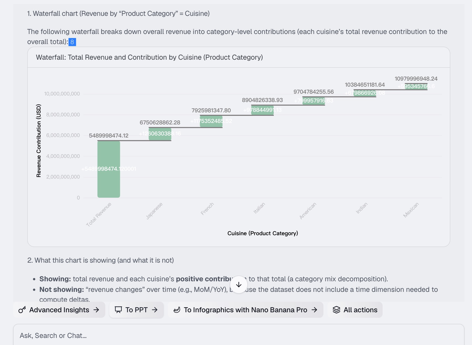
Bloom's AI immediately gets to work. Behind the scenes, it:
Identifies the key drivers of revenue change in your dataset
Calculates the cumulative impact of each factor
Determines the most appropriate chart type for your specific request
Generates an interactive waterfall chart with clear color coding for positive and negative contributions
The chart appears on your AI canvas—an interactive workspace where every insight, chart, and follow-up question is presented as a modular card.
Step 3: Generate Waterfall Charts and Insights
Once the initial waterfall chart is generated, you can explore your data further. Bloom doesn't just give you a static image—it provides an interactive exploration environment.
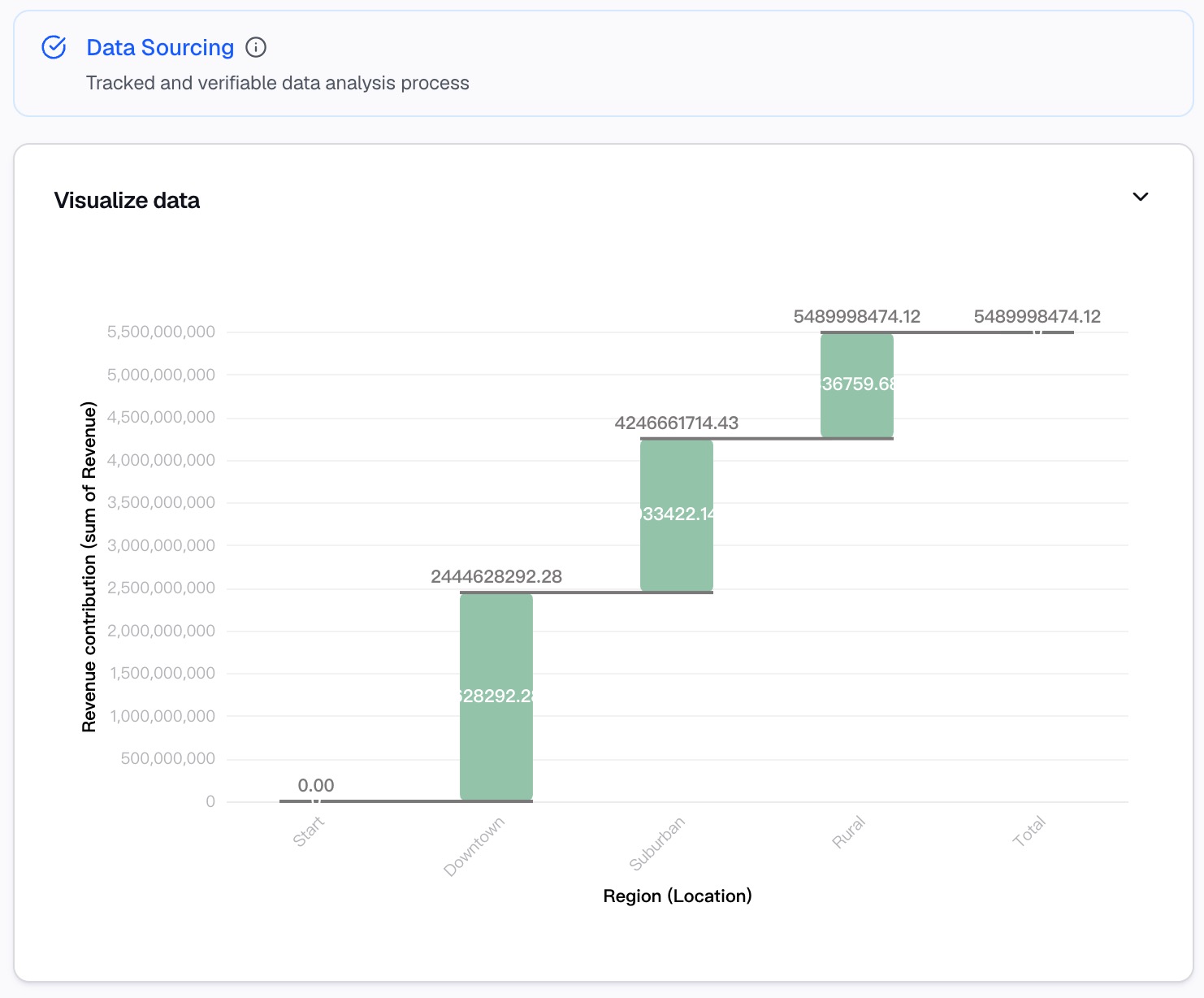
What you can do in the canvas:
View detailed insights: Each chart card includes a plain-language explanation of what the data shows and why it matters.
Ask follow-up questions: Type additional questions like "What's driving the negative contribution in Q3?" or "How does this look by region?" Bloom generates new charts and insights instantly.
Explore multiple paths: The canvas lets you explore different analytical angles simultaneously, with each insight organized as a separate card.
Drill into the details: Click on any insight card to open a detailed view with supporting data and additional visualizations.
Every chart, every question, and every conclusion is automatically recorded on your canvas, creating a complete record of your analysis.
Step 4: Turn Analysis Into Reports
Your insights shouldn't stay locked in the canvas. Bloom makes it easy to share your waterfall analysis with stakeholders.
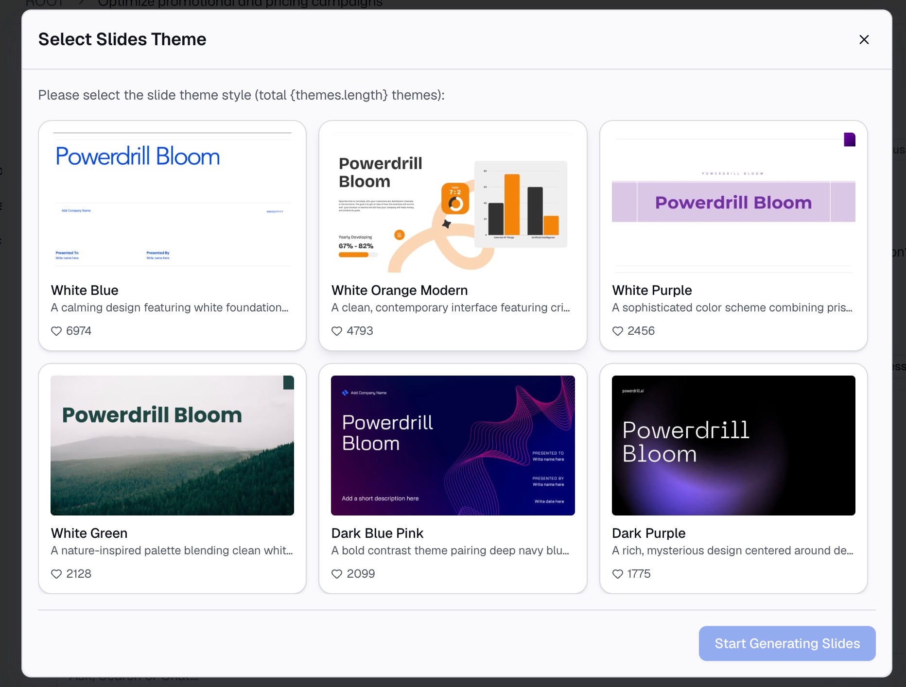
Export options:
PowerPoint (.pptx): Generate a professional slide deck with your waterfall chart and supporting insights
Images: Export individual charts as shareable images for emails or quick reports
Notion: Embed your charts and insights directly into Notion for team collaboration
No copy-pasting. No reformatting. No rebuilding charts in PowerPoint. Your analysis goes from canvas to presentation in seconds.
Best Practices for Revenue Waterfall Charts
Creating an effective waterfall chart isn't just about generating the visualization—it's about making sure the chart tells a clear, compelling story. Follow these best practices:
1. Order bars by magnitude
List the largest positive drivers first, then smaller positives, then smaller negatives, and finish with the largest negative driver. This creates a visual hierarchy that makes it easy to see what's driving the change.
2. Keep it simple—7 to 10 bars maximum
Too many bars overwhelm your audience. If you have more than 10 contributing factors, group minor categories into an "Other" category to reduce noise.
3. Use consistent color coding
Use one color for positive contributions (typically green or blue) and another for negative contributions (typically red). This makes the chart instantly readable.
4. Label clearly
Every bar should have a clear, descriptive label. Avoid acronyms or jargon that your audience might not understand.
5. Show the starting and ending values prominently
The first and last bars should stand out; they tell the audience where you started and where you ended up. Many waterfall charts use different colors or thicker borders for these bars.
6. Add a brief narrative
Don't just show the chart, but explain what it means. Highlight the key drivers and what they imply for the business. Bloom's AI automatically generates these explanations for you.
7. Use interactive exploration
If you're presenting to a live audience, use Bloom's interactive canvas to explore different scenarios on the fly. Answer questions like "What if we exclude this one-time charge?" in real time.
Final Thoughts
A revenue waterfall chart is one of the most powerful tools in a finance or strategy professional's toolkit. It turns confusing numbers into a clear visual story about what's driving business performance. But building one in Excel has always been a painful, error-prone process.
That's where Powerdrill Bloom changes everything. Upload your revenue data, ask for a waterfall chart in plain English, and let the AI handle the heavy lifting. No formulas. No manual formatting. No broken charts. Just a clean, interactive, presentation-ready waterfall chart in minutes.
And it doesn't stop there. Bloom's AI canvas lets you explore your data from every angle—ask follow-up questions, drill into the details, and uncover insights you might have missed. When you're ready to share, export your chart and analysis directly to PowerPoint, images, or Notion with one click.
Your revenue data tells a story. Let Bloom help you tell it—clearly, quickly, and with impact. Try Powerdrill Bloom's free beta today and see how easy revenue analysis can be.
FAQs
1. What is a waterfall chart used for?
It visualizes how a starting value changes through positive and negative contributions to reach a final result.
2. Do I need to know Excel formulas to create one?
No. Bloom analyzes your data and generates the chart automatically—no formulas required.
3. What file formats does Bloom support for revenue data?
Excel (.xlsx) and CSV files. Just upload and let Bloom handle the rest.
4. Can I export my waterfall chart to PowerPoint?
Yes. Bloom exports charts and insights directly to PowerPoint, images, or Notion with one click.
5. Is there a free version available?
Yes. Powerdrill Bloom offers a free beta with full access to data analysis and chart generation features.