How to Create a Stacked Bar Chart From Excel Without Excel Skills (in Minutes)

We have all been there. You are staring at a massive, overwhelming Excel spreadsheet filled with thousands of rows and columns of raw data. Your boss, your client, or your team has asked you for a clear, visual breakdown of the numbers. Specifically, they want a stacked bar chart—a fantastic visual tool for showing how individual parts contribute to a whole across different categories.
The problem? You are not an Excel wizard. When you try to build this chart manually, you suddenly find yourself tumbling down a rabbit hole of endless menus, confusing pivot tables, and frustrating data range selections. You highlight what you think is the right data, click "Insert Chart," and Excel spits out a chaotic, unreadable mess of colors that makes absolutely no sense. Instead of focusing on the story your data is telling, you end up wasting hours Googling tutorials, troubleshooting error messages, and pulling your hair out over minor formatting issues.
Fortunately, the landscape of data analysis has evolved. You no longer need to be a spreadsheet expert to turn raw data into stunning, presentation-ready visualizations. In this guide, we are going to show you exactly how to create a perfect stacked bar chart from your Excel data in a matter of minutes, requiring absolutely zero technical skills.
The Easy Way: Create a Stacked Bar Chart With Powerdrill Bloom
If you want to skip the headache of manual spreadsheet manipulation, the absolute best alternative is leveraging AI-powered data tools. Enter Powerdrill Bloom.
Powerdrill Bloom is a cutting-edge, incredibly user-friendly platform designed to bridge the gap between complex datasets and beautiful, actionable visualizations. It acts as your personal, on-demand data analyst. Instead of forcing you to navigate complex menus or memorize intricate formulas like VLOOKUP, Powerdrill Bloom allows you to interact with your data using everyday, natural language.
With this tool, creating a stacked bar chart goes from being a multi-hour chore to a simple, streamlined conversation. You simply provide your data, tell the AI what you want to see, and watch as it magically generates the exact chart you need. Below is the step-by-step process of how you can go from a blank screen to a completed stacked bar chart in just minutes.
Step 1. Upload Your Excel File to Powerdrill Bloom
The journey to your perfect chart begins with getting your data into the system. First, navigate to the Powerdrill Bloom platform and create an account or log in. Once you are on the main dashboard, look for the data upload section.
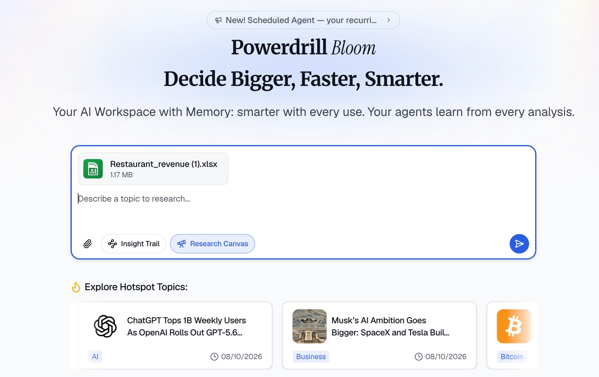
You do not need to worry about perfectly formatting your spreadsheet before uploading it. Whether your data is in a classic .xlsx file or a simpler .csv format, Powerdrill Bloom can handle it. All you have to do is drag and drop your file into the upload box, or click to browse your computer’s hard drive. Within seconds, the platform will securely ingest your file.
If you are worried about messy data—like blank cells, weirdly formatted dates, or inconsistent text—don't panic. One of the best features of this AI tool is that it automatically scans and understands the structure of your dataset right upon upload, preparing it for the next steps without you having to manually scrub it.
Step 2. Clarify Your Goal
Once your file is uploaded, you will be greeted by a chat interface. This is where the magic happens. In a traditional software program, your next step would be clicking through a maze of ribbons and dialog boxes. Here, your only job is to clarify your goal using plain English.
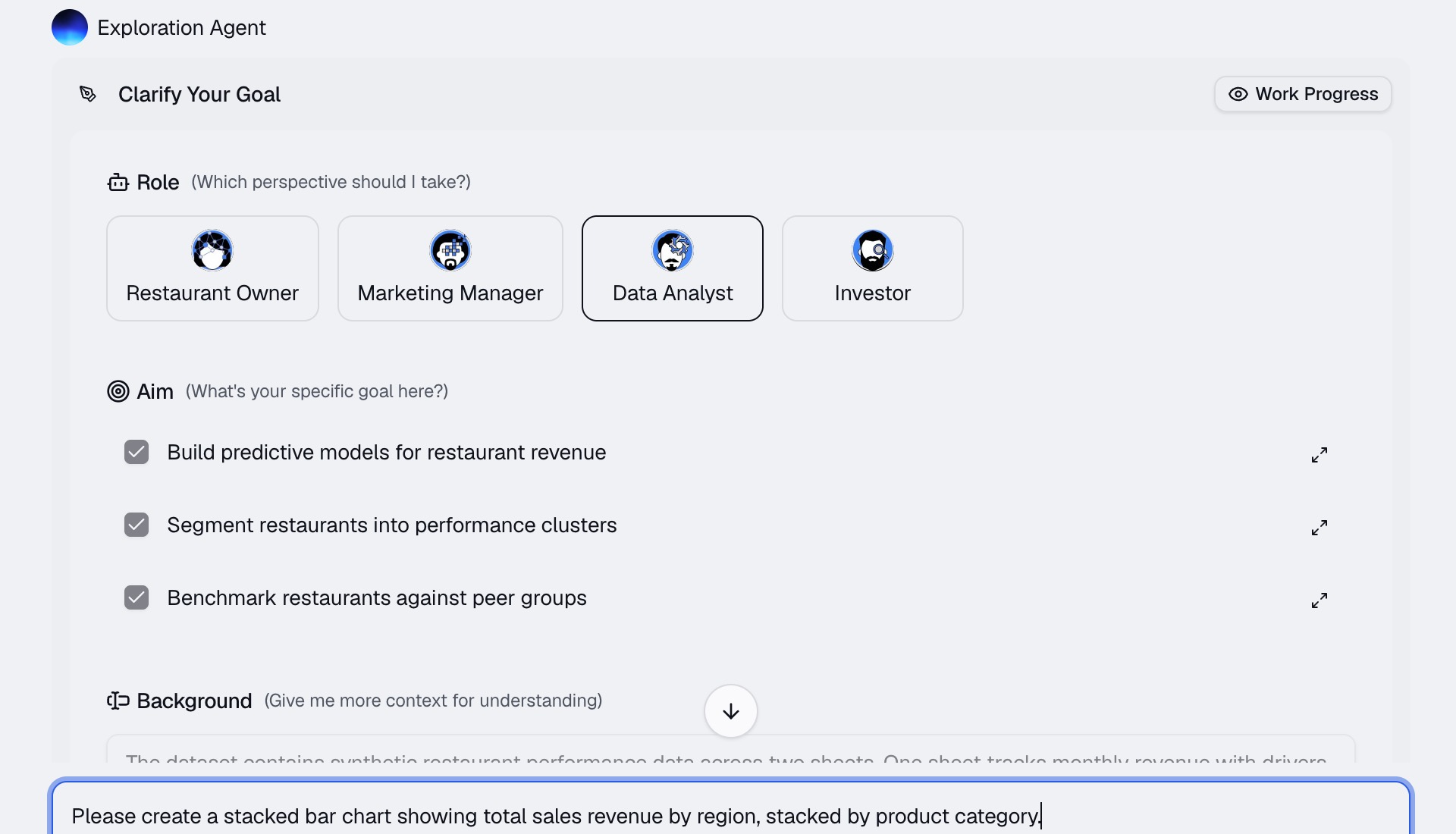
Think about what you actually want your stacked bar chart to show. For example, if you uploaded a spreadsheet containing last year's sales data, you might want to see how different product categories performed across four different regions.
All you have to do is type a prompt directly into the chat box. You might write something like: "Please create a stacked bar chart showing total sales revenue by region, stacked by product category."
You do not need to use programming jargon or specific technical phrasing. The system is built on advanced natural language processing, meaning it understands human intent. Just tell it what you want as if you were speaking to a human data analyst sitting right next to you.
Step 3. Let Powerdrill Bloom Analyze the Data
After you hit enter, Powerdrill Bloom takes over. You can sit back and watch as the AI goes to work.
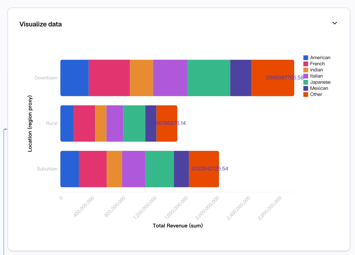
Behind the scenes, the platform is doing the heavy lifting that would normally take you hours in Excel. First, it identifies the relevant columns based on your prompt—in our example, it finds the "Region," "Product Category," and "Sales Revenue" columns. Next, it automatically aggregates the data, performing the necessary math to sum up the totals for each category. It essentially builds a virtual pivot table in the blink of an eye.
Finally, it maps this aggregated data to the correct axes of a stacked bar chart. It figures out that the regions should go on the X-axis, the revenue on the Y-axis, and the product categories should be represented by the differently colored stacked segments. Within mere seconds, a fully formed, accurate stacked bar chart will appear on your screen.
Step 4. Customize and Refine the Chart
Even though the AI generates a fantastic chart on its first try, you might want to make a few tweaks to ensure it perfectly matches your company’s branding or your personal aesthetic preferences. In Excel, customizing a chart involves right-clicking tiny elements, opening side panels, and guessing which hex code goes where.
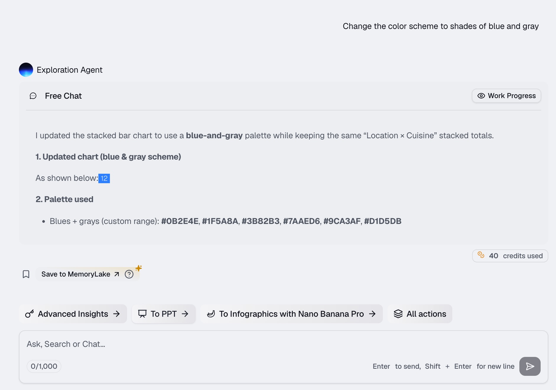
In Powerdrill Bloom, customization is just as easy as creation. You just continue the conversation. Do you want the chart to look more corporate? Type, "Change the color scheme to shades of blue and gray." Do you feel the title is a bit too robotic? Ask the AI to "Change the chart title to 'Q4 Regional Sales by Category'."
You can ask the system to add data labels so viewers can see the exact numerical value of each stacked segment. You can ask it to adjust the legend, rotate the axis labels for better readability, or even switch the orientation from vertical bars to horizontal bars. The AI iterates on the design instantly based on your commands.
Step 5. Export and Share
Your data is analyzed, and your stacked bar chart looks absolutely stunning. The final step is getting it out of Powerdrill Bloom and into the hands of your audience.
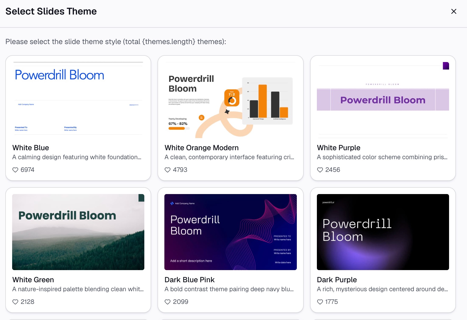
The platform makes exporting incredibly straightforward. With a simple click, you can download your brand-new stacked bar chart as a high-resolution image file (like a PNG or JPG), which is perfect for dropping directly into a PowerPoint presentation, a Word document, or an email to your boss.
If you need to share the chart in a more interactive format, Powerdrill Bloom also allows you to generate a secure, shareable link. You can send this link to your team members, allowing them to view the chart in their own browsers, hover over the data points to see the exact numbers, and truly engage with the insights you have uncovered.
Why Use Powerdrill Bloom Instead of Building the Chart Manually in Excel?
You might be wondering why you should adopt a new tool when you already have Excel installed on your computer. Here is exactly why moving away from manual spreadsheet charting is a game-changer:
Zero Learning Curve: Mastering Excel charts, particularly complex ones that require pivot tables and calculated fields, takes weeks of dedicated learning. With Powerdrill Bloom, if you know how to type a sentence or send a text message, you already have all the skills you need to build professional-grade charts.
Massive Time Savings: What normally takes 45 minutes of sorting, filtering, formatting, and troubleshooting in Excel takes roughly 15 seconds with AI. This frees you up to focus on the actual strategy and decision-making behind the data, rather than the mechanical process of drawing the chart.
Drastic Reduction in Human Error: When you manually highlight thousands of rows in Excel, it is incredibly easy to accidentally miss a row or include an empty cell, which completely skews your final chart. The AI automatically parses the entire dataset with programmatic precision, ensuring your visual representation is 100% mathematically accurate.
Professional Aesthetics by Default: Excel’s default chart colors and layouts often look dated and clunky. Powerdrill Bloom applies modern design principles automatically, ensuring that your charts look like they were crafted by a professional graphic designer, elevating the quality of your presentations.
Conversational Iteration: If you make a mistake in Excel and build a chart using the wrong data axis, you often have to start all over again. With Powerdrill Bloom, you simply type, "Actually, swap the X and Y axis," and the problem is fixed instantly.
Beyond Stacked Bar Charts: What Else Can You Do With Excel Data?
Creating a stacked bar chart is just the tip of the iceberg. Once your data is uploaded into an AI-powered platform like Powerdrill Bloom, a whole world of data analysis opens up to you. Here is what else you can do:
Generate Comprehensive Dashboards: Don't stop at just one chart. You can ask the AI to generate a pie chart of market share, a line graph of growth over time, and a scatter plot of customer demographics—all compiled into one single, cohesive dashboard that updates dynamically.
Extract Natural Language Insights: Sometimes you don’t just need a picture; you need an explanation. You can ask the AI, "What are the three biggest takeaways from this spreadsheet?" and it will write out a clear, concise summary of your data's most important trends.
Identify Hidden Trends and Anomalies: It is nearly impossible for the human eye to spot an outlier in a spreadsheet of 50,000 rows. You can ask the platform to identify any weird spikes in expenses or sudden drops in sales, helping you catch potential business issues before they become crises.
Perform Automated Data Cleaning: If your spreadsheet is full of duplicate entries, misspelled categories, or formatting inconsistencies, you can instruct the AI to clean, standardize, and merge the data for you, saving you from hours of mind-numbing manual cleanup.
Conduct Predictive Analytics: Want to know what next month looks like? Based on historical data, you can ask the AI to generate a basic forecast, plotting trendlines that help you anticipate future performance and make proactive business decisions.
Final Thoughts
Data is only as valuable as your ability to understand and communicate it. For far too long, the power of data visualization has been locked behind the steep learning curves of traditional spreadsheet software. By leveraging AI tools likePowerdrill Bloom, you completely remove those technical barriers. You can transform boring, intimidating Excel files into beautiful, insightful stacked bar charts in mere minutes. Empower yourself to stop fighting with formatting and start telling compelling stories with your data today.
FAQs
Do I need to clean my Excel data first?
No, Powerdrill Bloom automatically handles messy formatting, missing values, and duplicates before generating your visualizations.
Is my uploaded data secure and private?
Yes, your data is fully encrypted and processed securely. It is never used to train public AI models.
Can I change the chart colors easily?
Absolutely! You can customize colors, fonts, and labels simply by typing your design preferences into the chat interface.
Do I need to pay to use Powerdrill Bloom?
Powerdrill Bloom offers a free tier for basic features, along with premium plans for advanced analysis and higher usage limits.
What file formats does the platform support?
You can upload standard spreadsheet formats, including standard .xls, .xlsx, and .csv files, directly from your computer.