How to Create a Pie Chart From Excel Data With AI (Step-by-Step)

Introduction
Data visualization is the backbone of effective business communication, yet many professionals still waste hours wrestling with spreadsheet software. Selecting the right cells, dealing with formatting errors, and trying to make a basic chart look presentable can drain your productivity.
Fortunately, artificial intelligence has completely transformed how we interact with raw data. Instead of manually clicking through complex menus and memorizing formulas, you can now simply tell an AI what you want to see.
In this guide, we will explore the landscape of AI charting tools, review the top platforms available, and provide a clear, step-by-step tutorial on how to turn your raw Excel spreadsheets into beautiful, insightful pie charts in seconds.
What It Means to Create a Pie Chart From Excel Data Faster with AI
Creating a pie chart with AI is not just about changing the software you use; it is a fundamental shift in how you process information. Here is what this transformation actually means for your daily workflow:
Conversational Data Analysis: Instead of highlighting rows and columns, you use everyday language (e.g., "Show me a pie chart of sales by region").
Elimination of Manual Formatting: AI automatically understands data types, groups relevant categories, and applies professional design principles without manual tweaking.
Instant Error Correction: Traditional software fails if there is a blank cell or text in a number column. AI intelligently cleans and interprets the data before plotting it.
Focus on Insights over Mechanics: Because the chart is generated instantly, your time is freed up to analyze what the data actually means rather than figuring out how to build the graphic.
AI Tools for Create Pie Charts
1. Powerdrill Bloom
Powerdrill Bloom is a highly intuitive, AI-native platform built to synthesize and visualize data effortlessly. It acts as an intelligent data assistant, allowing users of any skill level to upload spreadsheets and generate charts through a conversational interface.
Key Features
Natural language processing for instant chart generation.
Seamless processing of messy or unstructured Excel/CSV files.
Automated data cleaning and categorization.
Pros
Incredibly easy to use with zero learning curve.
Lightning-fast chart generation and data insights.
High-quality, presentation-ready exports.
Cons
Requires an internet connection to process queries.
May require specific prompts for highly unconventional chart designs.
Pricing
Generous Free Tier available; competitive Pro plans start for $13.27/month.
2. Julius AI
Julius AI is a powerful AI data analyst that can read complex spreadsheets and write code in the background to execute advanced statistical analysis and visualizations.
Key Features
Chat-based interface that handles Python and R code natively.
Ability to generate animated and interactive charts.
Step-by-step explanation of the data analysis process.
Pros
Excellent for advanced mathematical and statistical tasks.
Transparent reasoning for how it generates its charts.
Strong data security and privacy protocols.
Cons
Can be overly complex if you just need a simple pie chart.
Occasional slow response times for massive datasets.
Pricing
Free basic access; Pro plans start at $20/month.
3. Graphy
Graphy focuses heavily on the aesthetics of data. It is an AI-enhanced visualization tool designed specifically to make sleek, modern, and beautiful charts for presentations and reports.
Key Features
Designer-curated templates for stunning visuals.
AI prompt-to-chart generation capabilities.
Interactive chart embedding for websites and Notion.
Pros
The generated charts are highly aesthetic and modern.
Very easy to collaborate on dashboards with team members.
Great integration with modern workspace apps.
Cons
Limited data manipulation and cleaning capabilities.
Not suited for deep, complex analytical workflows.
Pricing
Free basic plan; Pro plans start at $49/month.
4. Tableau (Tableau Pulse)
Tableau is a legendary enterprise-grade business intelligence platform. With the introduction of Tableau Pulse, it has integrated generative AI to help users navigate and visualize massive corporate databases.
Key Features
Massive data handling capabilities across multiple databases.
AI-driven insights and automated metric tracking.
Incredibly deep drill-down features for interactive dashboards.
Pros
The industry standard for large enterprise data.
Unmatched customization and filtering options.
Highly secure and reliable.
Cons
Extremely steep learning curve for beginners.
Very expensive and overkill for making a simple pie chart.
Pricing
Starts at $15/user/month.
5. Manus
Manus is an innovative, autonomous AI agent that goes beyond standard chatbots. It can autonomously navigate your computer environment, open spreadsheets, and execute multi-step workflows to create visualizations.
Key Features
End-to-end task execution and screen understanding.
Ability to operate standard software like MS Excel directly.
Autonomous multi-step reasoning.
Pros
Can handle highly repetitive and tedious formatting tasks.
Acts like a true virtual employee rather than just a tool.
Highly adaptable to different file types and softwares.
Cons
Still in early stages; execution can sometimes be unpredictable.
May take longer to execute than a direct web-based tool.
Pricing
How to Use Powerdrill Bloom to Create a Pie Chart From Excel Data
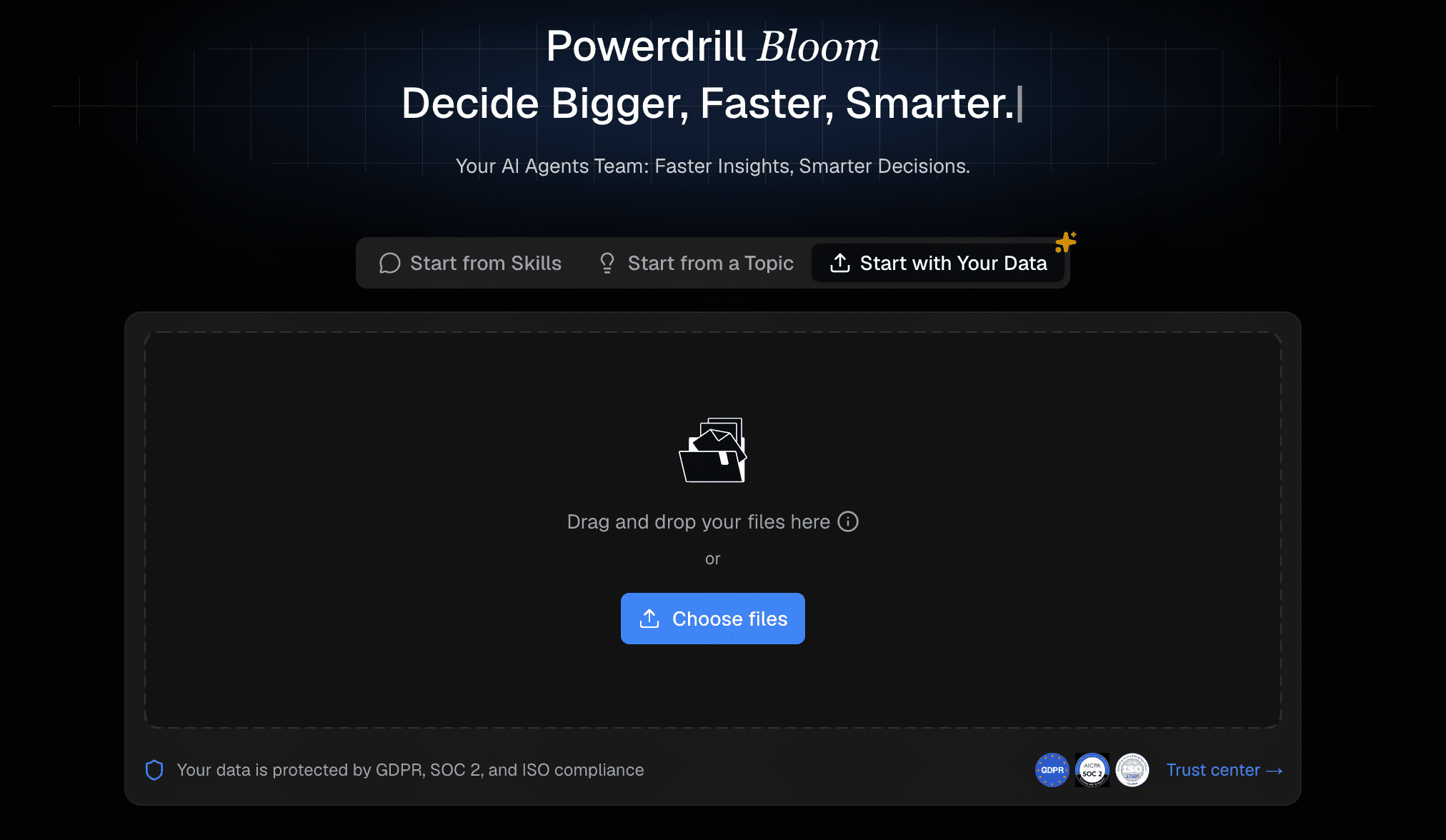
Step 1: Upload Excel/CSV File
Begin by logging into your Powerdrill Bloom dashboard. Locate the upload button and drag and drop your Excel (.xlsx) or CSV file directly into the interface. The AI will instantly read and process the structure of your dataset.
Step 2: Ask the AI for Insights
Before making a chart, you can ask Powerdrill Bloom to summarize your data. Simply type, "What are the key trends in this spreadsheet?" The AI will identify the columns, clean up any messy formatting, and highlight the most important metrics available for visualization.

Step 3: Query in Plain Language
To create your visualization, type a simple command into the chat box. For example, type: "Create a pie chart to show the proportion of the number of influencers in each region." Powerdrill Bloom will automatically select the correct numerical values and categorical labels to construct the chart.
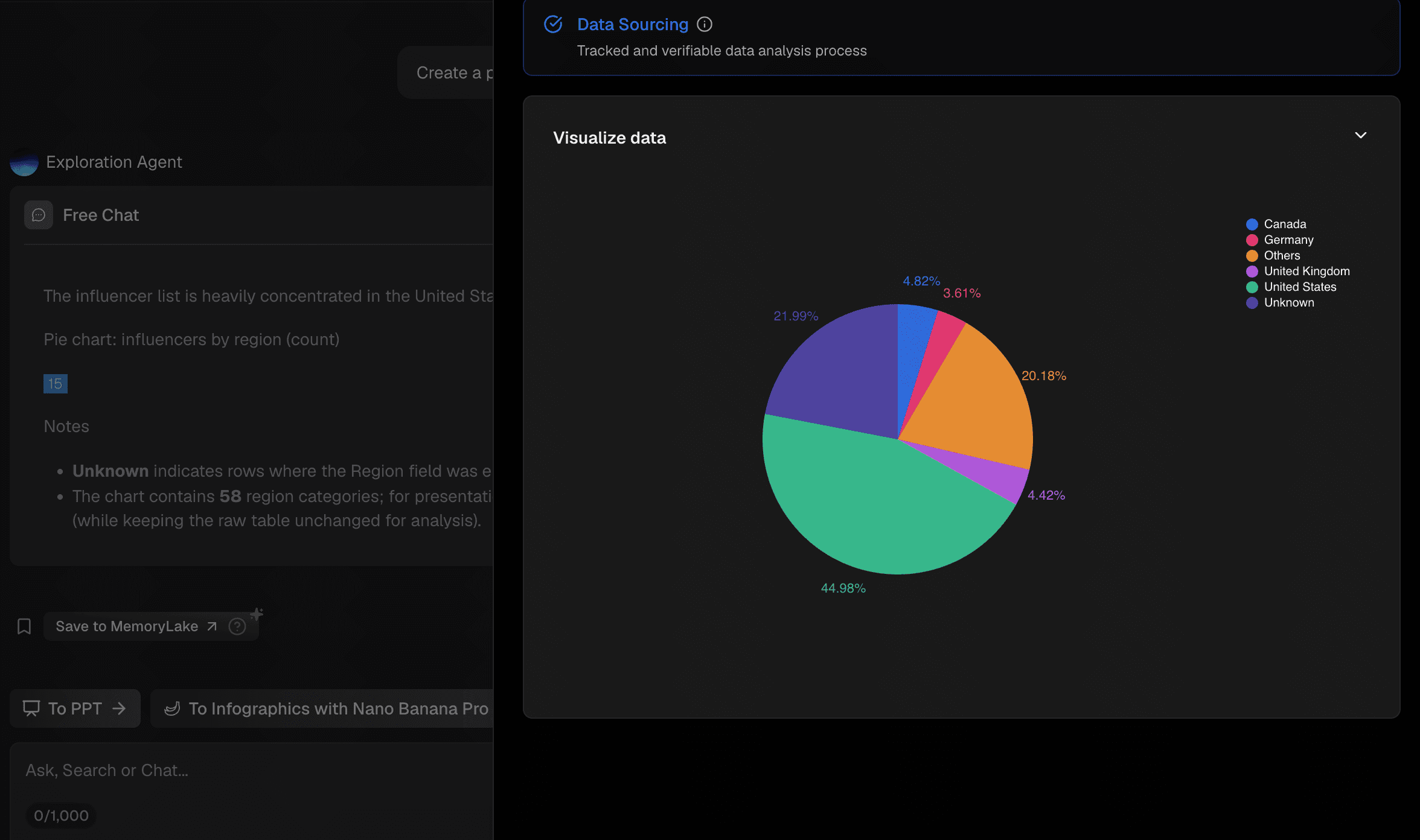
Step 4: Instantly Generate and Export
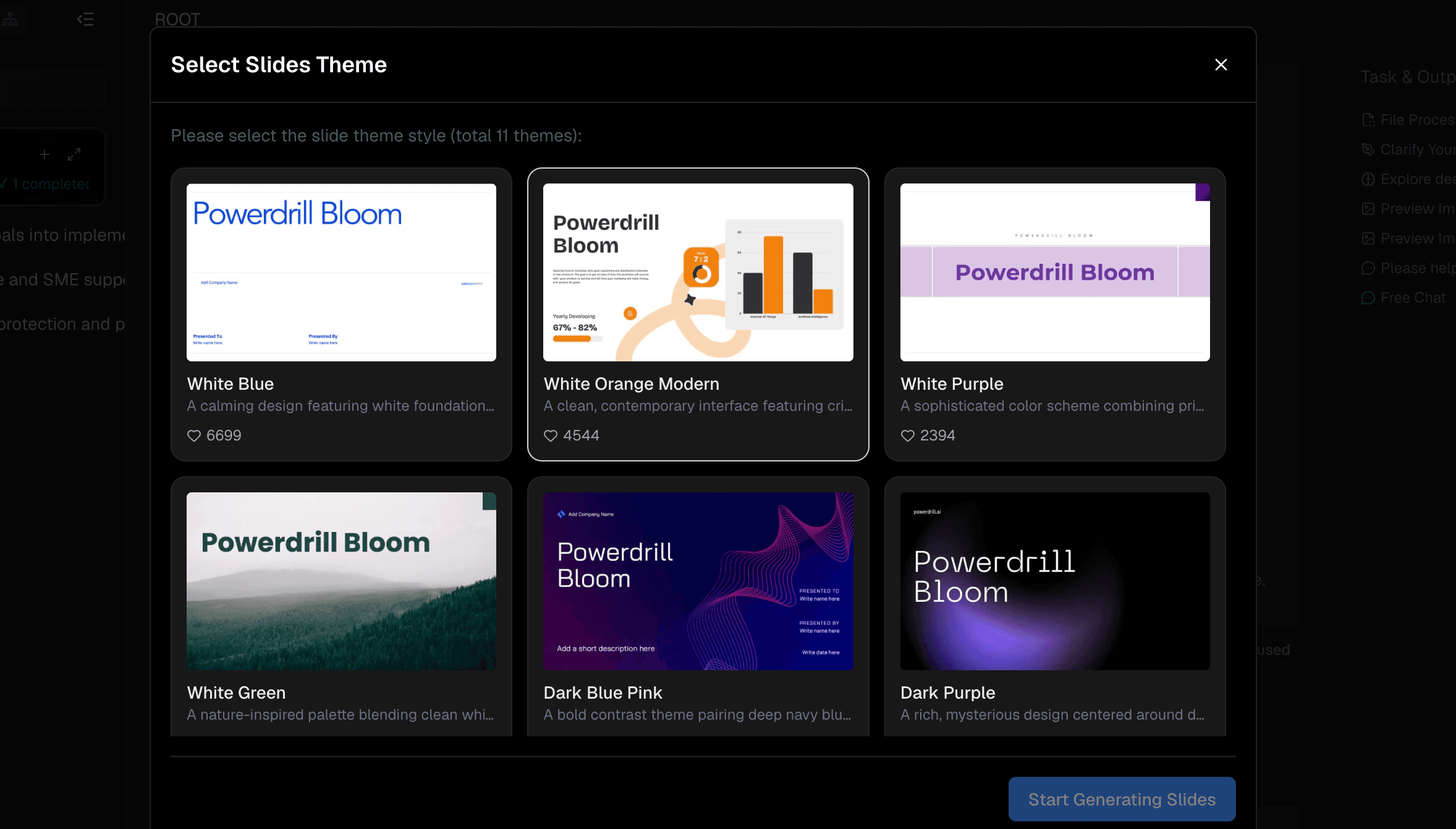
Within seconds, a beautifully formatted pie chart will appear on your screen. You can ask the AI to adjust colors or add percentage labels. Once you are satisfied, simply click the export button to download your chart as an image file for your next presentation.
Benefits of Using AI to Create a Pie Chart From Excel Data
Massive Time Savings: What used to take 15 minutes of tweaking in Excel now takes seconds.
Zero Technical Barrier: You do not need to know how to write VLOOKUPs, pivot tables, or macros to get professional visualizations.
Uncovering Hidden Trends: AI might suggest alternative visualizations or point out data anomalies you missed.
Flawless Formatting: AI tools automatically apply color theory, proper spacing, and legible fonts, making you look like a presentation pro.
Conclusion
The days of fighting with Excel menus, manually highlighting data ranges, and struggling to format pie charts are officially over. By leveraging artificial intelligence, anyone can transform raw, boring spreadsheets into compelling, presentation-ready visualizations in a matter of seconds. While tools like Tableau and Julius AI offer great depth for specialized tasks, they can often be too complex for quick, everyday needs.
If you want the most seamless, user-friendly, and fastest path from raw data to beautiful charts, you should make Powerdrill Bloom your go-to solution. Its conversational interface and intelligent data synthesis will permanently change the way you work with spreadsheets. Try Powerdrill Bloom today and take the friction out of your data analysis.
FAQs
Can Powerdrill Bloom read Excel files directly?
Yes, simply upload your Excel or CSV files, and it will instantly parse and structure the data.
Do I need coding skills to use Powerdrill Bloom?
Not at all. You can generate complex, beautiful charts simply by typing conversational, everyday language prompts.
Are AI-generated pie charts actually accurate?
Yes, they directly reflect the data you provide, eliminating human error in selecting ranges and formatting cells.
Can I export the pie charts from Powerdrill Bloom?
Absolutely. You can easily download your generated visualizations to use immediately in presentations, reports, or emails.
Is my Excel data secure with Powerdrill Bloom?
Yes, Powerdrill Bloom uses strict enterprise-grade security protocols to ensure your uploaded data remains completely private.