How to Create a Funnel Conversion Chart From Event Data (Quick Guide)
In today’s fast-paced digital landscape, understanding user behavior is the key to unlocking sustainable business growth. Whether you are managing an e-commerce platform, a SaaS application, or a content-driven website, you need to know exactly how users interact with your digital assets. Are they seamlessly navigating through your intended customer journey, or are they abandoning the process halfway through? This is where funnel conversion analysis becomes absolutely critical.
Tracking the user journey from the first touchpoint to the final desired action allows businesses to pinpoint exactly where they are losing potential customers. However, transforming raw, complex event data into a clear, actionable visual representation can often feel like a daunting task, especially if you lack advanced technical skills or a dedicated data science team.
Enter Powerdrill Bloom. Powerdrill Bloom is an innovative, AI-powered data analysis tool designed to democratize data visualization. It allows anyone, regardless of their technical background, to turn complex datasets into stunning, insightful charts using simple natural language. In this comprehensive guide, we will explore the fundamentals of funnel analysis, how to structure your data, and how to effortlessly create a funnel conversion chart from event data using Powerdrill Bloom.
What Is a Funnel Conversion Chart
A funnel conversion chart is a visual representation of a linear process that tracks user progression through a series of defined, sequential steps. The chart is shaped like a funnel—wide at the top and narrow at the bottom—because the number of users naturally decreases as they move from the initial step toward the final goal.
Understanding the anatomy of a funnel conversion chart is vital for extracting actionable business insights. Here are the core components of this visualization:
Stages (or Steps): These represent the specific actions a user must take to complete a goal. For instance, in an e-commerce setting, the stages might be: Visit Website > View Product > Add to Cart > Initiate Checkout > Complete Purchase.
Total Volume: This metric shows the absolute number of users who entered the funnel at the very first stage. It represents your total pool of potential converters for that specific workflow.
Conversion Rate: This is the percentage of users who successfully move from one step to the next, as well as the overall conversion rate from the first step to the last. It tells you how effective your process is at retaining user interest.
Drop-off Rate (or Churn): The inverse of the conversion rate. The drop-off rate highlights the percentage of users who abandon the funnel at a specific stage. High drop-off rates indicate friction points, such as confusing UI, unexpected costs, or technical bugs.
Time to Convert: While not always visualized directly in the main shape of the funnel, advanced funnel charts often measure the average time it takes for a user to move between steps. This helps identify delays that might be dampening the user experience.
Understanding Event Data for Funnel Analysis
Before you can build a meaningful funnel conversion chart in Powerdrill Bloom, you must have a solid grasp of the underlying data. Funnels are built using "event data"—a specific type of data that records actions performed by users at specific points in time.
To conduct an accurate and insightful funnel analysis, your event dataset must contain certain fundamental attributes. Here is a detailed look at the core components of event data:
Unique Identifier (User ID / Session ID): To track a user’s journey across multiple steps, you need a way to identify them consistently. A User ID tracks a specific logged-in person across multiple visits, while a Session ID tracks anonymous behavior within a single browsing period. Without this, you cannot link "Step A" to "Step B" for the same individual.
Event Name: This is the label given to the specific action the user performed. Clear, standardized naming conventions are essential. Examples include page_view, button_click, form_submit, or payment_success.
Timestamp: Funnels are strictly sequential. The timestamp records the exact date and time (often down to the millisecond) that an event occurred. This allows the analysis tool to verify that a user added an item to their cart before they checked out.
Event Properties (Metadata): These are additional details that provide context to the event. For a purchase event, properties might include item_category, cart_value, or device_type. Properties are crucial for segmenting your funnel (e.g., comparing the conversion rates of mobile users versus desktop users).
By ensuring your raw dataset contains these four distinct pillars, you set the stage for highly accurate and deeply granular funnel analysis.
Create a Funnel Conversion Chart From Event Data with Powerdrill Bloom
Creating a funnel chart used to require complex SQL queries, advanced Excel formulas, or expensive, hard-to-navigate business intelligence tools. Powerdrill Bloom revolutionizes this process by leveraging artificial intelligence. You can now chat with your data and generate professional visual insights in a matter of seconds.
Here is how you can create a funnel conversion chart using Powerdrill Bloom in four simple steps.
Step 1. Upload Your Event Dataset
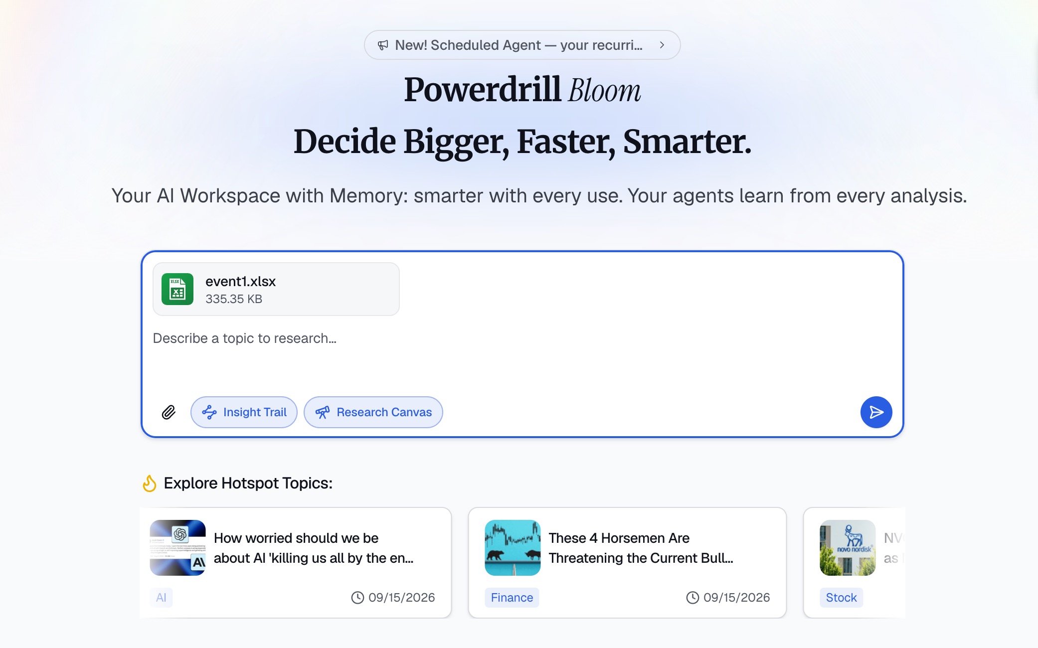
The first step is to feed your event data into the Powerdrill Bloom platform. Navigate to the main dashboard and click on the "Upload Data" button. Powerdrill Bloom supports a wide variety of formats, so you can easily upload a CSV, Excel spreadsheet, or connect directly to your existing database or data warehouse. Once uploaded, the platform’s intelligent engine will automatically scan the file, identifying columns like timestamps, event names, and user IDs, ensuring your data is formatted correctly for analysis.
Step 2. Describe Your Analysis Goal
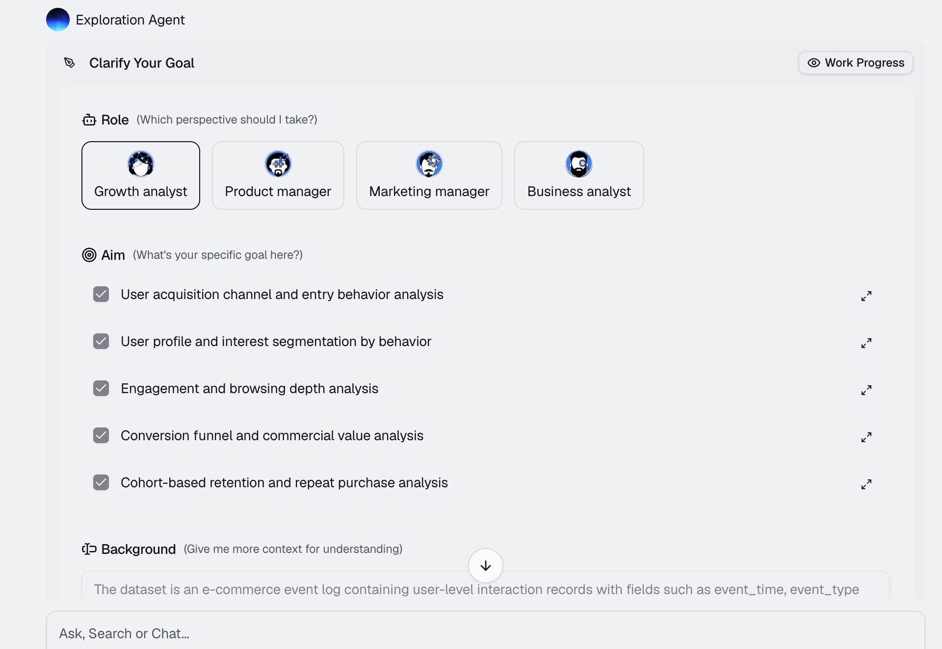
This is where the magic of Powerdrill Bloom truly shines. Instead of dragging and dropping fields into a complex UI or writing lines of code, you simply use natural language. In the chat interface, tell Powerdrill Bloom exactly what you want to see. The AI understands the sequence, identifies the relevant columns in your uploaded dataset, and prepares the logical query behind the scenes.
Step 3. Generate the Funnel Conversion Chart
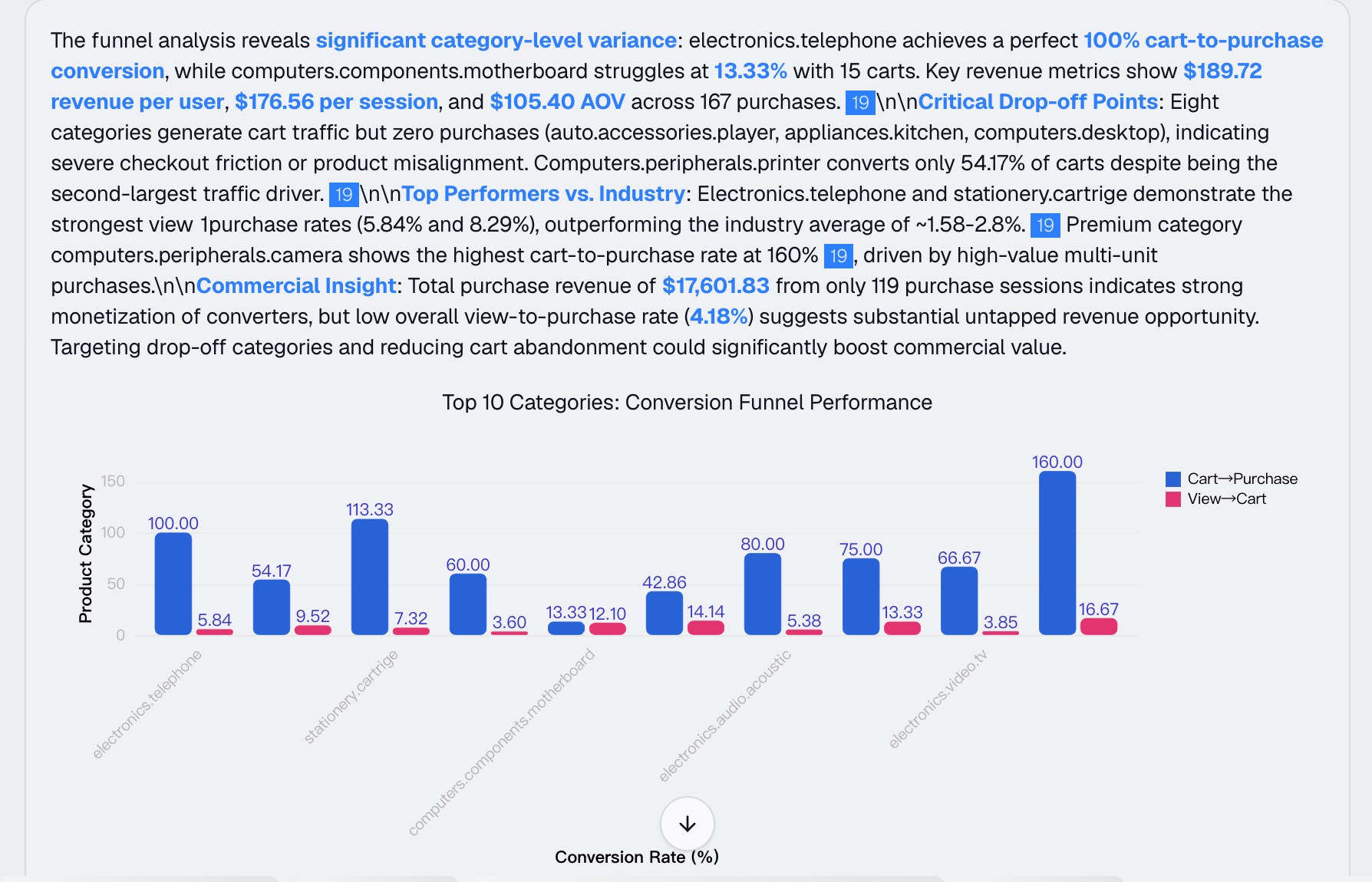
Once you hit enter, Powerdrill Bloom processes your prompt in real-time. Within seconds, it will generate a beautiful, interactive funnel conversion chart. The chart will clearly display the volume of users at each stage, the step-by-step conversion rates, and the critical drop-off points. Because it is interactive, you can hover over different sections of the funnel to see detailed tooltips, or ask follow-up questions in the chat, such as, "Can you break this funnel down by mobile vs. desktop users?" to instantly update the visualization.
Step 4. Export and Share
Once you are satisfied with your funnel conversion chart, it is time to put those insights into action. Powerdrill Bloom makes sharing incredibly easy. You can export the chart as a high-resolution image (PNG or JPEG) to drop into your presentation decks. Alternatively, you can save the chart to a dynamic Powerdrill Bloom dashboard, allowing your marketing, sales, and product teams to view the live, updated funnel via a secure sharing link.
Common Mistakes in Funnel Conversion Analysis
Even with powerful tools like Powerdrill Bloom, human error in strategy can lead to misleading insights. When mapping out your user journey, it is important to avoid these frequent pitfalls:
Including Too Many Steps: A funnel should represent a core, logical journey. Trying to track 10 or 15 micro-interactions (like every single button hover or minor scroll) clutters the chart and makes it impossible to identify the primary friction points. Stick to the major milestones.
Ignoring Time Windows: Users rarely complete complex funnels in a single session. If you don't define a logical "conversion window" (e.g., allowing a user 7 days to go from clicking an ad to making a purchase), you will incorrectly categorize delayed converters as drop-offs, skewing your data.
Overlooking Segmentation: Looking at an aggregate funnel can hide crucial truths. For example, your overall checkout conversion might look fine, but segmenting the data might reveal that iOS users convert at 80% while Android users convert at just 10% due to an OS-specific bug.
Misinterpreting Drop-offs: A high drop-off rate isn't always a bad thing. For instance, if users drop off after viewing a highly detailed FAQ or pricing page, they might have simply found the information they needed and realized they aren't the right fit. Always investigate the context of the drop-off.
Best Practices for Funnel Conversion Analysis
To truly harness the power of your event data and drive meaningful improvements in your business metrics, adhere to these proven best practices:
Define Clear Business Goals First: Before you even look at your data, know what you are trying to achieve. Are you trying to improve newsletter sign-ups, decrease cart abandonment, or boost software installations? Your business goal dictates the exact steps you should include in your funnel chart.
Keep the Funnel Simple and Linear: The most effective funnels track a strict, linear progression. Ensure that Step B logically follows Step A, and Step C logically follows Step B. If users can reach Step C without ever touching Step B, your funnel visualization will become distorted and difficult to analyze.
Use Granular Segmentation: Always slice your data. Compare your funnels by traffic source (Organic vs. Paid), geographic location, device type, or user demographic. This helps you identify which specific cohorts are performing best and which ones require targeted interventions.
Act on the Data Promptly: A funnel chart is only valuable if you use it to enact change. If you spot a massive 60% drop-off between the "Add to Cart" and "Payment Info" stages, immediately investigate that specific web page. Fix bugs, simplify forms, or add trust badges to optimize the flow.
Conclusion
Mastering funnel conversion analysis is an indispensable skill for any modern business striving to optimize its customer journey. By carefully tracking how users navigate through your digital processes, you can eliminate friction points, enhance user experience, and dramatically boost your overall conversion rates.
You no longer need to be a data scientist to uncover these game-changing insights. With Powerdrill Bloom, transforming raw event data into clear, actionable funnel charts is as easy as having a conversation. Ready to stop guessing and start optimizing? Try Powerdrill Bloom today to visualize your data effortlessly and unlock the true potential of your business growth.
FAQs
1. What is a funnel conversion chart?
It is a visual tool tracking user progression through sequential steps, highlighting where drop-offs occur in a specific process.
2. What kind of event data do I need?
You need sequential data containing unique user IDs, standardized event names, and precise timestamps for accurate journey tracking.
3. Is Powerdrill Bloom hard for beginners to use?
Not at all! It utilizes natural language processing, allowing you to generate complex charts simply by typing out your goals.
4. Can I export my funnel charts from Powerdrill Bloom?
Yes, you can easily export charts as high-resolution images or share interactive dashboards directly with your entire team.
5. How many steps should a typical funnel have?
Ideally, keep it between 3 to 5 critical milestones. Too many steps create visual clutter and dilute actionable insights.